
Web development was much simpler only a few years ago, when we were building HTML pages that included images and photos, and all elements shared the same resolution units. If for example, you aimed at a standard 1024×768 screen, you knew these were exactly the number of pixels available for displaying HTML elements and images.
In 2010, Apple introduced the iPhone 4 with Retina display. In order to simplify things for developers, the logical screen resolution remained the same as previous iPhone models (640×960) while the physical screen resolution was exactly doubled (1280×1920). This means that if, for example, you embed an image tag in your HTML page with width of 200 pixels and height of 300 pixels, and you display a double-size image of 400×600 pixels, the Retina display shows all pixels of the larger image, resulting in a much clearer visual result and without performing browser-side down-scaling.
Since then, most of Apple’s devices support this Device Pixel Ratio (DPR) of 2.0 (double physical resolution compared to logical resolution), including iPhone, iPad and Macbook Pro laptops. Android smartphones and tablets followed this trend, but there is a large variety of Android devices with different Device Pixel Ratios. For example, Samsung Galaxy S III has a DPR of 2.0, while the Samsung Galaxy S4 and LG G2 have a DPR of 3.0 (triple physical resolution). Some Android devices have non-round DPR values as well: 1.3, 1.5 and even 0.75.
Your website or mobile site is probably accessed by many users with HiDPI devices, or laptops with DPR higher than 1.0, so you should deliver high-resolution images to match the high visual quality your users expect. However, higher resolution images weigh more bytes and take more time to deliver, so you should avoid delivering double resolution images to standard devices of DPR 1.0. If you want to deliver different image resolutions to each type of device, you first need to create multiple versions of an image for each supported DPR, then detect the DPR of the user’s current device, and deliver the correct image version.
Creating and dynamically serving images with multiple resolutions, coupled with dynamic DPR detection for correct responsive delivery, can be quite challenging. That’s why we introduced Cloudinary’s Retina and HiDPI support with dynamic DPR detection and on-the-fly DPR-specific image delivery.
This new feature allows you to provide one image, and have it automatically adapted to the resolution appropriate to each user’s device or screen. Cloudinary will take your one image and automatically create versions of it, matching different resolutions, on the fly. Meaning that users of devices with high pixel density will get a great visual result, while low-DPR users don’t have to wait needlessly for larger images to load.
Let’s take the following image named ‘smiling_man’ that was uploaded to Cloudinary’s cloud-based image management service. The original image is of 849×565 pixels (below you can see a scaled down sample of 254×169 pixels)

Let’s say that in your website or mobile application you need a 100×100 profile picture thumbnail of this uploaded photo. Cloudinary can perform this image transformation on-the-fly. The following dynamic URL and sample code generates a 100×100 face-detection based version of the photo, by setting the width and height parameters to 100, selecting the fill crop mode with face gravity, for face-detection-based cropping:

Now, in order to generate the same photo, this time for a DPR of 2.0, all you need to do is to set the new dpr transformation parameter to 2.0. As you can see below, setting the dpr parameter to 1.0, 2.0 and 3.0 dynamically generates the same content with 100×100, 200×200 and 300×300 pixels respectively.


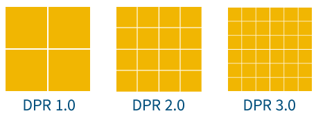
DPR 1.0 DPR 2.0 DPR 3.0
When embedding these images, in an HTML page for example, you should set the width and height image tag attributes to 100 for all three, although the actual image might have more pixels available, for an optimal visual result on HiDPI devices.
<img width="100" height="100" src="https://res.cloudinary.com/demo/image/upload/c_fill,w_100,h_100,g_face,dpr_2.0/smiling_man.jpg"/>
Code language: HTML, XML (xml)You can create image tags that have the logical width and height (100×100 in our example), while the URL of the image can be a dynamic image transformation URL that delivers a larger image according to the given dpr parameter. The three images below are all displayed within a 100×100 logical square, while you see more details and a better visual result for the last two images if you view this post using a HiDPI device.
DPR 1.0 (100×100, 4.6KB) DPR 2.0 (200×200, 12.1KB) DPR 3.0 (300×300, 22.6KB)
Images delivered by web applications and mobile sites might be more complex and involve overlays. If you are already familiar with Cloudinary, you know that Cloudinary supports dynamically generating images with overlays and watermarks of other uploaded image (see this blog post for more details).
When adding overlays, you need the overlay image to be correctly resized according to the required pixel density of the device (along with the containing image). Setting the dpr transformation parameter applies the same resizing rules both to the containing image, and the included overlay.
For example, the following URL dynamically generates a 100×100 face-detection-based circular thumbnail of the same photo, and adds another image named cloudinary_icon as a semi-transparent watermark that fills 90% of the width of the containing image. Setting the dpr value to 1.0, 2.0 or 3.0 generates the following images, while resizing both the containing image and the overlay to match the required DPR.
DPR 2.0 circular thumbnail with a watermark URL


DPR 1.0 DPR 2.0 DPR 3.0
Now you can create a 100×100 HTML image tag and deliver an image with the resolution that best matches the specified pixel density of your users’ devices.
DPR 1.0 (100×100, 4.8KB) DPR 2.0 (200×200, 12.8KB) DPR 3.0 (300×300, 23.1KB)
In order to automatically serve the correct DPR version of an image to each user, you need to detect the DPR on the user’s device. If your web application or mobile site is mostly dynamic and rendered on the server-side, one method is to check the User-Agent request header, and use it to set the correct DPR value of images embedded in your pages.
However, the User-Agent solution can be misleading – for example, the request header could show the user’s device is a Macbook Pro Retina which has high DPR, but in fact the actual display is an external HD monitor with low DPR.
Cloudinary’s jQuery plugin solves this, with client-side Javascript code that detects the actual device pixel ratio on the user’s current display. Then, Cloudinary allows you to dynamically build image URLs with the best matching DPR value, and lazy-load the actual images using Javascript. You can do all this with one line of code.
<img class="cld-hidpi"
     data-src=
"https://res.cloudinary.com/demo/image/upload/c_fill,dpr_auto,h_200,w_150/lupine.jpg"
/>
Code language: JavaScript (javascript)
Let’s explain how this works. In the image tag above, the src attribute is not set (you can set it to a placeholder blank image such as /images/blank.gif). The data-src attribute is set to a URL template of a remote image that was uploaded to Cloudinary, while cropping to a 150×200 rectangle. The URL template contains the dpr_auto directive, which allows the jQuery plugin to dynamically generate an actual image with the correct DPR value (e.g., dpr_1.0, dpr_2.0).
So – all you need to do in order to make your site responsive to retina and HiDPI screens, is to include Cloudinary’s jQuery plugin in your site (see the plugin’s getting started guide) and to add the following Javascript command at the end of the HTML page.
$.cloudinary.responsive();
Code language: JavaScript (javascript)
This method looks for all images in the page that have the cld-hidpi class, detects the device’s pixel ratio, and updates the HTML image tags accordingly. Even if a user switches from Retina to non-Retina displays using the same device, correct DPR-based URLs will be generated.
You can also manually update image tags with the correct DPR-based URLs, using custom jQuery selection and applying the cloudinary_update method:
$('img.my_dymamic_images').cloudinary_update();
Code language: JavaScript (javascript)
Server-side rendered pages can still enjoy the automatic device pixel ratio detection on the browser-side, as shown above. When using Cloudinary’s view helper methods (e.g., cl_image_tag in Ruby on Rails), you can set the new dpr parameter to auto. This creates an HTML image tag with a blank src attribute while the data-src attribute points to a dynamic image transformation URL.
When you load Cloudinary’s jQuery plugin and call $.cloudinary.responsive(); the image tags are automatically updated, and URLs are replaced with the correct DPR value. You can also set your placeholder image using the responsive_placeholder parameter, or set to the default inline blank image.
The following HTML image tag is generated by the code samples above:
<img class="cld-hidpi" height="150" width="100"
     data-src=
"https://res.cloudinary.com/demo/image/upload/c_fill,dpr_auto,h_150,w_100/lupine.jpg"
     src=
"data:image/gif;base64,R0lGODlhAQABAIAAAAAAAP///yH5BAEAAAAALAAAAAABAAEAAAIBRAA7"
/>
Code language: JavaScript (javascript)
Web applications and mobile sites need to become more and more responsive to support the growing variety of devices, resolutions, aspect ratios and pixel densities. It’s important to deliver images of adequate quality to high resolution devices, while preventing unnecessary delivery of large images to lower resolution devices, which wastes bandwidth and harms user experience by increasing page load times.
Cloudinary’s cloud-based image processing makes it easier to support retina and HiDPI devices, by performing on-the-fly generation of images and thumbnails based on a given Device Pixel Ratio. Cloudinary’s SDKs for all popular development frameworks, together with client side support using a jQuery plugin, allow automatic detection of the Device Pixel Ratio of users’ devices and on-the-fly delivery of images with appropriate resolution – without needing to prepare those images ahead of time.
Retina and HiDPI support is part of the larger Responsive Design challenge, and we have more features coming up that will ease the process of making your sites and apps fully responsive. More details coming soon!
Dynamic DPR detection and cloud-based image resizing is available for all of Cloudinary’s plans, including our free plan. Make sure to update your Cloudinary client libraries and jQuery plugin to the latest versions. And as usual, we look forward to your thoughts and feedback on this new feature, as we develop more image management capabilities that make Responsive Design easier to implement.
- Image Optimization for Websites: Beautiful Pages That Load Quickly
- PHP Image Compression, Resize, and Optimization
- Python Image Optimization and Transformation
-
Evolution of
: Gif without the GIF
- Top 10 Mistakes in Handling Website Images and How to Solve Them
- Three Popular and Efficient Ways for Loading Images
- Introducing Cloudinary’s WordPress Plugin for Dynamic Images and Video
- CDN for Images: Optimize and Deliver Images Faster
- Compress an Image Automatically Without Losing Quality
- Automatically Reduce Image Size Without Losing Quality
