
In the web-design arena, what you don’t see can hurt you. Worse, it could damage your brand’s reputation, let alone hurt the bottom line. I’m talking about images, which can consume a lot of bandwidth, upwards of 70 percent in some sites. Viewing them incurs a cost on your and your visitors’ part. In fact, you’re probably charged for images that are not displayed because visitors don’t scroll down far enough to view them.
Furthermore, image-loading speed affects a site’s performance, both actual and perceived. The perception can exert a bigger influence on conversions than the actual loading time.
With Cloudinary, delivering images online takes only minimal bandwidth. The webinar below delves into the details.
This post describes the three popular ways in which to load images along with the pros and cons of those approaches.
Related content: Read our guide to image management.
For years, three kinds of images have been causing front-end developers headaches:
- Below-the-fold images. Every so often, galleries, stores, and landing pages load images that their visitors never see or interact with. See this example. Why should visitors pay the toll if they don’t scroll?
- Hero images. These images, located at the top and big, bold, and bulky, can take a while to load. What are your visitors supposed to look at in the meantime?
- Image carousels. Depending on their size, carousels can cause problems that are encountered by below-the-fold and hero images.
The bigger and the more popular the site, the more acute those issues become. Waiting for images to load on slow connections is annoying. Worse yet, visitors might even run out of data on their mobile plan as loading proceeds.
To avoid bloating the site and to display the related images fast, you would likely load them in one or more of these three ways:
- Preload images. Load images before displaying them. Here is an example.
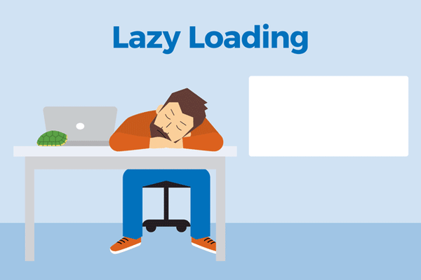
- Lazy-load images. Load images only as needed, such as when the visitor scrolls down far enough. See this excellent example. A downside: this approach sometimes results in flashes of missing content.
- Load progressive images. Load a small (often blurred) preview image first, then a larger, high-resolution image. Medium does that, ditto Facebook.
Now, which way is the “best”? You can probably tell from the quotation marks that there is no best way: you pick the technique that would be the most ideal for the job at hand given the pros and cons, as described below.

Many creative-design sites—especially those with video backgrounds or many large images, such as designer portfolios—preload images. If your site features a big image carousel that spans the entire width and height of the page, preloading makes sense. However, having visitors wait for a preloader to finish doing its job makes for poor user experience.
To eliminate that wait, try Mark Meyer’s recommendation: load images—especially those for sliders and galleries—that most visitors likely want to see with a preloader. Note that such an approach involves a healthy mix of parallel and sequential downloads along with heavy JavaScript, which works suboptimally on slow connections and devices.
For certain assets, consider loading them with the web standard <link rel=“preload”> instead of JavaScript. Since that standard is currently only supported by Chrome, Opera, and the Android browser, best use it for internal projects only.
Bottom line: if preloading images is your best choice, such as in the case of a client request, do it with a preloader. Opt for carousels with a progress bar instead of those that show gradually loading images.
For large volumes of images, such as in the case of image galleries, newspaper sites, blogs, and e-commerce, lazy-loading them is byte economical. However, lazy loading currently requires a lot more JavaScript than other approaches, leading to more complexity, more development time, and a higher potential for error scenarios. Most concerning, if not all the JavaScript is downloaded in the case of a slow connection or if not all the JavaScript is executed, your images might not show up at all. In that case, depending on the implementation, no images are displayed below or above the fold.
Lazy loading is ideal for well-known and well-understood demographics, who are mostly on mid- to high-end smartphones on fast networks, or laptop or desktop devices on broadband. If your audience is on slower connections, to avoid the dependency on JavaScript, do not lazy-load your images.
Consider this workaround with a non-JavaScript fallback, suggested by Robin Osborne.
Another option to check out is the library lazysizes, which lazy-loads images and generates related messages on the fly.
Two more tips:
- Ensure that essential images are as small as feasible and load them as normally as possible.
- Lazy loading usually works well for nonessential images in blog posts and photography portfolios. However, lazy-loading product shots on e-commerce sites might backfire because potential buyers might not be able to locate your product, especially if they’re on a mobile device with a slow connection.

Progressive images, aka image previews or low-quality image placeholders, are gaining popularity, notably on sites like Medium and Facebook, where images are at least as important as the text and a must-display.
Progressive images scratch a different itch altogether: perceived performance. As mentioned earlier, websites shouldn’t just be fast, they must feel fast. In this era of the microsecond-long attention span, you must keep visitors around long enough for your images to load in the first place. On sites in which images are the bulk of the content, that means letting visitors know that images are coming up momentarily.
A common way of doing that is by showing a much smaller, blurry version of the image, which fades into place once the high-resolution version loads. In the meantime, visitors who are reading the text of, say, a Medium post, might be none the wiser. Given the saying that the first impression is the last impression, progressive images can help you optimize that perception.
Note two other benefits offered by progressive images:
- Handling of progressive Images can occur in the back end of websites or apps, requiring minimal JavaScript. HTML and CSS would suffice for generating low-quality image placeholders. Here’s an example.
- Previews of progressive images are always displayed in the same size as their originals, which means that the page layout loads everything in the right dimensions, simplifying things dramatically.
Again, you load progressive images to let visitors know that images are forthcoming. For e-commerce sites, when a page full of product shots opens, you want visitors to wait around long enough for them to load. For social networks, you want the audience to see their newsfeed actively loading; if parts of it look empty, they might become frustrated and leave.
Still worried about the bytes? Complement this technique with responsive images on Cloudinary. All you have to do is load the image preview and then add an image tag with the srcset attribute. Even though such a step requires generating different sizes for every image, it’s an automated, seamless, and efficient process on Cloudinary.
Lazy-loading images is the best choice if bandwidth is your only concern. For tips on implementing that procedure, see this article. Also, keep in mind that progressive images might make a better first impression. In addition, I recommend the following:
- Lazy-load nonessential images as long as you have a fallback, in particular if your audience is on a fast connection.
- Progressively load images for sites in which images are all-important, e.g., product shots, social newsfeeds, articles whose context rests on the related photos, and tutorials.
- Preload images only if you have no other choice because doing so risks encountering the potential drawbacks of lazy loading and requires, by default, more bandwidth.
You could preload, say, the first three images in a carousel and lazy load the rest with blurry previews. That’s a complex move, however. On the other hand, by evaluating your approach on a case-by-case basis while taking into account your project’s various elements, you might be happily surprised by what you discover. If you come up with something cool, do tell us in the comments.


