
Sliders and carousels are popular ways to display web content such as testimonials, portfolio media, e-commerce sales, and so on for a variety of reasons, including their ability to moderate space usage on your website and interactively display these types of content, provide a great way to tell a story, do a presentation, and so on.
When using sliders, it is important to ensure that they are user-friendly and responsive on various devices, particularly mobile devices, which are becoming more popular.
We’ll see how to use the react-responsive-carousel module to include a responsive and customizable slider to a react app. We will use this package to create a simple image gallery and add some customizations to it.
Here is a link to the demo CodeSandbox.
Create a React application using the following command:
npx create-react-app carousel-react
Next, let’s add the project dependency:
npm install react-responsive-carousel
Add the following to your src/App.js file:
import { Carousel } from "react-responsive-carousel";
import "react-responsive-carousel/lib/styles/carousel.min.css";
import "./App.css";
const images = [
  "https://res.cloudinary.com/ifeomaimoh/image/upload/v1652345767/demo_image2.jpg",
  "https://res.cloudinary.com/ifeomaimoh/image/upload/v1652366604/demo_image5.jpg",
  "https://res.cloudinary.com/ifeomaimoh/image/upload/v1652345874/demo_image1.jpg",
];
function App() {
  return (
    <div className="box">
      <Carousel useKeyboardArrows={true}>
        {images.map((URL, index) => (
          <div className="slide">
            <img alt="sample_file" src={URL} key={index} />
          </div>
        ))}
      </Carousel>
    </div>
  );
}
export default App;
Code language: JavaScript (javascript)
This component is quite simple. Starting at the top, we import the Carousel component and its accompanying CSS styles, followed by our CSS file.
The order of loading styles is important so that our custom styles can override the former when we want to make some changes later.
Since we are building an image slideshow, we stored URLs to some image files in an array. Next, In the App component, we return some JSX, which renders the Carousel component with one prop (we will discuss more available props in the next section) named useKeyboardArrows, whose value is set to true. Setting it to true allows the user to control the slider using the arrow keys on the keyboard, which improves the user experience. Finally, within the Carousel component, we iterate over the images that make up our slide show and render them to the screen.
We’ll also need some styles to give the application a nice appearance. Copy the styles in this codeSandbox link to your src/App.css file.
Now we can start our application on http://localhost:3000/ using the following command:
npm start
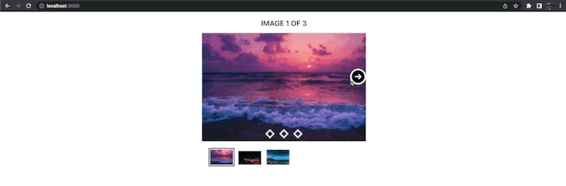
With just this basic setup, you see the image slider rendered on the screen, as seen below.

The Carousel component ships with a lot of properties that allow us to tailor the appearance and feel of the slider to the needs of our application.
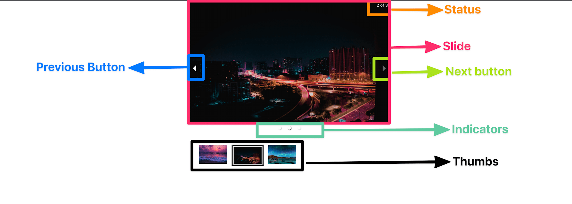
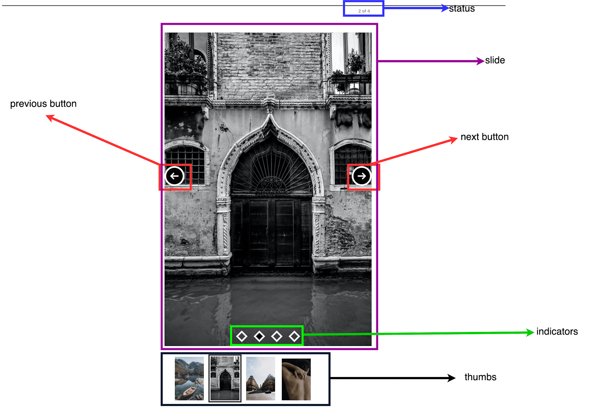
Before we start customizing the slider, let’s look at two diagrams. The first shows the major parts of a typical slider. The second one is a more schematic view of the first, and it includes most of the available customizable properties associated with each part of the slider and their respective data types.
Of course, we will not go through all the available properties; instead, the list below identifies typical customization concerns that one may be interested in:
- Customizing the slider’s control buttons.
- Customizing the indicators.
- Customizing the slider’s status text.
- Customizing the slider’s animation.
For each item above, where appropriate, we would add the required props to the Carousel component to customize it.
We would need some icons to serve as the buttons; Let’s create an SVG file that would house icons for our next and previous buttons. Create this file using the following command:
cd src
touch sprite.svg
Code language: CSS (css)
Add the following to the file:
<svg width="0" height="0" class="hidden">
  <symbol
    clip-rule="evenodd"
    fill-rule="evenodd"
    stroke-linejoin="round"
    stroke-miterlimit="2"
    xmlns="http://www.w3.org/2000/svg"
    viewBox="0 0 24 24"
    id="right"
  >
    <path
      d="m12.007 2c-5.518 0-9.998 4.48-9.998 9.998 0 5.517 4.48 9.997 9.998 9.997s9.998-4.48 9.998-9.997c0-5.518-4.48-9.998-9.998-9.998zm1.523 6.21s1.502 1.505 3.255 3.259c.147.147.22.339.22.531s-.073.383-.22.53c-1.753 1.754-3.254 3.258-3.254 3.258-.145.145-.335.217-.526.217-.192-.001-.384-.074-.531-.221-.292-.293-.294-.766-.003-1.057l1.977-1.977h-6.693c-.414 0-.75-.336-.75-.75s.336-.75.75-.75h6.693l-1.978-1.979c-.29-.289-.287-.762.006-1.054.147-.147.339-.221.53-.222.19 0 .38.071.524.215z"
      fill-rule="nonzero"
    ></path>
  </symbol>
  <symbol xmlns="http://www.w3.org/2000/svg" viewBox="0 0 24 24" id="left">
    <path
      d="m12.012 2c5.518 0 9.997 4.48 9.997 9.998 0 5.517-4.479 9.997-9.997 9.997s-9.998-4.48-9.998-9.997c0-5.518 4.48-9.998 9.998-9.998zm-1.523 6.21s-1.502 1.505-3.255 3.259c-.147.147-.22.339-.22.531s.073.383.22.53c1.753 1.754 3.254 3.258 3.254 3.258.145.145.335.217.526.217.192-.001.384-.074.531-.221.292-.293.294-.766.003-1.057l-1.977-1.977h6.693c.414 0 .75-.336.75-.75s-.336-.75-.75-.75h-6.693l1.978-1.979c.29-.289.287-.762-.006-1.054-.147-.147-.339-.221-.53-.222-.19 0-.38.071-.524.215z"
      fill-rule="nonzero"
    ></path>
  </symbol>
</svg>
Code language: HTML, XML (xml)
Update App.js file to import the sprite.svg file as shown below:
//...
import sprite from "./sprite.svg";
Code language: JavaScript (javascript)
Next, let’s update the App component to include two new props: renderArrowNext and renderArrowPrev.
function App() {
return (
<div className="box">
<Carousel
showIndicators
renderArrowNext={(clickHandler, hasNext) => {
return (
hasNext && (
<button className="nav_btn nav_btn_right" onClick={clickHandler}>
<svg>
<use xlinkHref={sprite + "#right"}></use>
</svg>
</button>
)
);
}}
renderArrowPrev={(clickHandler, hasNext) => {
return (
hasNext && (
<button onClick={clickHandler} className="nav_btn nav_btn_left">
<svg>
<use xlinkHref={sprite + "#left"}></use>
</svg>
</button>
)
);
}}
>
//...
}
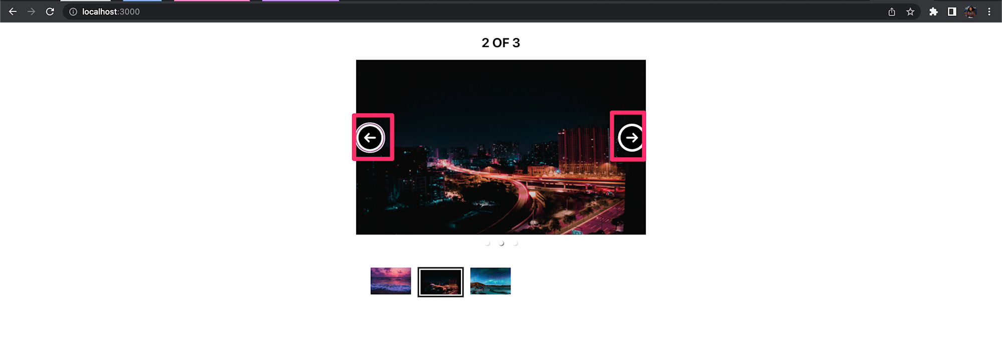
Code language: HTML, XML (xml)Both props receive a function value that accepts three parameters each, but we used two of them here: clickHandler is a callback that will be used to change slides, and the other called hasNext is a boolean that tells us if there is a next slide. Based on these parameters, we simply render a button if there is an available slide. We added some class names for styling and the clickHandler callback function to each button.
If you run your app now, you should see the newly added buttons as shown below:
We would include a prop called renderIndicator to customize our indicators. Let’s update our Carousel component with the following:
    function App() {
      return (
        <div className="box">
          <Carousel
            showIndicators
            renderArrowNext={(clickHandler, hasNext) => {
              //...
            }}
            renderArrowPrev={(clickHandler, hasNext) => {
              //...
            }}
            renderIndicator={(clickHandler, isSelected, index) => {
              return (
                <li
                  onClick={clickHandler}
                  className={`ind ${isSelected ? "active" : ""}`}
                  key={index}
                  role="button"
                />
              );
            }}
          >
          //...
    }
Code language: PHP (php)
The renderIndicator prop accepts a function that will be called a certain number of times based on the number of slides in our slideShow. In our case, it will be called three times since we have three images. The function also accepts three parameters, and it simply returns some basic JSX.
If you run your app now, you should see the indicators as shown below:

The Carousel’s status text helps to give users informative feedback, such as the current point in the slideshow and the available number of slides. To customize the status text, we can use the statusFormatter prop. Let’s update our App.js file with the following to include this prop:
function App() {
return (
<div className="box">
<Carousel
renderArrowNext={(clickHandler, hasNext) => {
//...
}}
renderArrowPrev={(clickHandler, hasNext) => {
//...
}}
renderIndicator={(clickHandler, isSelected, index) => {
//...
}}
statusFormatter={(currentItem, total) => {
return (
<p>
image {currentItem} of {total}
</p>
);
}}
>
//.
}
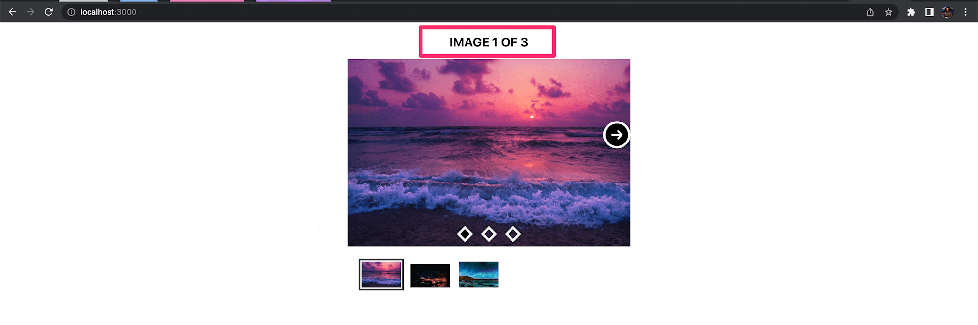
Code language: PHP (php)The statusFormatter prop accepts a function that expects two parameters. The first parameter called currentItem is a number representing the active slide, while the total parameter represents the total number of available slides. Here we simply render a p tag with some text that includes these parameters.
Run your app now, and you should see the changes made to the status text as shown below.
It is also a common requirement to customize how each slide animates in and out of the page. By default, the Carousel component uses a sliding animation and provides us with several props to customize this behavior, such as swipeAnimationHandler, animationHandler, or stopSwipingHandler. Update your App.js file with the following:
    function App() {

      const rotateAnimationHandler = (props, state) => {
        const transitionTime = props.transitionTime + "ms";
        const transitionTimingFunction = "ease-in-out";
        let slideStyle = {
          display: "block",
          minHeight: "100%",
          transitionTimingFunction: transitionTimingFunction,
          msTransitionTimingFunction: transitionTimingFunction,
          MozTransitionTimingFunction: transitionTimingFunction,
          WebkitTransitionTimingFunction: transitionTimingFunction,
          OTransitionTimingFunction: transitionTimingFunction,
          transform: `rotate(0)`,
          position:
            state.previousItem === state.selectedItem ? "relative" : "absolute",
          inset: "0 0 0 0",
          zIndex: state.previousItem === state.selectedItem ? "1" : "-2",
          opacity: state.previousItem === state.selectedItem ? "1" : "0",
          WebkitTransitionDuration: transitionTime,
          MozTransitionDuration: transitionTime,
          OTransitionDuration: transitionTime,
          transitionDuration: transitionTime,
          msTransitionDuration: transitionTime,
        };
        return {
          slideStyle,
          selectedStyle: {
            ...slideStyle,
            opacity: 1,
            position: "relative",
            zIndex: 2,
            filter: `blur(0)`,
          },
          prevStyle: {
            ...slideStyle,
            transformOrigin: " 0 100%",
            transform: `rotate(${
              state.previousItem > state.selectedItem ? "-45deg" : "45deg"
            })`,
            opacity: "0",
            filter: `blur( ${
              state.previousItem === state.selectedItem ? "0px" : "5px"
            })`,
          },
        };
      };

      return (
        <div className="box">
          <Carousel
            renderArrowNext={(clickHandler, hasNext) => {
              //...
            }}
            renderArrowPrev={(clickHandler, hasNext) => {
              //...
            }}
            renderIndicator={(clickHandler, isSelected, index) => {
              //...
            }}
            statusFormatter={(currentItem, total) => {
              //...
            }}
            transitionTime={310}
            animationHandler={rotateAnimationHandler}
            swipeable={false}
          >
          //...
    }
Code language: PHP (php)
In the code above, we included three additional props and set their respective values. We set the transition time for each slide to 310 milliseconds. Next, we defined our animationHandler prop, which expects a string or a function, and we set it to a function called rotateAnimationHandler.
The rotateAnimationHandler function accepts two parameters, both of which are objects. The first one, called props, holds the entire properties the Carousel component accepts. The properties we didn’t use maintain their initial values. The second one, called state, holds information concerned with the state of the slides. For clarity, some of the properties in this object include the following properties:
    {
      cancelClick: boolean,
      hasMount: boolean,
      initialized: boolean,
      isMouseEntered: boolean,
      itemListStyle: object,
      itemSize: number,
      prevStyle: Object,
      previousItem: number,
      selectedItem: number.
      selectedStyle: Object,
      slideStyle:Object,
      swipeMovementStarted: Boolean,
      swiping: Boolean
    }
Code language: JavaScript (javascript)
The essence of the rotateAnimationHandler function is to return an object that contains the three properties in the object above, whose values are set to Object. These properties are objects holding any CSS properties of our choice. The first is called slideStyle, and it contains the default styles each slide should have. prevStyle defines styles that the previously selected slide should have. Finally, the one called selectedStyle holds the styles for the active slide. Our rotateAnimationHandler function just defines styles that rotate each slide in and out of the page.
By customizing the slider animations as we did, swiping the slider will no longer be supported on mobile. To avoid any weird issues, we also disabled swiping using the swappable prop and set it to false.
Once again, refresh your browser to see the running application as shown below.
Find the complete project here on GitHub.
Carousels are still one of the most popular design elements seen on the web. This guide shows us how to embed a responsive and customizable slider in our webPages.


