I’ve been working to create a new image format, which I’m calling FUIF, or Free Universal Image Format. That’s a rather pretentious name, I know. But I couldn’t call it the Free Lossy Image Format (FLIF) because that acronym is not available any more (see below) and FUIF can do lossless, too, so it wouldn’t be accurate either.
This is not the first time I’ve made a new image file format. Some years ago, I created FLIF, the Free Lossless Image Format. For lossless compression, FLIF still performs pretty well against the available alternatives. But, in practice, lossless compression is not usually what you need for image delivery. Photographic images, in particular, benefit from lossy compression, whereas lossless compression wastes precious bits on sensor noise. FLIF was simply not designed for that.

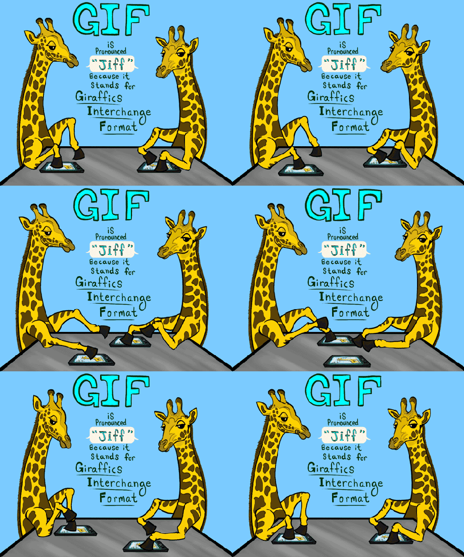
One of the key features of the name FUIF is that it has an ambiguous pronunciation (just like GIF and HEIF). For the record, the correct pronunciation is /fœʏ̯f/, and that’s actually a word in my native language, Dutch. But, personally, I’m calling it /fwɪf/ when speaking English. One could also argue that it should be pronounced /fjuːɪf/ (as in “valuing”) since the U stands for Universal. Furthermore, the sequence “ui” can be pronounced in many ways in English so there are plenty of alternatives to choose from: what about /fuːɪf/ (like “fluid”), /fuf/ (like “fruit”), or /fɪf/ (like “guitar”)?

But, naming and pronunciation aside, there are a lot of image file formats available already. So, if you’re wondering why we need another one, I completely understand and I hope that this post (along with the subsequent posts in this series) will convince you that we do.
There is an increasing variety in end-user viewing devices: from tiny smartwatch screens and a huge spectrum of screen sizes and display resolutions for phones, phablets, and tablets to numerous laptop and desktop computer screens, all the way up to 4K or 8K televisions or projectors. Then you need to consider network conditions, which can range from slow 2G or 3G with poor reception to ultrafast, always-on fiber connections. As a result, it’s no longer acceptable to create websites or apps that assume a given viewport width. Responsive Web Design (RWD) has become the norm.

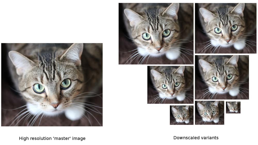
The current approach to flexible images within RWD entails creating a variety of downscaled images from each high-resolution master image and then sending different images to users according to their browsing context. That approach helps reduce unnecessary bandwidth consumption. Imagine sending a 4,000-pixel-wide image to a smartwatch! There are downsides, however. You must create those downscaled variants and store them somewhere. To web developers, RWD is a major challenge and they must make many significant decisions, such as how many variants are needed, what sizes, and what sort of infrastructure to create and manage them with.

Obviously, a service like Cloudinary helps reduce those pains by providing such an infrastructure, creating downscaled variants on the fly and by using techniques like Responsive Breakpoints to help automate most of the tasks involved. However, an image-processing infrastructure can’t resolve some of the inherent problems with a multifile approach. For example, the multiplication of files to be delivered has a negative impact on cache behavior at the CDN level. It can also be hard to avoid the possibility that individual end-users might end up downloading several variants of the same image, such as when their viewport width changes because of a browser window resize or phone rotation.
It’s possible and desirable to have an image format that is responsive by design, meaning that you can use just one single file instead of many downscaled variants. Truncating this single ‘master’ file to various offsets produces downscaled or lower-quality versions of the image, requiring a format that is essentially pyramidal and encoding the image from low resolution to high resolution.
This idea is not new. JPEG already can use progressive scan scripts and you can produce reasonably scaled 1:8, 1:4, and 1:2 previews by truncating a progressive JPEG with a suitable scan script. Hierarchical JPEG and JPEG 2000 took this idea even further. And, while that practice hasn’t seen wide adoption, browsers already render progressive JPEGs progressively so feel free to take advantage of pyramidal image resolution right now.
However, most of the recent image file formats have abandoned the progressive-decoding capability. WebP, BPG, HEIC (HEIF with a HEVC payload), and AVIF all cannot be decoded progressively; truncating a file would just produce the top part of the image. That’s an unfortunate side effect of the fact that those image formats were derived from video codec intraframe bitstreams. Hence, in the context of video, progressive decoding of an individual frame isn’t really useful.
In addition to RWD requirements, there is also increasing attention to the time it takes to load a web page and accord users the perception of a snappy experience. Low-quality image placeholders (LQIP), thumbnail galleries, and progressive rendering are ways to deliver aa preview on the screen before the entire image has been downloaded.
“Progressive decoding” and “responsive by design” are similar, though not quite identical, features:
- Progressive decoding originates from an era when viewing environments were pretty much the same for everyone: low bandwidth and a display resolution of 800×600 (or, later, 1024×768). Everyone is supposed to get the same final image (the entire file) but it’s nice to get a preview while the bytes are slowly arriving.
- By contrast, responsive by design implies that different people get a different final image (depending on the resolution they need). Even though progressive rendering of a responsive-by-design format is always possible, if the network is fast enough (or, for example, if the image is “below the fold”), you might not need to actually do that. Responsive by design implies “progressive,” but it’s slightly more than that. It must get exact downscaled images from truncated files, which means that some mechanism must find out where to truncate and then, at the specific truncation offsets, acceptable trade-offs between compression density and image quality can be achieved.
One of the main motivations for FUIF is to have an image format that is responsive by design, which means it’s no longer necessary to produce many variants of the same image: low-quality placeholders, thumbnails, many downscaled versions for many display resolutions. A single file, truncated at different offsets, can do the same thing.
In the upcoming posts of this series, I will discuss the other design principles behind FUIF, starting by looking at what makes it a universal image format.
The FUIF Code has now been made public.

