
In part 1 of this interview, Jason Grigsby and I discussed how the industry came to understand the responsive image problem. Here, in part 2, we discuss today’s solutions — taking a particularly deep dive into the puzzle of “responsive image breakpoints.”
EP: So, where are we, today, with responsive images? We have a number of new markup features that let us send different image resources to different users, depending on their context. Depending on which feature you use, you can either tell the browser which resource to load, or leave it up to the browser to pick. Each feature has been developed for a different use case, but all of them require you, the developer, to generate many images, whereas before you only had to generate one. And you have to decide — what underlying resources do I actually need? What should their dimensions be? Which is a surprisingly hard problem. You were one of the big, early thinkers about this, and coined the term “responsive image breakpoints.” What are responsive image breakpoints?
In 2012, Jason asked a hard question
JG: The Responsive Images Community Group defined a bunch of use cases, but there are two that I find especially useful:
- Art direction – Which means you want to vary the image somehow based on the size at which it’s going to be presented. The most common example is an image that contains text; if you simply shrink it down, the text becomes unreadable. As a result, you have to make some variations of the image as you go from size to size. The other use case is –
- Resolution switching – With resolution switching, there are no visual differences between the images. This is the most common use case – Yoav Weiss did some early analysis and saw that something like 80 percent of sites were only doing resolution switching. Either to fit both high-density and regular-density displays, or because the size of image on the screen can be bigger or smaller on a flexible layout.
When you’re resolution switching, you run into some challenges; how many images do you want to provide? So let’s say you have an image that runs from, say, 300 pixels wide on small screens, all the way up to a large device, where the image is displayed at 2,000 pixels wide. How do you know whether you need five image sources, or 10? How do you pick how many steps you need between 300 pixels and 2,000 pixels? In the art direction use case, the image itself provides us with hints: when the text becomes unreadable, we know we need to do something. When it comes to resolution switching we don’t know. That’s the real challenge.
For example, if an image is displayed at 400 pixels wide on a device, and we only had 300 and 2,000 pixel versions to choose from, we’d have to provide the 2,000 but shrink it down to 400. That’s a big jump. So maybe we decide to provide an image that is 800 pixels wide, too – that’s better! The browser picks that one instead of the 2,000, and the file size is smaller, the browser has to do less work; that’s a vast improvement. But you know what’s better than that? 600! And what’s better than that? 500, or 450, 410 – and eventually you realize that there’s nothing about this problem that gives you any idea of how many images you need; nothing intrinsic to say you need five images, or 10. If you start going down this path, you realize that the only thing you know is that if you could perfectly resize the image to the exact size that it’s used on the page, that’s the size you would choose – anything else is a compromise.
EP: Yes, but doing that is its own compromise! The markup complexity—
JG: Oh god!
EP: —is unimaginable. And you have to generate all of those resources. Originally, Cloudinary’s responsive image Javascript solution dynamically resized images to fit perfectly – and it was terrible. Suddenly we’re generating hundreds of resolutions of each image, and every time somebody resizes their window they’re downloading a whole new version. So what we ended up doing – what everyone ended up doing – was, we pegged the jumps to some arbitrary step size, like 100 pixels. And you came along, and said, hey, we can be smarter about this.
JG: So, one of the things that stood out to me, from the early conversations on the WhatWG mailing list – Scott Jehl [of Filament Group] said that when they picked image breakpoints, they picked them for different reasons than layout breakpoints. They picked them based on sensible jumps in file size. But that definition – “sensible jumps in file size” – is arbitrary. We asked, “what if it wasn’t arbitrary?” What if we were OK with downloading excess image data and resizing the image down, as long as the excess image data didn’t exceed 10K or 20K per image – whatever we decide our budget is.
This is very much the idea of “performance budgets” that Steve Souders and Tim Kadlec have talked about. In their case, for each feature that you add to a web page, you define the budget for it. If you do that – if you have an image, and you say you don’t want the jumps to be any larger than 20k, then you get into some interesting territory. You have something that is a hard rule. And then one image – if it has a ton of visual diversity in it – may take 10 images to cover the range, while another image may only take three. Or with a PNG, it could be one image that covers the entire range.
So that was my idea and I wrote about it as a thought experiment. My co-founder John Keith wrote a very simple algorithm to do this. He’s far more technical than I am, but neither of us are really image experts. Our test example was “let’s have these two ranges and resize the image and guess….and if it’s too large, we’ll guess again, and guess again, and guess again.”It wasn’t the most efficient way to go about this, but it allowed us to generate 10 examples for my article.
My hope in writing that post was that someone smarter than me would see it and say, “this is a good idea!,” and figure out how to do it. So I was really pleased last year when Cloudinary reached out and said “you know that crazy idea you had – we’ve built it.” I thought “You did what?! Are you crazy?” And apparently you are.
So those are the academic and theoretical origins of Cloudinary’s Responsive Images Breakpoint Generator, which is a free tool; part of the platform now. It’s so neat that someone smarter than me took the idea and made something with it.
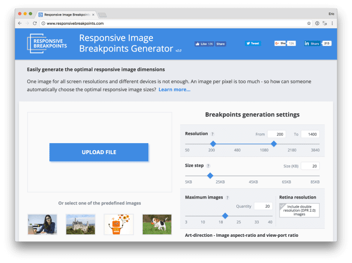
Cloudinary’s Responsive Image Breakpoints Generator
EP: That tool — its public face is very manual. You upload a high-resolution image, and download a zip full of down-sized versions. But what’s really exciting for me is watching that breakpoints logic be automated, either through our APIs, or in SDKs, or in new features, like the Client Hints support we just launched. Which brings me to my next point, automation. I pulled a quote from one of your blog posts: “most of what we deal with when it comes to responsive images is not something that designers and developers should be thinking about on a regular basis. The goal for most organizations should be to centralize image resizing and processing and automate as much of their responsive images as possible.” Why is automation so important?
JG: Oh, I mean, who wants to do it? I’m very glad we have these new standards – both srcset, and the escape hatch of being able to do art direction with the picture element.
But, in reality, images have become so complex – they’re at the point where video was a few years ago. I used to have software that I’d use to manually convert video into different formats and codecs; now we use a service. If it’s a small enough project, we use YouTube or Vimeo. If it’s a bigger project, we may go to private label service, like Brightcove or Zencoder. We don’t think “now I’m going to become an expert in how to encode video” because we recognize that with all the different ways we need to handle video – all the different codecs – it doesn’t make sense to do it manually.
The same is true of images. Adam Bradley said “‘Save for web…’ should die;” and he’s right. In an ideal world, content authors don’t have to think about images. They should just upload the highest-resolution, highest-quality image they have access too, and not have to worry about resizing and compressing it for delivery. Storage is cheap. Maybe you don’t even need that much resolution – right now – but who knows what screens are going to look like or what layout is going to look like in the future. But now you have it stored and all of the resizing happens automatically. That’s the ideal world.
What’s happening now is that people upload images that are far too large and they’re not getting resized at all. I could go to any local small business site and see this going on. And images aren’t in the right format – sometimes it’s as simple as line art that’s being saved as a JPEG when it should be a PNG. Sometimes it’s more complicated – they should be providing WebP alternatives, other alternatives. Trying to do all of that manually is tough.
Automation in this space makes sense; so does having a way to manually opt-out as needed. But I’ve spent a ton of time working with responsive images – even working on the specification – and I have no interest in writing markup out by hand.
EP: Are there any specific projects you can discuss where you’ve leveraged automation?
JG: We worked on a project for a major hotel chain; they had 400,000 images that had been hand-cut and resized over the years, and they were moving to a responsive design. So, if they had three responsive image breakpoints, they would have 1.2 million images. If they also supported 2x images, that would be 2.4 million images.
They were fortunate that they had all of the source files, but they were in a media management system that was disconnected from the content management system. So the process of moving to responsive design was complicated by the fact that they had to do a lot of work on those images before they could transition. We spent a lot of time auditing their responsive image useage and deciding which images needed resolution switching and which didn’t. We had to determine when we could automate, and when we needed to have people manually transform things.
This was before there was a responsive images standard, before srcset, sizes, and picture. And so the client was able to work with their CDN provider to automate image resizing, but not any of the markup, or breakpoints – stuff that we can automate now as services have taken things much further, but couldn’t back then. But at least they moved to a system where there was a connection between the content and the images, and they moved from manually resizing things to doing it automatically.
At some point, they’ll probably want to retool that, if they haven’t already, and move away from an old version of Picturefill, to the actual standards. When they do, they’re going to be in much, much better shape because they’ve centralized image processing and automated those pieces.
Thus concludes part 2 of my interview with Jason Grigsby. Next week, in part 3, I’ll ask Jason to predict the future of images on the web.