
The number of different devices available and their potential screen resolutions keep increasing, and to support this wide range of resolutions and devices, responsive website design is now the standard. A website’s markup must adapt itself to look perfect on all the different devices and in various resolutions, pixel densities and mobile device orientations. Managing, transforming and delivering images, is one of the main challenges of breakpoints for responsive design that web developers face.
Implementing a breakpoints for responsive design means building your website where the same images may be displayed in various dimensions. One image for all screen resolutions and different devices is not enough. Cloudinary is already helping developers create responsive images for websites, by uploading one image and dynamically resizing it to match different screen sizes. But clearly an image per pixel is too much – how can you automatically choose the optimal responsive image sizes?
Whether you are using a Javascript based responsive library, the srcset image attribute, the <picture> HTML5 element, the modern Client-Hints or other responsive image solutions, they still lack a response to the common need of deciding which image resolutions to select and how many different image versions to include in your responsive website. These are called responsive breakpoints or responsive image breakpoints.
 Cloudinary now offers a solution for intelligently finding the optimal responsive image dimensions for each specific image. The responsive breakpoints generation can be done programmatically using a cloud-based API or interactively using a new free open source web tool – the Responsive Breakpoints Generator.
While Cloudinary is a commercial service (with a free plan), the Responsive Breakpoints generator is completely free, open sourced and hosted on GitHub. We built it for the benefit of the community – recognizing that responsive breakpoints are a pain point for almost every developer trying to adapt their site to multiple screen sizes.
It’s a challenge to find the best breakpoints for your images, and to avoid making the mistake of not selecting enough images or selecting too many images, you’ll need to understand the tradeoff between the number of different images, the visual quality and the bandwidth involved.
When a small dimensional reduction significantly reduces the file size of the image, you should definitely create another scaled down image version. On the other hand, if scaling down images by a certain amount doesn’t significantly save enough bandwidth, you can deliver bigger images to your users and let the browser handle the resizing.
The challenge of scaling down images is further complicated by the fact that the file size reduction varies for different images. It depends not only on the specific content of the images, but also on the variable sensitivity the image has to the compression algorithms of JPEG, PNG, WebP and other image formats. For some images, a small scale down saves significant file size, while for other images even a more prominent scale down will not significantly affect the file size.
Therefore, you will want to define the file size step where it is worth creating another scaled down image version. Jason Grigsby of Cloud Four called this file size step performance budget in his article about image breakpoints. Cloudinary’s analysis verified that different images require a different number of versions in order to balance the bandwidth reduction trade-off according to your performance budget.
Consider the following 2400×1600 JPEG image:

Assume you need to display this image in your responsive website in various width dimensions between 200 and 1000 pixels, and you define the minimum file size step (performance budget) to be about 20KB. As the table below shows, you only need to create and deliver five different versions of this image to fit all the different devices and browsers.
| No. | Width | Height | File size | Image |
|---|---|---|---|---|
| 1 | 200 | 133 | 6.9 KB | View image |
| 2 | 477 | 318 | 27.2 KB | View image |
| 3 | 681 | 454 | 48.0 KB | View image |
| 4 | 847 | 565 | 67.6 KB | View image |
| 5 | 1000 | 667 | 86.9 KB | View image |
Now let’s take another JPEG photo:

Trying to find the best breakpoints for this image using the same settings of 200 to 1000 pixels wide and a minimum file size step of about 20KB, results in this image needing nine different versions as the table below shows.
| No. | Width | Height | File size | Image |
|---|---|---|---|---|
| 1 | 200 | 133 | 8.7 KB | View image |
| 2 | 380 | 253 | 27.8 KB | View image |
| 3 | 514 | 343 | 48.5 KB | View image |
| 4 | 619 | 413 | 68.3 KB | View image |
| 5 | 711 | 474 | 87.7 KB | View image |
| 6 | 804 | 536 | 108.5 KB | View image |
| 7 | 883 | 589 | 129.3 KB | View image |
| 8 | 957 | 638 | 148.2 KB | View image |
| 9 | 1000 | 667 | 160.7 KB | View image |
As shown above, the number of versions required for one image is almost half of the number required for another one. The difference might be even more dramatic for other types of photos. If you multiply this X2 difference by millions of user uploaded images, the result is a huge saving in storage, image processing costs and image management complexity, while still delivering the best looking images and preserving the user experience.
In order to perfectly balance the number of image versions for your responsive website, you need to find the correct breakpoints according to the file size step that you define. How can you do that? You can generate images for all possible width values and only select the ones that reflect a significant enough file size reduction. However this is inefficient and can be expensive.
Analyzing the behavior of the compression mechanisms for various image formats (mainly JPEG, PNG and WebP) resulted in the creation of algorithms to efficiently and intelligently find image breakpoints that match the dimensions and file size saving requirements.
Based on these algorithms we have created a new free public web tool called the Responsive Image Breakpoints Generator.
The Responsive Breakpoints Generator enables you to interactively upload your images and define settings to find the matching image dimensions that fit in your graphic design requirements. As you can see in the screenshot below, you can define the required image width range, the file size step in kilobytes, and a cutoff for the maximum number of images you allow. In addition, you can request that the results include double resolution images for DPR 2.0 displays (e.g., Retina Display).
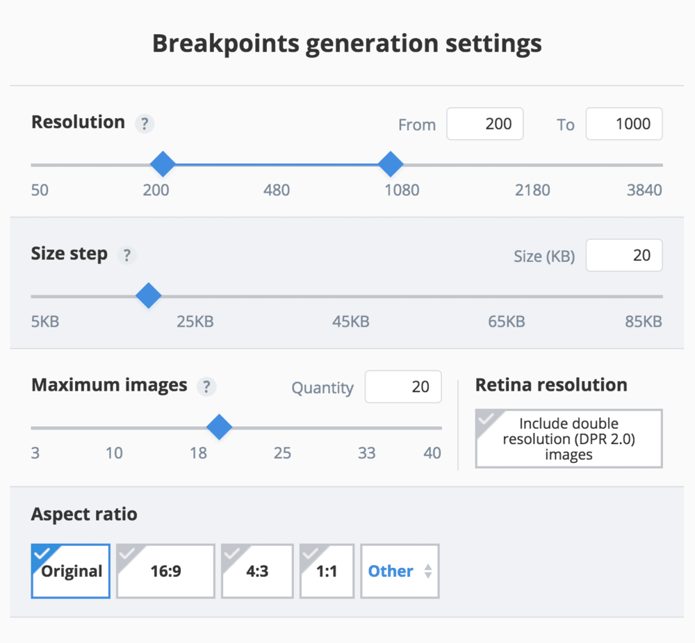
When you upload an image, the breakpoints are generated according to your settings and are calculated automatically in the cloud. The generated breakpoints are then displayed in a summary table and visually illustrated on your uploaded image. You can also download a zip file containing all the scaled down and optimized images that match the generated breakpoints.
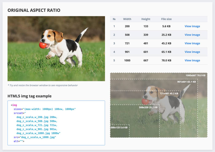
The generator tool also creates an HTML5 image tag that you can copy-paste into your code. The srcset attribute of the img tag is set to list the image versions and width values according to the intelligently selected breakpoints. Modern browsers that process the img tag will then know how to select the correct image version according to the available space of the image in your responsive web layout.
<img sizes="(max-width: 1000px) 100vw, 1000px"
     srcset="dog_c_scale,w_200.jpg 200w,
             dog_c_scale,w_508.jpg 508w,
             dog_c_scale,w_721.jpg 721w,
             dog_c_scale,w_901.jpg 901w,
             dog_c_scale,w_1000.jpg 1000w"
     src="dog_c_scale,w_1000.jpg"
     alt="A nice dog">
Code language: HTML, XML (xml)
In addition, responsive layouts also involve art direction. The original images may need to be cropped to match a different aspect ratio required by the graphic design, for a mobile device for example. The breakpoints generator tool enables you to select multiple aspect ratios and breakpoints will be generated for each aspect ratio separately, while the original image is cropped to match the required aspect ratio. The downloadable zip file will also contain all the images of all the aspect ratios.
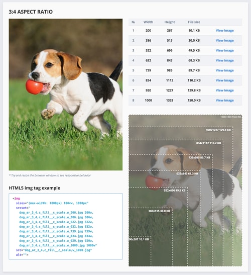
In addition, the generator tool shows an HTML5 ‘picture’ element code sample that combines the different aspect ratios and their breakpoints into a single responsive HTML solution. Below is a sample ‘picture’ tag which modern browsers, such as Chrome and Firefox already support, while Microsoft’s Edge and Apple’s Safari have just recently added support to their new official or beta versions. If you want to support older browsers as well, you can use the Picturefill polyfill Javascript library.
<picture>
  <source  media="(max-width: 480px)"
           sizes="(max-width: 1000px) 100vw, 1000px"
           srcset="dog_ar_3_4,c_fill__c_scale,w_200.jpg 200w,
                   dog_ar_3_4,c_fill__c_scale,w_386.jpg 386w,
                   dog_ar_3_4,c_fill__c_scale,w_522.jpg 522w,
                   dog_ar_3_4,c_fill__c_scale,w_632.jpg 632w,
                   dog_ar_3_4,c_fill__c_scale,w_739.jpg 739w,
                   dog_ar_3_4,c_fill__c_scale,w_834.jpg 834w,
                   dog_ar_3_4,c_fill__c_scale,w_920.jpg 920w,
                   dog_ar_3_4,c_fill__c_scale,w_1000.jpg 1000w">
  <source  media="(max-width: 768px)"
           sizes="(max-width: 1000px) 100vw, 1000px"
           srcset="dog_ar_16_9,c_fill__c_scale,w_200.jpg 200w,
                   dog_ar_16_9,c_fill__c_scale,w_525.jpg 525w,
                   dog_ar_16_9,c_fill__c_scale,w_746.jpg 746w,
                   dog_ar_16_9,c_fill__c_scale,w_934.jpg 934w,
                   dog_ar_16_9,c_fill__c_scale,w_1000.jpg 1000w">
  <img sizes="(max-width: 1000px) 100vw, 1000px"
       srcset="dog_c_scale,w_200.jpg 200w,
               dog_c_scale,w_508.jpg 508w,
               dog_c_scale,w_721.jpg 721w,
               dog_c_scale,w_901.jpg 901w,
               dog_c_scale,w_1000.jpg 1000w"
       src="dog_c_scale,w_1000.jpg"
       alt="A nice dog">
</picture>
Code language: HTML, XML (xml)
The Responsive Breakpoints Generator is a free web tool. It is open source under the MIT license and is hosted on GitHub, while the actual breakpoints generation algorithms and the image resizing and cropping transformations run in the cloud.
The breakpoints generator web tool introduced above allows you to interactively process your images, which is useful if you have a reasonable amount of statically uploaded images. However, what if your web application includes user-generated content from dynamically uploaded images?
In order to generate breakpoints for user uploaded images, you need to programmatically generate them from your code. For each uploaded image, you need to call an API method to generate the breakpoints, store or cache them on your side, and then build your HTML5 or CSS responsive web code according to these breakpoints.
Cloudinary’s API allows you to programmatically request the breakpoints for newly uploaded images or for existing ones. You can specify settings such as the width range, the file size step, and the maximum number of images, and request one or more image transformations to apply on the original image. Such transformations can include aspect-ratio based cropping, face detection based cropping and applying various image effects, filters and optimizations.
You can call the cloud-based API from your development framework code using our open-source SDKs for Ruby on Rails, Node.js, PHP, Python, Java, .Net and other frameworks. For example, the following code generates the breakpoints and the matching images for an uploaded image:
Below you can see a sample of the resulting JSON response:
    {
      "public_id": "dog",
      "width": 3000,
      "height": 2000,
      "format": "jpg",
      "bytes": 537666,
      "url":
       "https://res.cloudinary.com/demo/image/upload/v1453637947/dog.jpg",
      "secure_url":
       "https://res.cloudinary.com/demo/image/upload/v1453637947/dog.jpg",
      ...
      "responsive_breakpoints": [
        {
          "breakpoints": [
            {
              "width": 1000,
              "height": 667,
              "bytes": 79821,
              "url": "https://res.cloudinary.com/demo/image/upload/c_scale,w_1000/v1453637947/dog.jpg",
              "secure_url": "https://res.cloudinary.com/demo/image/upload/c_scale,w_1000/v1453637947/dog.jpg"
            },
            {
              "width": 891,
              "height": 594,
              "bytes": 65666,
              "url": "https://res.cloudinary.com/demo/image/upload/c_scale,w_891/v1453637947/dog.jpg",
              "secure_url": "https://res.cloudinary.com/demo/image/upload/c_scale,w_891/v1453637947/dog.jpg"
            },
            {
              "width": 712,
              "height": 475,
              "bytes": 45007,
              "url": "https://res.cloudinary.com/demo/image/upload/c_scale,w_712/v1453637947/dog.jpg",
              "secure_url": "https://res.cloudinary.com/demo/image/upload/c_scale,w_712/v1453637947/dog.jpg"
            },
            {
              "width": 503,
              "height": 335,
              "bytes": 25216,
              "url": "https://res.cloudinary.com/demo/image/upload/c_scale,w_503/v1453637947/dog.jpg",
              "secure_url": "https://res.cloudinary.com/demo/image/upload/c_scale,w_503/v1453637947/dog.jpg"
            },
            {
              "width": 200,
              "height": 133,
              "bytes": 5712,
              "url": "https://res.cloudinary.com/demo/image/upload/c_scale,w_200/v1453637947/dog.jpg",
              "secure_url": "https://res.cloudinary.com/demo/image/upload/c_scale,w_200/v1453637947/dog.jpg"
            }
          ]
        }
      ]
    }
Code language: JavaScript (javascript)
You can tell Cloudinary to generate breakpoints for multiple transformed versions of the original image in the same API call. The Node.js code sample below used the explicit API method to generate breakpoints for an already uploaded image. Breakpoints are requested for a 16:9 face-detection based cropped version of the original image and a 4:3 sharpened image version. The create_derived flag is enabled so that the derived images don’t need to be regenerated when first accessed by your users.
cloudinary.v2.uploader.explicit("dog", {
  responsive_breakpoints: [
    {
     create_derived: true,
     bytes_step: 20000,
     min_width: 200,
     max_width: 1000,
     max_images: 20,
     transformation: { crop: 'fill', aspect_ratio: '16:9', gravity: 'face' },
    },
    {
     create_derived: true,
     bytes_step: 30000,
     min_width: 350,
     max_width: 2000,
     max_images: 18,
     transformation: { crop: 'fill', width: '4:3', effect: 'sharpen' },
    }
  ] }, function(error, result) { console.log(result); });
Code language: JavaScript (javascript)Responsive design, and more specifically responsive images, are the ‘trending topics’ of the web and mobile development world. The lives of web developers aren’t getting any simpler as the number of different devices and potential screen resolutions increase.
Whichever responsive design solution or framework you choose, you still need to generate and deliver multiple versions of each image on your website. The challenge of finding the best fitting resolutions and the responsive breakpoints for each specific image, is common to all approaches and frameworks. It seems that even popular websites can still improve in the selection of the correct image dimensions.
The solution introduced in this post allows web developers to optimize the balance between bandwidth saving and high resolution image delivery for their responsive web sites. Responsive image dimensions are intelligently selected for each specific image and you can use Cloudinary’s API to automatically generate breakpoints while uploading new images or for your previously uploaded images. If you don’t have a Cloudinary account yet, you can setup one for free.
For the benefits of all web developers, we launched ResponsiveBreakpoints.com. This is a powerful free web tool. It is open sourced and hosted on GitHub. Try it out 🙂