
Five years ago, Ethan Marcotte [coined the term “responsive web design”][rwd] and gave it three defining ingredients: fluid grids, flexible media, and media queries.
An essential part of this flexible media is the use of the srcset img attribute in HTML, which plays a crucial role in creating responsive images. The srcset attribute, used within the <img> or <source> tags, allows authors to define various image resources along with “hints” that help the browser determine the most appropriate image source to display based on the resolution and screen size.
For instance, using srcset with descriptors like “2x” and “1x”, as in <source srcset="square-large.jpg 2x, square-small.jpg 1x" />, informs the browser about which image to use for different pixel densities. This setup is particularly beneficial for high-resolution screens, where a “2x” image can provide a crisper and more detailed display.
This attribute has simplified responsive image sizing, allowing for a more intuitive and efficient process of specifying different image versions for varying display scenarios.
That second ingredient, “flexible media” turned out to be a bit of a bugbear.
This is part of a series of articles about Responsive Images.
You see, most of the media on the web is bitmap images. Heck, measured by bytes, [most of the web is bitmap images][http-archive]. And bitmap images are fixed. They have a fixed height and a fixed width, and while it’s possible to make them visually grow and shrink using width and max-width CSS declarations, forcing users on small, low-resolution displays to load enormous images which have been sized to look good on high-resolution displays is a performance disaster. Every time we send a user more pixels than their device can use, we’re asking them to load data which they’ll end up throwing away. We’re sending them waste.
How much waste? Tim Kadlec has estimated that — for users on low-res mobile devices — 72% of image bytes served up by responsive pages are wasted. Responsive pages are sending small-screened users nearly four times as much data as they need.
New markup is here to save the day. We can’t include a single image resource that’ll work for everybody, but by using new responsive image features, we can stuff multiple resources into a single <img> and mark them up in such a way that browsers will load the most appropriate resource out of the set. We can mark up image elements which have the ability to adapt.
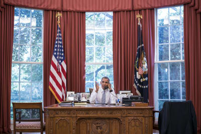
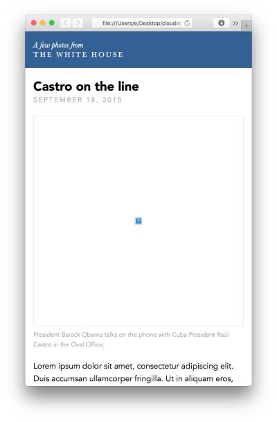
Let’s dive in with an example: a news-y article page with a single, large-ish image up top:
https://ericportis.com/etc/cloudinary/castro-on-the-line/
How can we make this image responsive? The first tool in our belt is an <img> attribute named srcset. srcset allows us to stuff multiple resources into a single <img>, via a comma separated list:
    srcset="large.jpg 1024w, medium.jpg 512w, small.jpg 256w"
Code language: JavaScript (javascript)
We label each resource with a “width descriptor” — those numbers with 'w's after them, above. These let the browser know how wide each resource is. If a resource is 1024 pixels wide, stick a 1024w after it in srcset.
Browsers will load the resource that best matches the current context. So, if the image is 512px wide on the layout, users on standard screens will probably get medium.jpg, and users on HiDPI display will probably get large.jpg.
Why “probably?” Ultimately, browsers decide which users get which resources. And we, as authors, can’t necessarily predict which sorts of users will get what. This is a good thing! Browsers know a lot more about their context than we do. They have a wealth of information about each user’s device, connection, and preferences and the pick-as-you-please philosophy of srcset lets them leverage it.
So, let’s add a srcset attribute to an <img>:
    <img srcset="small.jpg 256w,
                 medium.jpg 512w,
                 large.jpg 1024w"
         src="medium.jpg"
         alt="It’s responsive!" />
Code language: HTML, XML (xml)
Unfortunately, that won’t quite cut it. When browsers encounter our srcset, they’re missing a crucial piece of information: the <img>‘s layout width. In order to know an image’s display dimensions, browsers have to load and parse all of its page’s CSS – something which usually happens long after srcset-parsing. To cope, we need to give the browser an estimate of the layout width of the image right in our markup, using a new attribute: sizes.
sizes takes CSS lengths. If our <img> had a fixed width, we could simply stick that width in a sizes and call it a day. For instance – if it was always 640px across on the layout, our sizes would look like this:
    sizes="640px"
Code language: JavaScript (javascript)
Our example image is a little more complicated. Below its max width of 30em, it occupies the full width of the viewport: 100vw. Above that max-width, it will always be 30em wide (learn about ‘em’ and ‘vw’ CSS units)
So our image has two possible sizes. Luckily, just like srcset, sizes lets us supply multiple values in a comma-separated list. And it lets us tell the browser which lengths to use, when, using media queries. So to give the browser a complete picture of our <img>’s dynamic layout width, we can mark it up with the following:
    sizes="(min-width: 30em) 30em, 100vw"
Code language: JavaScript (javascript)
That says, if the viewport is at least 30em wide, this image will be 30em wide[1]. Otherwise, the image will be 100vw wide.
Putting all of the pieces together, we arrive at the following markup:
    <img srcset="small.jpg 256w,
                 medium.jpg 512w,
                 large.jpg 1024w"
         sizes="(max-width: 30em) 30em, 100vw"
         src="medium.jpg"
         alt="It’s responsive!" />
Code language: HTML, XML (xml)
This gives us a fluid, adaptable image, which will look crisp on large, hi-res displays and minimize the number of wasted image bytes sent to users on low-res devices[2].
But! Now we, as authors, have a new problem: creating and managing three resources instead of just one.
Rendering small, medium, and large versions for our single-image example is a minor inconvenience. But when multiplied by a whole page’s worth of images, this extra work becomes a real burden. Asking poor, mistake-prone humans to render multiple versions of images at specific sizes very carefully and entirely by hand is both cruel and foolish. We need to automate.
Using Cloudinary, we can upload a single, canonical, high-resolution image to the cloud and deliver it in as many different sizes as we want via URL parameters (or Cloudinary’s various SDKs). Controlling our images’ technical characteristics via text and code has enormous benefits:
- Image characteristics are easy to author, see, and alter, right from the markup
- We can encode these characteristics directly in markup templates
- We can track changes to these characteristics using version control
Using Cloudinary, adding a new image size (or changing an old one) on a site with thousands of images is as easy as changing a few lines in a template file. And content authors only have to worry about creating and uploading the highest-resolution image that they have; the nitty-gritty details of how that image will be variously compressed, sized, and served to users are handled automatically.
So let’s re-visit our example. And this time let’s not simply assume that we have multiple down-sized versions of our image readily at hand — let’s generate those resources with Cloudinary.
After creating a free Cloudinary account I uploaded the full-res (1.2MB!) version of the example image to my Media Library and gave it an easy-to-remember name: on_the_phone. Once uploaded, I can access it using the following URL.

Let’s break this URL down:
-
res.cloudinary.com/: the base Cloudinary URL -
eeeps: my Cloudinary cloud name -
image/upload/: the path to images uploaded to my media library -
on-the-phonethe name of the image we’d like to access -
.jpg: the desired format. We could just as easily request a.pngor.gifhere; even though the original, uploaded image is a JPEG, Cloudinary will do the conversion on the fly.
All of the resizing action is going to happen between the upload/ and the image name. This is where [image transformations][transforms] go — the bits that are going to let us control exactly how our image is compressed, shaped, and sized for delivery[3].
The first thing that we’re going to want to do to this image is scale it down. To do that, we’ll use Cloudinary’s [width parameter][w]. Stick a w_ and a number into our URL, and Cloudinary will give us our image scaled to that many pixels across.

This scaled-down, 512-pixel-wide image weighs in at 86KB. How could we slim it down even further?
Cloudinary’s default compression settings are fairly conservative, resulting in heavy images of high quality. We can choose our own tradeoff – sacrificing a little quality for lighter images – using the [quality parameter][q]. The quality parameter takes a number between 0 and 100; after a little trial and error, I settled on 70.

This results in an image that’s 46KB — half the size of the unq_‘d version! What else could we do to cut weight? What if tried a different format entirely, like Google’s relatively-new [WebP][webp] format?
WebP resized image of 70% quality
That cuts the size of the image by more than a third again, bringing it down to 36KB. But Here’s what that WebP looks like in anything but Chrome:
That clearly won’t do. How can we send new, advanced image formats to browsers that support them, without showing broken image icons to browsers that don’t?
There’s a whole new markup pattern that’s been spec’d specifically to address this problem, but using Cloudinary, we don’t need it. Just stick an f_auto parameter into an image URL, and Cloudinary will perform some server-side [content-negotiation][conneg] magic to ensure that every browser gets the latest and greatest format that it supports:

When accessing this URL, Chrome will get a WebP, Edge and IE 9+ will get a [JPEG-XR][jpeg-xr], and everybody else will get a JPEG.
Okay – now that we know how to use Cloudinary’s image transformations to generate resized (and optimized) versions of our original, let’s stick some Cloudinary URLs into our responsive image markup:
    <img
    	sizes="(min-width: 30em) 28em, 100vw"
    	srcset="https://res.cloudinary.com/eeeps/image/upload/f_auto,q_70,w_256/on_the_phone.jpg 256w,
    	        https://res.cloudinary.com/eeeps/image/upload/f_auto,q_70,w_512/on_the_phone.jpg 512w,
    	        https://res.cloudinary.com/eeeps/image/upload/f_auto,q_70,w_768/on_the_phone.jpg 768w,
    	        https://res.cloudinary.com/eeeps/image/upload/f_auto,q_70,w_1024/on_the_phone.jpg 1024w,
    	        https://res.cloudinary.com/eeeps/image/upload/f_auto,q_70,w_1280/on_the_phone.jpg 1280w"
    	src="https://res.cloudinary.com/eeeps/image/upload/f_auto,q_70,w_512/on_the_phone.jpg"
    	alt />
Code language: HTML, XML (xml)
That’s the fully-responsive <img> as it appears on our [example page][castro-on-the-line].

This <img> will adapt right along with our responsive layout, serving a well-optimized version of our resource to users with differing viewport sizes, device resolutions, and browser-format-support capabilities.
Even better, with this markup, we bring the number of image resources that we have to worry about creating and managing back down to one: the high-res original we upload to Cloudinary. And if we ever want to tweak how we’re actually delivering that image to users, it’s as simple as changing a few characters in our HTML.
Responsive images are here, and cloud-based image hosting makes them easy.
Thus concludes part one of a two-part series. Next time, I’ll show you how to pair <picture> with Cloudinary’s cropping transforms to add another dimension of adaptability to our images: [art direction][art-direction]. Stay tuned!
[1]: Particularly sharp readers may notice a slight problem with this: em are relative, and 30em in one context might not equal 30em in another. Within the context of sizes, an em is always equal to the default font size (usually 16px). But within the context of a CSS declaration, the size of an em is dependent on the font-size of the selected element. And indeed, our page’s [viewport-sized typography][vw-type] means that the two 30ems will almost never be precisely the same. But you know what? They’re close enough! A precise sizes value would make our markup harder to read, understand, and maintain – and would only effect which source was chosen in a tiny number of cases. In horseshoes, hand grenades, and sizes: close counts.
[2]: How do browsers actually use srcset and sizes to pick a source? They divide the resource widths (the ws), by the current layout width (figured out via sizes) to calculate each resource’s “image density”. So, let’s say our sizes evaluates to a layout width of 512px, and we’re working with a srcset="small.jpg 256w, medium.jpg 512w, large.jpg 1024w". The image densities would work out to:
small.jpg: 256w resource width ÷ 512px layout width = 0.5x image density
medium.jpg: 512w resource width ÷ 512px layout width = 1x image density
large.jpg: 1024w resource width ÷ 512px layout width = 2x image density
Browsers make their decision based on these image densities. So users on 1x devices will probably get medium.jpg, users on Hi-DPI displays will most likely load large.jpg, and perhaps users on slow connections, or who’ve set some sort of preference stating that they suffer from poor eyesight will get small.jpg. But again, there’s no way for us, as authors, to know for certain which sorts of users will get what. In the browser we trust.
[3]: Cloudinary’s SDK frameworks give you language-specific tools to build these URLs indirectly. Check out the tabs in the examples to see how achieve each transformation using your framework of choice.


