Responsive images in HTML are essential for modern web development, as they automatically adjust their size and resolution to match the device’s screen size and pixel density. This ensures that images look sharp and load efficiently on everything from small smartphones to large desktop monitors, optimizing both performance and user experience.
There are several key techniques for implementing responsive images: using CSS to make images scale within their containers, leveraging HTML attributes like srcset and sizes for resolution switching, and applying media queries for more granular control. By combining these methods, developers can ensure that images are never too large or pixelated, and that only the most appropriate image is delivered based on the user’s device and network conditions.
What Are Responsive Images?
Responsive images are images that are designed to adjust their size and resolution based on the size of the device or screen they are being viewed on. This allows images to look sharp and clear on any screen, whether it’s a small smartphone screen or a large desktop monitor. This is achieved by using different versions of the same image with varying resolutions, and using CSS or JavaScript to determine which version to serve based on the screen size.
This is part of an extensive series of guides about front-end development.
Responsive Images and Responsive Web Design
Responsive images are a part of responsive web design, which is a design approach aimed at creating websites that provide an optimal viewing experience across a wide range of devices and screen sizes. In responsive web design, the layout, content, and images of a website are flexible and adjust to the size of the device being used, allowing the website to be easily viewed on any device without the need for scrolling or zooming. Responsive images play a critical role in ensuring that images on a website look good on all devices and do not slow down the website’s loading time.
By using responsive images, website developers can ensure that images are appropriately sized for the device they are being viewed on, resulting in a better user experience.
Why Should You Use Responsive Images?
Responsive images are useful for websites for several reasons:
- Increased loading speed: They help to increase the loading speed of a website by serving optimized images that are appropriate for the size and resolution of the device being used. This means that images are smaller in size, which results in faster loading times and a better user experience.
- Better user experience: They provide a better user experience by ensuring that images look good and are easily readable on any device. This is particularly important for mobile users, who are more likely to leave a website if it takes too long to load or if images are not optimized for their device.
- Stronger SEO: Responsive images can also help to improve a website’s search engine optimization (SEO) by reducing the bounce rate (the number of visitors who leave a website after only viewing one page). Search engines use the bounce rate as a metric for measuring the quality of a website, so a lower bounce rate can result in higher search engine rankings.
Read our related blogs on images:
- Responsive images with ‘srcset’, ‘sizes’ and Cloudinary
- Programmatically Convert Raster Images to Vector Graphics
- Add Motion to Your Pictures
Responsive Images in HTML and CSS: 6 Useful Techniques
1. HTML Attributes: Srcset and Sizes
The srcset and sizes attributes are HTML attributes that are used to specify different versions of an image to be used based on the screen size and resolution of the device being used to view the website.
The srcset attribute is used to specify a list of different versions of an image and their respective widths, and it is used in conjunction with the sizes attribute. For example:
    <img src="image.jpg"
         srcset="image-small.jpg 320w,
                 image-medium.jpg 640w,
                 image-large.jpg 960w"
         sizes="(max-width: 320px) 280px,
                (max-width: 640px) 640px,
                960px">
In this example, the srcset attribute specifies three different versions of the image: image-small.jpg, image-medium.jpg, and image-large.jpg. The sizes attribute specifies the maximum width of the screen that each version of the image is intended for.
The browser will choose the most appropriate image to display based on the size and resolution of the device being used to view the website. This helps to ensure that images are optimized for the device being used, resulting in faster loading times and a better user experience.
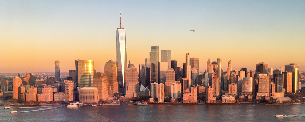
We will use the following images for testing:
example1.png (original resolution – 3869×1551 px)
example2.png (half the resolution of example1.png)
example3.png (one third the resolution of example 1.png)
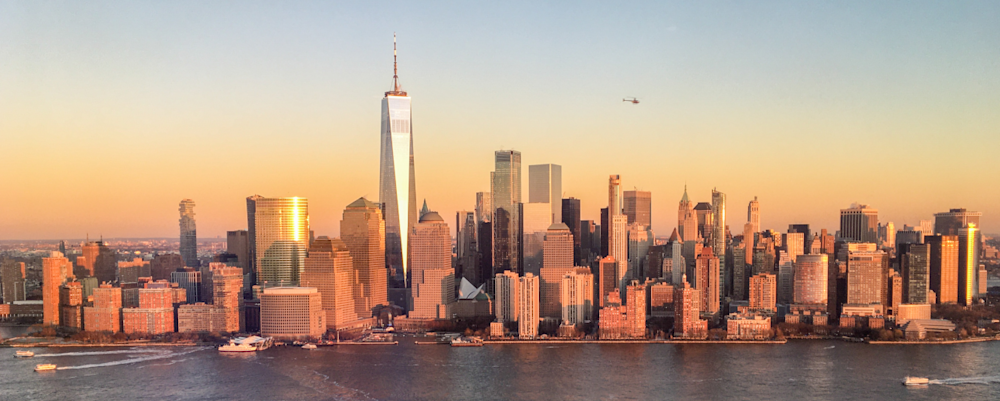
example4.png (a quarter the resolution of example 1.png)

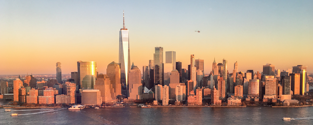
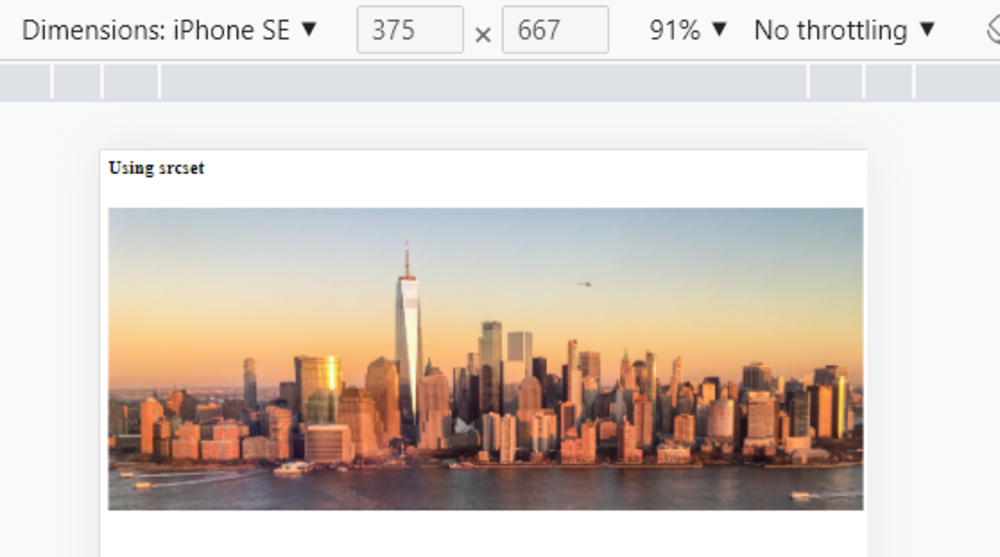
The output should look like this: when tested with the browser, we can check see it is automatically resized per the selected device.
2. Using Media Queries
Media queries are used in CSS to apply different styles to a web page based on the size and resolution of the device being used to view the website. They can be included in HTML by adding CSS rules within media query blocks in the stylesheet.
Here is an example of how to include media queries in a CSS stylesheet:
    /* Default styles */
    body {
      font-size: 16px;
      font-family: Arial, sans-serif;
    }

    header {
      background-color: #333;
      color: #fff;
      text-align: center;
      padding: 20px;
    }

    /* Media query for small screens */
    @media (max-width: 320px) {
      body {
        font-size: 14px;
      }


      header {
        padding: 10px;
      }
    }

    /* Media query for medium screens */
    @media (min-width: 321px) and (max-width: 640px) {
      body {
        font-size: 16px;
      }


      header {
        padding: 15px;
      }
    }

    /* Media query for large screens */
    @media (min-width: 641px) {
      body {
        font-size: 18px;
      }


      header {
        padding: 20px;
      }
    }
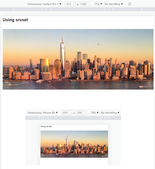
In the following output image, you can see the image is automatically resized depending on the device’s resolution.
In this example, the default styles are applied to all devices, and the media queries are used to override these styles for specific screen sizes:
- The first media query sets styles for small screens (with a maximum width of 320 pixels),
- The second media query sets styles for medium screens (with a minimum width of 321 pixels and a maximum width of 640 pixels)
- The third media query sets styles for large screens (with a minimum width of 641 pixels)
In this way, media queries allow you to create responsive designs that adapt to the size and resolution of the device being used to view the website, resulting in a better user experience for all users.
Learn more in our detailed guide to responsive images with CSS.
3. Defining Breakpoints
Breakpoints are the specific width values that are used in media queries to apply different styles to a web page based on the size of the device being used to view the website. A breakpoint is the point at which the layout of a web page changes to accommodate the different screen size.
Breakpoints are typically defined in pixels, and they are used to create a responsive design that adjusts to different screen sizes. Here are some examples of common breakpoints:
- 320px: This is a popular option for small screens, such as those used on smartphones.
- 640px: Commonly used for medium-sized screens, such as tablets.
- 960px: Commonly used for large screens, such as desktop computers.
- 1200px: Commonly used for extra-large screens, such as wide-screen monitors.
4. Specifying Maximum Width
The max-width property is a CSS property that sets the maximum width of an element. It can be used to prevent an element from becoming too wide when viewed on larger screens, which can help to ensure that the layout of a web page remains consistent and readable on all devices.
For example:
    img {
      max-width: 100%;
    }
In this example, the max-width property is used to set the maximum width of all img elements on the page to 100% of the width of their parent container. This means that the images will be resized to fit within the available space, but they will never become wider than the parent container.
5. Using Lazy Loading
Lazy loading is a technique for optimizing the loading of images on a web page. In the context of responsive images, lazy loading means that images are only loaded when they are needed, and not when the page first loads.
With lazy loading, images are only loaded when they are in or near the viewport, which is the portion of the web page that is currently visible on the screen. This can significantly improve the loading time of a web page, especially on mobile devices, where network speeds are often slower.
Here is an example of how to implement lazy loading for images in HTML using JavaScript:
    <img data-src="image.jpg" class="lazy">

    <script>
    // Select all images with the class "lazy"
    const images = document.querySelectorAll(".lazy");

    // Create an observer
    const observer = new IntersectionObserver((entries, observer) => {
      // Loop through each entry
      entries.forEach(entry => {
        // If the entry is in the viewport
        if (entry.isIntersecting) {
          // Get the image
          const image = entry.target;

          // Load the image
          image.src = image.getAttribute("data-src");

          // Stop observing the image
          observer.unobserve(image);
        }
      });
    });

    // Observe each image
    images.forEach(image => {
      observer.observe(image);
    });
    </script>
In this example, the data-src attribute is used to store the URL of the image, and the lazy class is used to select all images that need to be lazy loaded.
The IntersectionObserver API is used to detect when an image enters the viewport, and the src attribute is updated with the URL of the image. This means that the image is only loaded when it is needed, and not when the page first loads.
6. Setting Responsive Image Background
A responsive image background is an image that is set as the background of an element on a web page, and is designed to adjust its size and appearance based on the size of the device or screen being used to view the page. This means that the background image will scale and adjust its position to fit the available screen space, providing an optimal viewing experience for the user regardless of the device they are using.
Responsive image backgrounds are often set using CSS, and may use media queries to serve different versions of the same image based on the size of the device. The goal of a responsive image background is to provide a seamless and visually appealing design, regardless of the device being used to view the web page. By using responsive image backgrounds, website developers can ensure that the background images on their pages look good on all devices and do not slow down the website’s loading time.
7. CSS for Basic Responsiveness
The simplest way to make images responsive is by using CSS to ensure they scale within their containers. For example:
img {
 max-width: 100%; /* Ensures image doesn't exceed parent width */
 height: auto; /* Maintains aspect ratio */
 display: block; /* Removes extra space below inline images */
}
This approach allows images to shrink when the viewport is smaller than the image’s intrinsic size, while preventing them from exceeding their original size and becoming pixelated. It’s a foundational technique for responsive images and works well in combination with HTML attributes like srcset and sizes for more advanced resolution switching.
Responsive Images in WordPress
Implementing responsive images in WordPress is relatively straightforward. WordPress automatically generates several different sizes of each image that is uploaded to the media library. These sizes can be used to serve optimized images based on the size and resolution of the device being used to view the website.
The available image sizes can be configured in the WordPress settings, and they can also be added or modified using custom code. By default, the large image version will have maximum dimensions of 1024 pixels, while the smallest (thumbnail) image size will have maximum dimensions of 150 pixels.
In WordPress, the srcset attribute is generated automatically for each image that is uploaded to the media library, and it can be used to serve optimized images based on the size and resolution of the device being used to view the website.
Here is an example of how to implement responsive images in WordPress. Please note that this example requires that the image has the string ‘full’ in its filename.
    <img src="<?php echo wp_get_attachment_image_src( $attachment_id, 'full' )[0]; ?>"
         srcset="<?php echo wp_get_attachment_image_srcset( $attachment_id, 'full' ); ?>"
         sizes="(max-width: 320px) 280px,
                (max-width: 640px) 640px,
                960px">
In this example, the wp_get_attachment_image_src function is used to get the URL of the full-sized image, and the wp_get_attachment_image_srcset function is used to get the srcset attribute for the image. The sizes attribute is used to specify the maximum width of the screen that each version of the image is intended for.
Related content: Read our blog on how to create responsive image for WordPress.
Responsive Images with Bootstrap
Bootstrap is a popular front-end framework for developing responsive, mobile-first websites. It provides a set of CSS and JavaScript-based components and tools that make it easy to create responsive designs that look good on a variety of devices.
In Bootstrap, responsive images can be implemented using the .img-fluid class. This class is used to make images scalable and responsive, so that they will automatically adjust their size and resolution based on the size and resolution of the device being used to view the website.
Here is an example of how to implement responsive images in Bootstrap:
    <!DOCTYPE html>
    <html lang="en">
    <head>
      <title>Bootstrap Image Resize</title>
      <meta charset="utf-8">
      <meta name="viewport" content="width=device-width, initial-scale=1">
      <script src="bootstrap.bundle.min.js"></script>
    </head>
    <body>

    <div class="">
      <h1>Bootstrap Image Resize</h1>
      <p>Resize this responsive page to see the effect!</p>
    </div>


    <div class="">
    	<img src="example1.png" class="img-fluid" alt="Responsive Image">

    </div>

    </body>
    </html>
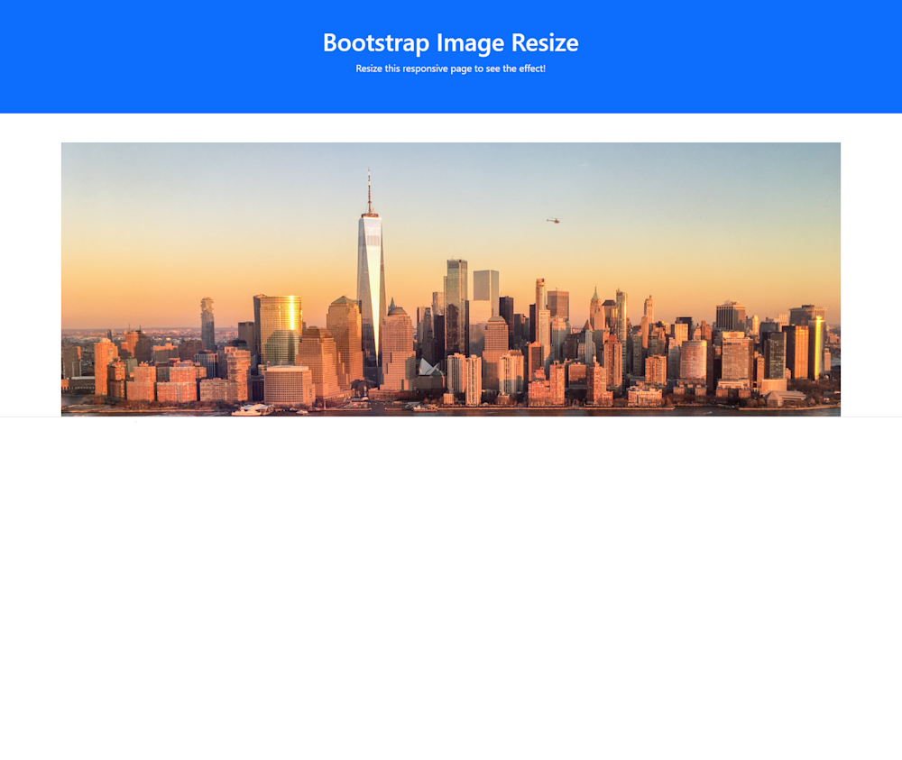
In this example, the img element is given the .img-fluid class, which makes the image scalable and responsive. The alt attribute is used to provide a text description of the image for accessibility purposes.
Automating Responsive Images With Cloudinary
A cloud-based service for managing images and videos, Cloudinary offers a generous free-forever subscription plan. While on that platform, you can upload images and apply built-in effects, filters, and modifications. You can also create image effects that are difficult or impossible to produce with just CSS.
Cloudinary makes it simple to deliver responsive images by doing the following:
- Dynamically transform images — Generates transformed (e.g., resized or cropped) versions of images on the fly with Cloudinary dynamic URLs. This capability is especially useful in conjunction with the HTML
srcsetattribute and<picture>element, enabling the browser to choose which image version to display. - Automating responsive images with JavaScript front-end frameworks (client side) — Programmatically sets the
<img> srcURL to a Cloudinary dynamic URL that delivers the optimal image for the available image width. - Automating responsive images with the cloudinary-core JS library (client side) — Programmatically sets the <img> src URL to a Cloudinary dynamic URL that delivers the optimal image for the available image width and the device’s DPR.
- Automating responsive images with Client Hints (mobile Chrome only) — Delivers the optimal image for the available width and the device’s DPR as specified in the Client Hints request header.
- Combining responsive automation with other Cloudinary features — Implements advanced RWD and art-directed, responsive images by leveraging Cloudinary’s other automation features.
See Additional Guides on Key Front-End Development Topics
Together with our content partners, we have authored in-depth guides on several other topics that can also be useful as you explore the world of front-end development.
Live Streaming Video
Authored by Cloudinary
- [Guide] A Guide on Live Streaming and Tips for Making It a Success
- [Guide] VOD Streaming vs. Live Streaming vs. OTT: The Video Economy
- [Blog] Contemplating Codec Comparisons
- [Product] Cloudinary Video | Automated Video Editing & Delivery
Video Format
Authored by Cloudinary
- [Guide] The Five Most Popular Web-Video Formats and Streaming Protocols
- [Guide] Video Frame Rates Explained Along With Tips for Picking the Right FPS
- [Blog] Contemplating Codec Comparisons
- [Product] Cloudinary Video | Automated Video Editing & Delivery
User Generated Content
Authored by Cloudinary

