Are you tired of websites that look great on your desktop computer but look like a mess on your smartphone or tablet? Responsive images are the solution you’ve been looking for. With responsive images, you can ensure your website looks amazing on any device, from the smallest smartphone to the largest desktop monitor. Optimizing your images for different screen sizes allows you to create a seamless user experience that keeps visitors engaged with your content.
This is crucial in today’s competitive online landscape, where users expect lightning-fast websites that load in the blink of an eye. Plus, with search engines prioritizing fast-loading websites, responsive images can help you improve your search engine rankings and attract more visitors to your site. So let’s dig into what makes them so special and how we can create them.
What Are Responsive Images?
Responsive images can adapt and adjust to different screen sizes and resolutions to provide the best viewing experience to users. With so many different devices and resolutions today, creating web images that can be scaled and optimized for each device without sacrificing quality or download speed has become increasingly important.
Responsive images can be achieved in several ways, such as using HTML and CSS to create fluid images that resize automatically based on the screen size or using JavaScript and server-side solutions to deliver different images to different devices based on the user’s device capabilities and network conditions.
When Should You Use Responsive Images?
Responsive images are crucial to web development in a multitude of ways. While this isn’t an exhaustive list, we’ve assembled some of the most common reasons why you may need responsive images:
- Mobile optimization: A good portion of users will look at a website on their cell phone or tablet before using a PC, making it crucial to use responsive images to ensure that your website looks good and loads quickly on all devices.
- Dynamic content: If your website has dynamic content, such as user-generated content or images pulled from external sources, using responsive images can ensure that these images are optimized for different screen sizes and resolutions.
- High-resolution images: Responsive images can help reduce the file size of these images and improve your website’s load times.
- Image-heavy websites: Using responsive images can help ensure that these images are optimized for different devices and that your website loads quickly and efficiently.
Responsive vs. Accessible Image Tags
Responsive image tags are crucial for optimizing images for different devices and screen sizes. This is because a single image may look great on a large desktop screen but appear distorted or too small on a mobile device. By using responsive image tags, web designers can ensure that the images on their site are adjusted according to the screen size of the device used to view them. This means users can enjoy an optimal viewing experience regardless of their device.
On the other hand, accessible image tags are essential for making images more accessible to people with disabilities, particularly those with visual impairments. Adding alt tags to images allows screen readers to describe the image’s content, which can help visually impaired users understand what is being displayed. This can be particularly important for e-commerce sites or websites that rely heavily on visual content. By ensuring that images are accessible, web designers can ensure that all users can enjoy the same browsing experience, regardless of their abilities.
It’s important to note that responsive and accessible image tags are not mutually exclusive. They can work together to create a better overall user experience. By using responsive image tags to ensure that images are optimized for different devices and screen sizes and accessible image tags to ensure that all users can understand the content of the images, web designers can create a site that is both user-friendly and accessible to all.
Alternatives to Responsive Image Tags
To make images suitable for various screen sizes and platforms, there are some alternatives to using responsive image tags, like:
- Server-Side Image Resizing – This process entails creating copies of the same image on the server in various sizes and resolutions and then serving the appropriate version depending on the user’s device or screen size.
- Client-Side Image Resizing – The images are resized using JavaScript according to the user’s device or screen height on the client side.
- Adaptive Images – This method includes using server-side detection and JavaScript to deliver various versions of an image depending on the user’s device or screen size.
Although each method has advantages and disadvantages, responsive image tags remain the most well-liked and widely accepted method for online image optimization for various screen sizes and devices.
How to Create Responsive Images
Images are essential to a website’s design but can also be a significant obstacle to responsiveness. Creating responsive images is important because it ensures a seamless user experience across all devices. So let’s show you how to make these responsive images through Cloudinary for a simple, flexible solution that can work for any team.
Prerequisites
To create responsive images, we’ll need a Cloudinary account. You can sign up for a free account in just a second. Once you have your account, you’ll need to install the latest version of Node.js. If you don’t have Node.js installed, download it free from the official Node.js website.
Now that everything is installed, the last step would be to install the Cloudinary Node.js SDK, which will help to make and authenticate API calls to Cloudinary’s cloud. To install this library, create a project folder and run the following command in your terminal:
npm install cloudinary
Now we’re ready to start creating responsive images.
Upload Your Image to the Cloudinary Console
Before we can start creating responsive images, we’ll first upload your image to Cloudinary using either the web interface or the API.
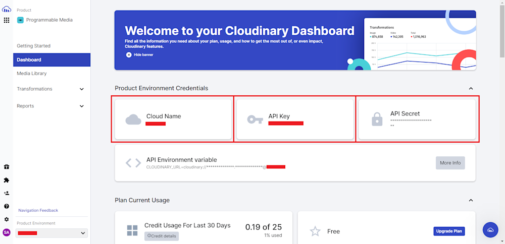
For now, we’ll upload our image to the cloud using the Cloudinary Node.js SDK. Start by opening your project directory and creating a new file named responsive_image_URL.js. Next, log in to your account and head to the Dashboard tab. Now copy your Cloud Name, API Key, and API Secret:
Now, open up the file and start by importing the Cloudinary Node.js SDK and define the API with your account credentials:
const cloudinary = require('cloudinary').v2;

cloudinary.config({
  cloud_name: 'your_cloud_name',
  api_key: 'your_api_key',
  api_secret: 'your_api_secret'
});
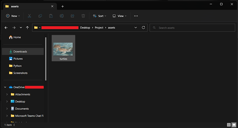
Next, in your project directory, create a folder named assets. Here add the images you want to upload. We will be using turtles.jpg:
Finally, define and call the API with the public_id of the images you want to upload:
return cloudinary.uploader.upload("./assets/turtles.jpg", {
    public_id: "turtle"
  })
  .then(result=>console.log(result));
Now you can simply run the code using Node:
node responsive_image_URL.js
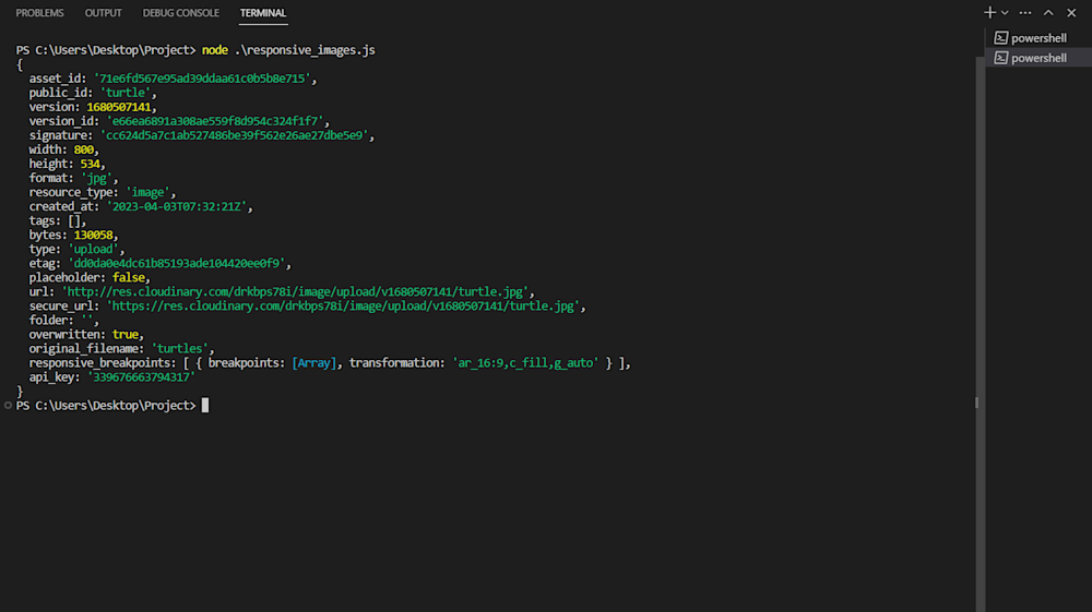
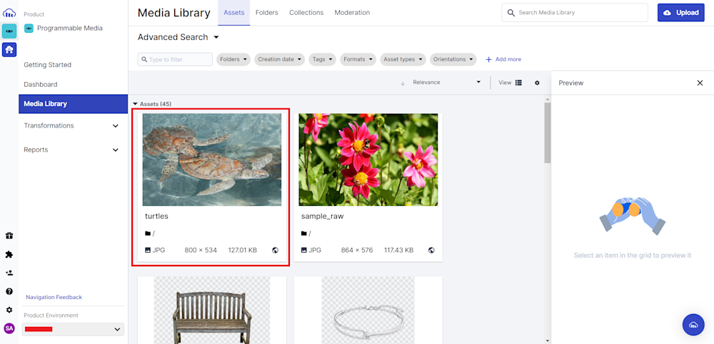
To verify your upload, follow the URL in the terminal output, or head on to the Media Library tab on your Cloudinary account:
Optional Step: Responsive Breakpoint Generator
Cloudinary offers a unique Responsive Breakpoint Generator. This feature helps you find the optimal number of versions for each image based on a balance between the number of versions generated and the file size reduction between each version.
The tool allows you to generate responsive image breakpoints interactively, but it can also be used programmatically with the API for applications that involve user-generated content. You can upload images to the cloud and generate breakpoints automatically using the API. The example code provided shows how to do this in Node.js while uploading your image:
return cloudinary.uploader.upload("turtles.jpg", {
    public_id: "turtle",
    responsive_breakpoints: {
      create_derived: true,
      bytes_step: 20000,
      min_width: 200,
      max_width: 1000,
      transformation: { crop: 'fill', aspect_ratio: '16:9', gravity: 'auto' }
    }
  })
  .then(result=>console.log(result));
For more information on requesting breakpoints and available parameter values, see the responsive breakpoint request settings documentation.
Using an Image From The Console
Now that our image has been uploaded, we can retrieve it using the Cloudinary API. For now, we will be using the Cloudinary demo cloud. Here is how you can define it in code:
Let’s retrieve the sheep.jpg available in the demo cloud. To do this we will be using the .image method of the Node.js SDK:
const imageUrl = cloudinary.image("samples/sheep.jpg", {
    transformation: { crop: 'fill', aspect_ratio: '16:9', gravity: 'auto' }
  })
console.log(imageUrl)
This will generate a URL for the image. The additional transformation parameter will add a few transformations before printing it to our console.
Generate a Responsive Image URL
The transformation parameter in the code above will generate a responsive image URL. Cloudinary automatically creates different versions of the image in various sizes and resolutions based on the device and screen size of the user, providing an optimized user experience.
If we run our responsive_image_URL.js we will get the following responsive image URL:
<img src='http://res.cloudinary.com/demo/image/upload/ar_16:9,c_fill,g_auto/v1/samples/sheep.jpg' />
This URL includes several parameters that control the aspect ratio, cropping mode, gravity, and version of the image being displayed. The ar_16:9 parameter sets the aspect ratio to ensure the image retains its proportions when resized. The c_fill parameter resizes the image to fill the designated space, and the g_auto parameter centers the image based on its focal point. Additionally, the v1 parameter specifies the version of the image and can be used to force a new version to be generated, ensuring users see the most up-to-date version.
Create Responsive Image Tags in HTML
Finally, to create responsive image tags in HTML, you must use the srcset and sizes attributes. The srcset attribute specifies the available image sizes, and the sizes attribute specifies the image container size. When the browser loads the page, it selects the best image size based on the device and screen size.
You can use the <picture> element along with the <source> and <img> elements. Here is an example code that you can use as a basis:
<!DOCTYPE html>
<html>
  <head>
    <meta name="viewport" content="width=device-width, initial-scale=1">
    <title>Responsive Image Example</title>
  </head>
  <body>
    <picture>
      <source
        media="(min-width: 800px)"
        srcset="http://res.cloudinary.com/demo/image/upload/v1/samples/sheep.jpg 800w,
                http://res.cloudinary.com/demo/image/upload/v1/samples/sheep.jpg 1600w"
        sizes="100vw">
      <source
        media="(min-width: 600px)"
        srcset="http://res.cloudinary.com/demo/image/upload/v1/samples/sheep.jpg 600w,
        http://res.cloudinary.com/demo/image/upload/v1/samples/sheep.jpg 1200w"
        sizes="100vw">
      <img
        src="http://res.cloudinary.com/demo/image/upload/v1/samples/sheep.jpg"
        alt="A beautiful landscape"
        sizes="100vw">
    </picture>
  </body>
</html>
In this code, we have used the <picture> element to group the <source> and <img> elements together. Inside the <picture> element, we have defined two <source> elements, each with a different media query and srcset attribute. The srcset attribute specifies the URL of the image and its width.

Finally, we have added an <img> element with a srcset attribute and a fallback src attribute. The sizes attribute specifies the size of the image relative to the viewport width.
This code will display the image with the appropriate size based on the device’s screen width.
Now let’s open our HTML page in a browser.
Final Thoughts
Responsive images must deliver a consistent user experience across all platforms. With its sophisticated image management capabilities, Cloudinary offers a simple and efficient option for managing and delivering responsive images. You can save time and effort while enhancing your website’s functionality and user experience by using Cloudinary. Sign up for Cloudinary today and see how it can simplify your life with responsive images!
Learn more:

