Visitors to your website expect an optimized user experience. One key aspect of this is faster page loads. An easy way to achieve faster load times is reducing your image size and overall bandwidth.
When you automatically generate responsive images you save bandwidth as the responsive images are naturally scaled to suit a user’s screen. Unfortunately, when making images responsive, a user rarely gets served an image in the size that best fits their screen. Instead, the image is sized to the nearest width.
This article explains how to automatically generate responsive images that are the exact dimensions for the viewing device rather than generate images to the nearest of 3 or 4 fixed dimensions.
Generating responsive images
The common process for generating responsive images is:
- Resize an image into at least three sizes.
- Export the sizes in the formats you want (WebP/JPEG/PNG).
- Optimize them for web delivery.
- Write the code to detect and serve the right image.
Example:
    <img
      sizes="(max-width: 320px) 280px, (max-width: 480px) 440px, 800px"
      srcset="dog-320.jpg 320w, dog-480.jpg 480w, dog-800.jpg 800w"
      src="dog-800.jpg"
    />
However, Cloudinary, an end-to-end media management solution for websites and applications, automatically generates responsive images through a variety of ways:
- The cloudinary-core JavaScript (JS) library.
- JavaScript frontend frameworks.
- Client Hints.
- Cloudinary dynamic image transformation.
- Responsive images | Cloudinary.
The cloudinary-core JS library is used in this article.
Using the cloudinary-core JS library
Using the cloudinary-core JS library, you can create the correct DPR (Device Pixel Ratio) image for devices that support higher resolutions and automate the width. The JS code checks the device’s DPR and the space available for the image. Users of high pixel-density devices will get a great result but may have to wait longer for images to load, while low DPR users won’t have to wait for large images to load.
Prerequisites
- A free Cloudinary account: https://cloudinary.com/users/register_free
- The cloudinary-core JavaScript (JS) library.
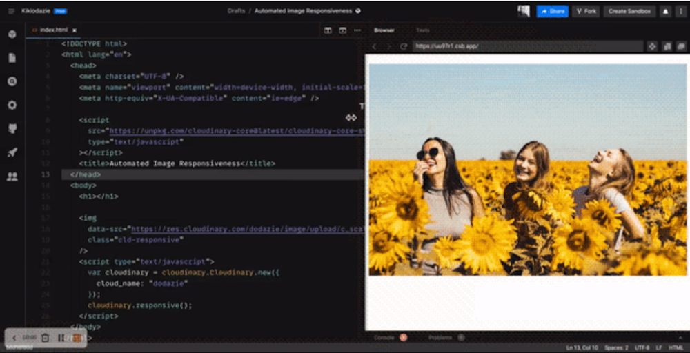
- You can see in this CodeSandbox a code that automates image responsiveness. Fork it and run the code.
- The source code is also available on GitHub Gist.
- This Unsplash stock image: https://images.unsplash.com/photo-1591035897819-f4bdf739f446?ixlib=rb-1.2.1&ixid=MnwxMjA3fDB8MHxwaG90by1wYWdlfHx8fGVufDB8fHx8&auto=format&fit=crop&w=1170&q=80
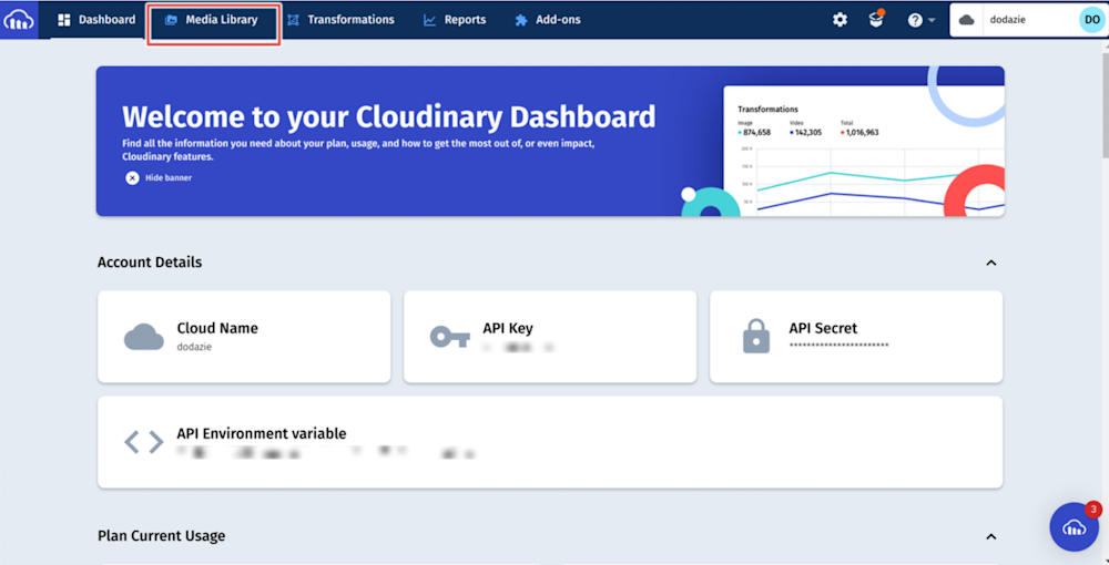
Step 1: Upload an image to Cloudinary
To upload an image to Cloudinary, create an account for free. After creating an account and logging in, click Media Library near the top left corner of the dashboard:
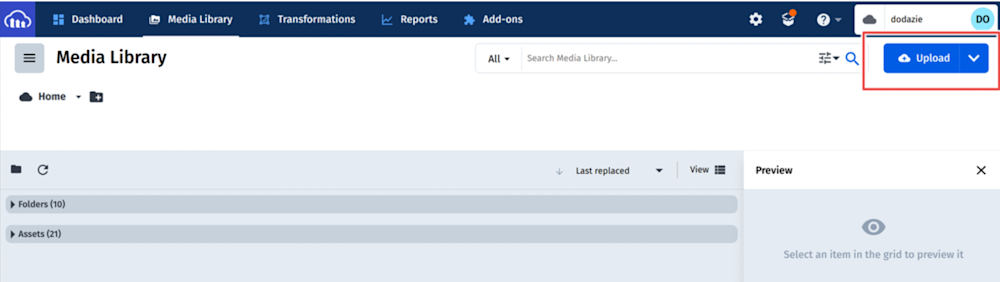
Once in the Media Library, select the blue Upload button:
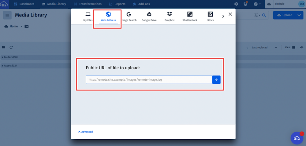
To follow along with this tutorial, paste the image URL found in the prerequisites in the upload window:
After the image uploads to your Media Library, copy its URL as shown below:
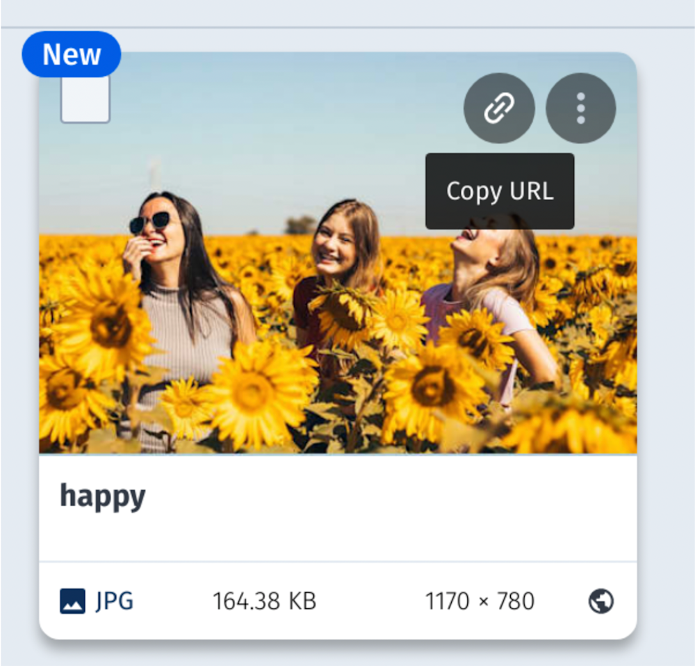
The URL will be similar to:
https://res.cloudinary.com/dodazie/image/upload/happy.jpg
To break down the above URL:
- res.cloudinary.com/ is Cloudinary’s base URL.
- dodazie is a Cloudinary account’s cloud name.
- image/upload/ is the path to the images uploaded to your media library.
- happy is the name of the image.
- .jpg is the format of this image. You can also request a .png or .WebP format by easily swapping out the .jpg for the format of your choice. Even though the original uploaded image is .jpg. Cloudinary will convert the format on the fly.
Next, we will use the cloudinary-core JS library to automate the responsiveness of the above image.
Step 2: Integrate the cloudinary-core JS library
To integrate the cloudinary-core JS library, you can use a package manager (yarn, npm) or include the library in your HTML pages.
Using a package manager
npm install cloudinary-core
Or
yarn install cloudinary-core
To include the library in your HTML pages
    <script
      src="https://unpkg.com/cloudinary-core@latest/cloudinary-core-shrinkwrap.js"
      type="text/javascript">
    </script>
The above cloudinary-core-shrinkwrap.js library is a shrink-wrapped version of the cloudinary-core library (it is not dependent on lodash).
This article will use the library on an HTML page.
Step 3: Set your HTML <img> tags parameters
For each image you want to make responsive:
- Stick the data-src attribute of the <img> tag to the URL of the image you uploaded to Cloudinary. You don’t need to set the src attribute of the <img> tag as it is updated dynamically.
- Using Cloudinary image transformation URL parameters, set the crop parameter to scale and the width and dpr parameters to auto — c_scale,w_auto/dpr_auto in the URL between upload/ and the image name:
https://res.cloudinary.com/dodazie/image/upload/c_scale,w_auto/dpr_auto/happy.jpg
- This will allow Cloudinary to automatically generate responsive images scaled to the accurate width value based on the DPR of the device and the identified width available for the images in the containing element.
- Add the cld-responsive class to the <img> tag. cld-responsive is the default class name, however, you can create custom class names and programmatically make HTML elements responsive.Your <img> tag will be:
    <img
        data-src="https://res.cloudinary.com/dodazie/image/upload/c_scale,w_auto/dpr_auto/happy.jpg"
        class="cld-responsive"
    >
Step 4: Call the Cloudinary responsive() method
At the end of the HTML page, add a call to Cloudinary’s responsive() JavaScript method:
    <script type="text/javascript">
        var cloudinary = cloudinary.Cloudinary.new({cloud_name: "<YOUR_CLOUD_NAME>"});
        cloudinary.responsive();
    </script>
The above responsive() method looks for all images on the page with the cld-responsive class name, detects the available width for the image on the page, and updates the HTML <img> tags accordingly. The image will also update whenever the window size or screen resolution changes.
Conclusion
Now you are ready to automate the responsiveness of the images on your website and provide visitors to your website an optimized user experience!
The process presented in this article covers the simplest way to automatically generate responsive images that are the exact dimensions for the viewing device. You can further customize the behavior to control whether to update images on resizing, when to update the image using stop-points, preserve the CSS image height, etc. To learn more, view the Cloudinary documentation.
Ready to get started? Create an account for free.
More from Cloudinary

