Images are essential for building engaging web applications and websites. However, with all the advancements in technology, images on the web have become complicated to manage due to the variety of sizes, formats, performance types, and resolutions available.
To make images responsive and performant on the web, developers traditionally use the srcset and sizes native img element attributes. This approach provides multiple image sources with sizes and hints to help the browser pick the most appropriate one:
    <img
        sizes='100vw'
        srcset='width-400.jpg 400w,
             width-800.jpg 800w,
             width-1600.jpg 1600w'
        src='cat_picture.jpg'
        alt='My image'
    />
Challenges with this approach:
- The requirement of creating multiple image sizes.
- A limited browser support.
- A bloated codebase due to multiple image sources.
In this article, you will learn how to implement a responsive image design to ensure improved performance across different devices and screen sizes.
A responsive approach with Cloudinary
Cloudinary is a visual media platform used to upload, store, manage, transform, and deliver images and videos for websites and applications. The platform also offers a vast collection of SDKs for frontend frameworks and libraries.
One of the cool features of Cloudinary is its ability to provide responsive image design; automatically resizing and optimizing images for faster delivery and a better user experience.
We will use React to develop our application; however, the approach covered in this article can also be applied to other JavaScript-based frontend frameworks and libraries.
To use Cloudinary you’ll need to create an account. Signup is completely free.
Sandbox
We completed this project in a CodeSandbox. Fork and run it to quickly get started.
<CodeSandbox id="confident-poincare-5pdvgt" title="How to do responsive image design" />
Github link here.
Getting Started
Step 1. Create a React project by navigating to the desired directory and running the command below in a terminal:
npx create-react-app resp_image && cd resp_image
The command creates a React project called ‘resp_image’ and navigates to the project directory.
* Due to a recent upgrade in the React version (“^18.0.0”), you might need to downgrade your application to a compatible version. Do this by deleting the generated node_modules folder.
Step 2. Modify the package.json file as shown below:
    {
      "name": "resp_image",
      "version": "0.1.0",
      "private": true,
      "dependencies": {
        "@cloudinary/react": "^1.2.2",
        "@cloudinary/url-gen": "^1.7.0",
        "@testing-library/jest-dom": "^5.16.4",
        "@testing-library/react": "^12.1.4",
        "@testing-library/user-event": "^13.5.0",
        "react": "^17.0.0",
        "react-dom": "^17.0.0",
        "react-scripts": "5.0.0",
        "web-vitals": "^2.1.4"
      },
      "scripts": {
        "start": "react-scripts start",
        "build": "react-scripts build",
        "test": "react-scripts test",
        "eject": "react-scripts eject"
      },
      "eslintConfig": {
        "extends": [
          "react-app",
          "react-app/jest"
        ]
      },
      "browserslist": {
        "production": [
          ">0.2%",
          "not dead",
          "not op_mini all"
        ],
        "development": [
          "last 1 chrome version",
          "last 1 firefox version",
          "last 1 safari version"
        ]
      }
    }
The snippet above does the following:
- Line 11: changes the react version to “^17.0.0”.
- Line 12: changes the react-dom version to “^17.0.0”.
Step 3. Reinstall the dependencies by running the command below:npm install
Step 4. Install the @cloudinary/url-gen and @cloudinary/react dependencies with:
npm i @cloudinary/url-gen @cloudinary/react
@cloudinary/url-gen provides all the functionality required to create delivery URLs.
@cloudinary/react contains React-based components for rendering, configuring, and transforming media assets.
Step 5. Include Cloudinary’s cloud name as an environment variable. To do this, create a .env file in the root directory and in this file, add the snippet below:
REACT_APP_CLOUDINARY_CLOUD_NAME=/*YOUR CLOUD NAME HERE/*
You can get Cloudinary’s cloud name by logging into the Cloudinary console and viewing any of the highlighted sections as shown below:

Image sourcing and upload to Cloudinary
Step 6. In the Cloudinary dashboard, upload the below sample image by clicking on the Media Library tab, then Upload, select the Web Address option, input the url, then clicking on the Arrow Button
Sample image url:
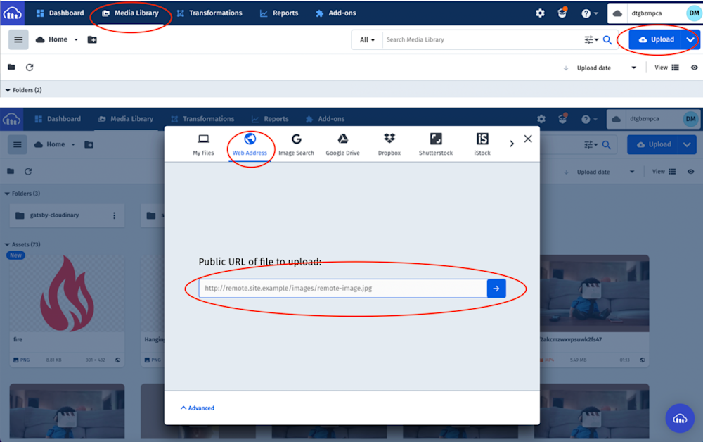
The uploaded image will be displayed on the console with its Public ID (the unique identifier for an asset stored in Cloudinary). This ID will come in handy when creating a responsive image design:

Creating a responsive image
Step 7. Modify the App.js file in the src folder to the following:
import './App.css';
import { Cloudinary } from '@cloudinary/url-gen';
import {
AdvancedImage,
responsive,
lazyload,
placeholder,
accessibility
} from '@cloudinary/react';
function App() {
//create cloudinary instance
const cld = new Cloudinary({
cloud: {
cloudName: process.env.REACT_APP_CLOUDINARY_CLOUD_NAME,
},
});
const myImage = cld.image('YOUR PUBLICID GOES HERE');
return (
<div className='App'>
<header>
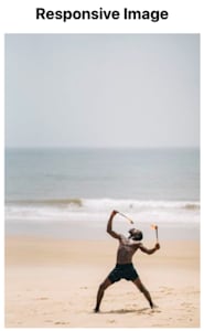
<h2>Responsive Image</h2>
</header>
<AdvancedImage
cldImg={myImage}
plugins={[
lazyload(),
responsive({ steps: [200, 400] }),
accessibility(),
placeholder(),
]}
/>
</div>
);
}
export default App;
The snippet above:
- Imports the required dependencies.
- Creates a cld variable that instantiates Cloudinary and passes in the cloud.
- Creates a myImage variable that uses the cld instance and Public ID to generate the image URL.
- Uses the AdvancedImage component to create an image by passing in the generated image URL and plugins. The component can also do the following:
- Lazyload: enhances performance by telling the browser not to download images that are not yet visible to the user on his screen. Instead, waits until the user scrolls to that image.
- Responsive: resizes images automatically based on viewports.
- Accessibility: makes images more accessible to users with disabilities.
- Placeholder: displays a lightweight version of the image while downloading the main image.Step 8. Once complete, we can start a development server using the command below:
npm start
Conclusion
This post discussed how to implement responsive image design in a web application. Cloudinary supports various SDKs and utilizes multiple techniques to optimize and deliver media assets. Try it out today (it’s free forever!) and supercharge your productivity.
More from Cloudinary:

