Responsive web design for CSS background images ensures that background visuals adapt seamlessly to a wide range of screen sizes, resolutions, and devices. By leveraging key CSS properties such as background-size: cover and background-size: contain, developers can control how images scale within their containers, either filling the space or fitting entirely within it.
Techniques like media queries allow for different background images or styles at various breakpoints, while the image-set() function enables serving high-resolution images for retina and high-DPI screens. Additionally, using viewport units (vw, vh) helps background containers scale relative to the viewport, further enhancing responsiveness.
This article explores these essential CSS strategies and demonstrates how to implement them, both manually and with the help of Cloudinary’s automated solutions, to create flexible, visually appealing, and performant background images for any device.
- Resizing Background Images With CSS
- Generating Responsive Image Backgrounds With Media Queries
- Generating Responsive Image Backgrounds With Cloudinary
For more details, see Best Practices for Responsive Web Design.
Why Are Responsive Images Important?
- Enhanced User Experience. Responsive images adapt to various screen sizes and devices, ensuring users can view images clearly and legibly, regardless of the device they use.
- Improved Accessibility. These images are beneficial for users with visual impairments as they can be resized to align with the user’s preferred font and screen size, making the content more accessible.
- Boosted SEO. Search engines favor websites optimized for multiple devices and screen sizes. Responsive images are a crucial component of this optimization strategy.
- Faster Page Load Times. Using the srcset and sizes attributes allows different versions of an image to be specified for various screen sizes and devices. This enables the browser to select the most suitable image, enhancing loading times and overall performance.
- Increased User Engagement. Providing a seamless and consistent experience across different devices can lead to higher user engagement and a lower bounce rate.
Responsive images are vital for optimizing websites for various devices and screen sizes. They enhance user experience, improve accessibility, boost SEO, speed up page load times, and increase user engagement, ultimately improving the overall performance of a website.
Resizing Background Images With CSS
With the CSS property background-size, you can resize background images and change the default behavior of tiling them at full size. Even though doing that does not make the background images responsive, you can look for and specify a setting for them that applies to all screen sizes or devices and then automatically apply the most appropriate settings with media queries.
See the examples below, which are from the Mozilla Web Docs.
Tiling Large Images
A way to change the display of background images is to resize them while tiling them in the background with CSS. For example, to tile four copies of a large image into a square of 300×300 pixels, set background-size to 150x to scale the image to that size. Next, define the width and height properties to the size of the container in which to display the image.
HTML
<div class="tiledBackground">
</div>
CSS
.tiledBackground {
  background-image: url(https://www.mozilla.org/media/img/logos/firefox/logo-quantum.9c5e96634f92.png);
  background-size: 150px;
  width: 300px;
  height: 300px;
  border: 2px solid;
  color: pink;
}
The image then looks like this:
Leveraging the contain Parameter
The contain value specifies that a background image be scaled in such a way that its height and width are as large as possible without breaching the size of the surrounding container. Setting contain does not override the default behavior of tiling the background image. So, as the container grows, more copies of the original image will be displayed.
HTML
<div class="bgSizeContain">
<p>Try resizing this element!</p>
</div>
CSS
.bgSizeContain {
  background-image: url(https://www.mozilla.org/media/img/logos/firefox/logo-quantum.9c5e96634f92.png);
  background-size: contain;
  width: 160px;
  height: 160px;
  border: 2px solid;
  color: pink;
  resize: both;
  overflow: scroll;
}
The image then looks like this:
Leveraging the cover Parameter
The cover value specifies that the background image be as small as possible while ensuring that the image’s width and height are the same as that of the container. If those dimensions are greater than that of the container, only part of the image is shown.
HTML
<div class="bgSizeCover">
<p>Try resizing this element!</p>
</div>
CSS
.bgSizeCover {
  background-image: url(https://www.mozilla.org/media/img/logos/firefox/logo-quantum.9c5e96634f92.png);
  background-size: cover;
  width: 160px;
  height: 160px;
  border: 2px solid;
  color: pink;
  resize: both;
  overflow: scroll;
}
The image then looks like this:
Pro Tip!Improve Core Web Vitals with Cloudinary
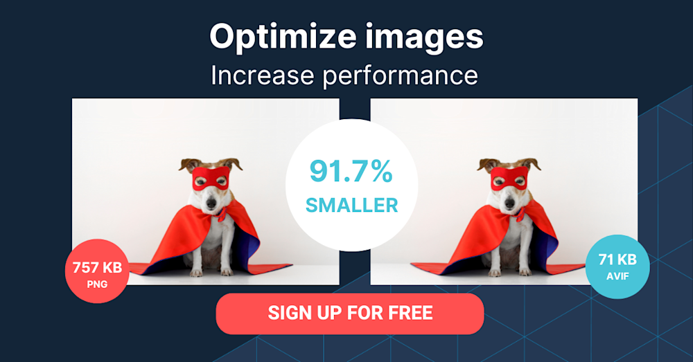
If you want to improve your Core Web Vitals metrics and make your website faster, we recommend you to deliver responsive images. Cloudinary allows you to dynamically resize your images on the fly as needed, with added features such as size optimization and format conversion.
Additional CSS Techniques for Responsive Background Images
To further enhance responsiveness, consider these CSS strategies:
- background-position: center; – Centers the background image within its container, ensuring important content remains visible as the container resizes.
- background-repeat: no-repeat; – Prevents the background image from repeating, which is often desirable for hero sections or banners.
- Viewport units (vw, vh): – Use height: 100vh; or width: 100vw; to make background containers scale relative to the viewport size, ensuring full-screen backgrounds on any device.
.responsive-background {
    background-image: url('image.jpg');
    background-size: cover;
    background-position: center;
    background-repeat: no-repeat;
    height: 100vh;
}
These properties help maintain the visual integrity of background images across a variety of devices and screen sizes.
Using image-set() for High-Resolution Backgrounds
The image-set() CSS function allows you to provide multiple image sources for different device pixel ratios, similar to srcset for <img> tags. This ensures crisp backgrounds on retina and high-DPI screens.
.high-res-bg {
    background-image: -webkit-image-set(
        url('low-res.jpg') 1x,
        url('high-res.jpg') 2x
    );
    background-image: image-set(
        url('low-res.jpg') 1x,
        url('high-res.jpg') 2x
    );
    background-size: cover;
}
Browsers will automatically select the most appropriate image based on the device’s pixel density, improving visual quality and performance.
Generating Responsive Image Backgrounds With Media Queries
With media queries, you can declare styles that apply to certain media or device types. To implement media queries, define—with CSS @media rules—breakpoints, which are thresholds that, if exceeded, cause the website to switch to another style.
A common practice is to specify different images for different screen sizes and then do either of the following with media queries:
- Switch to the most appropriate image for the user’s device.
- Switch to the style definitions for the same image.
If the conditions defined by a media-query rule are met—for example, if the screen exceeds a certain width—the styles defined by the breakpoint take effect.
Consider this CSS code that displays a background image:
body {
  background-position: center center;
  background-attachment: fixed;
  background-repeat: no-repeat; background-size: cover;
  background-image: url(images/bg-large.jpg);
}
Instead of adding the background-image property in the stylesheet, add it within a media rule. The example below creates a breakpoint for screens up to 640 pixels in width for displaying the bg-small.jpg image.
@media (max-width: 640px) {
  body {
    background-image: url(images/bg-small.jpg);
  }
}
Here is a media rule that accommodates slightly larger screens:
@media (min-width: 640px) and (max-width: 1280px) {
  body {
    background-image: url(images/bg-medium.jpg);
  }
}
This rule defines the third breakpoint, displaying the largest image for full desktop screens:
@media (min-width: 1281px) {
  body {
    background-image: url(images/background-large.jpg);
  }
}
Generating Responsive Image Backgrounds With Cloudinary
A cloud-based service for managing images and videos, Cloudinary offers a generous free-forever subscription plan. While on that platform, you can upload images and apply built-in effects, filters, and modifications. You can also create image effects that are difficult or impossible to produce with just CSS.
Cloudinary makes it simple to deliver responsive images by doing the following:
- Dynamically transform images — Generates transformed (e.g., resized or cropped) versions of images on the fly with Cloudinary dynamic URLs. This capability is especially useful in conjunction with the HTML srcset attribute and <picture> element, enabling the browser to choose which image version to display.
- Automating responsive images with JavaScript front-end frameworks (client side) — Programmatically sets the <img> src URL to a Cloudinary dynamic URL that delivers the optimal image for the available image width.
- Automating responsive images with the cloudinary-core JS library (client side) — Programmatically sets the <img> src URL to a Cloudinary dynamic URL that delivers the optimal image for the available image width and the device’s DPR.
- Automating responsive images with Client Hints (mobile Chrome only) — Delivers the optimal image for the available width and the device’s DPR as specified in the Client Hints request header.
- Combining responsive automation with other Cloudinary features — Implements advanced RWD and art-directed, responsive images by leveraging Cloudinary’s other automation features.
Enhance Your Web Design with Responsive Background Images
Responsive background images are essential for creating visually appealing and user-friendly web designs that adapt seamlessly to any device. By implementing the techniques outlined in this article, you can ensure that your website delivers an optimal user experience regardless of screen size or browser type.
By incorporating these strategies, you can significantly improve the responsiveness of your website, ensuring that your content is both visually stunning and easily accessible.
Ready to take your web design to the next level? Sign up for a free account with Cloudinary today and start creating fully responsive background images with ease. Enhance your website’s performance and user experience with the power of automated media management.
Don’t wait—transform your web design with responsive background images now!

