
Bootstrap is a collection of reusable code written in HTML, CSS, and JavaScript to help speed up site creation and design. It was developed for building responsive and mobile-first web applications and websites.
In this post, you will learn:
- Basic image resizing in Bootstrap with the
img-fluid(img-responsive) class. - How to resize images with Bootstrap by building a profile card. We will use Nuxt, a Vue.js-based JavaScript framework, to develop our application.
- Use Cloudinary to optimize images and speed up our page loading.
This is part of our series of articles about responsive images.
Basic Image Resizing in Bootstrap with image-fluid
Bootstrap provides the .img-fluid CSS class, which applies the max-width: 100%; and height: auto; CSS properties to the image, thereby ensuring that it scales nicely to the parent element. While image-fluid is the official class in the Bootstrap documentation, img-responsive works the same way.
The .img-fluid class is easy to use. Simply add it to your image tag, like this:
<img src="your-image.jpg" class="img-fluid" alt="Responsive image">
With this single line of code, your image will now scale up and down based on the screen size. This is particularly useful when you expect your website to be viewed on multiple devices, from a desktop monitor to a smartphone screen.
Detailed code example:
Let’s see a full HTML document with two images, one without the img-fluid class applied and one using it. This will show you the difference img-fluid makes.
    <!DOCTYPE html>
    <html lang="en">
    <head>
      <meta charset="UTF-8">
      <title>Bootstrap Image Resizing Example</title>
      <!-- Add the Bootstrap CSS link -->
      <link href="https://stackpath.bootstrapcdn.com/bootstrap/4.5.2/css/bootstrap.min.css" rel="stylesheet">
    </head>
    <body>

      <div class="container mt-5">
        <h1>Bootstrap Image Resizing Example</h1>

        <!-- Parent Div -->
        <div class="row">
          <div class="col-md-6">
            <h2>Non-Fluid Image</h2>
            <!-- Image without img-fluid class -->
            <img src="https://via.placeholder.com/600x400" alt="Non-responsive image">
          </div>

          <div class="col-md-6">
            <h2>Fluid Image</h2>
            <!-- Image with img-fluid class -->
            <img src="https://via.placeholder.com/600x400" class="img-fluid" alt="Responsive image">
          </div>
        </div>
      </div>

      <!-- Add the Bootstrap and jQuery JS link -->
      <script src="https://code.jquery.com/jquery-3.5.1.slim.min.js"></script>
      <script src="https://cdn.jsdelivr.net/npm/@popperjs/core@2.9.3/dist/umd/popper.min.js"></script>
      <script src="https://stackpath.bootstrapcdn.com/bootstrap/4.5.2/js/bootstrap.min.js"></script>
    </body>
    </html>
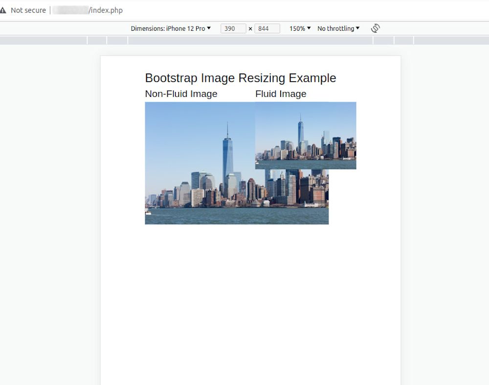
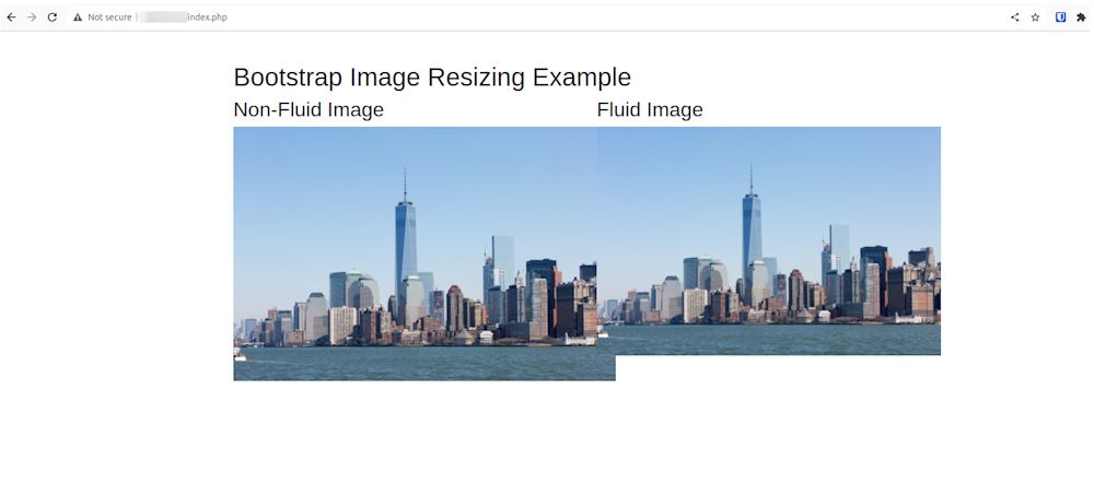
In this example, we have a Bootstrap container (<div class=”container”>) that houses a row (<div class=”row”>). Inside this row, there are two columns (<div class=”col-md-6″>). The first column contains an image without the .img-fluid class, and the second column contains an image with the .img-fluid class.
The image in the second column will scale up and down based on the screen size, while the image in the first column will not. This will allow you to clearly see the difference that the .img-fluid class makes.
You can replace https://via.placeholder.com/600×400 with the actual URL of the image you want to display.
Prerequisites
To get started, all we’ll need is a Cloudinary account. Thankfully, it’s free to sign up and use, and the free tier will be plenty for this tutorial.
Getting Started
We completed this project in a CodeSandbox. Fork and run it to quickly get started:
<CodeSandbox id="great-shockley-z3i9e2" title="How to resize image with bootstrap" />
Or, you can check out the source code via Github link here.
We’ll start by creating a Nuxt project by navigating to the desired directory and running this command:
npx create-nuxt-app bootstrap_resize_image && cd bootstrap_resize_image
Then, answer the configuration questions as shown below:
Ok to proceed? (y) < PRESS "y" and hit ENTER>
project name: <PRESS ENTER>
programming language: <JAVASCRIPT>
package manager: <NPM>
UI framework: <BOOTSTRAP VUE>
Nuxt.js modules: <AXIOS - PROMISE BASED HTTP CLIENT>
Linting tools: <ESLINT, PRETTIER>
Testing framework: <NONE>
Rendering mode: <UNIVERSAL (SSR/SSG)
Deployment target: <STATIC/JAMSTACK HOSTING>
Deployment tools: <JSCONFIG.JSON>
Continuous integration: <NONE>
Version control system: <GIT>
This creates a Nuxt project with Bootstrap called ‘bootstrap_resize_image,’ and navigates into the project directory.
Resizing image with Bootstrap
Next, modify the index.vue file in the pages folder to the following:
<template>
  <div class="container border border-primary p-5 rounded">
    <div class="d-flex flex-column justify-items-center align-items-center">
      <div class="mb-3 d-flex flex-column align-items-center">
        <img
          src="https://images.unsplash.com/photo-1630482517504-3ea85c10e7ba?ixlib=rb-1.2.1&ixid=MnwxMjA3fDB8MHxwaG90by1wYWdlfHx8fGVufDB8fHx8&auto=format&fit=crop&w=692&q=80"
          class="img-fluid rounded-circle mb-2"
          style="width: 80px; height: 80px"
          alt="profile picture"
        />
        <h5 class="mb-0">Daniel Mark</h5>
        <p>Software Engineer</p>
      </div>
      <div class="card" style="width: 288px">
        <img
          src="https://images.unsplash.com/photo-1630482517504-3ea85c10e7ba?ixlib=rb-1.2.1&ixid=MnwxMjA3fDB8MHxwaG90by1wYWdlfHx8fGVufDB8fHx8&auto=format&fit=crop&w=692&q=80"
          class="card-img-top"
          style="height: 320px"
          alt="profile picture"
        />
        <div class="card-body">
          <h5 class="card-title">Bio</h5>
          <p class="card-text">
            Lorem ipsum dolor sit amet consectetur adipisicing elit. Soluta nobis
            expedita, ipsum,
          </p>
        </div>
      </div>
    </div>
  </div>
</template>

<script>
export default {
  name: "App",
  components: {},
};
</script>
<style></style>
The snippet above uses the Bootstrap UI kit to create an avatar section with a circled profile picture, name, and job title. Then, it uses an image from Unsplash as the picture. It also creates a card section with a rectangular version of the profile image, and a bio section.
With that done, we can start a development server using the command below:
npm run dev
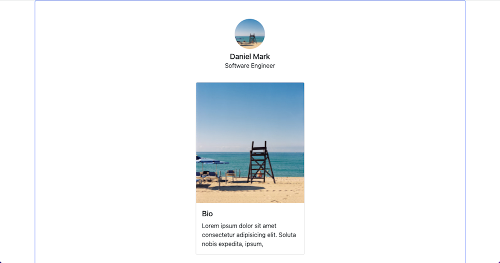
And that’s our basic page! It looks like a typical social media page, with one image being re-used twice. Bootstrap takes care of the resizing for us through its classes, so all we need to do is plug in our images and let them do the rest. But we aren’t done yet!
Optimizing The Process
While the Bootstrap UI kit helps us build our application quickly, it can become frustrating for those accessing on a slower network connection. That’s because Bootstrap doesn’t optimize the delivery of images when rendering them on the web.
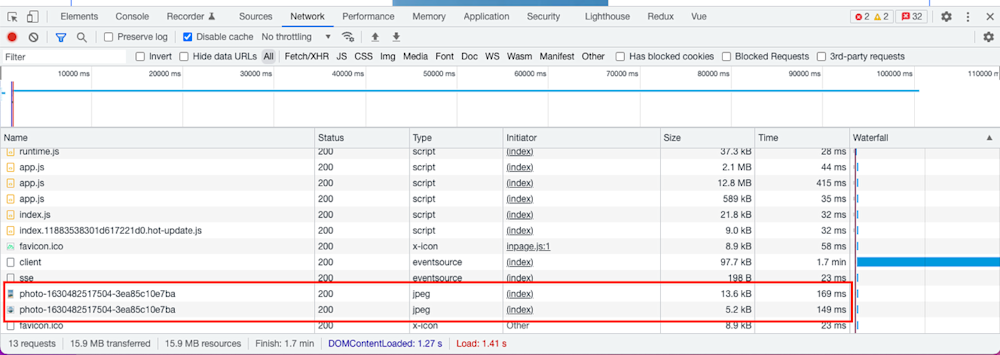
We can confirm the image size by opening the browser’s developer tools (F12, if you forgot), navigating to the Network tab, and refreshing the page to see the image size:
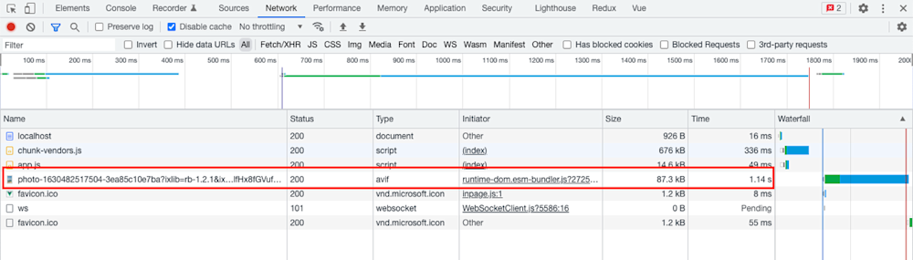
As you can see, our page load speed is fine for a small project, but it could be better. And with real websites serving dozens of images per page, this level of speed just won’t cut it. Which is why we’ll need a little extra oomph.
Cloudinary is a visual media platform used to upload, store, manage, transform, and optimally deliver images and videos for websites and applications. The platform also offers a vast collection of SDKs for frontend frameworks and libraries. We’ll be using it to optimize our images to improve our page loading speed, but they have much more to offer than that.
To use Cloudinary in our application, you’ll need to create an account. Thankfully, it’s entirely free to get started!
Using Cloudinary to Optimize Images and Speed Page Load
We’ll start by adding Cloudinary to our application by running the command below:
npm install @nuxtjs/cloudinary
Then, we’ll modify the nuxt.config.js file by adding Cloudinary y as a module in the modules section:
modules: [
    //other modules here
    '@nuxtjs/cloudinary', //add this
  ],
After that, we’ll configure Cloudinary by adding a section below the modules section, as shown below:
modules: [
    //other modules here
    '@nuxtjs/cloudinary',
  ],

//add this
cloudinary: {
    cloudName: '<your-cloud-name>',
    useComponent: true,
  },
The useComponent flag set to true lets us use the built-in Cloudinary components. Our cloud name is obtained from our Cloudinary dashboard. You can get the Cloudinary cloud name by logging into the Cloudinary console and viewing any of the highlighted sections as shown below:
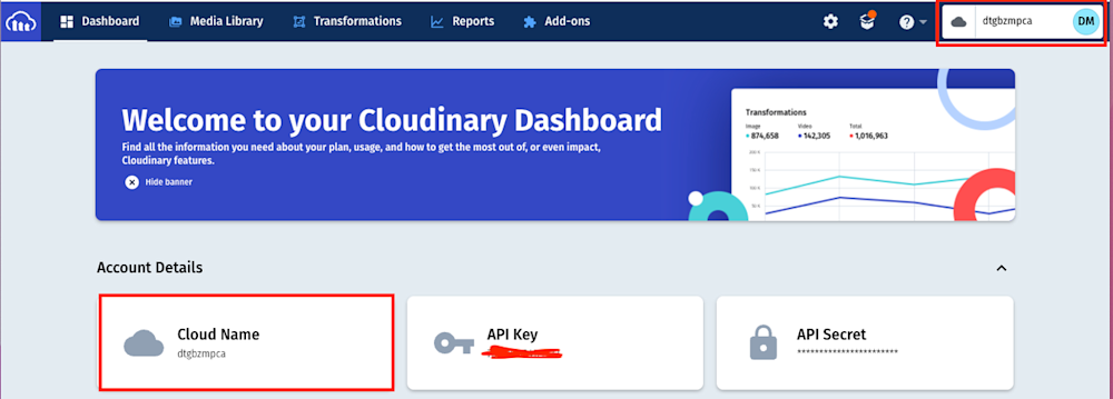
Image sourcing and upload to Cloudinary
Now that we have Cloudinary added to the project we’ll need to upload the below sample image from Unsplash:
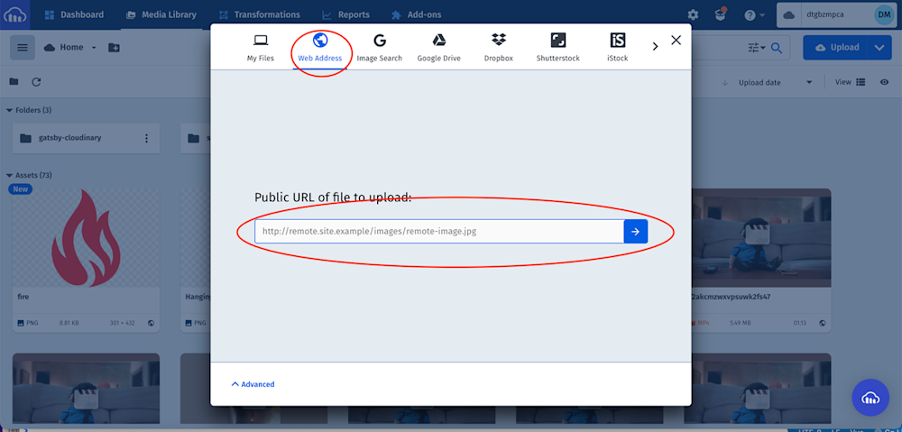
In your Cloudinary dashboard, upload the image by clicking on the Media Library tab, clicking on Upload, selecting the Web Address option, inputting the URL, then clicking on the Arrow Button:
PS: Cloudinary provides multiple sources of uploading media assets.
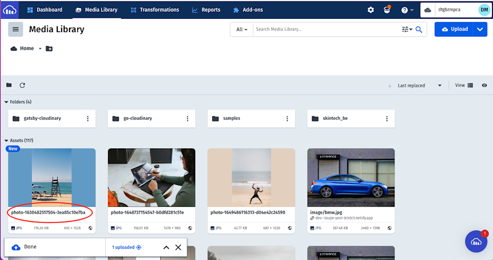
After uploading the image, we will see it displayed on the console with its PublicID, the unique identifier for an asset stored in Cloudinary. This ID will come in handy when resizing images in our application.
Optimizing Our Application with Cloudinary
Now that we have our images ready and Cloudinary is already integrated, let’s get to optimizing. Modify the index.vue file in the pages folder to the following:
<template>
  <div class="container border border-primary p-5 rounded">
    <div class="d-flex flex-column justify-items-center align-items-center">

      <div class="mb-3 d-flex flex-column align-items-center">
        <cld-image public-id="photo-1630482517504-3ea85c10e7ba" class="mb-2">
          <cld-transformation height="80" width="80" crop="fill" />
          <cld-transformation radius="max" />
        </cld-image>
        <h5 class="mb-0">Daniel Mark</h5>
        <p>Software Engineer</p>
      </div>

      <div class="card" style="width: 288px">
        <cld-image public-id="photo-1630482517504-3ea85c10e7ba">
          <cld-transformation height="320" crop="fill" />
        </cld-image>
        <div class="card-body">
          <h5 class="card-title">Bio</h5>
          <p class="card-text">
            Lorem ipsum dolor sit amet consectetur adipisicing elit. Soluta nobis
            expedita, ipsum,
          </p>
        </div>
      </div>
    </div>
  </div>
</template>
<script>

export default {
  name: "App",
  components: {},
};
</script>

<style></style>
The snippet above uses the cld-image component to render the image by passing its PublicID and the cld-transformation to resize and crop.
Now we can start a development server and confirm the sizes of the rendered images:
Conclusion
Bootstrap offers frontend developers a solid starting point for site design. With its easy to use setup and broad adoption, it can help even the most seasoned UI/UX devs. But using it alone isn’t the answer when it comes to managing digital media. Instead, you should be leveraging technology like Cloudinary.
Not only can it help your devs speed up page load time by optimizing images, but it can also help resize images on the fly without needing to use Bootstrap or CSS. And that’s just scratching the surface of Cloudinary’s powerful platform.
If you want to overhaul your media management, get started with Cloudinary today. It’s free!
More from Cloudinary:

