When developers first figured out how to build responsive websites, their solutions forced users on low-resolution displays to load images sized for high-resolution displays. This resulted in performance issues and turned visitors away.
To tackle these issues, developers introduced new responsive images with HTML5. Though the new approach addressed the issues, new problems arose when handling images at scale.
This article will show how to create responsive images with HTML5, problems associated, and how to solve them by implementing high performance responsive images for all viewers, irrespective of their resolution.
HTML5 responsive image features
Responsive images with HTML5 provide tools to markup image elements that can adapt to any user’s display. Two of the tools it brings are the srcset and sizes <img> tag attributes.
These attributes make it possible to offer multiple sizes of the same image, leaving the user’s browser to select the best size to display, solving performance issues.
How do srcset and sizes work?
To explain how srcset and sizes work, below is an <img> tag with the attributes:
    <img
       alt="image alt text"
       src="dog_picture.jpg"
       srcset="
          small.jpg 270w,
          medium.jpg 400w,
          large.jpg 720w
       "
       sizes="
          (min-width: 960px) 540px, 100vw
       "
    >
In the above <img> tag, you have the alt text and src added, so if a browser does not support srcset and sizes, it will fallback to src.
For srcset:
srcset="small.jpg 240w, medium.jpg 300w, large.jpg 720w"
The above srcset attribute specifies three sizes of the same image. The image width is specified in pixels (w for width).
For sizes, you specify the size of the image and in which situation it must be displayed using the combination of a media query and the width of the images:
sizes="(min-width: 960px) 540px, 100vw"
In the sizes code above, you are telling the browser:
- If the viewport width equals 960px or greater, then show the image with a width of 540px
- If the viewport width is smaller than 960px, then show the image as wide as the viewport (100vw means 100% of the viewport width).
Now, you may notice that in the example of srcset, there’s no image 540px in width. That’s not an issue because the user’s browser will select the best image available in size. In this case, large.jpg will be used with a width of 720px.
Creating multiple asset variants, at scale
Serving small, medium, and large versions of a single image (like in the example above), is a minor inconvenience. But when multiplied by a page worth of images, it becomes a tedious burden.
So, how do you solve this problem?
Enter Cloudinary
Using Cloudinary, you can upload a high-resolution image and deliver it in as many sizes as possible via URL parameters. The best part? It’s 100% free to use.
Getting started
To get started, view and fork the demo on Codepen.
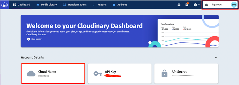
If you don’t have a Cloudinary account, create one for free. After creating an account and logging in, navigate to the Media Library on the top left corner of the Dashboard:
In the Media Library, click on Upload and select the image you want to use.
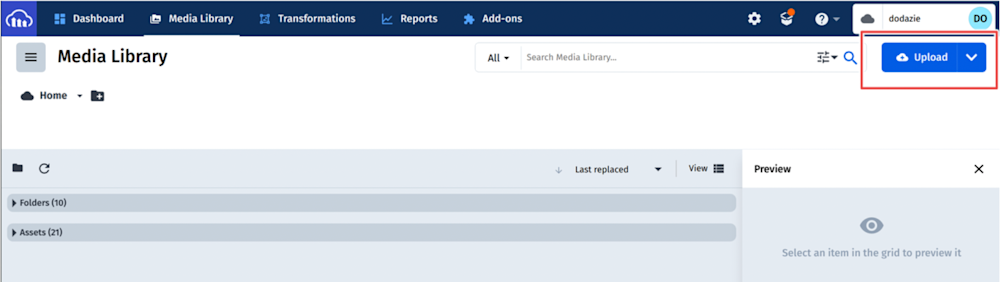
* Note there are multiple ways to upload an image to Cloudinary.
After uploading your image, copy its url:
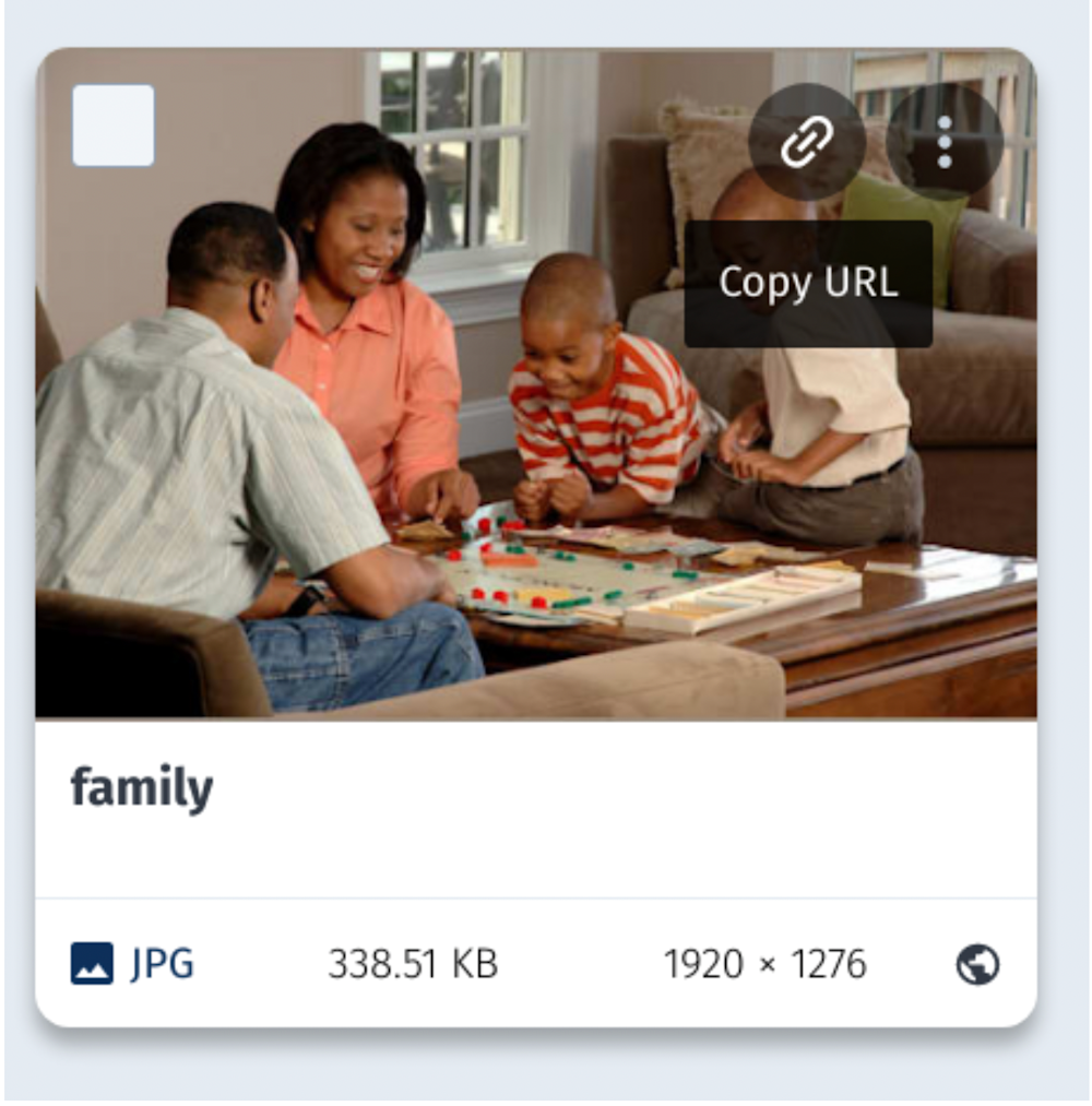
The URL of the image uploaded for this article is:
https://res.cloudinary.com/dodazie/image/upload/family.jpg
To break down the uploaded url:
- res.cloudinary.com/ is the base Cloudinary URL.
- dodazie is the Cloudinary account cloud name.
- image/upload/ is the path to the uploaded image in your media library.
- ‘family’ is the name of the uploaded image.
- .jpg can be any format of your image. You can also request a .png or .gif format, even though the original image is another format. Cloudinary will convert any format on-the-fly!
Use Cloudinary’s image transformation features to control how your image will be sized for delivery.
Resizing the image with image transformations
All resizing actions will happen between the url’s upload/ and image name using the Cloudinary image transformations url parameters.
First, scale the image. To do that, you can use Cloudinary’s Width parameter. Add a W_ and a number into the URL and Cloudinary will give you the image scaled to that many pixels across (magic!)
The URL will now be:
https://res.cloudinary.com/dodazie/image/upload/w_512/family.jpg
When you click on the above url, you will notice that the scale has reduced. If you download the image, the size will be less than the initial 338.51KB.
Let’s say you want to reduce the image size further. You can choose to trade off quality for lighter images using Cloudinary’s quality parameter.
Alternatively, Cloudinary can automatically select the best format for the viewer’s browser by adding the f_auto parameter to the URL.
The image URL will now be:
https://res.cloudinary.com/dodazie/image/upload/f_auto,w_512/family.jpg
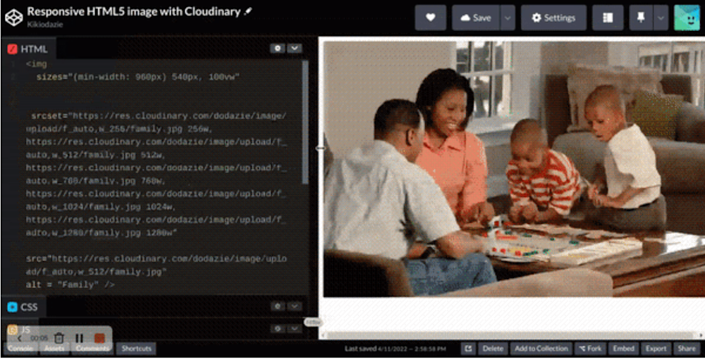
Now that you know how to use Cloudinary’s image transformations to generate resized and optimized versions of original images, add the Cloudinary urls w into your <img> tag:
    <img
      sizes="(min-width: 960px) 540px, 100vw"
      srcset="
    https://res.cloudinary.com/dodazie/image/upload/f_auto,w_256/family.jpg 256w,
    https://res.cloudinary.com/dodazie/image/upload/f_auto,w_512/family.jpg 512w,
    https://res.cloudinary.com/dodazie/image/upload/f_auto,w_768/family.jpg 768w,
    https://res.cloudinary.com/dodazie/image/upload/f_auto,w_1024/family.jpg 1024w,
    https://res.cloudinary.com/dodazie/image/upload/f_auto,w_1280/family.jpg 1280w"
      src="https://res.cloudinary.com/dodazie/image/upload/f_auto,w_512/family.jpg"
      alt= "Family"
    >
The above image is now fully responsive:
Conclusion
This article demonstrated how to implement responsive images with HTML5 and Cloudinary. Try it out today to start delivering optimized media assets. Additionally, Cloudinary offers many more features that can help reduce the complexity of serving responsive images; check them out on the Cloudinary documentation.
More from Cloudinary:

