What Is CSS?
Cascading Style Sheets (CSS) are the standard technology for defining the visual styles in webpages. At their most basic, CSS styles text, such as by defining its font size and color. More advanced CSS defines dynamic page layouts, images, and other visual elements, as well as changes to the appearance of a page triggered by JavaScript.
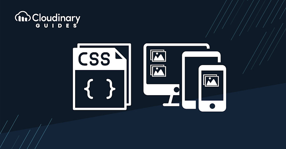
What Are Responsive Images?
Responsive web design (RWD) leverages flexible layouts, CSS media queries, and flexible images to build webpages, changing webpage layouts according to the visitor’s screen size and orientation.
Responsive images send small, low-resolution versions of images to small screens and large, high-resolution images to larger monitors. That step occurs before the browser starts loading CSS and images, ensuring a crisp look on both device types and downloads of the appropriate images.
This article covers the following topics:
Five Key CSS Techniques for Adding Responsive Images
With CSS’s background property, you can add responsive images to webpage elements to facilitate the repetition of complex images. When combined with media queries, background enables conditional image loading according to factors like screen resolution.
An effective and straightforward approach to making images responsive is by setting an image’s width as a percentage of its parent container. As a result, when the parent container’s size changes, the image’s size will adjust proportionally.
Additionally, for better customization, adding specific classes to images can help manage their responsiveness using @media queries in the CSS. This method provides more flexibility when adjusting image sizes across different devices.
1. Defining the Art Direction and Conditional Image Loading With Media Queries
Besides shaping the page layout through conditional image loading, media queries direct art according to the viewport’s width by, for example, ensuring that larger screens download the large.png image in the code below and apply it to <div>, the content’s division element. On the other hand, screen sizes that are below a certain threshold display a smaller image.
.example {
  height: 1200px;
  background-image: url(large.png);
  background-repeat: no-repeat;
  background-size: contain;
  background-position-x: center;
}
@media (max-width: 1000px) {
  body {
    background-image: url(bkg.png);
  }
  .example {
    background-image: url(small.png);
  }
}
2. Providing High-Resolution Images and Art Direction With Media Queries
With media queries, you can create rules for the device-pixel ratio so that users can specify various images for 1x and 2x displays:
@media (min-resolution: 2dppx),
(-webkit-min-device-pixel-ratio: 2)
{
  /* High dpi styles & resources here */
}
The Chrome, Opera, and Firefox browsers support the min-resolution: 2dppx standard. Other browsers, including Android and Safari, require an older prefixed syntax that doesn’t have a dppx unit. Since the browser loads only these styles if the devices match the media queries, be sure to also specify the base-case styles (see below). A major advantage of this technique is that browsers that do not support resolution-specific media queries render images nonetheless.
.sample {
  width: 150px;
  height: 150px;
  background-image: url(pic1x.png);
}
@media (min-resolution: 2dppx), /* Standard syntax */
(-webkit-min-device-pixel-ratio: 2)  /* Safari & Android Browser */
{
  .sample {
    background-size: contain;
    background-image: url(pic2x.png);
  }
}
min-width is another option for displaying images based on viewport size. The browser would not download the image if it doesn’t match the criterion set by the media query. This example mandates that a browser download the background image and apply it to the page body only if the image width is 600 pixels or more:
@media (min-width: 600px) {
  body {
    background-image: url(bkg.png);
  }
}
3. Providing High-Resolution Images With the image-set Function
The CSS image-set() function enhances the behavior of the background property and makes it easier to furnish different image files for various device types. Browsers can choose the most suitable image according to the device’s characteristics, e.g., a 2x image for a 2x display. At times, as in the case of limited network bandwidth, the browser might display a smaller image, e.g., a 1x image for a 2x device. See the code below.
background-image: image-set(
  url(pic1x.jpg) 1x,
  url(pic2x.jpg) 2x
);
Here, the browser loads the appropriate image and scales it to fit the screen or viewport. It assumes that the 2x image is twice the size of the 1x image, scaling the 2x image down to half its original size and ensuring that the image size appears to be the same on the page.
Note that the relatively new image-set() function works on only a few browsers—so far, on Chrome and Safari only with the -webkit prefix. Hence, be sure to add to your responsive webpages fallback images for browsers that do not support image-set(), like this:
.pic {
  width: 150px;
  height: 150px;
  background-image: url(pic1x.png);
  background-image: -webkit-image-set(
    url(pic1x.png) 1x,
    url(pic2x.png) 2x
  );
  background-image: image-set(
    url(pic1x.png) 1x,
    url(pic2x.png) 2x
  );
}
With this setup, browsers that support image-set() load the correct image; other browsers, the smaller image. The main drawback is that, given the low support for image-set(), most browsers end up displaying the smaller image (pic1x.png).
4. Creating Responsive Images on Fluid Layouts
It can be challenging to create responsive images on fluid layouts. Since images are usually the heaviest elements on a website, they must load before the other elements. Browsers often address this issue by scanning the HTML code for image URLs and starting to load them before performing other tasks, e.g., building the DOM, putting the layout together, and loading external CSS.
Browsers automatically know the environments for the web elements, e.g., viewport size, screen resolution, etc., which are leveraged by responsive webpages for media queries. However, browsers must know the image source even before looking up the rendered size of an image. To adapt images to fluid layouts, you can, for example, define the rendered size of each of the images and communicate that data to the browser.
The sizes attribute serves that purpose. For example, the w descriptors in srcset can specify the number of pixels in each of the source images, based on which the browser then picks the smallest image source whose resolution is high enough for the viewport.
Take a responsive image with three sizes:
small.png(240 × 160 pixels)medium.png(480 × 320 pixels)large.png(960 × 640 pixels)
A fluid layout would contain a flexible grid with one column for small viewports, two columns for mid-sized viewports, and three columns for large viewports:
<img srcset="small.png 240w,
medium.png 480w,
Large.png 960w"
sizes="(min-width: 36em) 33.3vw,
100vw"
src="small.png">
By defining the image sources by means of srcset with w descriptors, the above script passes on the actual image widths (in pixels) to the browser. Note that the script defines only image widths because, for simplicity, responsive images usually take into account widths, not heights.
To recap:
- The
widthdescriptor specifies the pixel count for image sources. - The
sizesattribute tells the browser the number of pixels required based on the final width of the rendered image. Early on,sizespasses on the page layout to the browser, which can then choose the appropriate image source before rendering the CSS code for the page.
To learn how to automate tasks related to responsive images, see the documentation on combining responsive automation with other Cloudinary features.
5. Specifying the Maximum Width Values
Web designers and developers often create responsive images with the max-width property, which specifies an element’s maximum width. No images can be wider than the max-width value, e.g., an image with a width of 1,000 pixels cannot generate an image of 1,200 pixels. Likewise, if the screen width is 640 pixels, the browser does not display the full image.
Therefore, be sure to set the max-width value to 100% so as to shrink the image to match the device:
img {
  max-width: 100%;
  width: 1000px; // Assume this is the default size.
}
The image is now fluid on all devices that are less than 1,000 pixels wide. For wider devices, however, the browser does not enlarge the image to fit the screen, which is the main drawback of max-width given its effect on image responsiveness.
Pro TipResponsive solutions using Cloudinary
When it comes to images, a responsively designed website should not just send a high-resolution image and rely on browser resizing to display the image on various devices. The image should be prepared in multiple resolutions so the requesting device can load only the image data that it needs.
-> Learn more about Responsive Images using HTML with Cloudinary
Automating Responsive Images With Cloudinary
A cloud-based service for managing images and videos, Cloudinary offers a generous free-forever subscription plan. While on that platform, you can upload images and apply built-in effects, filters, and modifications. You can also create image effects that are difficult or impossible to produce with just CSS.
Cloudinary makes it simple to deliver responsive images by doing the following:
- Dynamically transform images — Generates transformed (e.g., resized or cropped) versions of images on the fly with Cloudinary dynamic URLs. This capability is especially useful in conjunction with the HTML srcset attribute and <picture> element, enabling the browser to choose which image version to display.
- Automating responsive images with JavaScript front-end frameworks (client side) — Programmatically sets the <img> src URL to a Cloudinary dynamic URL that delivers the optimal image for the available image width.
- Automating responsive images with the cloudinary-core JS library (client side) — Programmatically sets the <img> src URL to a Cloudinary dynamic URL that delivers the optimal image for the available image width and the device’s DPR.
- Automating responsive images with Client Hints (mobile Chrome only) — Delivers the optimal image for the available width and the device’s DPR as specified in the Client Hints request header.
- Combining responsive automation with other Cloudinary features — Implements advanced RWD and art-directed, responsive images by leveraging Cloudinary’s other automation features.

