
React is an open-source, frontend JavaScript library for building user interfaces. Applications built in React support performance enhancement, user interface focused design, reusable components, and cross-platform support.
Due to React’s open-source initiatives, it has seen tremendous adoption in building applications that run on both web and mobile. Technologies, like Next.js, Gatsby.js, and Remix have built robust frameworks based on the React ecosystem.
Most React-based technologies are constantly improving and updating, and in response, developers are continually having to learn how to use images on various frameworks, and deal with breaking changes when upgrading project dependencies.
In this article, you will learn how to handle responsive images in React.
Some framework approaches to handling images
Most React-based frameworks provide components for rendering optimized and performant images. Let’s explore some of their syntax below:
Next.js approach: Provides an image component for rendering and optimizing images.
    <Image
      loader={myLoader}
      src="sampleImage.png"
      alt="Picture of the sample"
      width={500}
      height={500}
Gatsby approach: Provides StaticImage and GatsbyImage for rendering static and dynamic images.
    <StaticImage
      src="sampleImage.png"
      alt="Picture of the sample"
      placeholder="blurred"
      layout="fixed"
      width={500}
      height={500}

    //OR

    <GatsbyImage
      image={sampleImage}
      alt="Picture of the sample"
      width={500}
      height={500}
Remix approach: Uses the native img element to render images.
    <img

      src="sampleImage.png"
      alt="Picture of the sample"
While most framework-based solutions have proven to be effective in rendering and optimizing images, developers have been tasked with constantly switching context between the frameworks, keeping up-to-date on changes, and factoring in breaking changes during upgrades.
Cloudinary — learn once, implement everywhere!
Cloudinary is a visual media platform used to upload, store, manage, transform, and deliver images and videos for websites and applications. The platform also offers a vast collection of SDKs for frontend frameworks and libraries.
Cloudinary-react is a React SDK library developed to optimize and transform media assets effortlessly. Developers are independent of any framework when serving images on web applications and websites.
A Cloudinary account is needed to follow along with this tutorial. Signup is completely free and is free forever.
Pro Tip!Improve Core Web Vitals with Cloudinary
If you want to improve your Core Web Vitals metrics and make your website faster, we recommend you to deliver responsive images. Cloudinary allows you to dynamically resize your images on the fly as needed, with added features such as size optimization and format conversion.
Sandbox
We completed this project in a CodeSandbox. Fork and run it to quickly get started on creating responsive images in React.
<CodeSandbox id="silly-davinci-s1uvmq" title="How to handle responsive images in react" />
Github link here.

Getting started
Create a React project by navigating to the desired directory and running the below command in a terminal:
npx create-react-app handle_resp_img && cd handle_resp_img
The command creates a React project called ‘handle_resp_img,’ and navigates to the project directory.
* Potential breaking changes in React: due to a recent upgrade in React version (“^18.0.0”), you might need to downgrade your application to a compatible version by deleting the generated node_modules folder.
Next, modify the package.json file, as shown below:
    {
      "name": "resp_image",
      "version": "0.1.0",
      "private": true,
      "dependencies": {
        "@cloudinary/react": "^1.2.2",
        "@cloudinary/url-gen": "^1.7.0",
        "@testing-library/jest-dom": "^5.16.4",
        "@testing-library/react": "^12.1.4",
        "@testing-library/user-event": "^13.5.0",
        "react": "^17.0.0",
        "react-dom": "^17.0.0",
        "react-scripts": "5.0.0",
        "web-vitals": "^2.1.4"
      },

      "scripts": {
        "start": "react-scripts start",
        "build": "react-scripts build",
        "test": "react-scripts test",
        "eject": "react-scripts eject"
      },

      "eslintConfig": {
        "extends": [
          "react-app",

          "react-app/jest"
        ]
      },

      "browserslist": {

        "production": [
          ">0.2%",

          "not dead",
          "not op_mini all"
        ],

        "development": [
          "last 1 chrome version",
          "last 1 firefox version",
          "last 1 safari version"
        ]
      }
    }
The snippet above:
- Line 11: changed the react version to “^17.0.0”.
- Line 12: changed the react-dom version to “^17.0.0”.
Re-install the dependencies by running the following command:
npm install
Proceed to install the cloudinary-react dependency with:
npm i cloudinary-react
Include Cloudinary’s cloud name as an environment variable. To do this, first create a .env file in the root directory, and in this file, add the following snippet:
REACT_APP_CLOUDINARY_CLOUD_NAME=/*YOUR CLOUD NAME HERE/*
* Get the Cloudinary cloud name by logging into the Cloudinary console and viewing any of the highlighted sections shown below:

Image sourcing and upload to Cloudinary
To follow along, upload the below sample image from Unsplash to handle responsive images in React.
In the Cloudinary dashboard, you can upload the image by clicking on the Media Library tab, then Upload, select the Web Address option, input the url, then clicking on the Arrow Button:
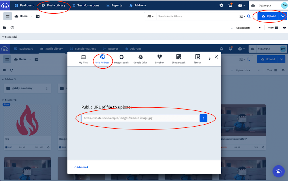
* Note there are multiple ways to upload images to Cloudinary.
After uploading the image, it will be displayed on the console with its Public ID (the unique identifier for an asset stored in Cloudinary). This ID will come in handy when creating responsive images in React.
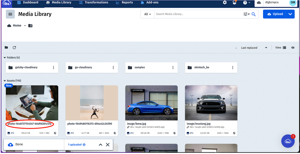
* When you upload the image, the Public ID can be fairly long. Double click on the image to rename it.
Handling a responsive image in React
Modify the App.js file in the src folder to the following:
import './App.css';
    import { Image, Transformation, CloudinaryContext } from 'cloudinary-react';

function App() {

return (

<div className='App'>
<header>
<h1>Responsive Image</h1>
</header>
<div className='image-wrapper'>
<CloudinaryContext
cloud_name={process.env.REACT_APP_CLOUDINARY_CLOUD_NAME}
<Image publicId='photo-1648737154547-b0dfd281c51e'>
<Transformation width='400' crop='scale' />
</Image>
</CloudinaryContext>

</div>
</div>
);
}

export default App;
The above snippet:
- Imports the required dependencies.
- Configures CloudinaryContext as a wrapper with the cloud name. CloudinaryContext serves as a container for Cloudinary components and passes all the properties defined to the children.
- Uses the Image component to render the uploaded image by passing in the Public ID..
- Uses the Transformation component to transform the image as desired.With that done, we can start a development server using the below command:
npm start
Conclusion
This post discussed how to handle responsive images in React. With the cloudinary-react library, developers can seamlessly optimize and deliver images across multiple React-based frameworks and libraries, without having to learn their specific approaches. Try Cloudinary out (it’s free forever!) to unleash the full potential of your digital media.
More from Cloudinary: