
HTML provides several robust methods for creating responsive images that adapt to different screen sizes, resolutions, and device capabilities. The primary tools for achieving this are the <img> element with its srcset and sizes attributes, which allow browsers to select the most appropriate image based on device pixel density and viewport size, and the <picture> element, which enables art direction by specifying different images for various breakpoints or formats. These techniques ensure that your images look sharp and load efficiently across desktops, tablets, and mobile devices, optimizing both user experience and performance.
In this guide, you’ll learn not only the basics of adding images in HTML, but also how to implement responsive images using srcset, sizes, and <picture>, as well as how to leverage modern image formats and integrate with services like Cloudinary for advanced automation and delivery.
In this article:
- What Are Responsive Images?
- Why Should You Create Responsive Images in HTML?
- How Do You Create Responsive Images in HTML?
Before diving into the specifics of responsive images, it’s important to understand the basics of adding and manipulating images in HTML. To insert an image, the <img> tag is used, which is an “empty element” and does not require a closing tag. Key attributes of this tag include:
src: Specifies the image’s relative or absolute file location.alt: Adds alternate text for the image, which is crucial for accessibility and SEO.width: Sets the width of the image.height: Sets the height of the image.
To add an image, follow these steps:
- Upload the image file to your server or hosting.
- Access the theme or HTML folder where your web page is located.
- Add the
<img>tag to your HTML and set thesrcattribute to point to the image location. - Optionally, set the
widthandheightattributes to define the image size. - Always add an
altattribute to describe the image. - Save the changes to your HTML file.
In addition to these basics, images in HTML can be used in various interactive ways, such as creating an image button by placing the <img> tag inside a <button> tag, creating a clickable image link with <img> and <a> tags together, or overlaying text on an image by using a div with a class named “image-container” and adding an image within it.
What Are Responsive Images?
By dynamically adapting to changes in screen resolution, screen size, or other differences among client devices, responsive images are part of a RWD [responsive web design] process that ensures that a site can accommodate environmental constraints: display dimensions and quality, connectivity and network conditions, available input types. You can place responsive images in various locations, including website content, headers, and backgrounds.
Responsive images must render at different pixel ratios on different devices to reflect the pixel depth of the viewing device. In addition, a responsive or fluid layout must be able to squeeze or stretch to cater to changes in screen size. All that requires multiple images being available in several resolutions to appropriately scale the screen across various sizes.
Why Should You Create Responsive Images in HTML?
According to Statista, more than 90% of internet users worldwide access the web on mobile devices. Since most webpages contain images, let alone that search engines measure web performance through image metrics, responsive images help achieve optimal performance and deliver a positive user experience.
Generally, browsers preload images before parsing CSS, i.e., before the site’s JavaScript detects the viewport width based on which to modify images. That’s why HTML is a more ideal choice than CSS for coding responsive images.
For more details, see responsive image CSS.
How Do You Create Responsive Images in HTML?
You can create responsive images in HTML in the three ways below.
Art Direction
As an alternative to the srcset and sizes attributes, HTML’s <picture> element enables you to define breakpoints, which are critical points at which a page’s design changes for an enhanced user experience. You can display a different image at each breakpoint, a technique known as art-directing images.
The sample code below provides three options for displaying the image of a house:
- A zoomed-out image that shows the house and its surroundings
- A regular image that shows only the house
- A zoomed-in image that shows the important elements of the house
<picture>
  <source
    srcset="house-zoomed-out.jpg"
    media="(min-width: 1200px)"
  />
  <source
    srcset="house-normal.jpg"
    media="(min-width: 800px)"
  />
  <img
    src="house-zoomed-in.jpg"
    alt="Baby Sleeping"
  />
</picture>
This code creates two breakpoints:
- If the screen size is less than 1,200 px., which is too small to show the entire image, switch the image to
house-normal.jpg. - If the screen size is less than 800 px., show the zoomed-in version so that viewers can still see the important elements of the house even on small screens.
To learn how to automate tasks related to responsive images, see the documentation on combining responsive automation with other Cloudinary features.
Resolution Switching
Switching an image’s resolution enables viewing of that image on different devices. Typically, you specify multiple versions of the image and display the one that is most appropriate to the user’s current display.
Before, you could specify only one source file with HTML’s <img> element for the browser. Now you can add more source images with hints in the srcset and size attributes to help the browser choose the right image.
Below is an example:
<img srcset="cute-cat-480w.jpg 480w,cute-cat-800w.jpg 800w"
  sizes="(max-width: 600px) 480px,800px"
  src="cute-cat-800w.jpg"
  alt="Cute cat sitting on the porch">
Both srcset and sizes contain a comma-separated list of values:
- srcset specifies the absolute sizes of the images as choices for the browser.
The syntax is as follows:
The image’s file name, a space, the image size with the w unit
The value of w denotes the intrinsic size of the image in storage—not pixels, which denote the size of the image as displayed on the screen.
- sizes defines the media conditions, such as the screen width, and specifies the optimal image size to select for a specific media condition. Here’s a list of all the available media features.The syntax is as follows:The name of the media feature, a colon, the condition to look for, a space, the width the image fills if the media condition is true.
Setting srcset and sizes with max-width triggers the following browser process:
- The browser looks up the width of the device.
- The browser identifies the first media condition in the sizes attribute that is true.
- The browser looks up the slot size specified in the media query.
- The browser loads an image with the same size, if available; and, if not, the first image that is larger than the selected slot size.
Here are the related scenarios:
- If a user accesses the page with a viewport of width 500, because the media condition is true (width of less than 600), the browser loads the image with size 480w, saving . significant bandwidth for users with smaller screens.
- If a user accesses the page with a viewport of width 700, the browser loads the larger image of 800w.
- If a user accesses the page with an old browser that does not support media queries, the browser complies with the settings of the regular src attribute and loads the 800w image—regardless of screen size.
Using <img> with srcset and sizes for Responsive Images
The <img> element, combined with the srcset and sizes attributes, is a foundational approach for delivering responsive images in HTML.
- The srcset attribute allows you to specify a list of image sources with their corresponding widths or pixel densities, enabling the browser to select the most suitable image based on the device’s screen characteristics.
- The sizes attribute provides hints to the browser about the intended display size of the image in different viewport scenarios, further optimizing image selection and loading performance.This method is particularly effective for serving different resolutions of the same image, ensuring crisp visuals on both standard and high-DPI (Retina) displays while minimizing unnecessary bandwidth usage.
Image-Format Switching
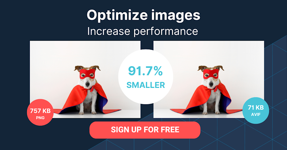
New image formats like WebP, replete with small file size and high quality, are widely used and supported by all modern browsers. Google’s website-performance guidelines now explicitly require that websites adopt modern image formats when possible.
To switch image format according to browser capabilities, add the <picture> element. The following example shows various image formats to switch to, depending on the MIME type supported by the browser.
<picture>
  <source type="image/svg+xml" srcset="car.svg">
  <source type="image/webp" srcset="car.webp">
  <img src="car.png">
</picture>
The first option is the most lightweight SVG. If the browser does not accept it, the next option is WebP. And if the browser rejects both, it loads the traditional PNG format.
As in the previous code examples, a comma-separated list of the srcset and sizes properties denotes the multiple image sizes for each format.
The <picture> Element for Art Direction and Format Switching
The <picture> element is a versatile tool in HTML for responsive images, enabling both art direction and format switching. By nesting multiple <source> elements with different media queries or type attributes, you can serve entirely different images or formats based on device characteristics such as screen width or browser support.
This is especially useful when you want to display a cropped or differently composed image on mobile versus desktop, or when you want to provide modern formats like WebP or AVIF with fallbacks for older browsers. The browser evaluates each <source> in order and selects the first match, ensuring optimal delivery and presentation for every user scenario.
How Do You Create Responsive Images in HTML With Cloudinary?
A cloud-based service for managing images and videos, Cloudinary offers a generous free-forever subscription plan. While on that platform, you can upload images and apply built-in effects, filters, and modifications. You can also create image effects that are difficult or impossible to produce with just CSS.
Cloudinary makes it simple to deliver responsive images by doing the following:
- Dynamically transform images — Generates transformed (e.g., resized or cropped) versions of images on the fly with Cloudinary dynamic URLs. This capability is especially useful in conjunction with the HTML srcset attribute and <picture> element, enabling the browser to choose which image version to display.
- Automating responsive images with JavaScript front-end frameworks (client side) — Programmatically sets the <img> src URL to a Cloudinary dynamic URL that delivers the optimal image for the available image width.
- Automating responsive images with the cloudinary-core JS library (client side) — Programmatically sets the <img> src URL to a Cloudinary dynamic URL that delivers the optimal image for the available image width and the device’s DPR.
- Automating responsive images with Client Hints (mobile Chrome only) — Delivers the optimal image for the available width and the device’s DPR as specified in the Client Hints request header.
- Combining responsive automation with other Cloudinary features — Implements advanced RWD and art-directed, responsive images by leveraging Cloudinary’s other automation features.

