Since 2015, WordPress has been at the forefront of supporting responsive images, a feature that automatically scales images to fit the screen or device they are viewed on. When an image is uploaded in WordPress using the media uploader, responsive attributes are applied to those images automatically, streamlining the process of image optimization.
For optimal display, certain image sizes are recommended for WordPress websites. For instance, blog post images should ideally be 1200 x 630 pixels, header images 1048 x 250 pixels, featured images can be 1200 x 900 pixels (landscape) or 900 x 1200 pixels (portrait), and WordPress background images should be around 1920 x 1080 pixels.
Customizing WordPress settings and adding specific code can further enhance the responsiveness of your images. However, it’s not only about responsiveness: there are ways in which you can adapt your images in WordPress not only to be fully responsive for the UX but also to transform and optimize them for SEO and performance.
In this article, we’ll explore the ins and outs of implementing responsive images in WordPress. From beginners to seasoned developers, we’ll cover the practical aspects and big-picture insights needed to deliver visually stunning and optimized web experiences across devices.
What Are Responsive Images?
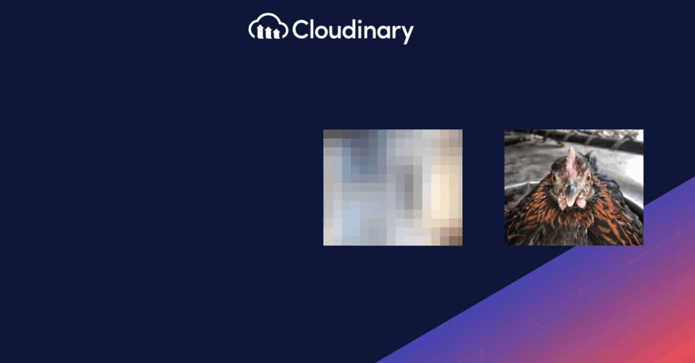
Responsive images are the unsung heroes ensuring that the visuals on a website look crisp and clear, regardless of the device you’re using. They adapt and serve the best image version based on the viewer’s screen size and device specifications.
Imagine browsing a website on your smartphone, and an image loads so large it’s clearly meant for a desktop. Not only does it take ages to load, but it also eats up unnecessary data. Responsive images ensure you see an image tailored just for your device, optimizing the viewing experience and loading speed.
Why You Should Use Responsive Images
Nobody wants to wait for a high-resolution image for a 4K monitor to load on their smartphone. Here’s why responsive images should be your go-to:
- Efficient Bandwidth Use. Why load a massive image file on a device that can’t even display it in its full glory? Responsive images ensure that only the most suitable image size is served, saving precious bandwidth.
- Speedy Page Loads. With responsive images, the data your device has to download is minimized, leading to faster page load times. And in the online world, every second counts!
- Enhanced User Experience. Have you ever been thrown off by an image that doesn’t fit the screen? Responsive images ensure visuals are displayed exactly as intended, making browsing a pleasure, not a chore.
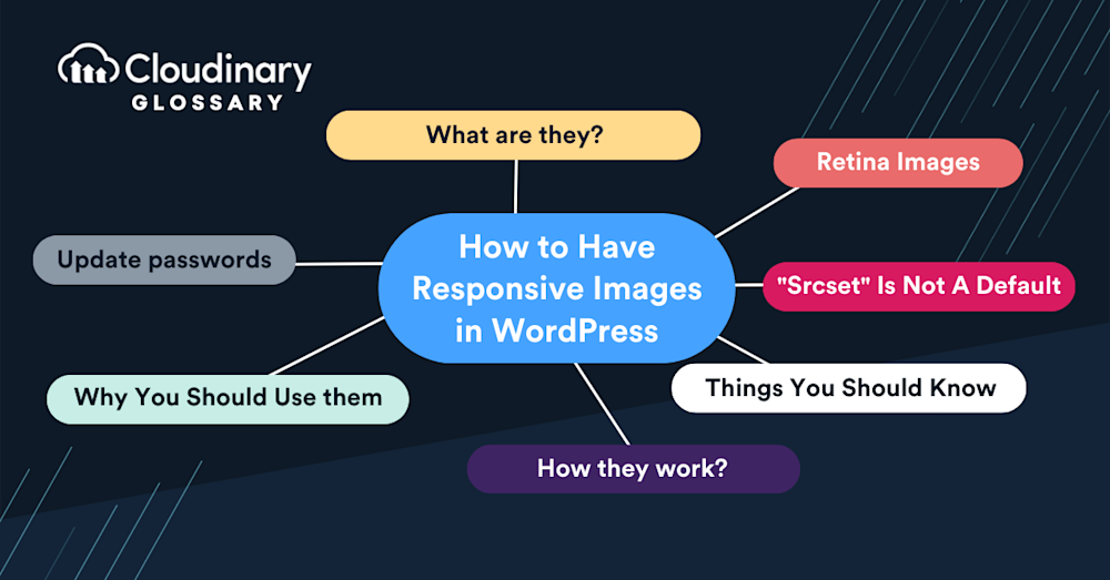
How Do Responsive Images Work in WordPress?
Responsive images are a feature in WordPress that automatically creates multiple sizes of each image uploaded to the media library. The magic happens when the browser recognizes the device it’s being displayed on and serves the appropriate image size. This means faster load times, a better user experience, and a boost in search engine optimization.
To add responsive images, you can upload multiple sizes or formats of an image. When a user visits your site, a combination of HTML, CSS, and JavaScript jumps into action to serve the image that fits the user’s screen parameters. So, whether someone’s checking out your site on a vintage iPad or the latest gaming monitor, they get the best visual experience possible.
Things You Should Know About Responsive Images
Before you dive into the world of responsive images, you should keep a few things in mind. While responsive images sound like a dream come true (and they often are), they’re not without their quirks.
Size Matters
The “sizes” attribute is optional but comes with a catch. It specifies the required image and the rendered width of the images. This means you need to ensure that the widths between images match. If they don’t, you might have a visual mess on your hands.
Another thing to note is that image rendering can vary by browser. Some browsers might prioritize cached versions of images, even if the size doesn’t match. This can lead to inconsistencies in user experience across different browsers.
“Srcset” Is Not A Default
Knowing that “srcset” isn’t a given in every theme is essential. Especially if you’re using a theme crafted by someone else, you might find that “srcset” isn’t implemented by default. Many themes, particularly the older ones, might not include this or the “sizes” attributes.
If you’re keen on using these attributes, you have several options. You can either customize the theme you’re currently using or switch to a different theme that already incorporates these attributes. Not sure if your theme uses “srcset”? A quick way to check is to pull up a page with an image on your desktop. Right-click the image, choose “Inspect,” and peek at the <img> element. If “srcset” is there, you’re good to go!
How Does Cloudinary Help You Regarding Responsive Images?
Cloudinary is an excellent addition to your toolbox when handling responsive images in WordPress. Integrating Cloudinary with your site streamlines your image optimization significantly. The platform provides:
- On-the-fly transformations. Automatic resizing, cropping, and format conversion to serve the most responsive image based on the viewer’s device.
- Efficient delivery. Leveraging a global CDN, Cloudinary ensures fast and efficient image delivery to your users regardless of location.
- Lightweight WordPress plugin. Cloudinary’s dedicated WordPress plugin simplifies the uploading, storing, and managing your media files directly within the WordPress dashboard.
- Optimized compression. Images are smartly compressed to save bandwidth without sacrificing quality.
These combined features improve site performance, seamless image management, and a top-notch browsing experience for your visitors.
The Wrap-Up On Responsive Images
As mobile browsing continues to rise, resulting in various screen sizes and resolutions, your site should adapt in kind. With responsive images, you’re enhancing the user experience by providing quick-loading, high-quality images and positively impacting your site’s SEO rankings. Responsiveness in images is no longer a luxury but a necessity that can cultivate visitor engagement, improve performance, and set your site apart in the digital landscape.
Venturing into responsive images doesn’t have to be intimidating or complicated, especially with robust tools like Cloudinary. As a cloud-based platform, Cloudinary can automatically transform, optimize, and deliver your WordPress images, mitigating the complexities tied with managing responsive images.
By incorporating effective usage of responsive images via Cloudinary, you’re carving out a path that leads to an improved, adaptable, and future-ready website — a way worth embarking on for any focused developer or site manager.

