What Is the CSS border Property?
The CSS border property is a shorthand property that allows you to set the appearance of an element’s border in a single declaration. It can be used to define the border width, border style, and border color for all four sides of an element. The border property is composed of three individual properties:
CSS Border Width
The border-width property: sSpecifies the thickness of the border. You can use length values (e.g., px, em, or rem) or predefined keywords (thin, medium, or thick).
CSS Border Style
The border-style property: dDefines the line style for the border. Some common values include solid, dashed, dotted, double, groove, ridge, inset, and outset.
The following values are allowed:
- dotted
- dashed
- solid
- double
- groove
- ridge
- inset
- outset
- none
- hidden
The border-style property can have from one to four values.
CSS Examples:
p.dotted { border-style: dotted; }
p.dashed { border-style: dashed; }
p.solid { border-style: solid; }
p.double { border-style: double; }
p.groove { border-style: groove; }
p.ridge { border-style: ridge; }
p.inset { border-style: inset; }
p.outset { border-style: outset; }
p.none { border-style: none; }
p.hidden { border-style: hidden; }
CSS Border Color
The border-color property: sets the color of the border. You can use color names, hexadecimal values, RGB, or RGBA values.
In addition to using these as a shorthand, each property can be set individually for granular control. For instance, border-style can be specified with one to four values, affecting each side of an element differently. If only one value is defined, it applies uniformly to all sides. If two values are used, the first value represents the top and bottom borders, and the second represents the right and left borders.
Similarly, border-width and border-color can also be defined with up to four values to control the appearance of each side of an element separately.
This is part of a series of articles about working with CSS images
In this article:
What Can You Do with CSS Borders?
The CSS border property has numerous use cases in web design and development. Some common applications include:
- Containing elements: Using borders to visually separate and contain elements like images, text, and other content can help organize the layout and make it easier for users to understand the structure of a web page.
- Highlighting sections: Applying borders to specific sections or elements on a page can draw attention to them, making them stand out from the surrounding content. This can be useful for highlighting important information, such as calls to action, notifications, or alerts.
- Table formatting: Borders are often used to style tables, making it easier to read and distinguish between rows and columns. By applying borders to table cells, rows, or the entire table, you can create a clean, organized presentation of data.
- Visual separation: Borders can be used to create visual separation between different sections or elements within a layout. This can help group related content together or distinguish between unrelated elements, improving the overall readability and organization of a web page.
- Decorative purposes: Borders can be used for purely decorative purposes, adding visual interest and style to a design. Creative use of border styles, widths, and colors can contribute to a unique and appealing visual appearance.
- Image frames: Applying a border to images can give them a framed appearance, making them stand out from the background and adding a touch of professionalism to a design.
- Buttons and form elements: Borders are commonly used to style buttons and form elements, making them more visually appealing and easier to interact with. Different border styles and colors can be used to indicate the state of a button or form element, such as hover, active, or disabled states.
- Card-based layouts: In modern web design, card-based layouts are prevalent. Applying borders to these cards can help separate content and make it more visually appealing and organized.
Additionally, for text elements specifically, you can use the text-stroke property to add an outline. This CSS property allows for the specification of the outline’s width and color, providing a way to highlight or stylize text content distinctively.
Related content: Read our guide to CSS image overlay
Pro Tip
Consider Cloudinary’s Digital Asset Management
Looking for a centralized location to manage all your media assets? Cloudinary’s Media Library makes it easy to upload, store, manage, and deliver images and videos efficiently.
3 Ways to Set an Inner Border in CSS
Here are several ways to apply a CSS inner border.
1. Using the Box-Sizing Property
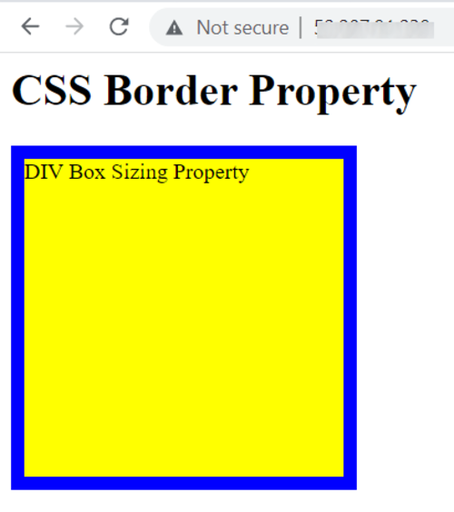
Adding a standard border to an element within a container increases the overall dimensions of that container. To avoid this, an inner border can be used as an effective alternative. It creates visual separation between the element and its outline or surrounding content without altering the container’s size. Inner borders can be applied to various elements, such as images, table cells, headers, and text. They can also take on different shapes, including square, rectangular, or circular, depending on the design requirements.
In CSS, the box-sizing property is a useful tool for creating inner borders. By setting it to “border-box”, the element’s padding and border are included within its defined width and height, preventing the overall size from increasing. For example, you can style a “div” by assigning it a width and height of 250px, applying a 10px solid blue border, and setting the background color to yellow, all while maintaining the element’s intended dimensions.
The div should thus have the dimensions 250×250 px. The added 10px border doesn’t change the container’s overall dimension because it is included inside the container. For example:
    div {
        box-sizing: border-box;
        -moz-box-sizing: border-box;
        -webkit-box-sizing: border-box;
        width: 250px;
        height: 250px;
        border: 10px solid blue;
        background: yellow;
    }
See the following sample code:
    <html>
    	<head>
    		<title>CSS Border</title>

    		<style>
    		div {
    			box-sizing: border-box;
    			-moz-box-sizing: border-box;
    			-webkit-box-sizing: border-box;
    			width: 250px;
    			height: 250px;
    			border: 10px solid blue;
    			background: yellow;
    		}

    		</style>
    	</head>

    	<body>
    		<h1>CSS Border Property</h1>

    		<div>
    			DIV Box Sizing Property
    		</div>

    	</body>
    </html>
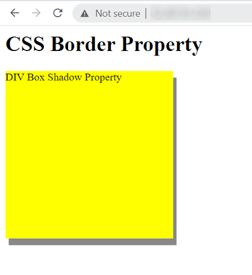
2. Using the Box-Shadow Property
Another approach to creating an inner border is with the box-shadow property in CSS. It lets you specify an inset shadow with the appearance of a border instead of a shadow. To achieve this effect, set the vertical and horizontal offset values as the first values for the box-shadow.
The remaining values (color, blur, and spread) are optional. Specify a small spread radius to create a narrow shadow and use the inset option to switch the outer shadow to an inner shadow. This shadow will then be inside the container and look like an inner border.

For instance, you can set the div’s width and height properties to 250px and the background to yellow. Using the box-shadow property, the spread radius should be set to 10px, with the other three options as 0px. Apply the color blue. The code should look like this:
    div {
        width:250px;
        height:250px;
        background-color:yellow;
        box-shadow: 5px 10px #888888;
    }

    We can use the following HTML code:

    <html>
    	<head>
    		<title>CSS Border</title>

    		<style>
    		div {
    			width:250px;
    			height:250px;
    			background-color:yellow;
    			box-shadow: 5px 10px #888888;
    		}

    		</style>
    	</head>

    	<body>
    		<h1>CSS Border Property</h1>

    		<div>
    			DIV Box Shadow Property
    		</div>

    	</body>
    </html>
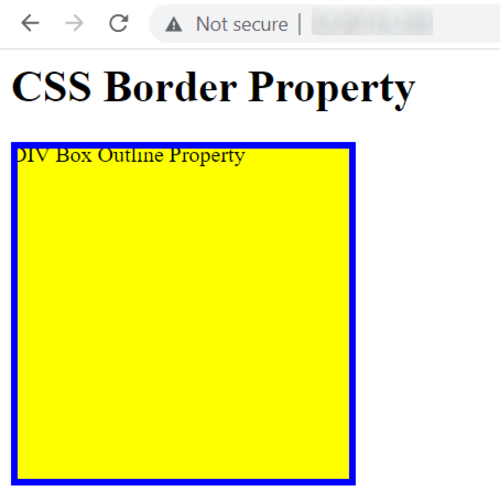
3. Using the Outline and Outline-Offset Properties
CSS offers properties that can effectively create the appearance of an inner border. The outline property draws a line outside an element’s border and allows you to define the style, width, and color of that line. To control the space between the outline and the actual border, the outline-offset property is used. Together, these properties help achieve a layered border effect without affecting the element’s layout or dimensions.
For instance, you could specify the div’s width and height as 250px and set the background to yellow. To create an inner border, divide the border’s width by two (in this case, 5px) and set the outline property as blue. The outline-offset property should have a negative value (-5px) to switch the outer border to an inner border.
This approach works by creating an outer border using the outline property and then inverting it with the outline-offset property. For example:
    div {
        width: 250px;
        height: 250px;
        background: yellow;
        outline: 5px solid blue;
        outline-offset: -5px;
    }
We can use the following code:
    <html>
    	<head>
    		<title>CSS Border</title>

    		<style>
    		div {
    			width:250px;
    			height:250px;
    			background-color:yellow;
    			box-shadow:0px 0px 0px 10px blue inset;
    		}

    		</style>
    	</head>

    	<body>
    		<h1>CSS Border Property</h1>

    		<div>
    			DIV Border Outline Property
    		</div>

    	</body>
    </html>
Related content: Read our guide to css stretch background image.

