What Is :hover in HTML and CSS?
In HTML-based web development, you may often use the :hover pseudo-class to create interactive elements on web pages. The :hover selector in CSS selects elements when you mouse over them. These elements can be anything from links and images to paragraphs and divs. When you apply the :hover pseudo-class to an element, you can change its properties, such as color, size, position, or the entire image.
An interesting way to use the :hover pseudo-class is to change an element’s image when the user hovers over it. This feature often creates engaging and interactive visuals on a webpage. It adds a touch of dynamism and interactivity to otherwise static web pages.
This is part of a series of articles about CSS Image.
In this article:
Benefits of Adding Image Hover Effects in HTML
There are numerous benefits to adding hovering effects in HTML, including the ability to change images.
Enhanced Visual Appeal
Adding hovering effects, especially the ability to change images on hover, significantly enhances a website’s visual appeal. It allows for a more dynamic interaction with the site, where images can transform to highlight information, showcase alternative views, or simply serve as a visual treat.
Improved User Interaction
Using hover effects improves user interaction by providing immediate feedback to users about their actions or choices. When an image changes upon hovering, it shows users they can interact with that element. This visual cue can be instrumental in guiding users toward making certain decisions, like clicking on a link or button. It also adds a layer of interactivity that can make navigation more interesting and engaging.
Improved Usability
These hover effects can also improve a website’s usability. By changing images on hover, web designers can use visual cues to indicate actionable items or provide additional information without cluttering the page. For example, a product image that changes to show a different angle or color option on hover can help users make informed decisions without needing to navigate away from the current page.
Related content: Read our guide to HTML image slider

How to Change Image on Hover with HTML and CSS
Let’s look at how to implement the :hover feature in CSS to change images.
Method 1: Change Image on Hover Using the background-image Property
You can use the background-image property in CSS to change an image when hovering over it. This approach involves setting a background image for a block-level element (like a div or button) and changing it when the user hovers over that element.
Our HTML is simple and looks like this:
<div class="image-hover"></div>
Then, in our CSS file, we should have something like this:
.image-hover {
    width: 300px; /* Specify the width */
    height: 200px; /* Specify the height */
    background-image: url('default-image.jpg'); /* Initial background image */
    background-size: cover; /* Cover the entire area of the element */
    transition: background-image 0.5s ease-in-out; /* Smooth transition */
}

.image-hover:hover {
    background-image: url('hover-image.jpg'); /* Change on hover */
]
In this method, the .image-hover class is assigned to a div that initially displays default-image.jpg as its background. Upon hovering, the background image changes to hover-image.jpg. The transition property is used to ensure that the image change occurs smoothly, enhancing the user experience.
Method 2: Change Image on Hover Using the Display Property
Another approach is to use two separate image elements and control their visibility with the display property in CSS.
This method provides more flexibility regarding the content structure and can be useful when the images contain links or additional interactive elements.
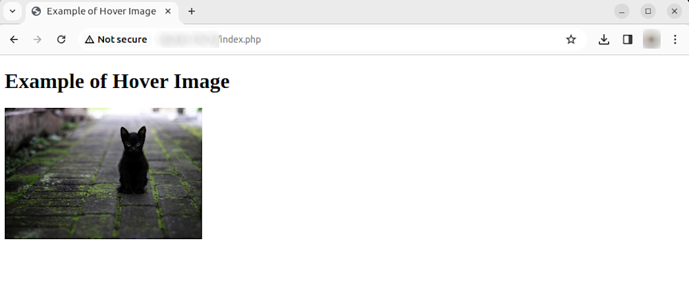
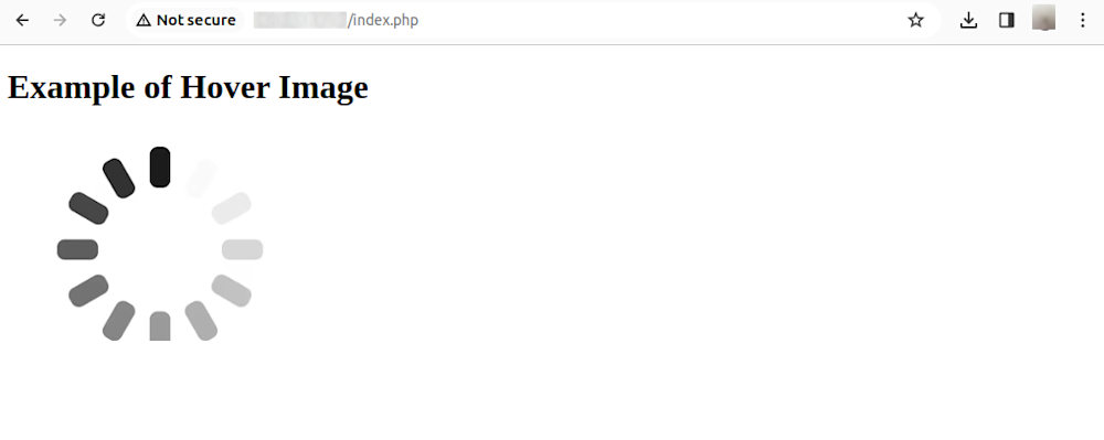
Our HTML should look a little like this, including both of our images in <div> elements:
    <div class="imageBox">
      <div class="imageInn">
        <img src="cat_img.jpg"  alt="Default Image">
      </div>
      <div class="hoverImg">
        <img src="loading.png" alt="Profile Image">
      </div>
    </div>
Then, using some in-line styling, we can add this to our HTML:
      <style>

    .imageBox {
      position: relative;
      float: left;
    }

    .imageBox .hoverImg {
      position: absolute;
      left: 0;
      top: 0;
      display: none;
    }

    .imageBox:hover .hoverImg {
      display: block;
    }

    .imageBox:hover .hoverImg {
        display: block;
    }

      </style>
In this setup, both the default and hover images are placed within a .image-wrapper container. The .hover-image is initially hidden using display: none;. When the user hovers over the .image-wrapper, CSS rules hide the .default-image and display the .hover-image instead.
This method allows for more complex interactions, such as independently adding animations or hover effects to each image.
Automatically Rescaling Images for Interactive Elements with Cloudinary
When creating interactive elements with images on your web pages, you will need to deliver images that are precisely resized and cropped to the required size. This gets more complex in a responsive website because you need to provide different images for different screen sizes and layouts.
Cloudinary is a cloud-based media management service with a generous free plan that simplifies working with images and videos. It allows users to perform various operations on their media files, including resizing, cropping, and optimization, through a simple URL-based interface or via SDKs for all popular programming languages.
URL parameters are the key-value pairs included in the URL that instruct Cloudinary on how to manipulate and deliver the requested image or video. Using these parameters, you can easily apply a wide range of transformations to your media files without needing manual intervention or additional server-side processing.
Let’s see how to effortlessly resize and rescale background images with Cloudinary. To try out the instructions below with your own images, sign up for a free Cloudinary account and upload the image to Cloudinary.
Limit Images to Specific Dimensions
To limit the size of an image to certain dimensions, change the crop value (c in URLs) to limit (c_limit).
Below is an image resized from 850 x 565 px. to 70 x 70 px, with the limit option. Due to the preserved aspect ratio, this display is 70 x 47 px.
While this might sound similar to rescaling images with CSS, there is a crucial difference. Cloudinary resizes the image on the server side and delivers it to the client in its smaller size. You can’t do that with CSS, which makes a huge difference in page load time.
https://res.cloudinary.com/demo/image/upload/w_70,h_70,c_limit/cashew_chicken.jpg
Learn more in the Cloudinary Cookbook
Crop Images With Auto Gravity
While resizing images, crop the images with Cloudinary’s intelligent auto-gravity features to focus on certain details—faces, objects, color contrasts, and more. The parameter to set is gravity (g in URLs), which offers an auto value (g_auto) that intelligently crops according to your image’s content.
Cloudinary automatically crops images with content-aware, AI-based features by selecting faces, individual features, or areas of interest. This example with the g_auto setting crops the most interesting area, as determined by AI:
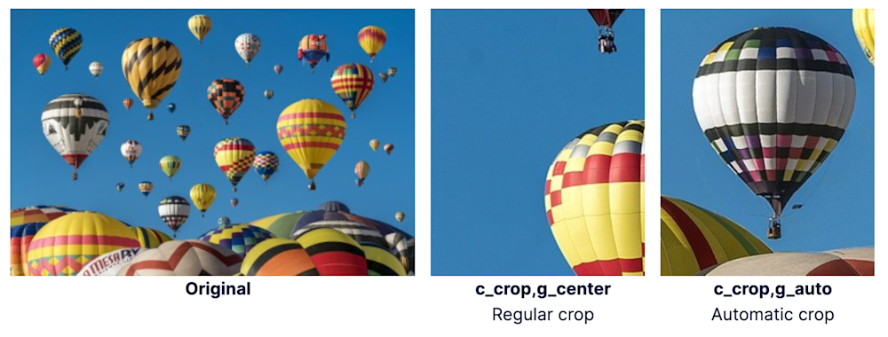
https://res.cloudinary.com/demo/image/upload/c_crop,g_auto,h_250,w_200/docs/hot-air-balloons.jpg
Learn more about gravity-based cropping in our tutorial
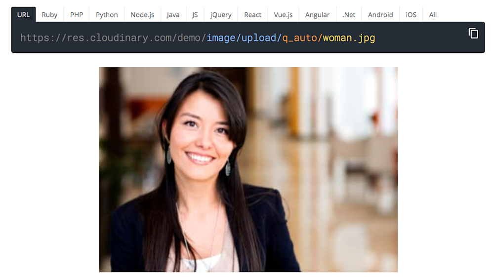
Automatically Optimize Image Quality
Cloudinary’s quality parameter (q in URLs) has an auto option (q_auto) that automatically compresses and tunes images to the smallest-possible image size without sacrificing image quality.
Here’s how it works. You add the q_auto parameter to the image URL. Cloudinary’s intelligent quality and encoding algorithm assesses the image content, format, and viewing browser. The algorithm identifies the optimal quality-compression level and encoding settings, compressing and encoding the image in the best way possible for each individual user.
This process ensures that websites, browsers, viewers, and devices are served with a compressed version of a superior-quality visual. Below is an example. If you view this example on a modern browser instead of the JPG image, you will see the image loads as a modern WebP image with a much smaller size.
https://res.cloudinary.com/demo/image/upload/q_auto_woman.jpg
See more examples of quality optimization on our demo page.
Sign up for a free Cloudinary account to get these features and much more.

