
What Is a Full Page Background Image?
A full page background image is a web design technique where an image is set to cover the entire visible page of a website. It can help create a captivating visual experience for site visitors and add depth to a website’s design. The image can be static or dynamic, depending on the site owner’s preference.
When used correctly, full page background images can significantly improve a website’s aesthetic appeal. They can help create a specific mood or atmosphere, highlight the website’s theme or brand, or offer a more immersive user experience. However, implementing a full page background image requires a good understanding of CSS.
Before we start
Using background images? There’s an easy, automatic way to resize, crop, and make them responsive.
Cloudinary is a cloud-based image management platform with a generous free plan. Cloudinary can:
- Resize your images on the server side so they load faster for users
- Automatically crop images with AI-based object and face recognition
- Automatically optimize image quality for faster page load time
- Expand images and fill in missing details with generative AI
- Automatically adapt images to responsive layouts
You can sign up for free and try it yourself, or learn more below.
This is part of a series of articles about CSS Image
In this article:
- How Do Backgrounds Work in CSS?
- Tutorial: Create a Full-Screen Responsive Background Image with CSS
- Optimizing Your Background Images with Cloudinary
How Do Backgrounds Work in CSS?
CSS backgrounds are used to define how an element’s background should look. CSS background properties are versatile, allowing developers to specify background colors, images, gradients, and patterns. These properties include background-color, background-image, background-size, background-repeat, background-position, and background-attachment, among others.
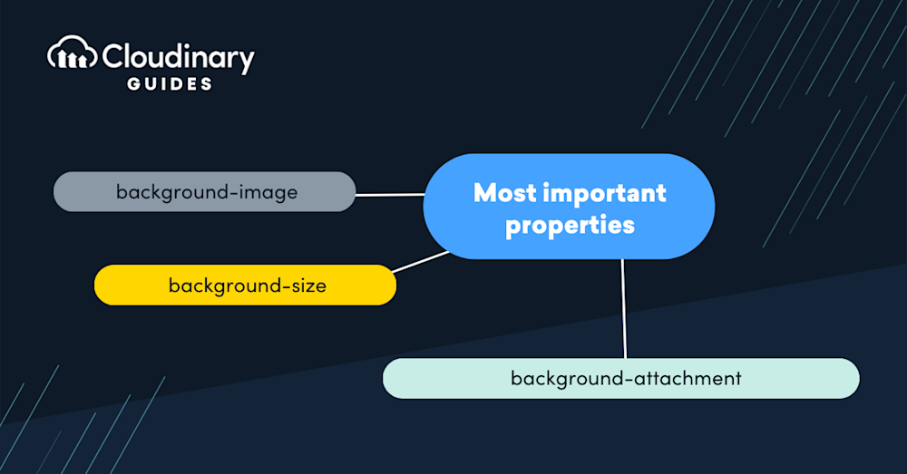
Let’s briefly review the most important properties:
- background-image sets one or more background images for an element. When using this property, the images are layered on each other, with the first image closest to the viewer.
- background-size is particularly important for full page backgrounds, as it determines how the background image should be scaled or stretched to cover the element. background-repeat controls if/how the image should repeat itself to fill the element, and background-position sets the starting position of the image.
- background-attachment determines whether the background image scrolls with the rest of the page or remains fixed.
While full page background images can enhance the visual appeal of a website, it’s essential to consider accessibility. A background image should not hinder the readability of the content overlaid on it. Proper contrast between the text and the background is crucial. CSS provides the backdrop-filter property, which can apply visual effects to the area behind an element. For instance, a slight blur or brightness reduction on a background image can improve text readability without sacrificing design.
Related content: Read our guide to CSS image overlay
Tutorial: Create a Full-Screen Responsive Background Image with CSS
Here is an overview of the steps required to create a responsive full page background image.
Setting a Background Image
The first step in creating a full-screen responsive background image is setting the background image itself. To do this, we use the CSS property background-image. Here is a simple example:
body {
background-image: url('path/to/your/image.jpg');
}
In the code above, we’re setting the background image of the body element to the image located at path/to/your/image.jpg. This path can be a local file path or a URL to an image on the internet.
Understanding the background-size Property
Simply setting the background image isn’t enough. By default, the image will repeat itself to fill the entire element. It also won’t scale with the size of the element, potentially leading to distorted or pixelated images. This is where the background-size CSS property comes in. It allows you to control the size of the background image and how it scales with the element’s size.
There are several values you can set for the background-size property:
- auto: This is the default value. The width and height of the image are set to their natural dimensions.
- length: You can specify the width and height of the image in pixels, ems, or any other CSS length value.
- percentage: You can specify the width and height of the image as a percentage of the element’s width or height.
- cover: The image will scale as much as needed to cover the element while maintaining its aspect ratio completely.
- contain: The image will scale as much as necessary to fit entirely within the element while maintaining its aspect ratio.
For a full-screen responsive background image, we typically use the cover value:
body {
background-image: url('path/to/your/image.jpg');
background-size: cover;
}
In the code above, the background image will scale as much as needed to cover the entire body element while maintaining its aspect ratio. This ensures the image always fills the whole screen, regardless of the size or aspect ratio.
Important note
When using background-size:cover, you will need to manually crop and rescale images to prevent them from being distorted.
The cover option does not maintain aspect ratio. If you choose contain instead, the image will preserve aspect ratio, but the background image might not cover the full page. To make it look good, you will need to prepare an image with the appropriate size for each screen resolution.
With Cloudinary, you can automatically crop, rescale, and adapt your images to the required screen size. Cloudinary can automatically crop images with AI-based object and face recognition, expand images, and fill in missing details with generative AI.
The image-set() Function
The image-set() function is a CSS function that allows you to specify multiple images for different screen resolutions. This is particularly useful in ensuring your full-screen responsive background image looks sharp on high-resolution screens.
Here is an example of how to use the image-set() function:
body {
background-image: image-set(
url('path/to/your/image.jpg') 1x,
url('path/to/your/image@2x.jpg') 2x,
url('path/to/your/image@3x.jpg') 3x
);
background-size: cover;
}
In the code above, we’re specifying three different versions of the image for different screen resolutions. The 1x version is used for standard resolution screens, the 2x version is used for screens with twice the standard resolution (like Retina displays), and the 3x version is used for screens with three times the standard resolution.
Using the image-set() function ensures your full-screen responsive background image always looks sharp, regardless of the screen resolution.
Adding Dynamic Background Images
So far, we’ve been setting the background image directly in the CSS code. However, you might want to change the background image dynamically based on user interactions or other conditions in many cases. This can be achieved using JavaScript.
Here is a simple example of how to change the background image using JavaScript:
function changeBackgroundImage(imagePath) {
document.body.style.backgroundImage = "url('" + imagePath + "')";
}
In the code above, the changeBackgroundImage() function changes the background image of the body element to the image located at imagePath. You can call this function whenever you want to change the background image.
Note: You will need to use an onload() event handler in the body tag to load the background image.

Optimizing Your Background Images with Cloudinary
A crisp, compelling, full-page background image can significantly elevate your website’s visual experience. However, ensuring these images don’t hamper your website’s performance can be challenging. This is where Cloudinary steps into the limelight, offering an elegant solution for optimizing and delivering background images efficiently without sacrificing quality. In this segment, we’ll dive into what Cloudinary is, how it seamlessly blends with CSS for full-page background images, and why it’s a game-changer for web developers aiming to balance aesthetics and performance.
Cloudinary is a cloud-based service that provides an end-to-end image and video management solution. It’s designed to help web developers and marketers automatically optimize their media assets for the web. With features like automatic resizing, cropping, compression, and format conversion, Cloudinary ensures that your images are high-quality and web-friendly.
How Cloudinary Powers Image Optimization
Optimizing images for the web is crucial for visual appeal, website performance, and SEO ranking. Large, unoptimized images can slow down your site, negatively impacting user experience and search engine ranking. Cloudinary uses advanced algorithms to analyze each image, adjusting its compression level and format based on the content and viewing context. This means you can serve high-quality images that load faster and consume less bandwidth.
Automating Background Images with CSS and Cloudinary
Integrating Cloudinary with CSS for full-page background images is straightforward and powerful. Using Cloudinary’s URL-based API, you can apply transformations and optimizations to your images directly within your CSS file. Here’s a simple example to illustrate how this works:
body {
background-image: url('https://res.cloudinary.com/your-cloud-name/image/upload/q_auto,f_auto/w_1200/nice-background.jpg');
background-size: cover;
background-position: center center;
}
In this example, ‘q_auto‘ and ‘f_auto‘ are Cloudinary’s smart compression and format selection features, ensuring the image is delivered in the optimal format with the right compression level. The ‘w_1200’ parameter dynamically resizes the image to fit the width of the page, enhancing load times and performance without manual intervention.
Beyond just optimization and automation, using Cloudinary for your website’s background images comes with several added benefits:
- Responsive Delivery – Cloudinary automatically scales and delivers images best suited for the user’s device, ensuring a flawless visual experience across all platforms.
- Enhanced Performance – By reducing file sizes and leveraging modern formats like WebP, Cloudinary can significantly improve your website’s loading time, a factor that’s increasingly important for SEO.
- Ease of Use – Cloudinary’s comprehensive documentation and supportive community make it easy for developers to integrate and utilize its powerful features, regardless of their expertise level.
By harnessing the power of Cloudinary for your website’s background images, you’re not just optimizing media but elevating the entire user experience. Whether you’re building a portfolio, an e-commerce platform, or a blog, Cloudinary’s comprehensive image management capabilities ensure your website remains at the forefront of performance and design.
Reduce your website’s load time and improve SEO with Cloudinary’s optimization features. Sign up for free today.

