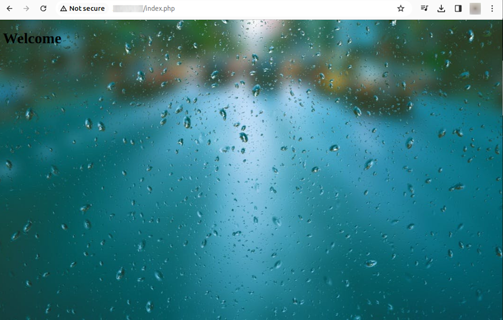
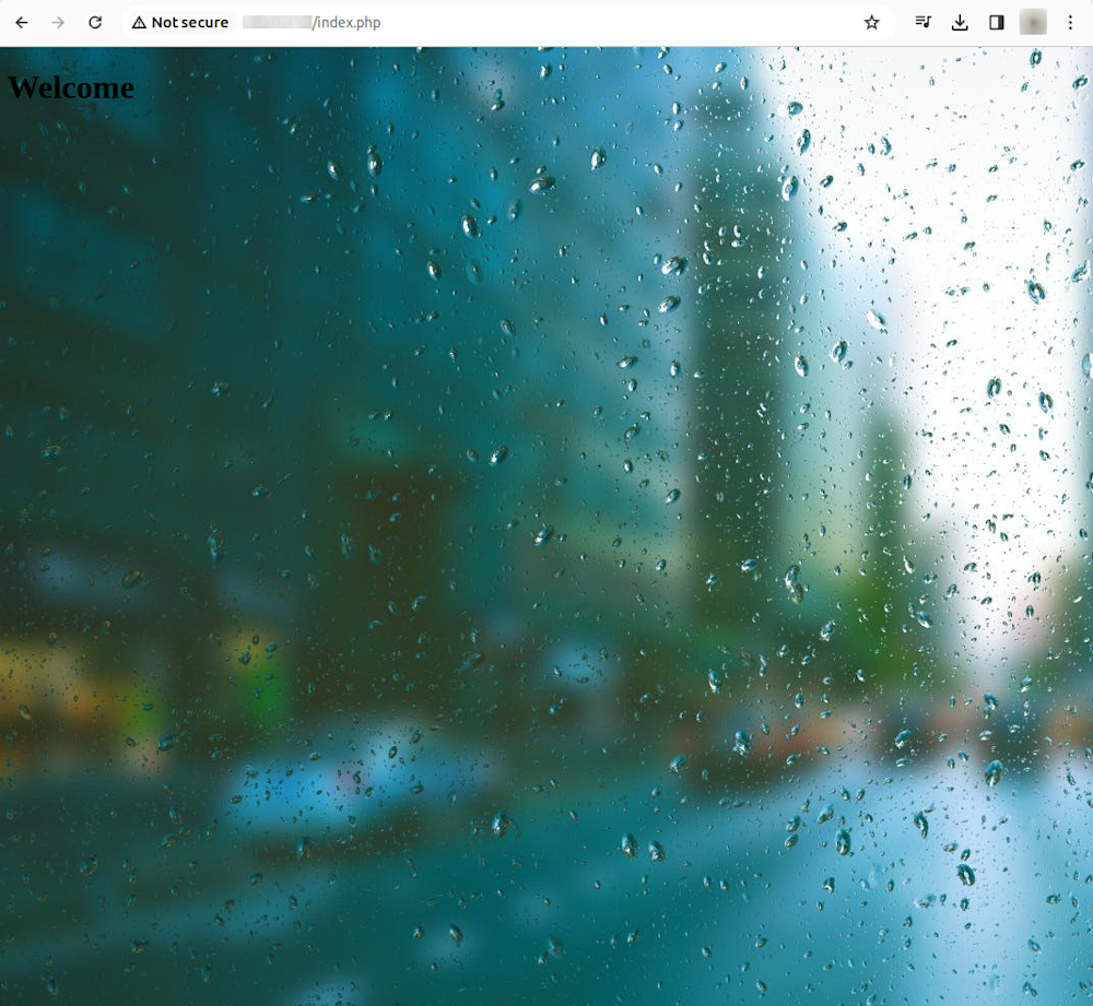
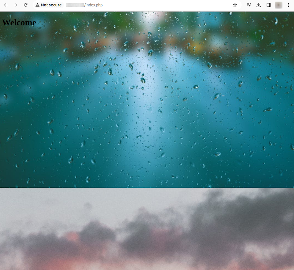
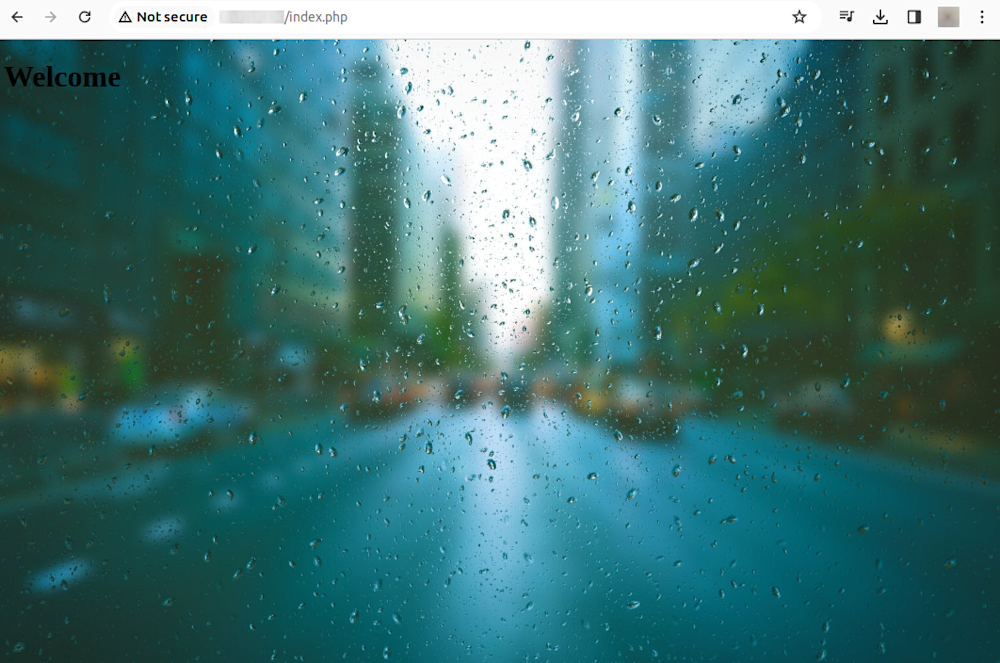
The background-image property in CSS allows you to set an image as the background for any HTML element. This property can add a single image or multiple images or even create an image gradient as the background.
In CSS, you can control the position of the background image, whether or not the image should be repeated, the scrolling behavior of the image, and much more. Let’s look deeper into the syntax to understand how you can manipulate the CSS background image property to our advantage.
Before we start
Using background images? There’s an easy, automatic way to resize, crop, and make them responsive
Cloudinary is a cloud-based image management platform with a generous free plan. Cloudinary can:
- Resize your images on the server side so they load faster for users
- Automatically crop images with AI-based object and face recognition
- Expand images and fill in missing details with generative AI
- Automatically adapt images to responsive layouts
You can sign up free and try it for yourself or learn more below.
This is part of a series of articles about CSS Image
In this article:
- Background Image Syntax in CSS
- Working with CSS Background Images
- 3 Tips for Automating Background Images
Background Image Syntax in CSS
The generic syntax of the CSS background-image property is:
background-image: url('path_to_your_image');
With this syntax, the ‘url()‘ function specifies the path to the image. The image path can either be an absolute path or a relative path.
With this syntax, the ‘url()‘ function specifies the path to the image. The image path can either be an absolute path or a relative path.
The CSS background-image property also allows you to specify multiple images as backgrounds layered on top of each other. The syntax for multiple images is:
background-image: url('path_to_first_image'), url('path_to_second_image');
In this, each image is separated by a comma. The first image in the list is the topmost layer, and the rest of the images follow in the order specified.
Working with CSS Background Images
Set Background Position
The background-position property in CSS allows you to position a background image exactly where you want it. It can take two values representing the horizontal and vertical positions, respectively. For instance, background-position: center center; will position the background image in the middle of the container.
body {
  background-image: url('image.jpg');
  background-position: center center;
}
In the example above, the background image is vertically and horizontally centered. You can also use keywords like top, bottom, left, and right to position the image or specific measurements like pixels or percentages.
Background Image Repeat
The background-repeat property is one of the most commonly used properties when working with CSS background images. A background image will repeat itself horizontally and vertically by default to fill the entire container. However, this may not always be the effect you’re looking for.
body {
  background-image: url('image.jpg');
  background-repeat: no-repeat;
}
In this example, our background image isn’t repeated. Setting the background-repeat property to no-repeat prevents the image from repeating itself. Other possible values for this property include repeat-x (repeat horizontally), repeat-y (repeat vertically), or repeat (repeat in both directions).
Multiple Backgrounds
CSS allows you to add multiple background images to a single element. This can be achieved by specifying each background image in the background-image property, separated by a comma. The first image in the list will be the one closest to the viewer, and the last one will be the furthest.
body {
  background-image: url('image1.jpg'), url('image2.jpg');
  background-position: center, top;
  background-repeat: no-repeat;
}
In this example, image1.jpg will be positioned at the element’s center and will not be repeated. image2.jpg will be placed at the top and will repeat itself to fill the remaining space of the component. This feature can be useful when creating complex designs or effects.
Resizing and Attachment of Background Image
The background-size property in CSS allows you to control the size of the background image. It can take values like cover (which resizes the background image to cover the entire container), contain (which resizes the image to the largest size such that its width and height can fit inside the area), or specific dimensions.
body {
  background-image: url('image.jpg');
  background-size: cover;
}
You can also control whether a background image scrolls with the rest of the page or is fixed with the background-attachment property. For instance, background-attachment: fixed; will create a “parallax” effect where the background image does not move with the rest of the page.
Learn more in our guide to stretching background images
Background Gradients
Another feature of CSS background images is the ability to create gradients, a smooth transition between two or more colors. CSS offers three types:
- Linear – Colors shift from one to another based on the direction (up, down, left, right, or diagonally).
- Radial – A central point is defined, where the colors will shift outwards from that point.
- Conic – They still share a central point, but colors are rotated around that point instead of shifting outwards.
body {
  background-image: linear-gradient(red, yellow);
}
In this example, our background image will be a gradient transitioning from red to yellow. You can also create radial gradients with the radial-gradient() function or combine multiple gradients for more complex effects.
Using Transparency
The opacity of a background image can be controlled with the background-color property in conjunction with RGBA color values. An RGBA color value includes the red, green, and blue components and an alpha component representing transparency.
body {
  background-image: url('image.jpg');
  background-color: rgba(255, 255, 255, 0.5);
}
In the example above, a white (255, 255, 255) semi-transparent (0.5) background color is applied on top of the background image. This can be useful when you want to overlay text or other content on top of a background image and ensure it’s still readable.
3 Tips for Automating Background Images
When using background images, it can be difficult to manually rescale and crop them, especially in a responsive design. With Cloudinary, you can completely automate the process and even expand images by filling in the missing details with generative AI.
Cloudinary is a cloud-based media management service with a generous free plan, simplifying working with images and videos. It allows users to perform various operations on their media files, including resizing, cropping, and optimization, through a simple URL-based system or via SDKs for all popular programming languages.
URL parameters are the key-value pairs included in the URL that instruct Cloudinary on how to manipulate and deliver the requested image or video. Using these parameters, you can easily apply a wide range of transformations to your files without needing manual intervention or additional server-side processing.
A major advantage of using Cloudinary for image resizing is that the service dynamically resizes images on the server side before they are delivered to users, solving the problems of CSS-based resizing.
Let’s see how to effortlessly resize and rescale background images with Cloudinary. In order to try out the instructions below with your own photos, sign up for a free Cloudinary account and upload the image to Cloudinary.
1. Limit Images to Specific Dimensions
To limit the size of an image to specific dimensions, we can change the crop value (c in URLs) to have a limit (c_limit).
Below is an image that’s been resized from 850 x 565 px. to 70 x 70 px. with the limit option. Due to the preserved aspect ratio, this display is 70 x 47 px.
https://res.cloudinary.com/demo/image/upload/w_70,h_70,c_limit/cashew_chicken.jpg
![]()
Learn more in the Cloudinary Cookbook
2. Crop Images With Auto Gravity
To focus on specific details—faces, objects, color contrasts—while resizing images, we can crop the images with Cloudinary’s intelligent auto-gravity features. The parameter to set is gravity (g in URLs), which offers an auto value (g_auto) that intelligently crops according to your image’s content.
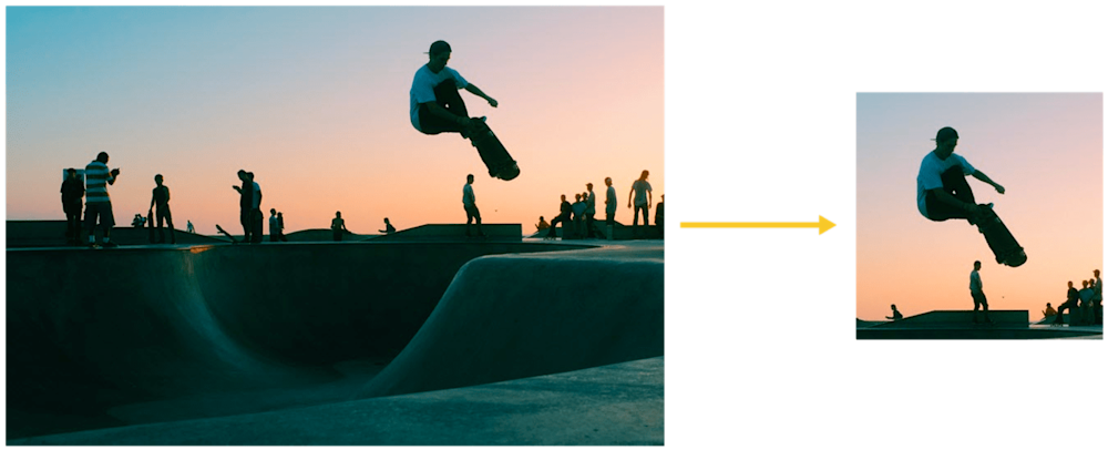
Cloudinary automatically crops images with content-aware, AI-based features by selecting faces, individual features, or areas of interest. Look at how Cloudinary uses the g_auto setting to crop the most interesting area, as determined by AI:
Another example of avoiding irrelevant objects instead of the product in product images taking center stage is defining the product as the focus. The picture on the right below has the backpack in focus.
This code uses g_auto:classic
https://res.cloudinary.com/demo/image/upload/c_thumb,g_auto:classic,h_175,w_175/v1551428220/veducate/spencer-backman-482079-unsplash.jpg

This code uses g_auto:backpack to focus on the backpack:
https://res.cloudinary.com/demo/image/upload/c_thumb,g_auto:backpack,h_175,w_175/v1551428220/veducate/spencer-backman-482079-unsplash.jpg

Learn more about gravity-based cropping in our tutorial
3. Expand Images with AI-Powered Generative Fill
Generative Fill works with Cloudinary’s padding crop modes and leverages the new gen_fill option for backgrounds (b_gen_fill for URLs). Combining these options allows users to achieve a visually pleasing fill that seamlessly matches the original image. You can even add a natural language prompt to the gen_fill command to specify what the generated background should contain.
Let’s see an example of generative fill. Here is an original image with a width of 600 and a height of 900:
Original image, 600×900
Here is how we use c_pad to resize the image while maintaining aspect ratio and visibility of the original. Then, Cloudinary adds in new areas by using their generative fill. This code pads the original to a 1:1 aspect ratio.
https://res.cloudinary.com/demo/image/upload/b_gen_fill,c_pad,ar_1:1/v1687525630/ai/woman_model.jpg
Here, we can use c_lpad to scale down the image with padding if it is larger than the specified width/height limit, maintaining aspect ratio and visibility. The new areas will be generated around the scaled image as needed. Here, we’ve created a 400×800 image from the original – the original is shrunk to fit, and new imagery is inserted, including feet!
https://res.cloudinary.com/demo/image/upload/c_lpad,h_800,w_400,b_gen_fill/v1687525630/ai/woman_model.jpg
For more information on generative fill, check out the documentation or try the demo.
Sign up for a free Cloudinary account and resize images automatically with these features and more.
