
With Cascading Style Sheets (CSS), you can change the size and aspect ratio of images and backgrounds. Three resizing options are available: absolute resizing, retention of the aspect ratio, and relative resizing. You can also scale and fill backgrounds. However, those are all manual chores that take time, skill, and effort.
In CSS, specific properties such as background-size with the value cover can be used to effectively resize the background images of div elements. This method ensures that the background image covers the entire area of the div, adjusting itself proportionally. Additionally, the max-width property, when set to 100%, allows images to adjust their size while maintaining the aspect ratio, fitting perfectly within their parent container. This approach is particularly useful for responsive design, ensuring that images look consistent across different devices.
Another important aspect is the use of the width attribute, which can be set relative to the parent container. This ensures uniform dimensions of images on all devices. Combining width: auto; with max-height: 100%; can prevent distortions in the image while respecting its original proportions. It’s worth noting that while the max-width and max-height properties are highly effective, they may not be supported in all browsers, which is an important consideration for cross-browser compatibility.
With Cloudinary, you can easily transform images, including resizing them and their backgrounds. This article explains how to manually do those tasks with CSS and through an automated, AI-based process in Cloudinary.
This is part of a series of articles about Bulk Image Resize.
Here are the topics:
- Resize images with CSS3
- Resize backgrounds with CSS3
- Crop images automatically with Cloudinary
- Resize and rescale images automatically with Cloudinary
- Learn more about Cloudinary
- Check out the details of CSS images
You can resize images with CSS3, the latest CSS version, in one of three ways, as described below. Pick your choice according to the values of the height and width properties you desire.
With absolute resizing, you specify the height and width values along with the static ones in pixels (px), ems (em), or another absolute-size format. See this example:
img{
  height: 100px;
  width: 200px;
}
To retain the aspect ratio, statically modify either the height or width value and set auto for the other property to enable automatic sizing, as in this example:
img{
  height: 100px;
  width: auto;
}
Relative sizing means sizing images according to the parent <div> or the size of the client viewport. If you apply that property to an image as the only element, the parent container is the viewport. Setting object-fit: contain retains the image’s original dimensions. CSS then sizes to the point at which the entire image is visible.
This example sizes an image to fit the space available in the parent container:
img{
  height: 100%;
  width: 100%;
  object-fit: contain;
}
Say you want to resize a background image to better fit an element or your page. The background-size property would come in handy. See the examples below.
Similar to resizing with standard images, absolute resizing changes the background dimensions to match the height and width you specify. Keep in mind that manually setting values also changes the aspect ratio.
To resize backgrounds, specify the width first and then the height. Omitting the height defaults it to auto. For example, the three codelines below produce the same image size, assuming that the image starts as 200px by 200px:
background-size: 100px 100px;

background-size: 100px;

background-size: 100px auto;
Relative sizing works in the same way as absolute resizing, as described above, except that, here, you specify the value for the background-size property instead of the values for height and width. For example:
background-size: 50% auto;
To automatically resize your background to the maximum that the parent element can hold, specify the contain value—just like what you do for object-fit. The background then automatically tiles to fill any remaining space.
To stop that behavior, add the background-repeat property. However, such a setup leaves any space that cannot be filled with the single-image blank.
Here’s an example:
background-size: contain;
Background-repeat: no-repeat;
To apply an effect similar to contain but with no blank space, specify the cover value to fill the container element of the background but crop off any excess image outside the container, like this:
background-size: cover;
For more ways to transform images in CSS, see our article on CSS’s image effects and filter.
A cloud-based service for managing images and videos, Cloudinary offers a generous free-forever subscription plan. While on that platform, you can upload your images, apply built-in effects, filters, and modifications. You can also resize images automatically, focusing on the most important elements with AI or adapt them to your website design without having to manually crop or scale them.
Additionally, you can transform images programmatically with SDKs or simple URL parameters. Cloudinary applies changes dynamically, leaving your original images intact. That means you can modify images on the fly to adapt to design changes—a huge convenience and time saver.
Related content: Read our guide to resize image html.
Below are three ways to resize element or background images with Cloudinary’s URL parameters. Each of the sections below links you to the Cloudinary Cookbook page with more details.
To limit the size of an image to certain dimensions, change the crop (c in URLs) value to limit.
Below is an image that’s been resized from 850 x 565 px. to 70 x 70 px. with limit. Due to the preserved aspect ratio, this display is 70 x 47 px.
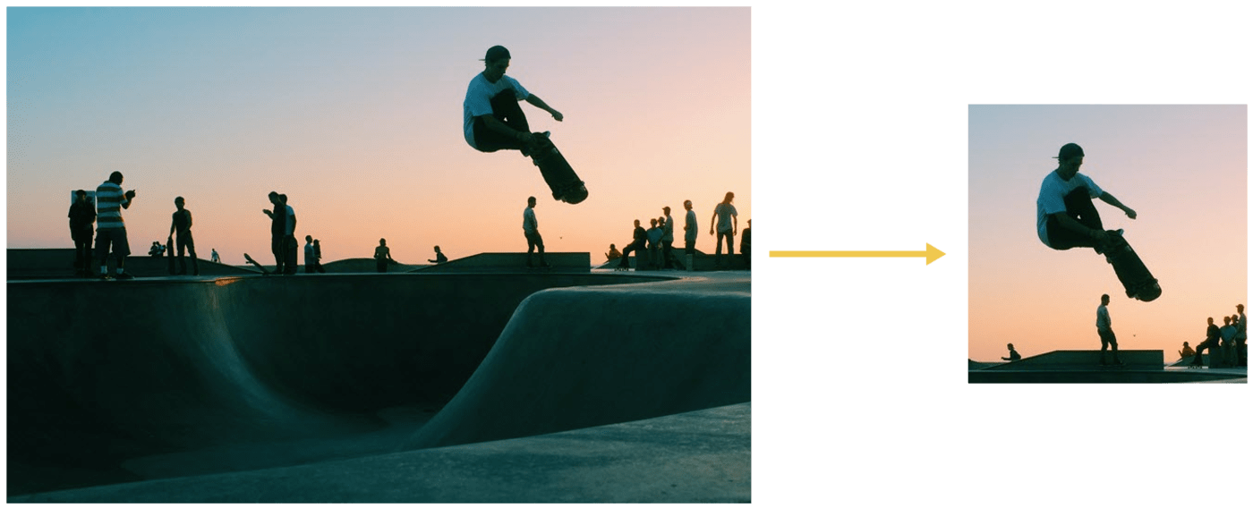
To focus on certain details—faces, objects, color contrasts—while resizing images, crop the images with Cloudinary’s intelligent auto-gravity features. The parameter to set is gravity (g in URLs), which offers an auto value that intelligently crops according to your image’s content.
Cloudinary automatically crops images with content-aware, AI-based features by selecting faces, individual features, or areas of interest. To trigger that task, apply the gravity filter (g) with the features you want to preserve.
This example with the g_auto setting crops the most interesting area, as determined by AI:
Another example: to avoid irrelevant objects instead of the product in product images taking center stage, define the product as the focus. The picture on the right below has the backpack in focus.
 g_auto:classic
 g_auto:backpack
Besides the image-resizing capability, Cloudinary offers a multitude of robust tools for web developers, including the following:
- Automated image uploads. You can upload images at scale anywhere from a browser, mobile app, or application back-end directly to the cloud.
- Generous image storage. Cloudinary accords you up to 25 GB free managed, secure, and cloud-based storage space with multiregion backup, revision history, and disaster recovery.
- Seamless asset management. You can efficiently manage your image library on Cloudinary by performing tasks like searching, organizing, and tagging files; controlling access; and monitoring usage and performance.
- Effective image transformation. You can transform, enhance, transcode, crop, scale, and enhance images with a URL-based API or with SDKs that support all popular programming languages.
- Automated image optimization. Cloudinary automatically selects the optimal quality and encoding settings for images, adapts the settings to any resolution or pixel density, and scales or crops images to focus on the important regions.
- Responsive images. Cloudinary automatically scales images in an art-directed manner, cropping them to fit different resolutions and viewports.
- Reliable and fast image delivery. Cloudinary delivers images through Content Delivery Networks (CDNs)—Akamai, Fastly, and CloudFront—with no integration or management on your part.
Do give Cloudinary a try. To start, sign up for a free account.
Want to learn more about CSS images? These articles are an excellent resource:
- Working With CSS Images
- CSS Image Overlay: Overlaying Text and Images for Visual Effect
- Image Resizing: Manually With CSS and Automatically With Cloudinary
- CSS Image Effects: Five Simple Examples and a Quick Animation Guide
- Creating Image-Filter Effects With CSS and Riveting Transformations
- Rotating Images in JavaScript: Three Quick Tutorials
- Cool Tricks for Resizing Images in JavaScript