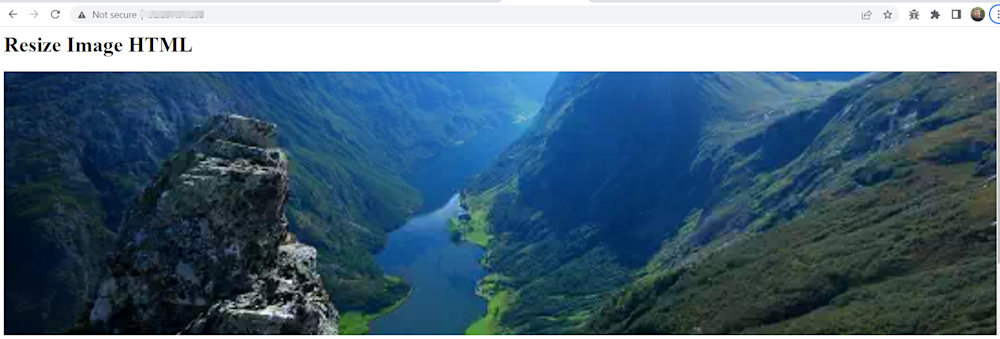
Image resizing involves adjusting the dimensions of an image, either by enlarging or reducing its size, while preserving the aspect ratio or intentionally distorting it. This is commonly done to optimize images for faster loading on websites, save storage space, or enhance the overall appearance of a page. Various techniques like interpolation, cropping, and compression can be used for resizing, and it is typically done using dedicated software or online tools.
Resizing images in HTML involves using the <img> tag to change the size of the image as it appears on the user’s screen, but without changing the file size or physical image size. While this is convenient, it also has several disadvantages, as we explain below.
In addition to setting the width and height attributes directly in the <img> tag, you can also use inline CSS via the style attribute to resize images on a case-by-case basis. It is also important to specify dimensions for images to prevent layout shifts or flickering as the page load
This is part of a series of articles about bulk image resize.
In this article:
- Important Caveats of HTML-based Image Resizing
- How to Resize Images in HTML
- Resize and Rescale Images Automatically with Cloudinary
Important Caveats of HTML-based Image Resizing
One of the primary issues with HTML-based image resizing is that it does not actually change the file size of the image. When you set the width and height attributes in the <img> element, the browser merely scales the image to fit within the specified dimensions. The original image file remains unchanged and is still downloaded in its entirety by the browser.
This leads to several problems:
- Performance Impact: Since HTML resizing does not reduce the file size, it can have a detrimental impact on the overall performance of your webpage. As the browser downloads the original, unoptimized image files, it consumes more bandwidth and increases the page load time. This issue is particularly noticeable on slower networks or mobile devices, where downloading large image files can significantly slow down the user experience.
- Quality Loss: Another issue with HTML resizing is the potential loss of image quality. When the browser scales an image to fit the specified dimensions, it uses its internal algorithms to perform the resizing, which can sometimes result in a lower-quality image. This problem is more noticeable when the image is downscaled significantly, as the browser may struggle to maintain the image’s sharpness and detail.
- Increased CPU Usage: Since the browser is responsible for resizing the image, it consumes more processing power to perform this task. This additional CPU usage can lead to slower page rendering times, particularly on lower-powered devices or those with many images to process.
- Layout Instability and Flickering: If you do not specify the width and height of an image, the web page might flicker as the browser loads the image and adjusts the layout. To avoid this, it is best to define these dimensions explicitly or use CSS properties to ensure stability.
Given the problems and performance impact of HTML-based image resizing, it is recommended to use other methods for resizing images. A good option is to use responsive images with the srcset and sizes attributes to ensure that the browser downloads the most suitable image based on the device’s screen size and resolution.
Learn more in our detailed guide to responsive images
Another option is to use Cloudinary’s dynamic resize feature (read more below). Cloudinary is a cloud-based image management solution that lets you upload images and deliver them to users, dynamically resized to the most appropriate size for the user’s device.

Pro Tip!Consider Cloudinary’s URL Transformations
Cloudinary makes it simple to transform your images on the fly into any desired format, without requiring coding expertise. Just upload your images to Cloudinary, modify the URL, and you’re all set! For more advanced control, you can also use our intuitive web-based platform to manage your image transformations.
How to Resize Images in HTML
If, despite our warnings, you still want to resize your images in HTML, here are several ways to do it.
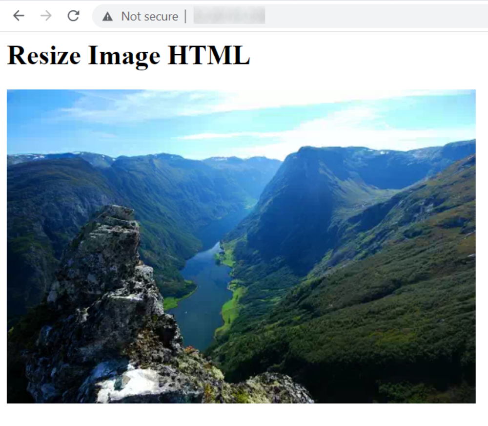
Resizing an Image Using Width and Height Attributes
When working with images in HTML, one of the simplest ways to resize an image is by using the width and height attributes of the <img> tag. These attributes allow you to specify the dimensions of the image directly within your HTML code.
Here’s an example of how you can resize an image using the width and height attributes:
<img src="path/to/your/image.jpg" width="300" height="200">
In this example:
- The src attribute specifies the path to the image file.
- The width attribute sets the width of the image to 300 pixels.
- The height attribute sets the height of the image to 200 pixels.
Resizing an Image Using the Style Attribute
Another method for resizing images is to use the style attribute within the <img> tag. This approach allows for more flexible, case-by-case adjustments using inline CSS.
Example:
<img src=”path/to/your/image.jpg” style=”width: 200px; height: 100px;”>
This method is especially useful when you need precise control over an individual image’s dimensions without affecting global styles.
Considerations When Using Width and Height Attributes
While using the width and height attributes is straightforward, there are a few considerations to keep in mind:
- Aspect Ratio – If you only set one of the attributes (either width or height), the browser will resize the image while preserving its original aspect ratio. However, if you set both attributes, the image might be stretched or compressed if the aspect ratio of the specified dimensions does not match the original aspect ratio of the image.
- Quality – As mentioned before, resizing images using HTML attributes does not change the file size of the image. If the original image is large, it will still take time to load, which can affect page performance. For better performance, consider resizing the image before uploading it to your website.
Responsiveness – For responsive design, you might want to use CSS for more control over how images resize on different screen sizes. Using width: 100%; in CSS can ensure the image scales with the size of its container.
Maintaining the Aspect Ratio When Resizing Images
Here is an example of how to resize an image while maintaining the aspect ratio:
You can download demo.webp from here. Add this style tag to HTML header:
    <style>
    .scaleA {
      width: 100%;
      max-width: max-content;
    }
    </style>
And add this line to the HTML code:
<img src="demo.webp" class="scaleA">
This approach is the easiest way to automatically resize an image. It involves setting the width to 100%. The default height setting is “auto,” which scales the height automatically based on the width.
The “max-content” setting is optional and limits an image’s maximum size to the original width. Thus, if an image had a width of 500px, it will only be able to scale up to 500px—this is useful to prevent the resized image from becoming blurry and over-stretched.
Fitting a Container
Another approach is to resize the image to fit a container:
    <style>
    /* (A) DESIRED FIXED DIMENSION */
    .scaleB {
      width: 500px;
      height: 500px;
      border: 10px solid blue;
    }


    /* (B) RESIZE METHOD */
    .fill { object-fit: fill; }
    .contain { object-fit: contain; }
    .cover { object-fit: cover; }
    .scale { object-fit: scale-down; }
    </style>


    <img src="demo.webp" class="scaleB fill">
    <img src="demo.webp" class="scaleB contain">
    <img src="demo.webp" class="scaleB cover">
    <img src="demo.webp" class="scaleB scale">
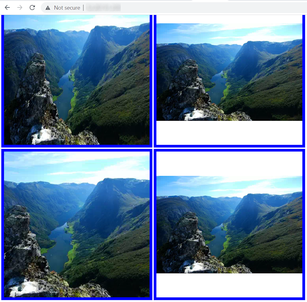
If you resize your browser window, your browser will automatically rearrange the images.
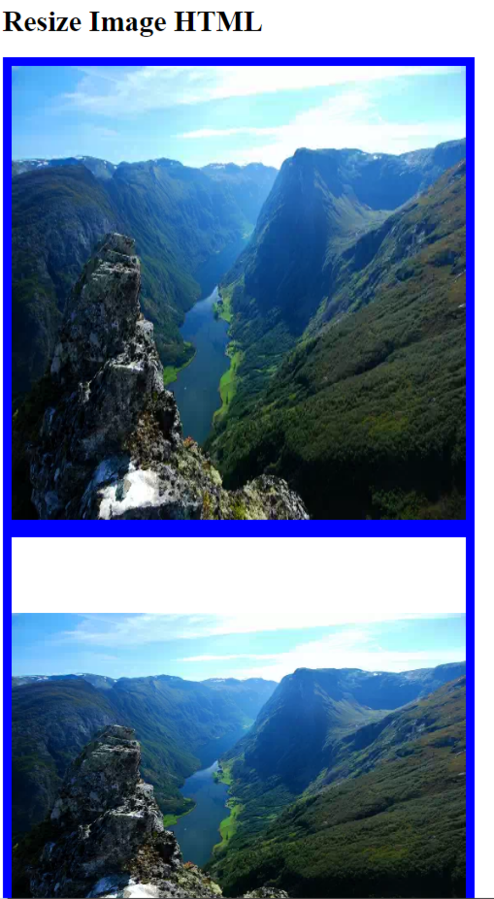
The object-fit method is best suited to resizing images to fit specific dimensions. The default scaling definition (if you haven’t specified the resize) is none. Other options include:
fill—which stretches the image stretched to the dimensions provided but ignores the aspect ratiocontain—contains the image within the dimensions specified, maintaining the aspect rations.
The cover element scales the image while maintaining the original aspect ratio, clipping the image to cover the specified dimensions. The scale-down achieves the same effect as contain or none, depending on which is the better fit.
Resizing a Background Image
Here is an example of how to resize a background image in a div container:
    <style>
    .scaleC {
      /* (A) FIXED DIMENSIONS */
      width: 100%; height: 400px;
      overflow: auto;


      /* (B) BACKGROUND IMAGE */
      background-image: url(demo.webp);
      background-position: center;
      background-size: cover; /* contain | cover | auto */
      background-repeat: no-repeat;
      background-attachment: scroll; /* fixed | scroll | local */
    }
    </style>


    <div class="scaleC">
      <p style="margin-bottom:500px">Test</p>
    </div>
Here is an overview of the settings:
background-imagespecifies the image used as the background.background-positioncenters the image in the div container.background-sizespecifies the resize method (coverorcontain).background-repeatshould be set tono-repeat, as there is only one background image.background-attachmentspecified the element to which the background image is attached. Options includefixed(the background is static during scrolling),scroll(the background relates to the div and doesn’t move during scrolling), andlocal(the background relates to div’s contents and moves during scrolling).
Resize and Rescale Images Automatically with Cloudinary
Cloudinary is a powerful and feature-rich cloud-based media management service that simplifies the process of working with images and videos. It allows users to perform various operations on their media files, including resizing, cropping, and optimization, among others, through a simple URL-based interface, or via SDKs for all popular programming languages.
URL parameters are the key-value pairs included in the URL that instruct Cloudinary on how to manipulate and deliver the requested image or video. By using these parameters, you can easily apply a wide range of transformations to your media files, without the need for manual intervention or additional server-side processing.
A major advantage of using Cloudinary for image resizing is that the service dynamically resizes images on the server side, before they are delivered to users, solving the problems of HTML-based resizing.
In the following section, we will explore Cloudinary’s automatic resizing capabilities, which are facilitated by URL parameters. These capabilities enable you to effortlessly resize and rescale images, ensuring optimal performance and user experience on your website. Each of the sections below links you to the Cloudinary Cookbook page with more details.
In order to try out the instructions below, sign up for a free Cloudinary account.
Limit Images to Specific DimensionsCopy link to this headig
To limit the size of an image to certain dimensions, change the crop (c in URLs) value to limit.
Below is an image that’s been resized from 850 x 565 px. to 70 x 70 px. with limit. Due to the preserved aspect ratio, this display is 70 x 47 px.
URL
https://res.cloudinary.com/demo/image/upload/w_70,h_70,c_limit/cashew_chicken.jpg

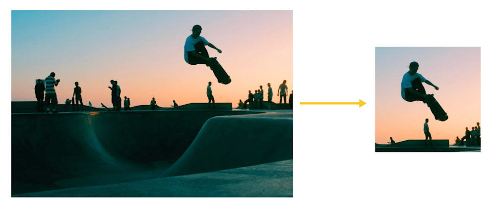
To focus on certain details—faces, objects, color contrasts—while resizing images, crop the images with Cloudinary’s intelligent auto-gravity features. The parameter to set is gravity (g in URLs), which offers an auto value that intelligently crops according to your image’s content.
Cloudinary automatically crops images with content-aware, AI-based features by selecting faces, individual features, or areas of interest. To trigger that task, apply the gravity filter (g) with the features you want to preserve.
This example with the g_auto setting crops the most interesting area, as determined by AI:
Another example: To ensure the product takes center stage instead of irrelevant objects, set the product as the main focus. In the image on the right, the backpack is clearly in focus, drawing attention to the key item.
URL
https://res.cloudinary.com/demo/image/upload/c_thumb,g_auto:classic,h_175,w_175/v1551428220/veducate/spencer-backman-482079-unsplash.jpg
g_auto:classic
URL
https://res.cloudinary.com/demo/image/upload/c_thumb,g_auto:backpack,h_175,w_175/v1551428220/veducate/spencer-backman-482079-unsplash.jpg

g_auto:backpack
Sign up for a free Cloudinary account and resize images automatically without impacting page performance

