
Designing visually appealing and responsive web pages is crucial, and properly scaling images is a key component of that process. With countless devices of varying screen sizes accessing the web, it’s essential to ensure that your images adapt seamlessly, maintaining their quality and aesthetic appeal.
CSS, or Cascading Style Sheets, provides powerful tools to scale images effectively. This article explores the traditional and modern methods of resizing images using CSS, focusing on the image width attribute, the max-width property, and the versatile scale() function. By understanding these techniques, you can create a more flexible and adaptive web design that delivers a consistent user experience across all devices.
Before we start
Scaling images with CSS? There’s a more powerful and efficient way.
Cloudinary is a cloud-based image management platform with a generous free plan. Cloudinary can automatically:
- Resize your images on the server side so they load faster for users
- Automatically crop images with AI-based object and face recognition
- Automatically optimize images for faster loading without reducing quality
You can sign up free and try it for yourself or learn more below.
This is part of a series of articles about CSS images
In this article:
- Resize with the Image Width Attribute
- Resizing a Responsive Image Using the Max-Width and Height:auto Property
- What is the CSS scale() Function?
- Understanding CSS transform: scale Syntax and Values
- Examples of CSS Scale Usage
Resize with the Image Width Attribute
One of the simplest methods to resize images using CSS is by applying the width attribute. This approach allows you to set a fixed width for your images, ensuring they maintain a consistent size across different devices and screen resolutions. By specifying a fixed width, you can control the exact dimensions of the image, which is particularly useful for maintaining a uniform appearance in a layout.
For instance, if you want your image to always display at 600 pixels in width, you would use the following CSS code:
While this method is straightforward, it doesn’t account for the varying screen sizes that characterize different devices. Consequently, images resized with a fixed width attribute may not display optimally on smaller or larger screens. As a result, this technique is best suited for cases where maintaining a specific image size is critical, regardless of the user’s device.
Resizing a Responsive Image Using the max-width and height:auto Property
For a more flexible approach that ensures your images look good on all devices, using the max-width property in conjunction with the height:auto property is highly effective. This method is particularly beneficial for responsive web design as it allows images to scale proportionally, without stretching or distorting, to fit within their parent container.
Here’s how you can implement this in your CSS:
By setting `max-width` to 100%, the image will scale down to fit the width of its parent container while maintaining its aspect ratio. The height:auto property ensures that the image’s height is adjusted automatically to preserve its original proportions. This approach ensures that the image will not exceed its natural dimensions, preventing distortion and maintaining visual integrity across various screen sizes.
This technique is particularly useful for creating layouts that adapt seamlessly to different devices, providing a consistent viewing experience whether the user is on a mobile phone, tablet, or desktop computer. It combines flexibility with simplicity, making it a preferred choice for many web developers aiming to create responsive and adaptive designs.
Pro Tip!
Improve Core Web Vitals with Cloudinary
If you want to improve your Core Web Vitals metrics and make your website faster, we recommend you to deliver responsive images. Cloudinary allows you to dynamically resize your images on the fly as needed, with added features such as size optimization and format conversion.
What is the CSS scale() Function?
The scale() function is a transformative function in CSS that alters the size of an element on the webpage. It is part of the CSS transform property, which lets you modify the appearance and layout of objects without affecting their actual size in the page layout. Aside from scaling objects, the CSS transform property lets you move, rotate, skew, and scale elements.
The scale CSS function works by modifying the size of an element along the X and Y axes. When you apply the scale function to an item, you’re essentially stretching or shrinking it horizontally or vertically. This can be useful for creating engaging animations, highlighting specific content, or changing the layout of your webpage.
Remember that the scale function does not affect the actual size of the element in the document flow. It only alters the visual representation of the element on the screen, making it appear larger or smaller. This means the scale function does not affect the layout of other elements on the page.
Understanding CSS transform: scale Syntax and Values
Using the scale CSS function involves using the transform property followed by the scale function with the desired scale values. The general syntax is as follows:
element {
  transform: scale(sx, sy);
}
Here, sx represents the scale factor along the X-axis (horizontal), and sy represents the scale factor along the Y-axis (vertical). If only one value is provided, it is applied to both axes.
The scale values are unitless, representing the factor by which the element will be scaled. A value of 1 leaves the element at its original size, values less than 1 shrink the element, and values greater than 1 enlarge it. For example, a value of 0.5 shrinks the element to half its size, and a value of 2 grows the element to double its size.
The transform property also allows for scale3d, scaleX, scaleY, and scaleZ functions. These provide more control over the transformation by allowing you to specify different scale values in a three-dimensional space.
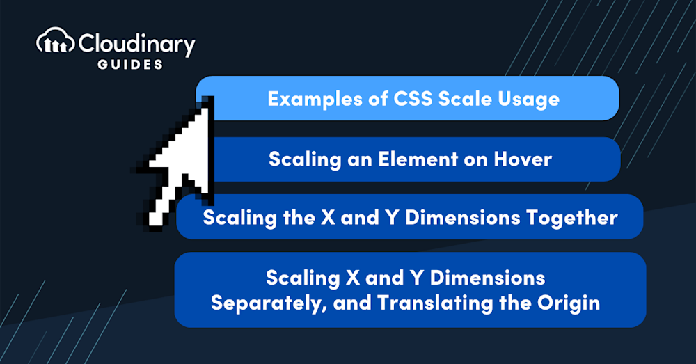
Examples of CSS Scale Usage
Scaling an Element on Hover
One common use of the scale CSS function is to increase the size of an element when a user hovers over it. This is a handy way to highlight interactive elements in a webpage and improve the user experience. Here’s a simple example of how you can achieve this:
div {
  width: 100px;
  height: 100px;
  background-color: red;
  transition: all 0.5s ease-in-out;
}

div:hover {
  transform: scale(1.5);
}
In this example, a div element is initially set to a size of 100px by 100px with a red background. The transition property is used to animate the scaling transformation over 0.5 seconds. When the user hovers over the div, the scale function increases the element’s size by 1.5 times.
Scaling the X and Y Dimensions Together
Scaling doesn’t always have to be one-dimensional. With the scale CSS function, you can simultaneously scale an element’s X and Y dimensions. Let’s take a look at how you can achieve this:
div {
  width: 100px;
  height: 100px;
  background-color: blue;
}

div:hover {
  transform: scale(2, 2);
}
In this case, the div element is initially set to a size of 100px by 100px with a blue background. When the user hovers over the div, the scale function increases the element’s size by 2 times in both the x and y dimensions. This results in an element that is twice as wide and twice as tall when hovered over.
Scaling X and Y Dimensions Separately and Translating the Origin
The scale CSS function also allows you to scale the X and Y dimensions of an element separately. This means you can make an element wider without making it taller, and vice versa. You can also use the translate function to change the origin of the transformation. Here’s how:
div {
  width: 100px;
  height: 100px;
  background-color: green;
}

div:hover {
  transform: scaleX(1.5) scaleY(2) translate(50px, 50px);
}
In this example, the div element is initially set to a size of 100px by 100px with a green background. When the user hovers over the div, the scaleX function increases the element’s width by 1.5 times, doubling the scaleY function’s height. The translate function then moves the transformed element 50px to the right and 50px down.

Rescale Images Automatically with Cloudinary
URL parameters are the key-value pairs included in the URL that instruct Cloudinary on how to manipulate and deliver the requested image or video. Using these parameters, you can easily apply a wide range of transformations to your media files without needing manual intervention or additional server-side processing.
A major advantage of using Cloudinary for image resizing is that the service dynamically resizes images on the server side before they are delivered to users, solving the problems of CSS-based resizing.
In order to try out the instructions below with your own images, sign up for a free Cloudinary account and upload the image to Cloudinary.
Limit Images to Specific Dimensions
To limit the size of an image to certain dimensions, change the crop (c in URLs) value to limit (c_limit).
Below is an image that’s been resized from 850 x 565 px. to 70 x 70 px. with the limit option. Due to the preserved aspect ratio, this display is 70 x 47 px.
https://res.cloudinary.com/demo/image/upload/w_70,h_70,c_limit/cashew_chicken.jpg
Learn more in the Cloudinary Cookbook
Crop Images With Auto Gravity
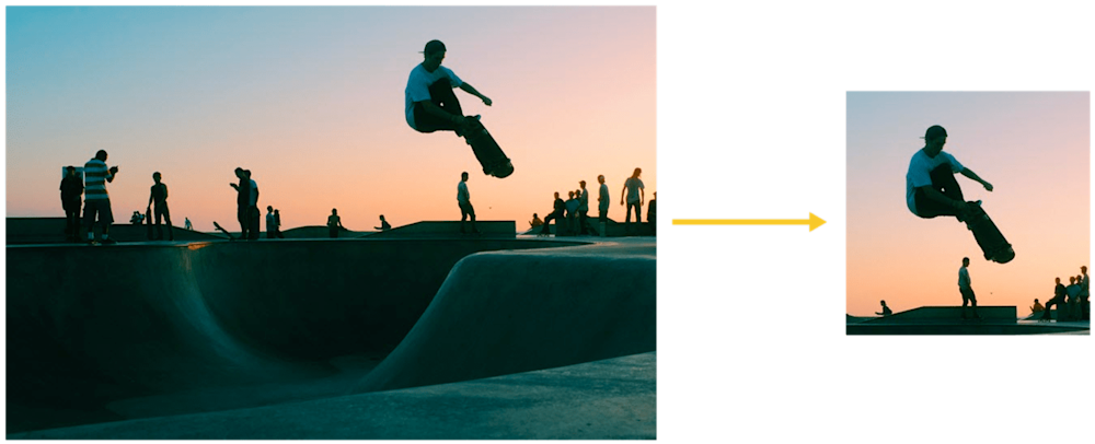
To focus on certain details—faces, objects, color contrasts—while resizing images, crop the images with Cloudinary’s intelligent auto-gravity features. The parameter to set is gravity (g in URLs), which offers an auto value (g_auto) that intelligently crops according to your image’s content.
Cloudinary automatically crops images with content-aware, AI-based features by selecting faces, individual features, or areas of interest. This example with the g_auto setting crops the most interesting area, as determined by AI:
Another example: to avoid irrelevant objects instead of the product in product images taking center stage, define the product as the focus. The picture below has the backpack in focus.
This code uses g_auto:classic:
https://res.cloudinary.com/demo/image/upload/c_thumb,g_auto:classic,h_175,w_175/v1551428220/veducate/spencer-backman-482079-unsplash.jpg

This code uses g_auto:backpack to focus on the backpack:
https://res.cloudinary.com/demo/image/upload/c_thumb,g_auto:backpack,h_175,w_175/v1551428220/veducate/spencer-backman-482079-unsplash.jpg

Learn more about gravity-based cropping in our tutorial.
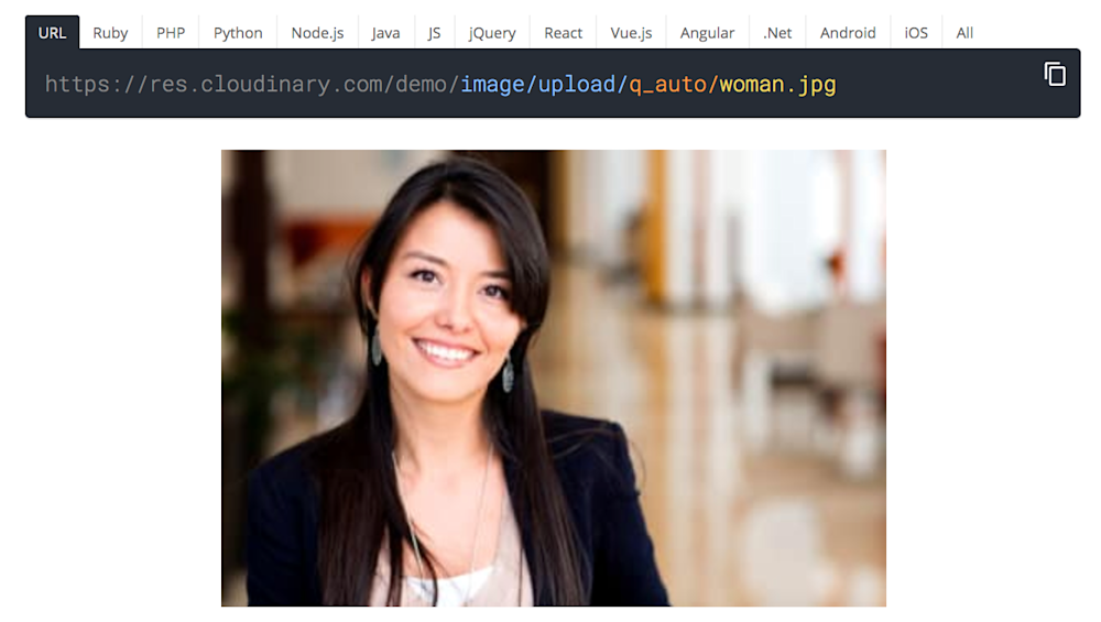
Automatically Optimize Image Quality
Cloudinary’s quality parameter (q in URLs) has an auto option (q_auto) that automatically compresses and tunes images for the smallest possible size without sacrificing image quality.
Here’s how it works. You add the q_auto parameter to the image URL. Cloudinary’s intelligent quality and encoding algorithm assesses the image content, format, and viewing browser. The algorithm identifies the optimal quality-compression level and encoding settings, compressing and encoding the image in the best way possible for each user.
This process ensures that websites, browsers, viewers, and devices are served with a compressed version of a superior-quality visual. Below is an example. If you view this example on a modern browser instead of the JPG image, you will see the image loads as a modern WebP image with a much smaller size.
https://res.cloudinary.com/demo/image/upload/q_auto_woman.jpg
See more examples of quality optimization on our demo page.
Sign up for a free Cloudinary account and resize images automatically with these features and more.

