
As the web continues to evolve and become more interactive, creating engaging and interactive user interfaces is important for enjoyable user experiences. The CSS zoom property is a useful tool that can be used to control the magnification level of an element, create visual effects like zoom-on-hover for images, or emphasize UI elements.
In this article, we explore basic and advanced CSS image zoom techniques, responsive design considerations, and the integration of Cloudinary for dynamic image delivery, as well as practical code examples for its implementation. In the end, you’ll have the knowledge and practical examples to use CSS zoom effectively for creating beautiful interfaces.
In this article:
- Basic Techniques for CSS Image Zoom
- Advanced CSS Image Zoom Variations
- Responsive Design and CSS Image Zoom
- Using Cloudinary for Dynamic CSS Image Zoom
Basic Techniques for CSS Image Zoom
CSS offers powerful tools to create zoom effects that are both lightweight and customizable. The most common scenarios when you can apply zoom effects to an image are usually during user interactions like hover, focus, or click. For more complex applications, you can also combine zoom effects with scroll-based animations using JavaScript or a library like GSAP.
The most straightforward way to implement zoom in CSS is by using the zoom property. However, one major problem with using the zoom property is that it causes layout rearrangement of the surrounding elements on the page where it’s used. By contrast, transform: scale() can resize the entire page, where zoom will only scale elements, not the page.
How to Use transform: scale() for Zooming
The CSS transform property is used to create 2D and 3D transformations on elements such as rotating, scaling, and skewing. To implement a basic zoom effect, you can use any of the following declarations:
transform: scaleX(): This is used for scaling elements horizontally along the X-axis.transform: scaleY(): For scaling elements vertically along the Y-axis.transform: scale(): A shorthand property that scales an element uniformly (both horizontally and vertically) or independently along both axes (by passing a single value).transform: scale3d(): Scales an element in the x, y, and z planes.
Often, when you want to scale images with this property, you’ll use the third option. It allows you to create a uniform zoom effect, where both the width and height of the image are scaled proportionally.
Here’s an example showing how to use transform: scale() for zooming images in a container:
<!DOCTYPE html>
<html lang="en">
<head>
    <meta charset="UTF-8">
    <title>Image Grid with Zoom Effect</title>
    <style>
        body {
            background: #f4f4f4;
            font-family: Arial, sans-serif;
            margin: 0;
            padding: 40px;
            display: flex;
            justify-content: center;
            align-items: center;
            min-height: 100vh;
        }
        .container {
            display: grid;
            grid-template-columns: repeat(3, 1fr);
            gap: 20px;
            background: #fff;
            padding: 30px;
            border-radius: 12px;
            box-shadow: 0 4px 24px rgba(0,0,0,0.08);
        }
        .img-zoom {
            overflow: hidden;
            border-radius: 8px;
            box-shadow: 0 2px 8px rgba(0,0,0,0.06);
            background: #eee;
        }
        .img-zoom img {
            width: 100%;
            height: 220px;
            object-fit: cover;
            display: block;
        }
        .img-zoom:hover img {
            transform: scale(1.15);
        }

    </style>
</head>
<body>
    <div class="container">
        <div class="img-zoom">
            <img src="https://images.unsplash.com/photo-1506744038136-46273834b3fb?auto=format&fit=crop&w=400&q=80" alt="Nature 1">
        </div>
        <div class="img-zoom">
            <img src="https://images.unsplash.com/photo-1465101046530-73398c7f28ca?auto=format&fit=crop&w=400&q=80" alt="Nature 2">
        </div>
        <div class="img-zoom">
            <img src="https://images.unsplash.com/photo-1519125323398-675f0ddb6308?auto=format&fit=crop&w=400&q=80" alt="Nature 3">
        </div>
    </div>
</body>
</html>
One common problem with applying zoom effects to images is the possibility of the image to extend beyond its container’s boundaries, causing layout issues or visual clutter. To prevent this, we set the container’s overflow property to hidden (overflow: hidden;), ensuring the zoomed image remains within bounds.
Here’s the output of the above code:

We got the zoom effect, but notice how the zoom effect feels jarring when the images are hovered on? We can make it look better by using the transition property to create smooth animations between states.
Applying Transitions for Smooth Zoom Effects
The transition property in CSS is a shorthand property that allows you to define smooth animations when the value of a CSS property changes. It controls how CSS properties transition between their initial and final states over a specified duration.
To add a transition effect to the zoom effect, add the following to the previous code:
 .img-zoom img {
            width: 100%;
            height: 220px;
            object-fit: cover;
            transition: transform 0.4s cubic-bezier(.25,.8,.25,1);
            display: block;
        }
Here, transition: transform 0.4s cubic-bezier(.25,.8,.25,1) animates the transform property over 0.4 seconds with a cubic-bezier function that defines custom timing functions for the transition. The cubic-bezier function allows for precise control over the speed and acceleration of the image’s movement by defining a cubic Bezier curve. You can use your browser’s Dev Tool to customize the cubic-bezier and adjust the control points to achieve your desired animation effect.
Notice how the zoom effect feels smoother now with the transition:
Advanced CSS Image Zoom Variations
Beyond basic zooming, CSS allows us to create complex effects by combining transform with other properties like rotation, blur, or panning. These advanced techniques add creative flair and interactivity, making your website and applications more engaging and interactive.
One common example is morphing images into different shapes using clip-path and applying zoom effect simultaneously:
<!DOCTYPE html>
<html lang="en">
<head>
    <meta charset="UTF-8">
    <meta name="viewport" content="width=device-width, initial-scale=1.0">
    <title>Clip-Path Morphing with Zoom Effects</title>
    <style>
        * {
            margin: 0;
            padding: 0;
            box-sizing: border-box;
        }

        body {
            font-family: 'Arial', sans-serif;
            background: #0c0c11;
            min-height: 100vh;
            padding: 40px 20px;
            color: white;
            position: relative;
            overflow-x: hidden;
        }

        body::before {
            content: '';
            position: fixed;
            top: 0;
            left: 0;
            right: 0;
            bottom: 0;
            background: rgba(120, 0, 255, 0.1);
        }

        .container {
            max-width: 900px;
            margin: 0 auto;
            position: relative;
            z-index: 1;
        }

        .grid {
            display: grid;
            grid-template-columns: repeat(auto-fit, minmax(350px, 1fr));
            gap: 40px;
            margin-bottom: 50px;
        }

        .morph-container {
            position: relative;
            height: 300px;
            border-radius: 20px;
            overflow: hidden;
            background: rgba(255, 255, 255, 0.1);
            backdrop-filter: blur(20px);
            border: 1px solid rgba(255, 255, 255, 0.2);
            box-shadow: 0 20px 40px rgba(0, 0, 0, 0.3);
            cursor: pointer;
        }

        .morph-container img {
            width: 100%;
            height: 100%;
            object-fit: cover;
            transition: all 0.8s cubic-bezier(0.25, 0.46, 0.45, 0.94);
        }

        .diamond-rect img {
            clip-path: polygon(50% 0%, 100% 50%, 50% 100%, 0% 50%);
            transform: scale(1);
        }

        .diamond-rect:hover img {
            clip-path: polygon(10% 10%, 90% 10%, 90% 90%, 10% 90%);
            transform: scale(1.3);
        }

        .circle-morph {
            position: relative;
        }

        .circle-morph img {
            clip-path: circle(30% at 50% 50%);
            transform: scale(1);
        }

        .circle-morph:hover img {
            clip-path: circle(100% at 50% 50%);
            transform: scale(1.1);
        }

        @media (max-width: 768px) {
            .grid {
                grid-template-columns: 1fr;
                gap: 30px;
            }


            h1 {
                font-size: 2rem;
            }


            .morph-container {
                height: 250px;
            }
        }
    </style>
</head>
<body>
    <div class="container">
        <div class="grid">


            <div class="morph-container diamond-rect">
                <img src="https://images.unsplash.com/photo-1507525428034-b723cf961d3e?w=500&h=400&fit=crop" alt="Ocean waves">
            </div>
            <div class="morph-container circle-morph">
                <img src="https://images.unsplash.com/photo-1506905925346-21bda4d32df4?w=500&h=400&fit=crop" alt="Layered composition">
            </div>
        </div>
    </div>
</body>
</html>
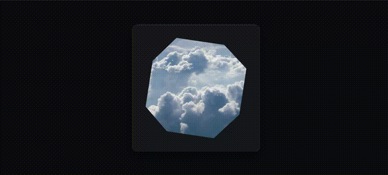
Here’s the output:

Here’s another example using automatic animation to zoom and morph images into different shapes using keyframe animations and clip-path:
<!DOCTYPE html>
<html lang="en">
  <head>
    <meta charset="UTF-8" />
    <title>Advanced Zoom Morphing</title>
    <style>
      * {
        box-sizing: border-box;
        margin: 0;
        padding: 0;
      }

      body {
        display: flex;
        justify-content: center;
        align-items: center;
        height: 100vh;
        background: linear-gradient(135deg, #0f0f23, #1a1a2e, #16213e);
        overflow: hidden;
      }

      .image-wrapper {
        display: flex;
        place-items: center;
        place-content: center;
        position: relative;
        height: 500px;
        width: 500px;
        border-radius: 20px;
        overflow: hidden;
        background: rgba(255, 255, 255, 0.05);
        backdrop-filter: blur(20px);
        border: 1px solid rgba(255, 255, 255, 0.1);
        box-shadow: 0 20px 40px rgba(0, 0, 0, 0.4),
          inset 0 1px 0 rgba(255, 255, 255, 0.1);
        cursor: pointer;
        transition: all 0.6s cubic-bezier(0.25, 0.46, 0.45, 0.94);
      }

      .image-wrapper img {
        width: 90%;
        height: 90%;
        object-fit: cover;
        animation: morphShape 13s infinite ease-in-out reverse both;
        transition: transform 0.6s cubic-bezier(0.25, 0.46, 0.45, 0.94);
      }

      .image-wrapper:hover img {
        transform: scale(1.15);
      }

      .image-wrapper:hover {
        box-shadow: 0 30px 60px rgba(0, 0, 0, 0.5),
          0 0 100px rgba(138, 43, 226, 0.2),
          inset 0 1px 0 rgba(255, 255, 255, 0.2);
        border-color: rgba(138, 43, 226, 0.3);
      }

      @keyframes morphShape {
        0% {
          clip-path: polygon(
            50% 0%,
            100% 25%,
            100% 75%,
            50% 100%,
            0% 75%,
            0% 25%
          );
          transform: scale(0.8);
        }

        12.5% {
          clip-path: polygon(
            45% 5%,
            90% 20%,
            95% 70%,
            55% 95%,
            10% 80%,
            5% 30%
          );
        }

        25% {
          clip-path: polygon(
            30% 10%,
            80% 15%,
            90% 60%,
            70% 90%,
            20% 85%,
            10% 40%
          );
        }

        37.5% {
          clip-path: polygon(
            25% 0%,
            75% 0%,
            100% 50%,
            75% 100%,
            25% 100%,
            0% 50%
          );
        }

        50% {
          clip-path: polygon(
            30% 10%,
            70% 10%,
            90% 30%,
            90% 70%,
            70% 90%,
            30% 90%,
            10% 70%,
            10% 30%
          );
        }

        62.5% {
          clip-path: polygon(
            40% 15%,
            75% 20%,
            85% 40%,
            80% 75%,
            60% 85%,
            25% 80%,
            15% 60%,
            20% 25%
          );
        }

        75% {
          clip-path: polygon(
            50% 0%,
            75% 25%,
            100% 50%,
            75% 75%,
            50% 100%,
            25% 75%,
            0% 50%,
            25% 25%
          );
        }

        87.5% {
          clip-path: polygon(
            28% 7%,
            75% 8%,
            93% 28%,
            92% 73%,
            70% 93%,
            24% 92%,
            7% 71%,
            8% 26%
          );
        }

        100% {
          clip-path: polygon(
            0% 15%,
            15% 15%,
            15% 0%,
            85% 0%,
            85% 15%,
            100% 15%,
            100% 85%,
            85% 85%,
            85% 100%,
            15% 100%,
            15% 85%,
            0% 85%
          );
        }
      }
    </style>
  </head>
  <body>
    <div class="image-wrapper">
      <img
        src="https://images.unsplash.com/photo-1517685352821-92cf88aee5a5?w=500&h=400&fit=crop"
        alt="Zoom Morphing Image"
      />
    </div>
  </body>
</html>
Which creates the following effect:
Responsive Design And CSS Image Zoom
For zoom effects to be effective, they must adapt to various screen sizes and maintain accessibility. A zoom effect that works well on desktop might not behave well on mobile. To address this, you can use CSS media queries to disable or alter zoom behavior based on screen size.
Additionally, to make zoom effects responsive, use relative units like percentages or viewport units (vw, vh) for container dimensions. You can also use media queries to adjust zoom levels or disable effects on smaller screens where user interactions may be challenging:
.image-wrapper {
  width: 100%;
  max-width: 500px;
  height: 300px;
  overflow: hidden;
}

.image-wrapper img {
  width: 100%;
  height: 100%;
  object-fit: cover;
  transition: transform 0.3s ease;
}

.image-wrapper img:hover {
  transform: scale(1.8);
}

@media (max-width: 768px) {
  .image-wrapper img:hover {
    transform: scale(1.4);
  }
}

@media (max-width: 480px) {
  .image-wrapper img:hover {
    transform: scale(1.2);
  }
}
Using Cloudinary for Dynamic CSS Image Zoom
Cloudinary allows you to create interactive image zoom effects by leveraging its zoompan effect, which is inspired by the well-known Ken Burns effect. zoompan allows you to animate static images by applying smooth zooming and panning, effectively turning still photos into dynamic videos or animated GIFs automatically and on the fly.
Let’s say you want to create a 10-second product video that zooms out from the top-left corner of an image and gently pans to the bottom-right. You can do that entirely with Cloudinary by simply adding transformation parameters to the image URL:
e_zoompan:du_10;from_(x_0.0;y_0.0;zoom_4.5);to_(x_1.0;y_1.0;zoom_1.0)
In the snippet above:
du_10specifies a duration of 10 seconds.from_()andto_()define the motion path using floating-point coordinates, wherexandyvalues range from0.0to1.0(percentages of image width and height).zoomcan range from1.0to8.0, with higher values providing more detailed focus.
Now to turn the image into a video, all you need to do is chain the transformation with a format like .mp4 and Cloudinary will handle the rest:
<img src="https://res.cloudinary.com/demo/video/upload/e_zoompan:du_10;from_(x_0.0;y_0.0;zoom_4.5);to_(x_1.0;y_1.0;zoom_1.0)/sample.mp4" alt="Zoompan Demo">
Here’s a practical example that creates a 7-second zoompan effect using this image:
https://res.cloudinary.com/demo/image/upload/e_zoompan:du_7;from_(x_3769;y_7489;zoom_4.5);to_(x_3311;y_5558;zoom_1.8)/c_scale,w_400/q_auto/docs/clothing.mp4
Cloudinary offers a simple, yet powerful set of tools for creating interactive zoom effects. You can learn more about the zoompan effect in this comprehensive guide.

Wrapping Up
Implementing CSS image zoom effects provides a powerful way to bring your web designs alive. From simple scale() transformations to more complex interactive panning and filter effects, these effects can guide attention, improve usability, and make your site more engaging.
For automated and optimized image delivery, Cloudinary’s zoompan transformation lets you transform any static image into a motion picture, allowing you to create dynamic visual interactions without the overhead of traditional video production.
Make your website mobile-friendly with Cloudinary’s responsive images and image management tools. Sign up for free today!

