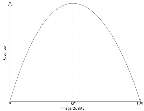
Beyond tax rate t*, tax revenues actually decrease because economic activity is stifled as a result of excessive tax burdens. You may wonder why we are discussing mundane economic principles, but there is a very good reason: Your website/app follows a similar curve with regard to revenue and media performance.
Consider how this concept applies to your website. You have to compress your images so your site loads as fast as possible, but you don’t want to compress them too much and suffer the consequences of poor image quality. In most cases, we have to guess what our optimal tax rate (bandwidth) is to maximize revenue. If we compress our images too much, visual quality becomes poor and our website/app becomes laughable from the user perspective. Because of this, I call the web performance version of the Laffer Curve “The Laughable Curve” and it looks like this:
Some sites opt for a quality that still looks pretty good but is compressed as much as possible. Perhaps those developers understand their visitors and know that a faster loading website is more valuable than a nice looking one. Others opt for high visual quality and even minor, barely noticeable image artifacts are unacceptable. In these cases, developers may know that their visitors are discerning types, who have very high standards, and they don’t want to risk their brand image.
Much of this is likely speculation, though, because it is hard to determine where Q* sits. Even in today’s world of personalized experiences, A/B testing and advanced analytics with micro segments down to the 1:1 level, we’re still left to guess what people want. And that guesswork is potentially leaving a lot of money on the table. For example, e-commerce giant Amazon noted that a page load slowdown of only 1 second would cost it $1.6 billion in sales revenue. Similarly, Google noted that a slowdown of just four tenths of a second in its search results would result in a loss of 8 million searches per day, which translate into millions less in online advertising.
The relationship between site performance and revenue/conversion is a highly studied one and the evidence is overwhelming that performance has an outsized effect on your key performance indicators (KPIs). This potential A/B test uniquely doesn’t start with a hypothesis, but an established theory. So why is it rarely, if ever, tested? My theory: the “Content Dilemma.”
The Content Dilemma is a stubborn bottleneck that has plagued marketers, creative teams, product managers and developers alike. Simply stated, your ideas for using content in unique ways for each web visitor is hampered by your capacity to create that content. Anyone who is trying to personalize their site, run a nurture campaign, or deal with segment-based display advertising quickly runs into this limitation. In turn, the idea of testing image quality on your site falls victim as well, since different images have to be created for each different quality level you want to test. Cloudinary can help you create dynamic content programmatically and on the fly, eliminating this creative bottleneck, and providing vital assistance when executing A/B testing to ensure that you’re maximizing revenue.
- A way to conduct A/B/N tests – These can be internal systems or a third-party tool like Maxymiser, Optimizely, Adobe Target or SiteSpect. For technical reasons, a server side solution or a SiteSpect account might be best, since transforming image URLs with JavaScript could introduce its own performance issues.
- A reporting mechanism – To get maximum value out of an A/B/N test, it is necessary to set up as many segments as possible, since different cohorts will respond differently to changes. For instance, you can compare mobile vs. desktop, since there’s typically a huge variability in connection speed and browser performance. There are also distinctions between rural and urban, different browsers, new and returning customers, with hundreds of other unique factors coming into play. Maxymiser is a really great tool for doing this because it will identify what your important segments are without requiring you to set them all up ahead of time. Passing the visitor experience as a variable to your site analytics tool (Adobe Analytics, Coremetrics, WebTrends, to name a few) will work great as well, enabling you to closely examine how exactly behavior is affected by image size/quality.
- Images – You will want to start with four or so different quality levels (a A/B/C/D test), which will require you to take the number of images on your site and multiply by four. Don’t ask your creative team to do this, they will never talk to you again. Here’s where a tool like Cloudinary is valuable because it enables you to quickly create various images simply by changing a parameter in the image URL. The ability to make these image changes on the fly will not only help you execute the test, but also maintain the winning experiences going forward.
Now, let’s take a closer look at how you can change image quality when doing A/B/C/D testing.
This is my original image, Farmer Bob: