
Developing a great website and maintaining it can be a challenging and time-consuming task, even for the most talented developer. You need to meet graphic design requirements for any device according to the latest design trends, and constantly find ways to optimize your website performance, for any browser.
We can save you a lot of time and effort. Cloudinary takes care of the entire image management pipeline: image upload, a rich set of transformation and optimization capabilities, cloud storage, administration and super-fast CDN delivery.
We invite you to experience Cloudinary in action with our new interactive demo.
The demo will walk you through visual image transformation and optimization examples, as well as some use-cases of popular website implementations. All this is accompanied by ready-to-use code samples in Ruby on Rails, PHP, Node JS, Angular JS, jQuery and more.
Here are the top 5 demo highlights that can save a lot of time and effort in your website or app development.
Rather than users uploading images to your own servers, or using a cloud storage solution that still requires that you handle the upload yourself, Cloudinary lets you upload images directly from the user’s browser with no server-side work at all. The interactive demo uses our very own upload widget to upload images directly from the browser to Cloudinary.
The upload widget is a complete UI solution you can embed in your website with a single line of Javascript code. It allows your users to upload selected images from any device or using a remote URL. The upload widget can also be customized in any look & feel and configured to support capturing photos from your users’ camera, interactive cropping, thumbnail previews, and more.
Every image is uploaded once, and stored once. From then onwards it is reused and instantly delivered in any size and aspect ratio, to fit multiple device layouts and resolutions, using a single URL with on-the-fly transformation or a single line of code. This is even more powerful the next time you want to redesign your website – there is no manual image work required, simply change that one line of code.
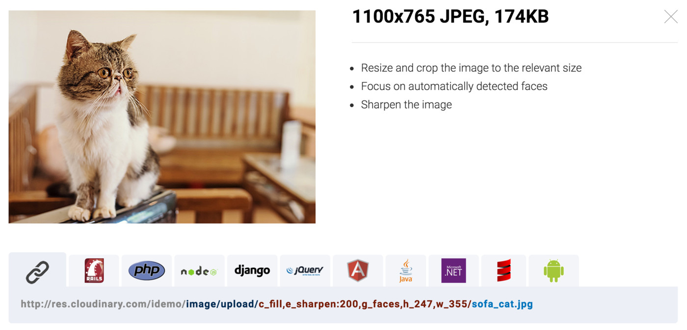
Other than scaling to any size, images can be intelligently cropped to maximize the visibility of important areas within the image, whether using automatic face detection, or auto-detected areas of interest.
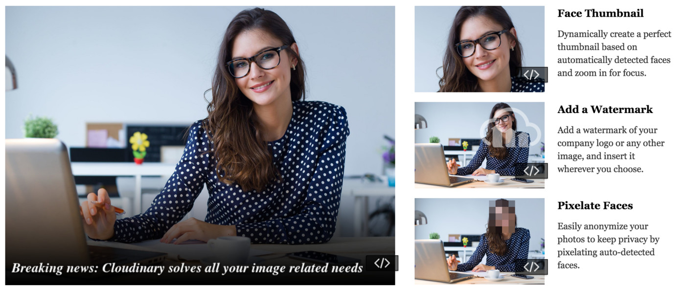
Graphic design or other requirements usually involve more than resizing and cropping. The interactive demo page shows how to apply effects, such as sharpening the image, artistic filters, colorization, and more. It also shows how you can add watermarks and text overlays, or create thumbnails based on automatic face detection – on-the-fly using dynamic delivery URLs.
Images typically account for the majority of a website’s bandwidth, and it’s important to take the necessary steps to optimize them. In the interactive demo, you can see exactly how much bandwidth you could be saving by adjusting the compression quality or converting to different image formats (depending on browser support). And yes, this too, with a single URL or line of code.
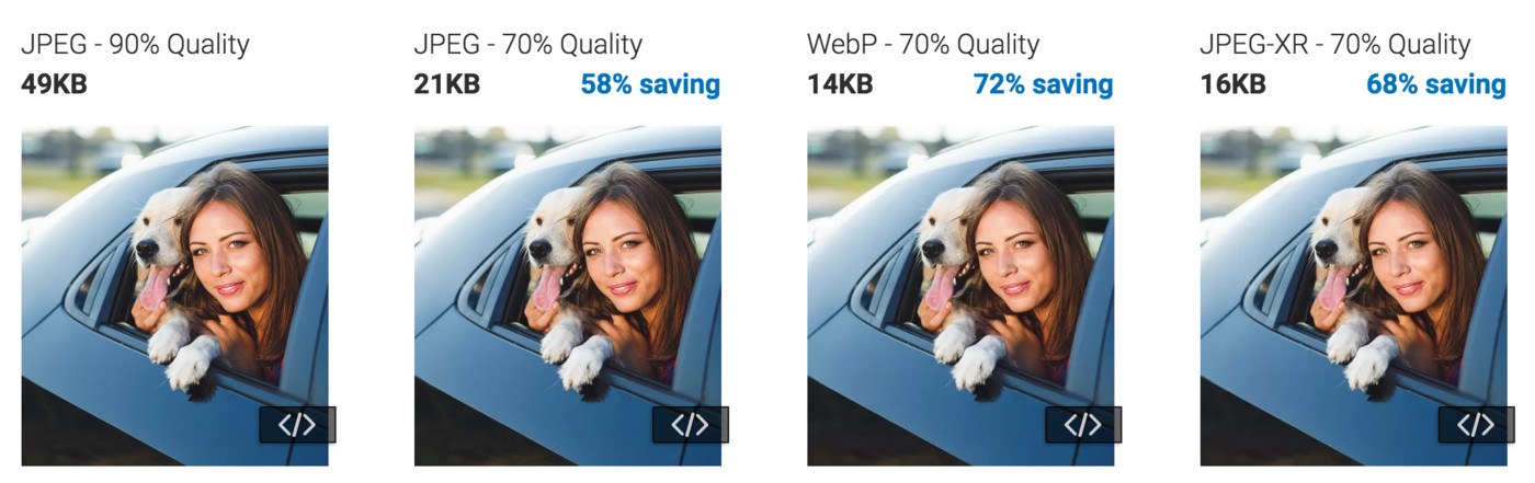
Cloudinary can also optimize the file size vs. the perceived visual quality, on-the-fly, by intelligently tuning encoding and compression settings and then selecting the appropriate image format based on the specific image’s content. This is done with our intelligent quality selection algorithm.
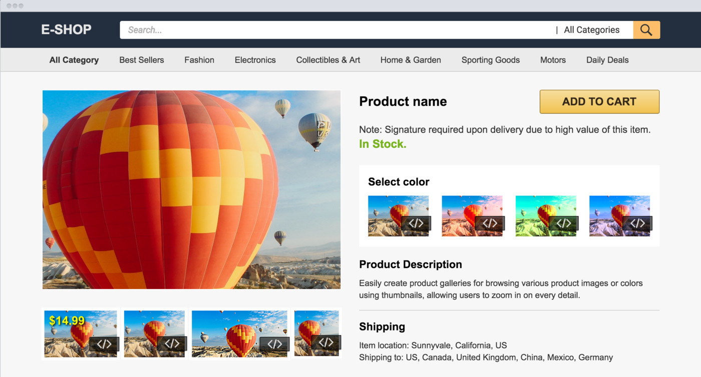
Putting it all together – below is a screenshot from the interactive demo, showing how Cloudinary can be used to easily create product galleries for eCommerce sites: browsing between different product images (or colors using thumbnails), and allowing users to zoom in on every detail.
The interactive demo presents some examples of how Cloudinary can be used to build and optimize eCommerce sites, news & media sites, or social sites and apps.
The examples are fully responsive – try them out on any device or resolution, and notice how the optimal image is delivered every time using Javascript code that detects the device DPR and the allocated width.
One of our main goals when creating this interactive demo was to show how easily you can build a responsive website with user uploaded images, that perfectly fits the graphic design and layout of your website or app.
Every feature you see in the interactive demo, and a whole lot more, is available as part of our free plan. We’re very excited to finally make this demo publicly available. You can use it as a quick reference guide – grab some code samples, and try them out. We hope you like it 🙂
Further Reading on Image Optimization
- Website image optimization and fast delivery with Cloudinary
- The complete guide to PHP image compression and optimization
- Python Image Optimization and Transformation
- Image Optimization in Ruby
- Image Optimization for WordPress
- Learn about the pros and cons of JPEG 2000
- Adopting the WebP Image Format for Android on Websites Or Native Apps
- 10 Website Image Mistakes that Slow Load Times
- Automatically Reduce Image Size Without Losing Quality
- Automate Placeholder Generation and Accelerate Page Loads
- 3 Ways to Do Progressive JPEG Encoding