Animations are a powerful way to add motion to the user interface. The moving of elements is possible with animations, as well as their appearance and disappearance.
This post will teach us how to manage image animations using the Nuxt.js inbuilt animations element.
We completed this project in a CodeSandbox. Fork and run it to quickly get started.
https://github.com/Olanetsoft/Manage-image-animations-in-Nuxt.js
Nuxtjs is the bedrock of our Vue.js project, providing structure and flexibility while allowing us to scale confidently.
It is extensible, offering a robust module ecosystem and hooks engine that makes it simple to integrate our REST or GraphQL endpoints, favorite CMS, CSS frameworks, and many other third-party applications.
To create a new project, we will use the command below to scaffold a new project:
    npx create-nuxt-app <project-name>
Code language: HTML, XML (xml)
A series of prompts will appear as a result of the command. Here are the defaults we recommend:

The command creates a Nuxt.js project with TailwindCSS called video-ad-nuxtjs.
TailwindCSS is a CSS framework containing a lot of classes to help us customize our website’s style.
Next, we navigate to the project directory and start the development server using the command below.
    cd <project name> && yarn dev
Code language: HTML, XML (xml)
Nuxt.js will start a hot-reloading development environment accessible by default at http://localhost:3000
We proceed to install the @nuxtjs/cloudinary dependency with:
    npm install @nuxtjs/cloudinary
Code language: CSS (css)First, we need to modify the nuxt.config.js file by adding @nuxtjs/cloudinary as a module in the modules section:
    modules: [
        '@nuxtjs/cloudinary', //add this
      ],
Code language: JavaScript (javascript)
Next, we need to configure Cloudinary by adding a cloudinary section below the modules section as shown below:
    modules: [
        '@nuxtjs/cloudinary',
      ],

    // add this
    cloudinary: {
        cloudName: '<your-cloud-name>',
        useComponent: true,
    },
Code language: JavaScript (javascript)
The useComponent flag set to true lets us use the built-in Cloudinary components. Our cloud name is obtained from our Cloudinary dashboard.
We can start building the image animations with our project fully set up and configured.
Inside the index.vue file let’s update it with the following code snippet to set up our layout for the project.
https://gist.github.com/Olanetsoft/dc0639196babd4eb602b35e87d7a3c63
https://gist.github.com/Olanetsoft/dc0639196babd4eb602b35e87d7a3c63
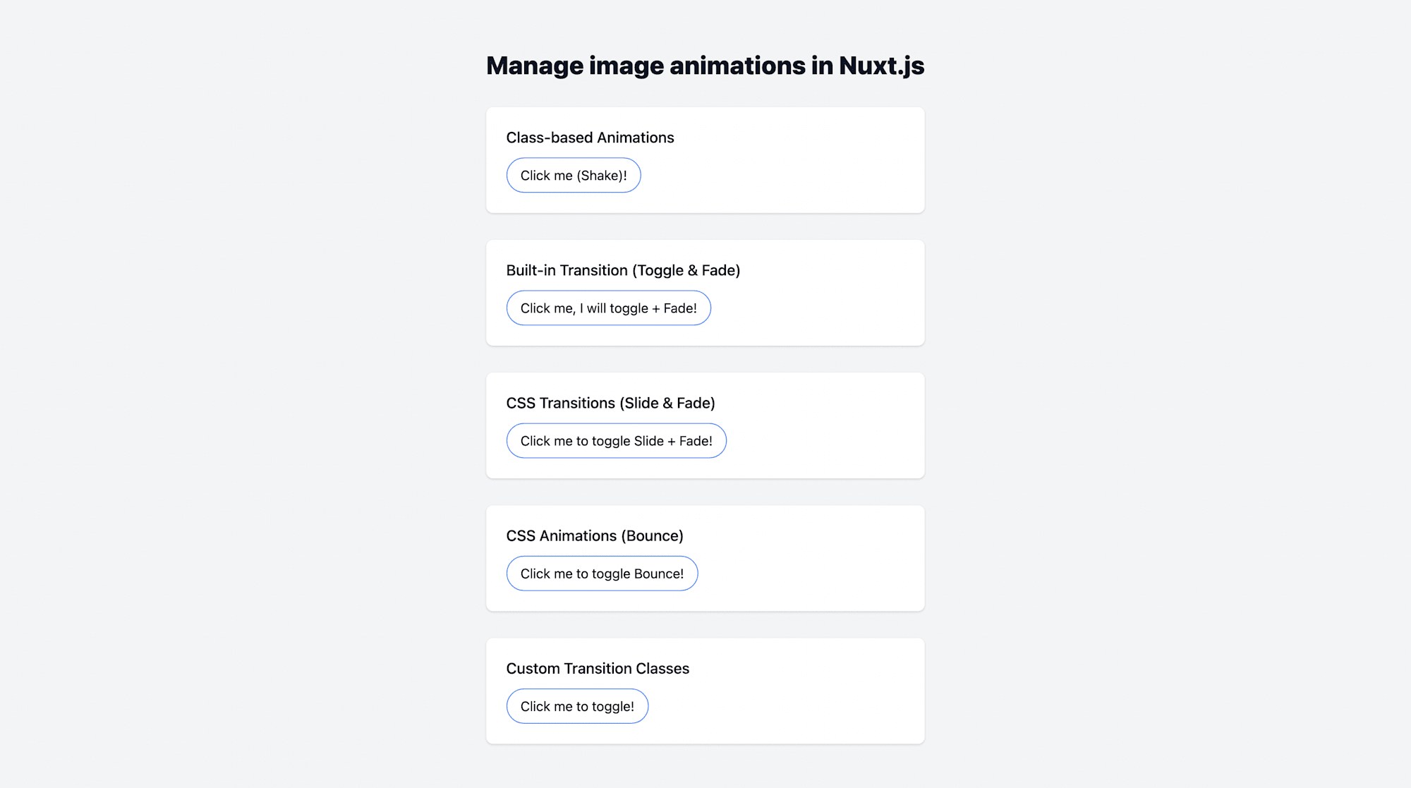
Let’s open our browser, we should see something similar to the image below.

In the following section, we will implement how to manage image animations in Nuxt.js using the Class-based Animations, Built-in Transition (Toggle & Fade), CSS Transitions (Slide & Fade), CSS Animations (Bounce), and Custom Transition Classes.
Class-Based Animations
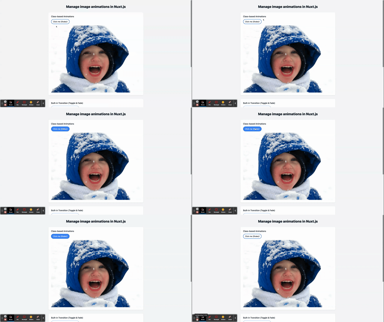
We can start animations for components that aren’t entering or leaving the DOM by dynamically adding a CSS class with the following code snippet:
    <template>
      <div
        class="relative flex items-top justify-center min-h-screen bg-gray-100 sm:items-center sm:pt-0">
        <div class="max-w-4xl mx-auto sm:px-6 lg:px-8 mb-8">
          //...
          <div class="mt-8 bg-white overflow-hidden shadow sm:rounded-lg p-6">
            <h2 class="text-lg leading-6 font-medium text-gray-900">
              Class-based Animations
            </h2>

            <!-- Update the div class -->
            <div :class="{ shake }">
              <button
                @click="shake = !shake" // Add this
                //...
              >
                Click me (Shake)!
              </button>

              <!-- Add this -->
              <cld-image
                public-id="/samples/people/boy-snow-hoodie.jpg"
                class="mt-3"
              >
              </cld-image>
            </div>
          </div>
          //...
        </div>
      </div>
    </template>

    <script>
    export default {
      name: "IndexPage",
      data() {
        return {
          shake: false,
        };
      },
    };
    </script>
Code language: HTML, XML (xml)
In the code snippet above, we;
- Created a
shakestate variable with a default set tofalse - Updated the class in the
divreferencing theshakestate variable - Added the
@clickattribute to the button to set the value of the state variable when it’s clicked - Added a Cloudinary image with a
public-idof our choice

Built-In Transition (Toggle & Fade)
In this section, we’ll use the built-in <Transition> component to implement the built-in transition with toggle and fade capability. It doesn’t need to be registered because it is accessible in any component’s template. It is possible to apply enter and exit animations to elements or parts supplied to it via its default slot.
    <template>
      <div
        class="relative flex items-top justify-center min-h-screen bg-gray-100 sm:items-center sm:pt-0
        "
      >
        <div class="max-w-4xl mx-auto sm:px-6 lg:px-8 mb-8">
          //...
          <div class="mt-8 bg-white overflow-hidden shadow sm:rounded-lg p-6">
            <h2 class="text-lg leading-6 font-medium text-gray-900">
              Built-in Transition (Toggle & Fade)
            </h2>
            <button
              @click="tFade = !tFade" // Add this
             //...
            >
              Click me, I will toggle + Fade!
            </button>

          <!-- Add this -->
            <Transition>
              <cld-image
                v-if="tFade"
                public-id="/samples/people/group-picture.jpg"
                class="mt-3"
              ></cld-image>
            </Transition>
          </div>
          //...
        </div>
      </div>
    </template>

    <script>
    export default {
      name: "IndexPage",
      data() {
        return {
          //...
          tFade: true,
        };
      },
    };
    </script>
Code language: HTML, XML (xml)
In the code snippet above, we;
- Created a
tFadestate variable with a default value oftrue - Added the
@clickattribute to the button to set the value of the state variable when it’s clicked - Added a Cloudinary image with a
public-idof our choice wrapped with the built-in<Transition>component

CSS Transitions (Slide & Fade)
With the help of the transition CSS property, we can quickly describe various transitional elements, such as the attributes that should be animated, the length of the transition, and easing curves.
Another example of many attributes transitioning is seen here, with distinct durations and softening curves for entry and exit.
    <template>
      <div
        class="relative flex items-top justify-center min-h-screen bg-gray-100 sm:items-center sm:pt-0">
        <div class="max-w-4xl mx-auto sm:px-6 lg:px-8 mb-8">
          //...
          <div class="mt-8 bg-white overflow-hidden shadow sm:rounded-lg p-6">
            <h2 class="text-lg leading-6 font-medium text-gray-900">
              CSS Transitions (Slide & Fade)
            </h2>
            <button
            @click="sFade = !sFade" // Add this
              //...
            >
              Click me to toggle Slide + Fade!
            </button>

            <!-- Add this -->
            <Transition name="slide-fade">
              <cld-image
                v-if="sFade"
                public-id="/samples/people/group-picture-3.jpg"
                class="mt-3"
              ></cld-image>
            </Transition>
          </div>
        </div>
      </div>
    </template>

    <script>
    export default {
      name: "IndexPage",
      data() {
        return {
          //...
          sFade: true,
        };
      },
    };
    </script>
Code language: HTML, XML (xml)
In the code snippet above, we;
- Created
sFadestate variable with a default value oftrue - Added an
@clickattribute to the button to set the value of the state variable when it is clicked - Added a Cloudinary image with a
public-idof our choice wrapped with the built-in<Transition>component and an attribute ofname=``"``slide-fade``"

CSS Animations (Bounce)
In this section, we will experiment with the bounce functionality using the CSS animation with the following code snippet.
    <template>
      <div
        class="relative flex items-top justify-center min-h-screen bg-gray-100 sm:items-center sm:pt-0">
        <div class="max-w-4xl mx-auto sm:px-6 lg:px-8 mb-8">
         //...
          <div class="mt-8 bg-white overflow-hidden shadow sm:rounded-lg p-6">
            <h2 class="text-lg leading-6 font-medium text-gray-900">
              CSS Animations (Bounce)
            </h2>
            <button
            @click="bounce = !bounce" // Add this
             //...
            >
              Click me to toggle Bounce!
            </button>

          <!-- Add this -->
            <Transition name="bounce">
              <cld-image
                v-if="bounce"
                public-id="/samples/people/jazz.jpg"
                class="mt-3"
              ></cld-image>
            </Transition>
          </div>
        </div>
      </div>
    </template>

    <script>
    export default {
      name: "IndexPage",
      data() {
        return {
          //...
          bounce: true,
        };
      },
    };
    </script>
Code language: HTML, XML (xml)
In the code snippet above, we;
- Created a
bouncestate variable with a default value oftrue - Added an
@clickattribute to the button to set the value of the state variable when it is clicked - Added a Cloudinary image with a
public-idof our choice wrapped with the built-in<Transition>component and an attribute ofname="bounce"

Custom Transition Classes
The code snippet below shows how to pass the enter-from-class and enter-active-class props to the Transition component to specify custom transition classes.
    <template>
      <div
        class="relative flex items-top justify-center min-h-screen bg-gray-100 sm:items-center sm:pt-0">
          //...
          <div class="mt-8 bg-white overflow-hidden shadow sm:rounded-lg p-6">
            <h2 class="text-lg leading-6 font-medium text-gray-900">
              Custom Transition Classes
            </h2>
            <button
            @click="show = !show" // Add this
            //...
            >
              Click me to toggle!
            </button>

            <!-- Add this -->
            <Transition
              name="custom-classes"
              enter-active-class="animate__animated animate__tada"
              leave-active-class="animate__animated animate__bounceOutRight"
            >
              <cld-image
                v-if="show"
                public-id="/samples/people/smiling-man.jpg"
                class="mt-3"
              ></cld-image>
            </Transition>
          </div>
        </div>
      </div>
    </template>

    <script>
    export default {
      name: "IndexPage",
      data() {
        return {
          //...
          show: true,
        };
      },
    };
    </script>
Code language: HTML, XML (xml)
In the code snippet above, we;
- Created a
showstate variable with a default value oftrue - Added an
@clickattribute to the button to set the value of the state variable when it is clicked - Added a Cloudinary image with a
public-idof our choice wrapped with the built-in<Transition>component and an attribute ofname="custom-classes"

This post demonstrated how to manage image animations in Nuxt.js.
You may also find these resources helpful.
