
In this blog post, we’ll show you how to upload images with a single button, store them in specific folders, enable manual moderation, and display these images in your app filtered by tags – all by using Next.js.
First, we’ll need to set up the following:
- A free Cloudinary account. If you haven’t already, sign up for a Cloudinary account. It’s where our images will live and be managed.
- Next.js App Router. Make sure you have the Next.js App Router. We can use the pages router, but for this demo, let’s stick with the App Router to stay on the cutting edge.
- Next-Cloudinary package. The next-cloudinary package is a handy tool that makes integrating Cloudinary into our Next.js app a breeze.
- Cloudinary package. This is the Cloudinary SDK for Node.js.
- Some cool images! This tutorial will demonstrate how to upload images. So go ahead and prepare some awesome, good-looking images for our tests.
Once we have our Cloudinary account and images ready, it’s time to kick things off by setting up our Next.js app. Let’s start with this command:
npx create-next-app@latestCode language: CSS (css)After running the command, you’ll see a few prompts that will set the details of the app for you. Let’s go step by step:
- Name your app.
- Enable app router.
The other steps are optional and entirely up to you. In my case, I chose to use TypeScript and Tailwind CSS as well.
Afterwards, we’ll need to install our Cloudinary package for easy Cloudinary integration in our app:
npm install next-cloudinaryWe’re almost there – just one more step and we’ll be ready to start hacking! We’ll need to set up some environment variables to help us securely store key information for our app to communicate with Cloudinary:
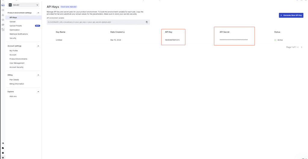
- NEXT_PUBLIC_CLOUDINARY_CLOUD_NAME. This is your Cloudinary cloud name, a unique identifier for your Cloudinary account. This can be found at the top-right corner of your Cloudinary console.
- CLOUDINARY_API_SECRET. The private key used for secure connections with the Cloudinary API.
- NEXT_PUBLIC_CLOUDINARY_API_KEY. The public key used to authenticate your requests to the Cloudinary API.
You can find your private and public API keys in the API Keys section on the settings page of your Cloudinary console:
Let’s jump straight to why we’re here: uploading images.
We have two different components to accomplish this goal: CldUploadButton and CldUploadWidget. The button component, as the name suggests, adds a button to our page for easy uploads, whereas the widget component gives you more control over the UI.
To render the CldUploadWidget component within a Server Component, we’ll need to rely on client components since client-side methods must be passed as props. As a result, this component can’t be directly used as a server component, limiting its ability to function as a first-class server-side element.
Because of the above, for this tutorial, we’ll use the CldUploadButton component instead.
Before using this component, though, determine where and how to render it without affecting our tree and bundle. As stated in the React docs, we’ll need to specify where our client boundary starts using the “use client” directive. We don’t need to add multiple “use client” at the top of the file if we’re already in the client bundle of Next.js; if we’re already importing our component inside the client bundle, adding an extra “use client” won’t cause additional bundling effects as it’s already part of it.
For this reason, Cloudinary ships its client components without the “use client” directive by default, so we have the flexibility to choose when and where to start the client-side bundle without adding unnecessary boundaries.
Now, let’s decide where to start our client tree. We have two options:
- Mark the entire page as a Client Component using the “use client” at the top of the file, import our component, and start using it from there. This approach isn’t ideal because it would make the entire component tree client-side.
- Create a wrapper that enables this client-side component without affecting the rest of the tree. This approach allows us to progressively enhance the page, rather than rendering it as static HTML/CSS.
Since the second approach is a better solution for our use case, let’s proceed with that. We’ll start by setting up the wrapper component.
First, navigate to the root of your Next.js app, then go to the app directory and create a new folder named “components”.
Inside this folder, create a new file for our wrapper component and name it “UploadButton.tsx” (or just “jsx“, depending on if you chose typescript, or not). This component will utilize the next-cloudinary package to render the button that we need for uploading images in Cloudinary.
UploadButton.tsx, our wrapper component, is where we’ll import and use the Cloudinary upload button. It will look like this:
"use client";

import { CldUploadButton, type CldUploadButtonProps } from "next-cloudinary";

function UploadButton(props: CldUploadButtonProps) {

  return <CldUploadButton {...props} />;

}

export default UploadButton;Code language: JavaScript (javascript)
Now, if we render this component in our page.tsx component, we can import this component and start using it. I also added basic styles to the button:
import UploadButton from "@/app/components/UploadButton";

export default function Home() {

  return (

    <main>

      <UploadButton

       className="bg-blue-500 hover:bg-blue-700 text-white font-bold py-2 px-4 rounded-full"

       />

    </main>

  );

}Code language: JavaScript (javascript)
You’ll see a button with the text Upload. When you click it, the Upload widget will open. However, uploading an image won’t work just yet. We’ll need to make some adjustments first.
We have two different ways of uploading our images using our button: Signed and Unsigned methods. The difference is that Unsigned lets us upload images without any authentication, like our API secret, for example. It has its use cases, like public social media sites with no moderations or event-based application where users need to quickly share photos of an event happening, but for the most part, we want to make sure and have more control over what is uploaded to our Cloudinary account for safety reasons, so we’ll go with the signed workflow.
Our flow will work by having a new endpoint that’s triggered when we upload an image. This endpoint will return a signature token, which we’ll then use to complete the image upload process.
Let’s create our endpoint. We’ll be using Route Handlers from Next.js. Inside our app folder, we’ll create an api folder, and within that, we’ll add a new folder called “sign-cloudinary-params“. Then, we’ll create a route.ts file inside this folder.
app

 ↳api

  ↳sign-cloudinary-params

   ↳route.ts //create this fileCode language: JavaScript (javascript)
The route.ts file will contain the following code:
import { v2 as cloudinary } from "cloudinary";

// Config our cloudinary instance

cloudinary.config({

  cloud_name: process.env.NEXT_PUBLIC_CLOUDINARY_CLOUD_NAME,

  api_key: process.env.NEXT_PUBLIC_CLOUDINARY_API_KEY,

  api_secret: process.env.CLOUDINARY_API_SECRET,

});

export async function POST(request: Request) {

  const body = await request.json();

  // Get the params to sign from the request body.

  // This is something that we don't need to worry about as it will come

  // from the upload widget

  const { paramsToSign } = body;

  // Get the signature with the api_sign_request method, passing the params to sign and the api secret

  const signature = cloudinary.utils.api_sign_request(

    paramsToSign,

    process.env.CLOUDINARY_API_SECRET as string

  );

  // Return the signature

  return Response.json({ signature });

}Code language: JavaScript (javascript)
Here, we’re passing the params to sign from the request and using the api_sign_request method to get our signature token.
So now, to use this endpoint with our button, we’ll pass a new prop inside our component: signatureEndpoint. In this prop, we’ll specify the endpoint that we just created:
import UploadButton from "@/app/components/UploadButton";
export default function Home() {
return (
<main>
<UploadButton
// The signatureEndpoint prop is the path to the route that will sign the Cloudinary params
signatureEndpoint="/api/sign-cloudinary-params"
className="bg-blue-500 hover:bg-blue-700 text-white font-bold py-2 px-4 rounded-full"
/>
/>
</main>
);
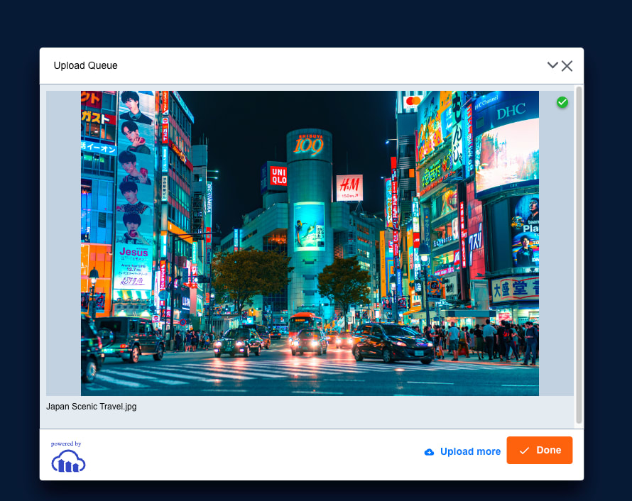
}Code language: PHP (php)And that should be it! Now if we try uploading an image with our button again, we should be able to upload it. For this example, I prepared some photos of Japan!
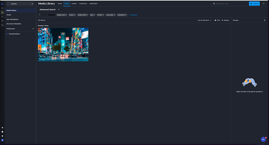
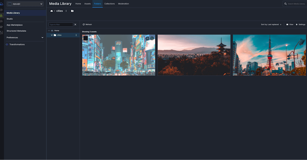
Now, if we go to our Cloudinary account, we’ll see the photo in our Media Library:
Let’s improve this upload flow even more, shall we? Wouldn’t it be neat to organize these photos instead of just storing them all in one place? Or to get a specific set of images? Depending on our needs, we might want to retrieve specific images from our library and also add some moderation; we don’t want any images in there. To achieve this, we’ll use Upload Presets.
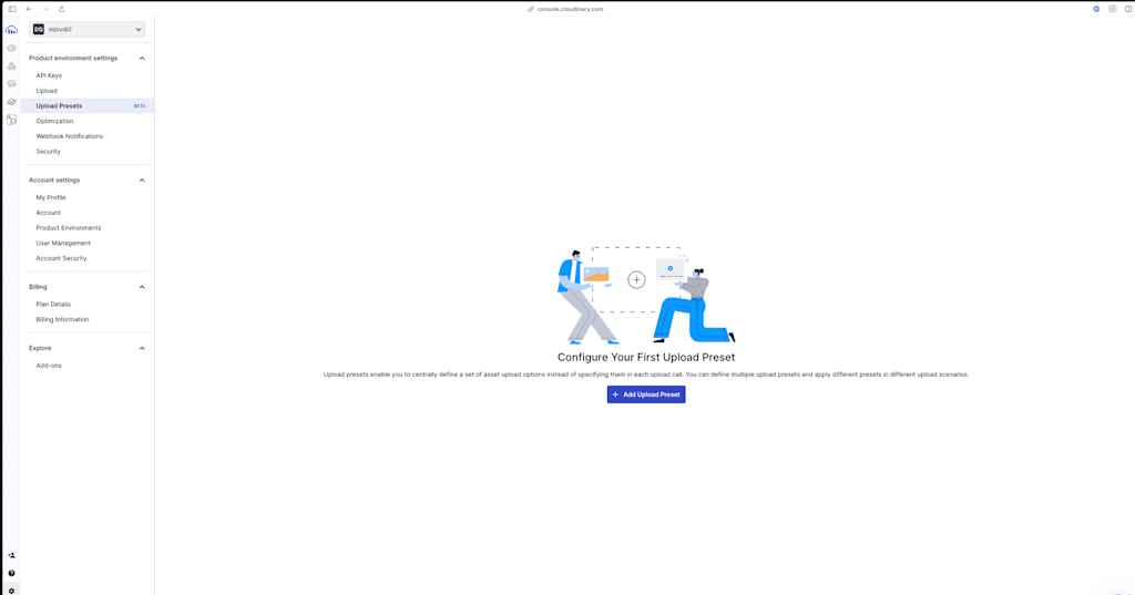
In our Cloudinary account, click Settings (the cog on the bottom left), Upload Presets, and then Add Upload Preset:
We can create a preset that will be used to group images containing “cities”:
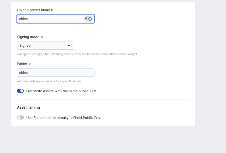
The other options are fine as is, we want these images to be signed as explained above, and the overwriting is also helpful in case we upload an image with the same public ID that already exists in our Media Library. The public ID is a unique string generated when an asset is uploaded to Cloudinary. If the Use filename or externally defined Public ID option is enabled, the public ID will match the file’s name. If this option is disabled, the public ID will be automatically generated as a random string of characters. Enabling the overwrite ensures that if we upload an image with the same public ID, it replaces the old one.
I also set a folder name so that all images saved with this preset go into the “cities” folder.
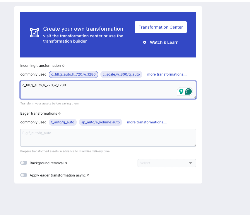
I’d like to add an extra functionality to this preset. Go to the Transform tab. Here, we can apply transformations to our assets like round borders, background removal, and more, but for this demo, let’s add a transformation that resizes our image to a fixed size when uploading them, just like this:
We could also add more configurations for these assets, like adding tags, allowing only specific formats, changing the format of the assets, and more.
Once we’re ready with our configuration, click Save.
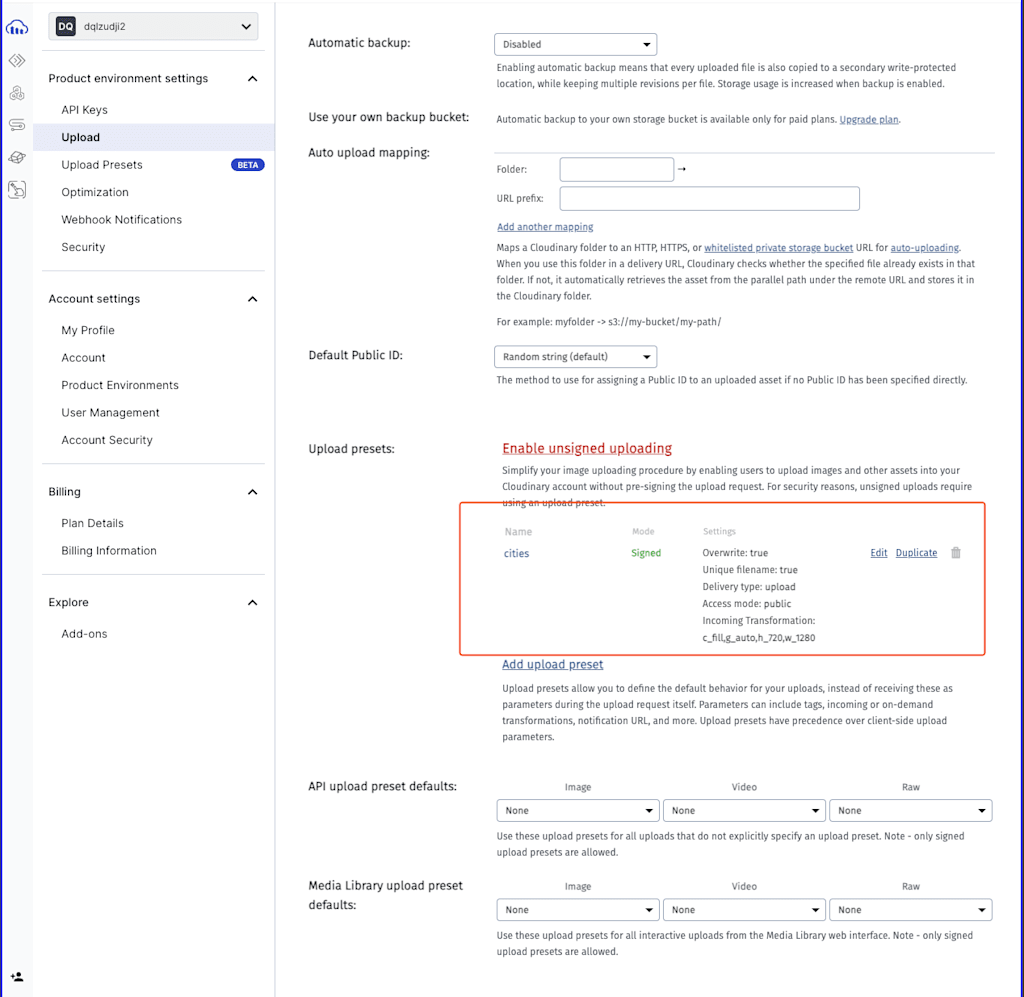
Then, let’s go to the Upload tab to find the preset we created:
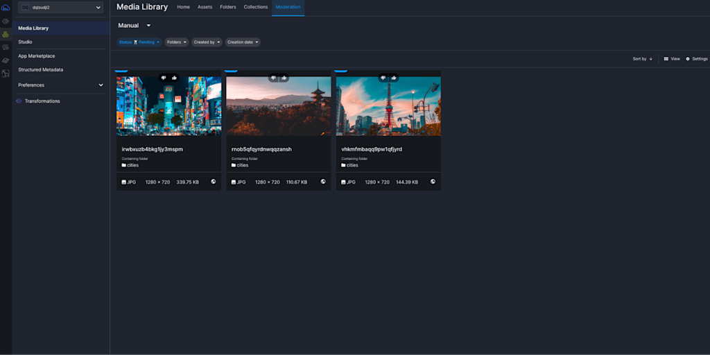
Inside our preset, select the Upload Control tab and the Manual checkbox in the Auto moderation section. This means that every time an asset is uploaded with this preset, it will first need to pass manual moderation before the image is available for display.
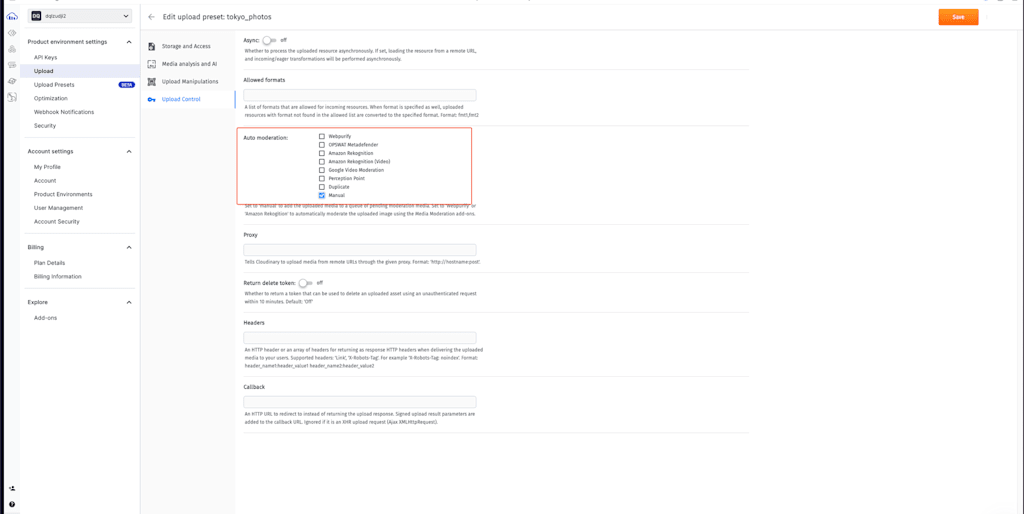
We could add auto-moderation to these assets via one of these options, making an advanced algorithm to make decisions. These are useful when we need to moderate a large volume of uploads and want to ensure consistency, but for now, let’s stick with manual moderation as we don’t have a large volume of uploads and so we have more control over what gets uploaded. We can also add more strict moderation settings, like specifying which proxy these assets need to come from or the allowed formats of the assets.
Let’s save these new settings and add the new preset to our button:
import UploadButton from "@/app/components/UploadButton";

export default function Home() {

  return (

    <main>

      <UploadButton

        signatureEndpoint="/api/sign-cloudinary-params"

        className="bg-blue-500 hover:bg-blue-700 text-white font-bold py-2 px-4 rounded-full"

        // The uploadPreset prop is the name of the upload preset that we created in Cloudinary

        uploadPreset="cities"

      />

    </main>

  );

}Code language: JavaScript (javascript)
Now, if we upload new images and check our media, the image will be stored in the folder that we specified before:
When we click the Moderation tab, the image will be pending our moderation approval. If we decline, it will be erased. If we approve, it will proceed, and we’ll be able to access this asset and display it in our app.
Also, notice how our transformation is working perfectly! All of our images now have the fixed size that we specified.
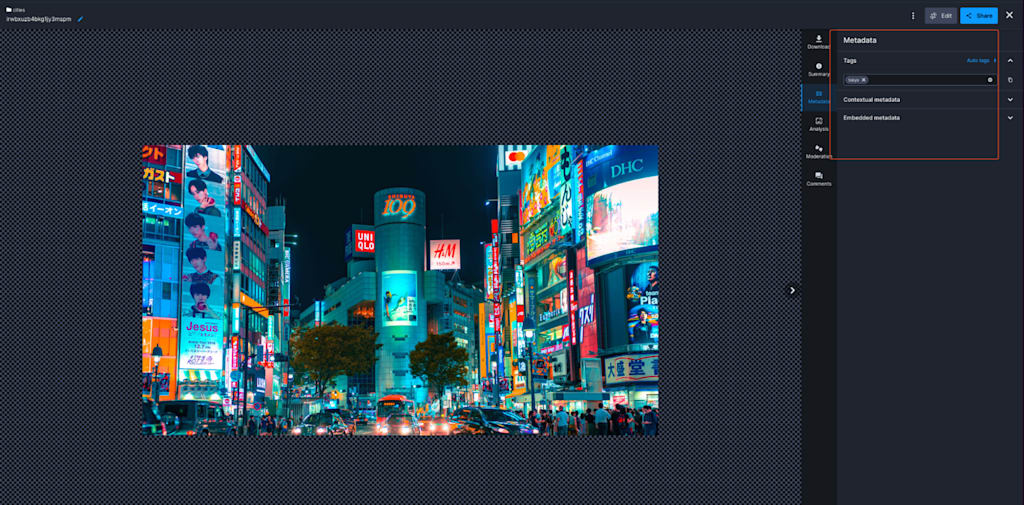
Before going to the next section, let’s say that we don’t have just one city, but multiple. Tagging these images would be helpful to distinguish between them. In our UploadButton component, pass a new “options” prop where we can specify tags to be added to our assets once we upload them:
<UploadButton

          // The signatureEndpoint prop is the path to the route that will sign the Cloudinary params

          signatureEndpoint="/api/sign-cloudinary-params"

          className="bg-blue-500 hover:bg-blue-700 text-white font-bold py-2 px-4 rounded-full"

          // The uploadPreset prop is the name of the upload preset that we created in Cloudinary

          uploadPreset="cities"

          options={{

            tags: ["tokyo"],

          }}

        />Code language: PHP (php)
Now, if we upload a new image and check its metadata, it should have the tag we specified:
Our “Upload Preset” configuration and tags are ready! Let’s proceed to the next step: retrieving these images dynamically from our App!
To retrieve our images, we’ll use our Cloudinary SDK. To avoid instantiating the Cloudinary SDK every time we need it, let’s create a new utility function to handle this for us. In our app folder, create a new folder called “utils” and inside it, add the file “getCloudinary” and write the following code:
import { v2 as cloudinary } from "cloudinary";

export default function getCloadinary() {

  // Config our Cloudinary instance

  cloudinary.config({

    cloud_name: process.env.NEXT_PUBLIC_CLOUDINARY_CLOUD_NAME,

    api_key: process.env.NEXT_PUBLIC_CLOUDINARY_API_KEY,

    api_secret: process.env.CLOUDINARY_API_SECRET,

  });

  return cloudinary;

}Code language: JavaScript (javascript)
Let’s use it in our Server Component and use one of their APIs to retrieve the images in the folder that we need:
import UploadButton from "@/app/components/UploadButton";

import getCloudinary from "@/app/utils/getCloudinary";

// Cloudinary client

const cloudinary = getCloudinary();

export default function Home() {

  // Get all the resources from the "cities" folder and the ones that have the "tokyo" tag

  const { resources } = await cloudinary.search.expression("folder=cities AND tags=tokyo").execute();

  return (

    <main>

      <UploadButton

        // The signatureEndpoint prop is the path to the route that will sign the Cloudinary params

        signatureEndpoint="/api/sign-cloudinary-params"

        className="bg-blue-500 hover:bg-blue-700 text-white font-bold py-2 px-4 rounded-full"

        // The uploadPreset prop is the name of the upload preset that we created in Cloudinary

        uploadPreset="cities"

      />

    </main>

  );

}Code language: PHP (php)
The CldImage component from next-cloudinary will unlock the Cloudinary’s full potential so let’s use it to display our images. Just as we did with our <UploadButton/>, create a wrapper for this component:
// app/components/CldImage.tsx

"use client";

import { CldImage as CldImageDefault, CldImageProps } from "next-cloudinary";

const CldImage = (props: CldImageProps) => {

  return <CldImageDefault {...props} />;

};

export default CldImage;Code language: JavaScript (javascript)
Next, we’ll import it in our page.tsx component and start displaying our images! I added some styles to my component, but feel free to add your own:
import UploadButton from "@/app/components/UploadButton";

import getCloudinary from "@/app/utils/getCloudinary";

import CldImage from "@/app/components/CldImage";

const cloudinary = getCloudinary();

export default async function Home() {

  // Get all the images from the "cties" folder and the ones that have the "tokyo" tag

  const { resources } = await cloudinary.search

    .expression("folder=cities AND tags=tokyo")

    .execute();

  return (

    <main>

      <section className="flex flex-col gap-10 mt-10 items-center min-h-screen">

        <UploadButton

          // The signatureEndpoint prop is the path to the route that will sign the Cloudinary params

          signatureEndpoint="/api/sign-cloudinary-params"

          className="bg-blue-500 hover:bg-blue-700 text-white font-bold py-2 px-4 rounded-full"

          // The uploadPreset prop is the name of the upload preset that we created in Cloudinary

          uploadPreset="cities"

          options={{

            tags: ["tokyo"],

          }}

        />

        <ul className="grid grid-cols-3 gap-4">

          {resources.map((image: CldImage) => (

            <li key={image.public_id}>

              <CldImage

                className="max-w-sm overflow-hidden shadow-lg"

                alt={image.public_id}

                src={image.secure_url}

                width={500}

                height={500}

              />

            </li>

          ))}

        </ul>

      </section>

    </main>

  );

}

type CldImage = {

  public_id: string;

  secure_url: string;

  width: number;

  height: number;

};Code language: JavaScript (javascript)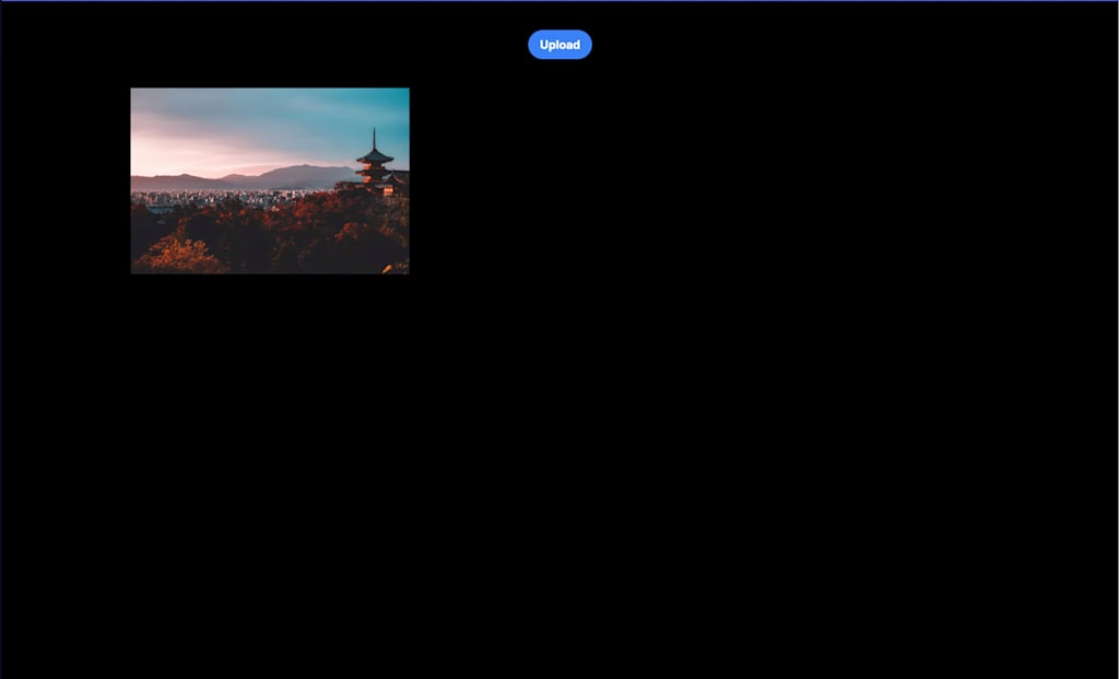
And we’re done! We can now display the images that we’ve approved in our moderation list.
In this flow, we created a component to dynamically upload our images to Cloudinary, added tags to these assets, and configured them through our custom Upload Preset to transform, moderate, and organize them. We also displayed these images easily in our Next.js app using Server Components.
We’ve just scratched the surface of what Cloudinary offers for uploading and displaying images. There are many more features to explore, such as auto transformation, auto moderation, and more advanced settings. Sign up for a free account today.