
Today we have different devices with different sizes and orientations, and sending images that have been designed to look good on larger screens to users with considerably smaller low-resolution screens isn’t suitable for performance. It can also create a poor user experience.
In this jam, we’ll learn how to use one of HTML’s responsive image features – resolution switching to make images responsive on devices with different screen sizes, thereby improving performance.
With resolution switching, We can provide the browser with additional information (viewport width, resolution, etc.), which it can use to display a different-sized copy of the same image based on the device.
We’ll use both the srcset and size attributes on the `img element to provide the browser with additional image assets to make the right choice.
    <img srcset="ifeoma-imoh-500w.jpg 500w,
                 ifeoma-imoh-800w.jpg 800w"
         sizes="(max-width: 600px) 500px,
                800px"
         src="ifeoma-imoh-800w.jpg"
         alt="MYy profile picture">
Code language: HTML, XML (xml)
srcset
Using the srcset attribute, we allow the browser to choose by providing a list of images and widths in pixels separated by commas. Images are labeled with a width descriptor – w and not px.
sizes
The sizes attribute gives the browser some information about the page layout based on some media conditions(e.g., (max-width:400px)). The browser then determines which image to choose from the list provided in the srcset attribute when certain conditions are true. All we need to do is give it multiple comma-separated values. For example, in our code snippet above, we say that when the viewport width is 500px or less, the browser should load the image that is 500px wide.
Manually creating multiple alternate versions of each image can be time-consuming if your website has many images, so let’s explore how to automate this process using Cloudinary.
Cloudinary provides us with dynamic URL transformations that we can use to adjust our media assets easily. We will upload a high-resolution image to Cloudinary and deliver it in various sizes and qualities based on the device viewport width.
First, you need to create a Cloudinary account if you do not have one already. After that, you should see your account details on your dashboard. Now upload an image to your Media Library with a file name that can be easily remembered. This file name or image name is also referred to as the public ID for that image.
<a href="https://res.cloudinary.com/ifeomaimoh/image/upload/ifeoma.jpg" target="_blank">https://res.cloudinary.com/ifeomaimoh/image/upload/ifeoma.jpg</a>
This is the URL for the image I uploaded, and all our transformation instructions will be added between the /upload and the public ID – ifeoma.jpg. For more on transformation URL structure, see here.
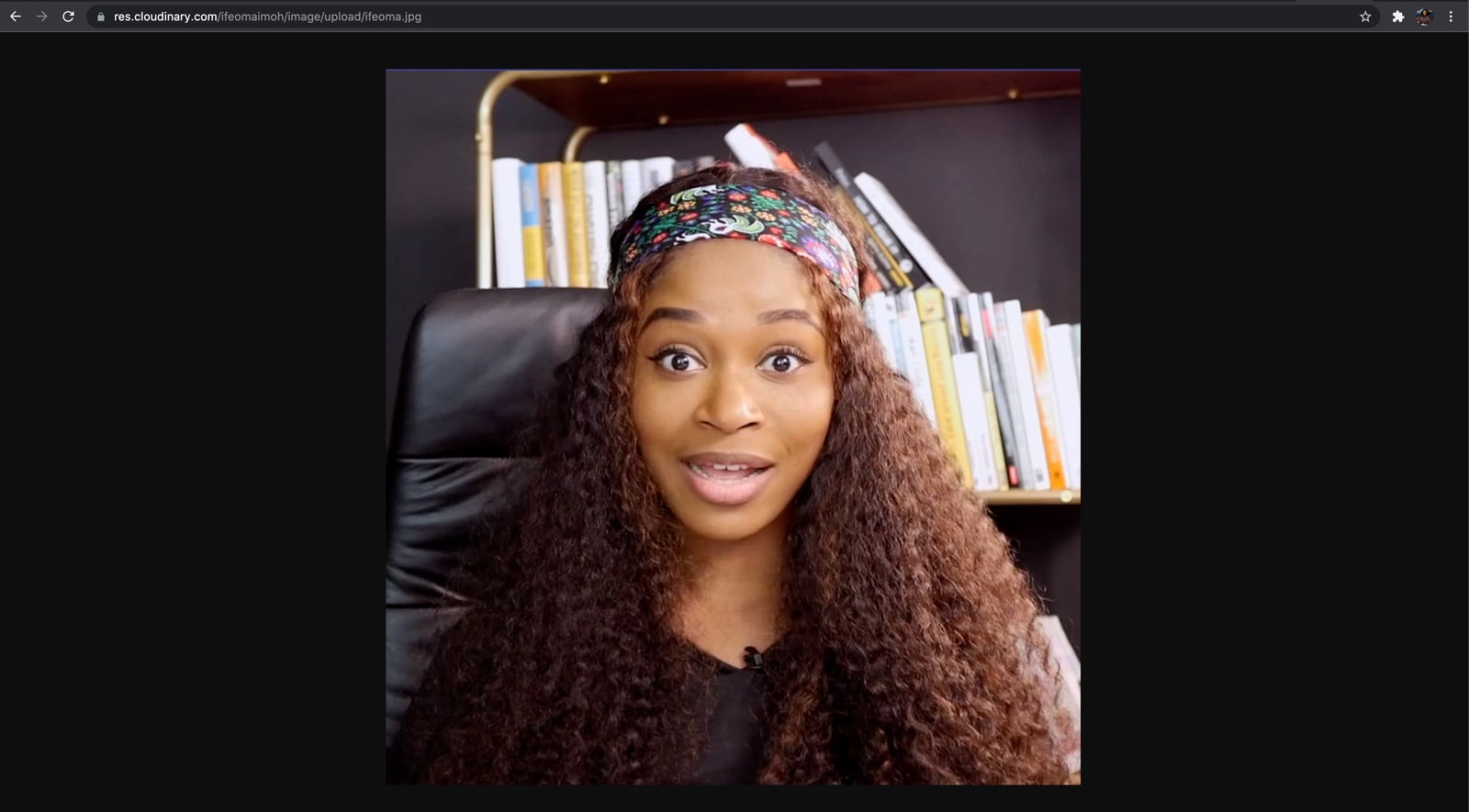
I uploaded the full resolution version of this image to my Cloudinary media library, and its file size is 89kb.
To optimize our image and deliver it with minimal file size alongside high visual quality, we are going to focus on these three things:
- Reducing the width of the image
- Reducing the quality of the image for smaller devices
- Automatic format selection
We are going to handle resizing our images with Cloudinary’s width parameter. Including this parameter sets the image to your desired width in pixels based on the value you specify.
To scale our image down to a width of 500px, all we need to do is add w_500 between the upload/ and the public ID.
https://res.cloudinary.com/ifeomaimoh/image/upload/w_500/ifeoma.jpg

Scaling the width of this image down to 500px now results in a file size of 39kb.
We can define the quality compression levels applied to our images with the quality parameter provided by Cloudinary. The quality parameter accepts values ranging from 1 (smallest file size possible) to 100 (best visual quality). The value we choose determines what we’re willing to trade-off between visual quality and file size. In the URL below, I passed in 50.
<a href="https://res.cloudinary.com/ifeomaimoh/image/upload/q_50/ifeoma.jpg" target="_blank">https://res.cloudinary.com/ifeomaimoh/image/upload/q_50/ifeoma.jpg</a>

Reducing the quality of this image now results in a file size of 31kb, and the loss in visual quality isn’t so much.
This is another way we can significantly reduce our file size and save bandwidth without sacrificing quality. Using Cloudinary, we can specify that we deliver the best image format based on the user’s browser. Cloudinary has a fetch_format (f_) transformation parameter, which converts and delivers images in various formats. Using it is as easy as providing the desired format as a file extension of your image URL. For more details, see the automatic format selection documentation.
If you want to convert to the png version of the uploaded JPEG file, it is as simple as specifying the format as the file extension of the delivery URL
<a href="https://res.cloudinary.com/ifeomaimoh/image/upload/q_70,w_500/ifeoma.png" target="_blank">https://res.cloudinary.com/ifeomaimoh/image/upload/q_70,w_500/ifeoma.png</a>
In our case here, we will be setting the fetch_format parameter to auto because we want to deliver images (as WebP, AVIF, or JPEG) based on the user’s browser. Cloudinary will automatically detect which browser is requesting the image, and it will deliver it in the best format for that browser. If a browser does not support any optimized formats that f_auto returns, the image will be delivered in the file extension’s format.
https://res.cloudinary.com/ifeomaimoh/image/upload/f_auto,q_70,w_500/ifeoma.jpg
We’ve seen how to use Cloudinary’s image transformations to resize and optimize our image. Let’s put our transformed URLs in an img tag. Create a folder called responsive-images and inside it, create an index.html file. Add the following to your index.html file.
    <!DOCTYPE html>
    <html lang="en">
    <head>
        <meta charset="UTF-8">
        <meta http-equiv="X-UA-Compatible" content="IE=edge">
        <meta name="viewport" content="width=device-width, initial-scale=1.0">
        <title>Resolution Switching</title>
    </head>
    <body>
        <h1 style="color:rgb(126, 4, 116);text-align:center;">Resolution Switching with srcset and sizes</h1>
        <div  style="
            max-width: 800px;
            margin: 0 auto;
            padding: 30px 30px;">
            <img style="width: 100%;"
            sizes="(max-width 500px) 500px, 1000px)"
            srcset="https://res.cloudinary.com/ifeomaimoh/image/upload/f_auto,q_70,w_500/ifeoma.jpg 500w,
            https://res.cloudinary.com/ifeomaimoh/image/upload/f_auto,q_70,w_768/ifeoma.jpg 768w,
            https://res.cloudinary.com/ifeomaimoh/image/upload/f_auto,q_70,w_1024/ifeoma.jpg 1024w,
            https://res.cloudinary.com/ifeomaimoh/image/upload/f_auto,q_70,w_3200/ifeoma.jpg 3200w,"
            src="https://res.cloudinary.com/ifromaimoh/image/upload/f_auto,q_70,w_500/ifeoma.jpg"
            alt="My profile picture"
            />
        </div>
    </body>
    </html>
Code language: HTML, XML (xml)
We wrapped our img element in a div whose max-width is set to 800px. In viewports above that width, the div remains at 800px and centers itself. In our srcset attribute, we passed three resized and optimized Cloudinary URLs. Now, based on which media condition is true and which slot size is specified for that media query, the browser is intelligent enough to determine the width of the requesting device and then load the appropriately-sized image. Using the src attribute, we’re also specifying a fallback image for older browsers that don’t understand what the srcset and sizes attributes are.
In this article, we learned that using resolution switching is one way to solve the problem of delivering large image files to smaller screens. Because they assist the browser in determining which image to load, the srcset attribute must always be accompanied by the sizes attribute. We also saw how easy it is to use Cloudinary’s image transformation URLs to resize, optimize and generate multiple image formats.
Check out the demo on CodeSandbox
Resources you may find helpful: