Today’s world is no longer about desktop design. We’re already in a mobile-first world. For your brand to be successful, you must have a great mobile experience and have presence on both Android and iOS.
More customers and brands are moving to the mobile platform. What is the reason for that? Why do people choose to use their phones? Why are mobile devices getting more and more popular?
How many hours were spent on mobile devices around the world last year? Can anyone guess how many hours?
The answer is 3.8 trillion hours. Yes, the number is that high!
- People devote a third of their waking time to mobile apps. That’s right, a third!
- People downloaded apps 230 billion times in 2021.
- $320,000 were spent in the app stores (both App Store and Google Play) every minute in 2021.
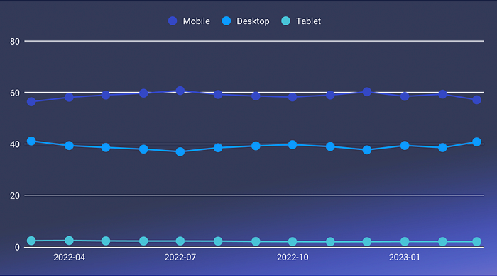
In the following graph, we can see the dark blue line at the top, which represents the mobile internet traffic percentage in the last year. The light blue line is the desktop traffic. The mobile surpassed the desktop internet traffic and hit more than 60%. It didn’t happen yesterday or last month. This has been the trend for a long time.
There are many reasons for this trend. Devices are getting stronger in terms of battery life and screen quality, and applications and mobile networks are improving as well, which contributes to the overall user experience.
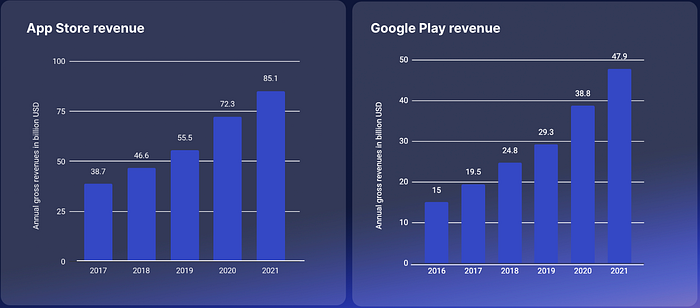
In this image we can see two graphs. The left one represents the revenue for the Apple App Store between 2017 and 2021. We can see the consistent growth in revenue over the years. The right one represents Google Play Store revenue between 2016 and 2021.
In 2021, the Apple App Store made over 85 billion dollars while the Google Play Store fell short to 48 billion dollars. These numbers are unbelievable and come from your applications through subscriptions, consumables, and non-consumables.
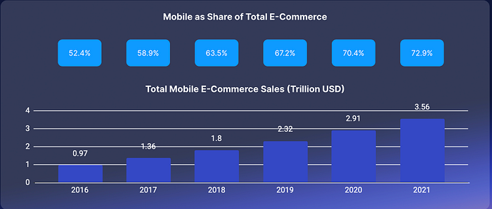
In the following graph, we can see the growth of the mobile ecosystem in the e-commerce category. Between 2016 and 2021, this market has grown up to 3.56 billion dollars — a growth of almost 73%. This is due to many factors; phones are personal and we feel comfortable holding payment methods on our phones.
Mobile devices have become a popular channel for online shopping, with many users preferring to make purchases on their smartphones and tablets. If you offer a seamless mobile shopping experience, you can benefit from increased sales and customer loyalty.
Apple Pay and Google Wallet make it easier and safer to buy products or services using your mobile device, and it’s already on your phone, so you don’t have to re-enter information.

Tinder is a remarkable success with over 5 million downloads per month, a monthly revenue of over 65 million dollars, and an annual revenue of over 700 million dollars.
It started 11 years ago as a native application only. In 2012 Tinder published its iOS native application, and in 2013 its Android application: Mobile First. Only by 2017 did they move their app to the desktop but with limited features.
Tinder is a classic use case of a mobile-first world. Not only that, but they took the online dating genre from the desktop websites to mobile. After Tinder, dozens of dating apps started showing up, such as Bumble, Grindr, and Hinge.
Now that we know why mobile is important and its huge growth in the last few years, I want to show how a poor mobile experience harms your business.
I’ll start by stating this. If people want something from you, they’ll reach you through their phone. If they have a bad experience they’ll click off. Users’ expectations only grow with time.

Many companies tell themselves, “I’ve already invested a lot in the desktop website. We can just ‘adjust’ it to mobile,” but then it’s not 100% mobile compatible. Mobile users expect websites and apps to load quickly and be easy to navigate on their devices.
If your website or app is slow or difficult to use, users may become frustrated and have a negative experience, leading to a poor perception of your business.
It’s important to mention when a user downloads a native application to their phone, they expect it to be tailored to their phone. They expect the best performance and user experience!
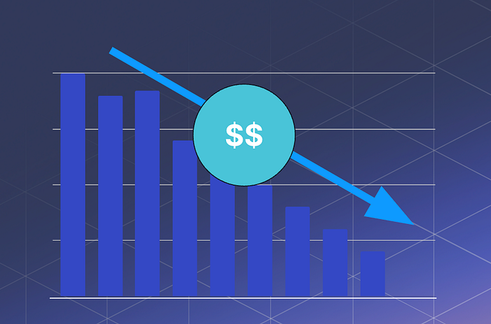
If your mobile site or app is difficult to use, users may abandon their purchases, leading to a loss in revenue for your business.
If a website or mobile app is slow to load, difficult to navigate, or displays poorly on a mobile device, users are more likely to abandon it and look for alternatives.
Not only that, a bad mobile experience will damage your brand reputation, and users will be less likely to engage with your brand even outside of mobile.
If your competitors have a better mobile experience, users may be more likely to choose their products or services over yours, leading to a competitive disadvantage and a loss in revenue as well.
The competition in the mobile world is fierce. More and more brands are moving their businesses to a mobile platform. If you consider yourself at the top of your field, you must have a good native app or mobile web to be competitive.

Google’s search engine algorithm actively penalizes websites that haven’t participated in mobile marketing. Your site should be responsive and easy to browse on mobile devices.
To put it simply, Google will move your website down in the search rankings due to a bad mobile experience. These penalties are becoming more strict over time. If your company hasn’t felt the impact yet, it will soon.
In addition, more than 50% of all searches come from mobile devices and smartphones. Most people don’t open their laptops and conduct searches, but they do on their phones.

There’s no way to determine your ranking in the store, but there are a number of factors that can definitely help, such as the number of downloads, ratings, and reviews; the amount of time users spend in your app; retention rate; application quality; frequent updates; new features; and bug fixes — all of these factors (and more) determine your ranking on the applications stores.
One more thing I’d like to mention is that an app with a score of less than 4.0 stars likely won’t be downloaded by users. A low rating can signal to potential users that the app may have issues or may not meet their expectations.
How would you know if your customers’ mobile experience is up to par? We’ll talk about metrics that you can measure and monitor on your native application or mobile web that’ll determine if your users are having a good or bad mobile experience.
As stated by the legendary Peter Drucker, “What gets measured gets improved.”
Bounce rate is the percentage of users who leave your app or website after viewing only one page. High bounce rates can indicate a poor user experience or irrelevant content. Make sure you research and investigate those and really understand the reasons behind why your users are leaving your page and how you can improve it.
Time on site is the amount of time users spend on your website. This metric can indicate engagement and user interest in your content, as well as satisfaction with your app performance. It might even hint at retention.
Conversion rate is the percentage of users who take a desired action on your app or website, such as making a purchase or subscribing to a service.
This metric can help evaluate the effectiveness of your mobile experience in driving user behavior.
Measuring this is extremely important because you can learn and understand if an action you want your customers to take is actually happening, if you’re missing out. Details like a call to action button not being good enough, or even not visible can hurt your conversion rate.
Retention rate is the percentage of users who return to your app or website after their initial visit.
This metric can indicate the level of user loyalty and satisfaction with your mobile experience.
This of course depends on the type of application/web and the service you business offers, but high retention usually indicates that people like your app and will likely recommend it to others.
Asking for feedback from users through surveys or in-app feedback mechanisms can provide valuable insights into issues with your mobile experience.
In general, it’s a way for us as developers to communicate with our customers, understand their needs, and what they like and don’t like about our application or web.
Follow your user’s story with events, understand where users drop and where your biggest gaps are, and be sure to track your users using events — for screens, actions, and everything else in your application that you think is important.
Build user stories to understand how users navigate your application. Use platforms such as MixPanel or Flurry to create funnels and understand where users fall and where you are missing out. Investigate those falls and learn how to improve the funnel rates.
Users’ ratings and reviews can provide feedback on their mobile experience, as well as the overall quality of the app.
Be sure to address their concerns in the reviews section, and let them know if their issue has been solved on a newer version. This can bring users back, improve retention, and get users to improve their score for your application on the store. As we mentioned before, your store rating impacts your ranking on the application store.
Be sure to track your crash rate, using mechanisms such as Firebase Crashlytics, Sentry, etc.
It’s important to understand if you have a spike of crashes between releases, to see where users fall, and to be able to fix those quickly.
Remember, users expect the best experience when they’re downloading a native application. A crash can harm your app in crucial metrics (e.g., conversation, retention, etc.)
Specifically, measure the time it takes for your app or website to load on a mobile device. Slow loading times can lead to user frustration and abandonment.
This is no longer the 90’s. Text-only apps won’t do — a successful app needs to be reached in media; have images, videos, and animations; and should deliver a great experience so the user will want to come back.
For example, loading media on a mobile device with an unstable connection can be challenging, and you need to be able to play through that and still deliver a good experience.
Here are a few examples from Google’s research on how a delay, even a small one, can hurt your business:
- A 100ms delay in page load can result in a 7% reduction in conversion. Multiply this by 10 (although it’s not a linear connection), and you get a 70% conversion reduction for a 1-second delay.
- A 1-second delay can cause a 20% drop in traffic, which of course also impacts engagement and retention rates. Users expect everything to be instant, so applications and the web should load as quickly as possible.
- A 1-second delay can lead to an 11% decrease in page views. The more pages that people navigate through your application or web, the more time they spend in your app or website. It’ll be more likely that they’ll take a desired action.
- A 1-second delay can lead to a 16% decrease in customer satisfaction, which will impact your ratings, reviews, and the user’s perception of your brand.
This is the first part of how to build a winning mobile strategy. In this part, we discussed why your business should focus on building a strong-performing mobile application/web in a mobile-first world. We also talked about how a poor mobile experience can harm your business, and how to measure and monitor your users’ mobile experience.
In part two, we’ll discuss specific ways to improve your native application/mobile web’s performance for a better user experience. And, if you haven’t already, learn how Cloudinary can help you quickly improve your users’ mobile experience today.
