
As the world becomes increasingly interconnected, file sharing and exchange (mainly images) are becoming more prevalent. As a result, particular care must be taken in making the process as easy as possible.
This is the first part of a two-part series. In this post, we’ll look at how to add drag and drop functionality for media files to a React application, allowing you to select multiple images at once and, not only that, preview the selected images before uploading. Before uploading, you will also have the opportunity to delete an image if you wish to.
Here’s a link to the demo on CodeSandbox.
Create a new React app using the following command:
npx create-react-app drag_and_drop_demo
Next, let’s add the project dependencies. We will be using Ant Design to render our UI components for this project. Add it to your project using the following command:
    npm i antd @ant-design/icons
Code language: CSS (css)
Next, we need to import the antd CSS. To do this, open src/App.css and edit its content to match the following:
    @import '~antd/dist/antd.css';
Code language: CSS (css)To keep our components lean and focused on presentation, we’ll use hooks to inject the needed functionality into the component. In the src folder, create a new folder called hooks. This folder will hold the hooks we will create in this app – one for the drag and drop functionality and the other for preview.
In the src/hooks folder, create a new file called useFileSelection.js and add the following to it:
    import { useState } from 'react';
    const useFileSelection = () => {
      const [selectedFiles, setSelectedFiles] = useState([]);
      const addFile = (file) => {
        setSelectedFiles((currentSelection) => [...currentSelection, file]);
      };
      const removeFile = (file) => {
        setSelectedFiles((currentSelection) => {
          const newSelection = currentSelection.slice();
          const fileIndex = currentSelection.indexOf(file);
          newSelection.splice(fileIndex, 1);
          return newSelection;
        });
      };
      return [addFile, removeFile];
    };
    export default useFileSelection;
Code language: JavaScript (javascript)
We start by declaring a state variable for the selected files. Since we will be dealing with more than one file in the selection, we initialized it with an empty array.
Next, we declare a function named addFile to add a file to the array of selected files. The function takes a file and adds it to the currently selected files by using the setSelectedFiles function to update the state.
We also want to be able to remove a file from the list of selected files, so we declare a function named removeFile, which accepts the file to be removed as a parameter. In the setSelectedFiles function call, we pass a function that takes the selected files in state and does the following:
- Creates a shallow copy of the current selection of files using the slice function.
- Gets the index of the provided file in the current selection of files.
- Removes the file from the shallow copy using the splice function.
- Returns the new selection with the file removed.
Finally, we return an array containing the addFile and removeFile functions.
In the src/hooks folder, create a new file named useFilePreview.js and add the following to it:
    import { Modal } from 'antd';
    import { useState } from 'react';
    const useFilePreview = () => {
      const [previewVisibility, setPreviewVisibility] = useState(false);
      const [previewImage, setPreviewImage] = useState(null);
      const [previewTitle, setPreviewTitle] = useState('');
      const getBase64Representation = (file) =>
        new Promise((resolve, reject) => {
          const reader = new FileReader();
          reader.readAsDataURL(file);
          reader.onload = () => resolve(reader.result);
          reader.onerror = (error) => reject(error);
        });
      const handlePreview = async (file) => {
        if (!file.url && !file.preview) {
          file.preview = await getBase64Representation(file.originFileObj);
        }
        setPreviewImage(file.url || file.preview);
        setPreviewVisibility(true);
        setPreviewTitle(
          file.name || file.url.substring(file.url.lastIndexOf('/') + 1)
        );
      };
      const hidePreview = () => {
        setPreviewVisibility(false);
      };
      const previewContent = (
        <Modal
          visible={previewVisibility}
          title={previewTitle}
          footer={null}
          onCancel={hidePreview}
        >
          <img alt={previewTitle} style={{ width: '100%' }} src={previewImage} />
        </Modal>
      );
      return [handlePreview, previewContent];
    };
    export default useFilePreview;
Code language: JavaScript (javascript)
In this hook, we declare three state variables. previewVisibility is a boolean that determines whether the image preview should be rendered. previewImage contains the base64 representation of the image to be previewed, while previewTitle contains the title of the preview, which is the name of the file to be previewed.
Next, we declare a function named getBase64Representation which takes a file and returns its base64 representation.
After this, we declare an asynchronous function named handlePreview which takes a file and updates the preview image, title, and visibility in state. By setting the visibility to true, the preview will be rendered and displayed to the user.
The user should also have the option to close the preview. The hidePreview function handles this by setting the visibility in state to false, causing the preview to be hidden. Next, we declare the JSX for the preview. The preview is essentially an image wrapped in a Modal component. Using the title and image stored in state, we update the relevant props for the preview component. Finally, we return an array containing the handlePreview function and previewContent constant.
With the hooks in place, we can create the components for our application. In the src folder, create a new folder called components.
In the src/components directory, create a new file called DragAndDrop.js and add the following to it:
    import { Upload } from 'antd';
    import { PlusOutlined } from '@ant-design/icons';
    import useFilePreview from '../hooks/useFilePreview';
    const { Dragger } = Upload;
    const DragAndDrop = ({ addFile, removeFile }) => {
      const [handlePreview, previewContent] = useFilePreview();
      const beforeUploadHandler = (file) => {
        addFile(file);
        return false;
      };
      return (
        <>
          <Dragger
            multiple={true}
            onRemove={removeFile}
            showUploadList={true}
            listType="picture-card"
            beforeUpload={beforeUploadHandler}
            onPreview={handlePreview}
            accept="image/*"
          >
            <p className="ant-upload-drag-icon">
              <PlusOutlined />
            </p>
            <p className="ant-upload-text">
              Click this area or drag files to upload
            </p>
          </Dragger>
          {previewContent}
        </>
      );
    };
    export default DragAndDrop;
Code language: JavaScript (javascript)
The DragAndDrop component takes two props – addFile and removeFile. These will be used to update the selection of files in state. The functionality and JSX to render previews of uploaded images are retrieved from the useFilePreview hook.
The beforeUploadHandler function takes a file and adds it to the selection in state. This function is passed as a prop to override the default behavior of the Upload component when a file is added. By returning false, we disable the default behavior of uploading the selected file to a provided URL.
Finally, we return the JSX for the DragAndDrop component. Antd provides a Dragger component as part of the Upload component. Because we want to upload multiple images at once, we pass true for the multiple prop. We also restrict the accepted file type to images using the accept prop. The showUploadList and list-type props let the component know that we want to display the uploaded images as a list with picture-card, causing the list to be displayed as a grid of thumbnail images. We also include the JSX for the image preview (retrieved from the useFilePreview hook) under the Dragger component.
Update your src/App.js file to match the following:
    import './App.css';
    import { Button, Card } from 'antd';
    import DragAndDrop from './components/DragAndDrop';
    import useFileSelection from './hooks/useFileSelection';
    const App = () => {
      const [addFile, removeFile] = useFileSelection();
      return (
        <div style={{ margin: '1%' }}>
          <Card
            style={{ margin: 'auto', width: '50%' }}
            actions={[<Button type="primary">Submit</Button>]}
          >
            <DragAndDrop addFile={addFile} removeFile={removeFile} />
          </Card>
        </div>
      );
    };
    export default App;
Code language: JavaScript (javascript)
In the App component, we retrieve the addFile and removeFile functions from the useFileSelection hook, which we pass as props to the DragAndDrop component. We wrap the DragAndDrop component in a Card component. We also include a button in the card, which will be used to submit (upload) the selected files.
Run this command to spin up a local development server:
npm start
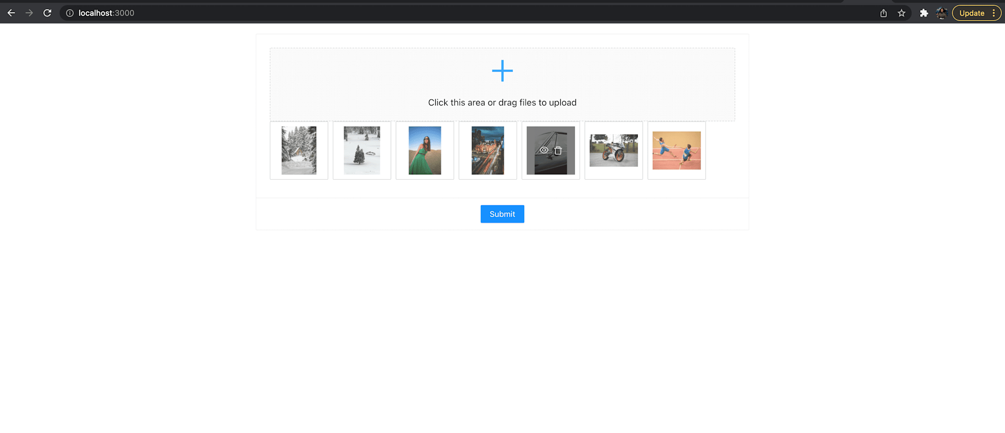
By default, the application will be available at http://localhost:3000/. When you upload some images, the final result should look like the image below:
Find the complete project here on GitHub.
In this article, we saw how to take advantage of Antd to create a visually appealing component that eases the process of uploading multiple images via the drag and drop functionality. In the next part of this series, we’ll take things a step further by uploading multiple files to Cloudinary at once.