
Media content makes up the majority of the internet and is the prominent source of performance issues. These issues are often overlooked even though they are the most approachable category of performance bottlenecks to fix.
Auditing image performance is often overlooked because we build products on high-end devices that deliver and render images smoothly even when those images are ridiculously heavy.
Unfortunately, a significant percentage of the world end up unable to use your site because they can’t afford to due to:
- Slow internet bandwidth/speed to download large images
- Capped internet usage.
- Low-end computing devices (processors and RAMs).
Performance issues, like I already mentioned, are not difficult to fix. All browsers support “real” responsive image tooling, so you can send the right image dimension to the right device viewport width. Smaller dimensions generally mean small disk size, smaller processing power, and smaller download size.
To optimize, you need to measure first. Here are two ways to measure the render sizes to determine if your images need to be optimized.
Open the website demo or any site with images in Chrome. Right-click on an image and click Inspect Element. The browser will highlight the image in the Elements tab:
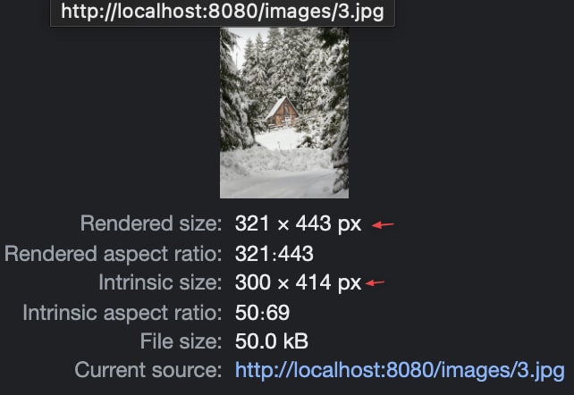
Hover on the highlighted image link to show more information about the selected image:
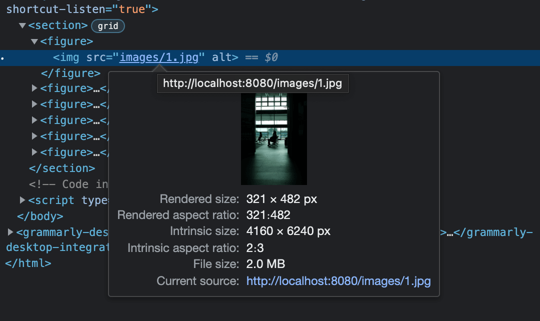
We are interested in the value for the Rendered size and Intrinsic size.
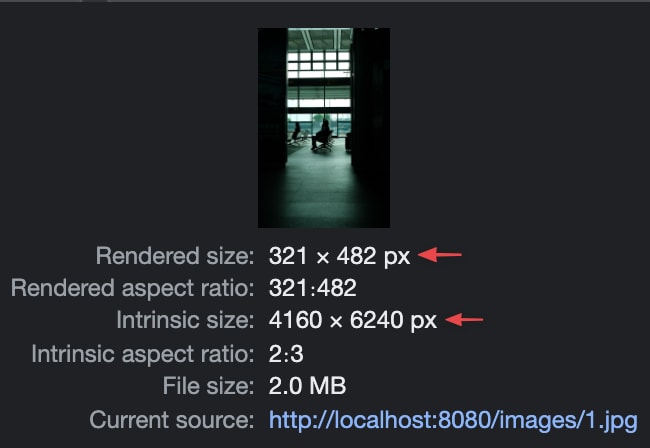
The Rendered size is the portion of the page that the image takes up.
The Intrinsic size is the original size of the image.
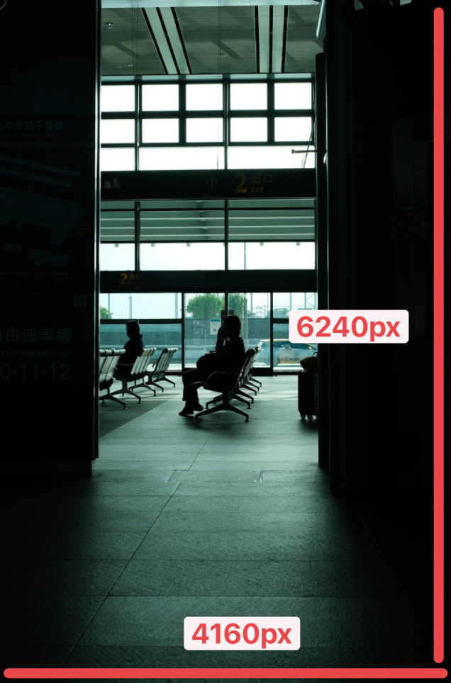
I intentionally choose a ridiculously large image for such a small space to illustrate a point. Most of the images you will get from a photographer will be very big and heavy. It is our job as developers to resize and optimize the images.
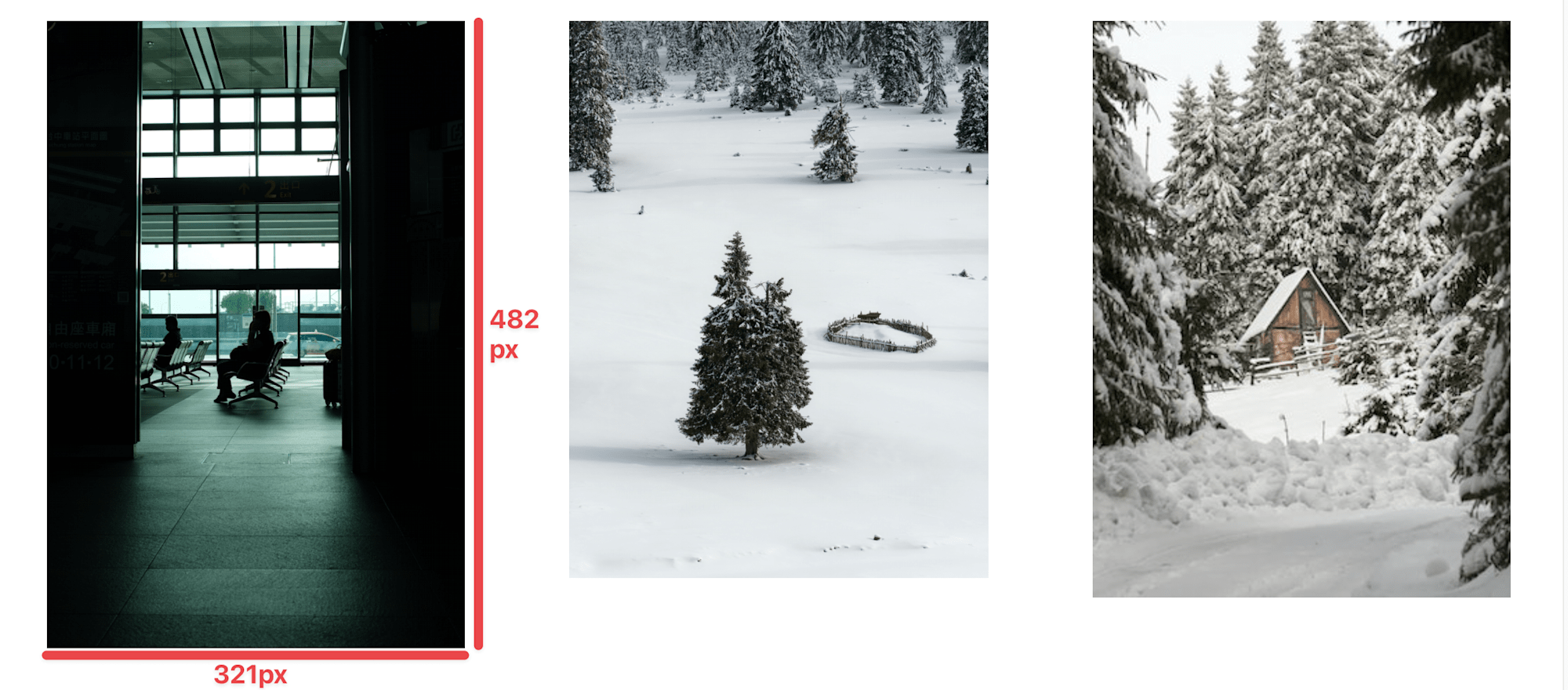
The image above needs to take up the following space on our page: 321px on the x-axis and 482px on the y-axis. Therefore, the image the browser should download should be roughly between 321px – 450px (x-axis) and 482px – 550px (y-axis). These are ranges I made up to pad the numbers, so anything reasonable works
It is also good to keep in mind that I am assuming that we only have one viewport to serve images. To conditionally render different sizes based on the viewport, please take a look at this MDN article.
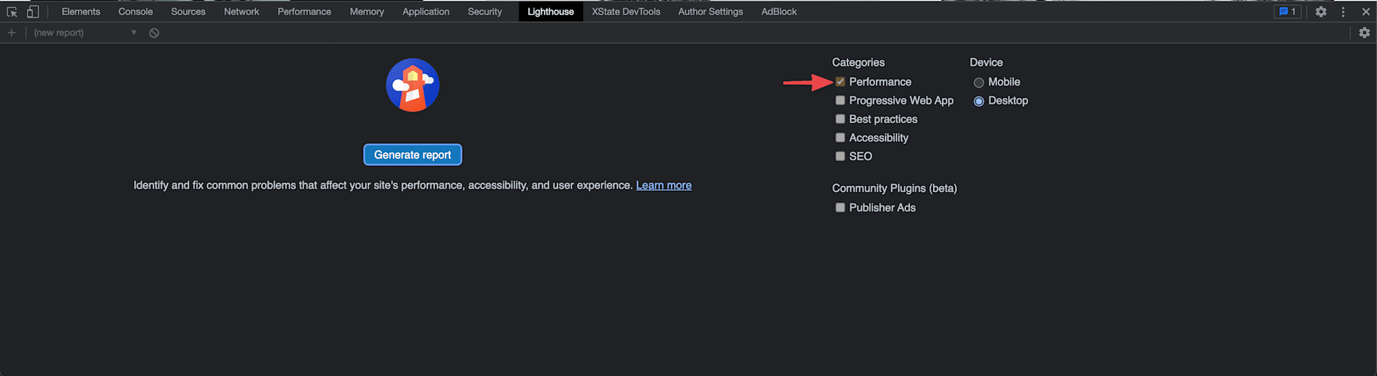
Lighthouse has evolved into a handy 360deg tool for auditing performance. While the hover option above gets the job done, it does not inform you whether you are doing things right or wrong. It just tells you the sizes of the image. Running your site through lighthouse will tell you if you need to act on something or if all is good.
In Chrome Dev Tool, click the Lighthouse tab and disable all the items in the Categories section except Performance.
Click the Generate report button and wait for Lighthouse to do its thing. When a report is generated, you should see that we have issues under Properly size images.
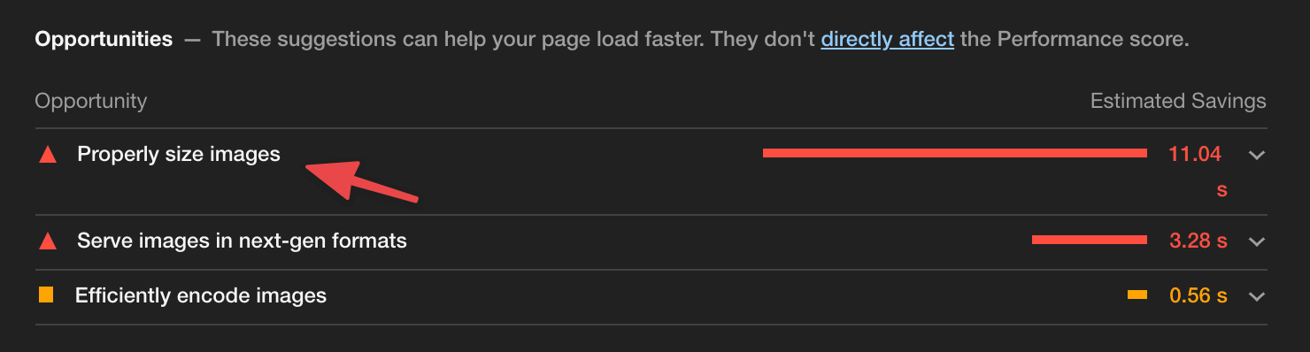
Click to expand and take a look at the details of this issue.
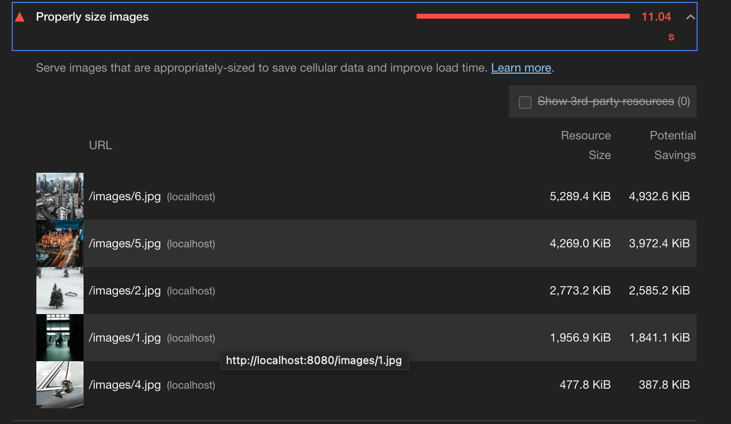
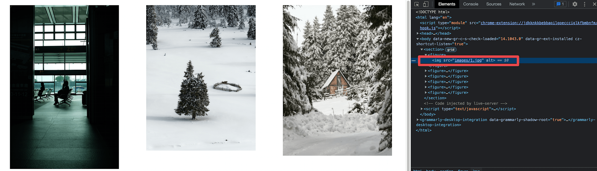
You can see all the images that are oversized for their slots. Image number 3 is not here because I intentionally sized it properly to show you that Lighthouse wouldn’t pick it up if it’s appropriately sized.
Here is a link to the demo on CodeSandbox.
The first step to getting optimization right is to measure first. Now you know how to do that for images and performance issues introduced by image sizes. Take some time to explore the Lighthouse and Performance tab and see what more information about your images you may find interesting.