
Even though a picture is worth a thousand words, it costs a pretty penny to store and deliver images online. Because of this, many modern web-development tools aim to minimize the impact of images, and other media assets, on site performance.
This post shows you how to build an optimized webpage by leveraging the gatsby-transformer-cloudinary plugin and gatsby-image. We’ll upload local images to a remote content delivery network (Cloudinary), then subsequently source, and transform, the responsive remote images in a GatsbyJS project.
We completed this project on Codesandbox, and you can find it here. You need to provide your Cloudinary credentials as environment variables in the sandbox by creating a .env file in the root directory. Specify the environment variables as shown in .env.example.
https://codesandbox.io/s/using-remote-images-in-gatsby-w-gatsby-image-live-yqhxq
Here are the steps we’ll follow to use remote images in a gatsby project with gatsby-image:
- Install Gatsby.js and its dependencies.
- Set up the project configuration and layout.
- Handle single- or multiple-image queries from Cloudinary through gatsby-transformer-cloudinary.
- Optimize the sourced images with Cloudinary and lazy-load them with gatsby-image.
- Transform the images using Cloudinary right in the graphql image query.
- Design a responsive layout and typography with Chakra-ui.
Typically, with gatsby-image, images are stored locally in the project. To utilize external images, a hosted image is required and used with a normal HTML <img/> element. With gatsby-transformer-cloudinary, we can utilize remote images in gatsby-image.
This project requires knowledge of JavaScript, React, and the basics of Gatsby.js. You install Gatsby.js and other packages with Node.js and its package manager npm, or Yarn, a viable alternative for it.
We install Gatsby.js globally with npm, and create a new project using the command
        npm install -g gatsby-cli && gatsby new gtc-demo
Code language: JavaScript (javascript)
To give you a jump-start, Gatsby scaffolds new projects with a starter, which comprises several pages and modules, and we’ll remove them when they’re obsolete.
We proceed to install the required dependencies using the command:
    cd gtc-demo && npm i --save gatsby-transformer-cloudinary dotenv @chakra-ui/gatsby-plugin @chakra-ui/react @emotion/react @emotion/styled framer-motion
Code language: CSS (css)Sign up for a Cloudinary account. Cloudinary offers a free tier, which is more than adequate for small to medium projects. Once signed up, note your cloud name, API key, and API secret for later use.
Gatsby touts two types of plugins:
- Source plugins that fetch data from many sources into Gatsby projects.
- Transformer plugins that convert sourced data to usable formats.
gatsby-transformer-cloudinary uploads images from a local directory to Cloudinary, and transforms the returned image to a format usable by gatsby-image. Cloudinary serves as a drop-in replacement for gatsby-plugin-sharp, and harnesses gatsby-image’s native image-processing capabilities.
Gatsby ships with a configuration file named gatsby-config.js in the root of the project. We’ll set up gatsby-transformer-cloudinary, and @chakra-ui/gatsby-plugin, by updating the array of plugins in gatsby-config.js, to include this:
    require("dotenv").config()
    module.exports = {
      siteMetadata: {
        title: `Gatsby x Cloudinary`,
        description: `Serve remote images in your Gatsby app using gatsby-image`,
        author: `@gatsbyjs`
      },
      plugins: [
        `gatsby-plugin-react-helmet`,
        {
          resolve: `gatsby-source-filesystem`,
          options: {
            name: `cloudinary-images`,
            path: `${__dirname}/src/remote-images`
          }
        },
        {
          resolve: "@chakra-ui/gatsby-plugin",
          options: {
            isUsingColorMode: true
          }
        },
        {
          resolve: "gatsby-transformer-cloudinary",
          options: {
            cloudName: process.env.CLOUDINARY_CLOUD_NAME,
            apiKey: process.env.CLOUDINARY_API_KEY,
            apiSecret: process.env.CLOUDINARY_API_SECRET,
            uploadFolder: "gtc-art-gallery"
          }
        }
      ]
    }
Code language: JavaScript (javascript)
In the configuration file, gatsby-source-filesystem, a source plugin sources file nodes into the Gatsby data layer. Here, we’ve sourced all the images in a folder, which are uploaded once to Cloudinary on build.
We created the remote-images folder in the src directory of the project, and uploaded all the images into the folder.
We proceed to create a .env file in the project’s root directory, and add our Cloudinary credentials as specified below:
    # Find this at https://cloudinary.com/console/settings/account
    CLOUDINARY_CLOUD_NAME=xxxxx

    # Generate an API key pair at https://cloudinary.com/console/settings/security
    CLOUDINARY_API_KEY=xxxxxxxxxxxxxx
    CLOUDINARY_API_SECRET=xxxxxxxxxxxxxxxxxxx

Code language: PHP (php)
Next, we start the development server on localhost:8000 by running the command:
gatsby develop
All the images in the remote-images folder are uploaded to Cloudinary, and added to file nodes for the returned URLs are created in Gatsby’s graphql layer.
The layout.js file in the src/components directory specifies the pages’ design, which persists across the site, and can contain UI elements like headers and footers.
We edit the layout to add a header, which contains the navigation bar and body of the website. First, we import all required dependencies with:
    import React from "react"
    import PropTypes from "prop-types"
    import { graphql, useStaticQuery } from "gatsby"
    import Header from "./header"
    import { Box, Text, Link } from "@chakra-ui/react"
Code language: JavaScript (javascript)
Next, we define the layout component, and fetch the site title defined in gatsby-config.js using useStaticQuery, a hook that utilizes Gatsby.js’s StaticQuery API to make GraphQL queries in Gatsby.js components.
    const Layout = ({ children }) => {
      const data = useStaticQuery(graphql`
        query SiteTitleQuery {
          site {
            siteMetadata {
              title
            }
          }
        }
      `)
      return (
        <Box>
          <Header siteTitle={data.site.siteMetadata.title} />
          <Box width={["90%", "90%", "80%"]} mx={"auto"}>
            <main>{children}</main>
            <Text mt={10}>
              For this demo, the amazing images here by great artists were all
              sourced from{" "}
              <Link
                href={"https://unsplash.com/"}
                target={"_blank"}
                color="teal.500"
              >
                Unsplash
              </Link>
            </Text>
          </Box>
        </Box>
      )
    }
    Layout.propTypes = {
      children: PropTypes.node.isRequired
    }
    export default Layout
Code language: JavaScript (javascript)
In the snippet above
-
The
<Header/>custom component represents the navigation bar. Chakra-ui styles the layout with different responsive widths and multiple breakpoints: 90 percent, 90 percent, and 80 percent for mobile, tablet, and desktop devices, respectively. -
The
mxproperty sets the page’s horizontal-margin property toauto, centering the page content regardless of the width.
Next, we add the site title and the navigation bar’s dimensions by updating the Header functional component in src/components/header.js, as follows.
We import the required dependencies, and UI components.
    import { Link as GatsbyLink } from "gatsby"
    import PropTypes from "prop-types"
    import React from "react"
    import { Box, Flex, Heading, Text, Button } from "@chakra-ui/react"
Code language: JavaScript (javascript)
Next, we create a Header component to render a minimal navigation bar with a menu link.
    const Header = ({ siteTitle }) => {
      return (
        <Flex
          as="nav"
          align="center"
          justify="space-between"
          wrap="wrap"
          px={["0.5em", "0.5em", "1.5em"]}
          py={["1em", "1em", "1.5em"]}
          bg="blue.900"
          color="white"
        >
          <Flex align="flex-start">
            <Heading as="h1">
              <GatsbyLink to="/">
                <Box color={"white.800"}>
                  <Text fontSize={["md", "md", "lg"]}>{siteTitle}</Text>
                </Box>
              </GatsbyLink>
            </Heading>
          </Flex>
          <Flex align="flex-end">
            <Button colorScheme={"blue"} mr={2} size={"sm"}>
              <GatsbyLink to="/">Home</GatsbyLink>
            </Button>
          </Flex>
        </Flex>
      )
    }
Code language: JavaScript (javascript)
Lastly, we define the proptypes, the component’s default prop values, and export the Header component.
    Header.propTypes = {
      siteTitle: PropTypes.string
    }
    Header.defaultProps = {
      siteTitle: ``
    }
    export default Header

Code language: JavaScript (javascript)
We use Chakra-ui components and styles to build a navigation bar, accompanied by the site title and a button to return to the homepage with a click.
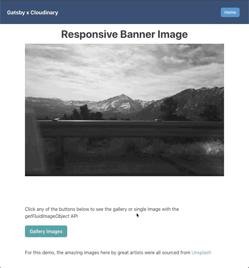
We have two pages: a page with a responsive banner image, and a page with a responsive image gallery.
Responsive banner image
In src/pages/index.js, we’ll import the required dependencies and make a GraphQL query for a Cloudinary Image.
First, we import the required dependencies and make a GraphQL query for the fluid images:
    import React from "react"
    import { graphql, Link, useStaticQuery } from "gatsby"
    import Layout from "../components/layout"
    import SEO from "../components/seo"
    import Image from "gatsby-image"
    import { Box, Button, Heading, Text } from "@chakra-ui/react"

    const IndexPage = () => {
      // fetch images
      const data = useStaticQuery(graphql`
        query BannerImage {
          bannerImage: file(name: { eq: "7" }) {
            cloudinary: childCloudinaryAsset {
              fluid(transformations: ["e_grayscale"], maxWidth: 1500) {
                ...CloudinaryAssetFluid
              }
            }
          }
        }
      `)
      // Assign the returned images to variables.
      const bannerImage = data.bannerImage.cloudinary.fluid

			return (
				// component JSX to go in here
			)
Code language: JavaScript (javascript)
The useStaticQuery hook is for querying the images in this component. The ...CloudinaryAssetFluid fragment returns a fluid image data that contains aspect ratio, the base64 image, src, sizes, and srcSet. Where we must specify those data fields in a query, fragments take the place of the GraphQL fields.
Just as we added e_grayscale transformation in the query, multiple Cloudinary transformations including format and quality types, can be utilized. You can find transformation options here.
Next, we return the JSX elements to render the page. The elements are Chakra-ui components.
      return (
        <Layout>
          <SEO title="Home" />
          <Box mb={[10, 20, 100]}>
            <Heading size={"xl"} m={3} textAlign={"center"}>
              Responsive Banner Image
            </Heading>
            <Box>
              <Image fluid={bannerImage} />
            </Box>
          </Box>
          <Text my={5}>
            Click any of the buttons below to see the gallery or single Image with
            the <i>getFluidImageObject</i> API
          </Text>
          <Box>
            <Button colorScheme={"teal"} mr={10} mb={[2, 0, 0]}>
              <Link to="/gallery"> Gallery Images</Link>
            </Button>
          </Box>
        </Layout>
      )
    }
    export default IndexPage
Code language: JavaScript (javascript)
We pass the fluid image data to the gatsby-image <Image/> component to render the image.
To see the lazy loading in action, we refresh the page or look in the browser’s network tab. Since subsequent refreshes returned cached image versions, we have to do a hard refresh of the page or throttle the network to spot the lazy loading.
Gallery Images
Like the single responsive image, we’ll create a page by creating a file in the src/pages directory called gallery.js. Gatsby.js handles the automatic page creation of any file added to the src/pages directory.
We proceed to import the required dependencies and query all the uploaded images.
    import React from "react"
    import Image from "gatsby-image"
    import { Box, Heading, SimpleGrid } from "@chakra-ui/react"
    import { graphql, useStaticQuery } from "gatsby"
    import Layout from "../components/layout"
    import SEO from "../components/seo"

    const SinglePage = () => {
      const data = useStaticQuery(graphql`
        query GalleryImages {
          listImages: allCloudinaryAsset(limit: 9) {
            images: edges {
              node {
                fluid {
                  ...CloudinaryAssetFluid
                }
              }
            }
          }
        }
      `)
      const galleryImages = data.listImages.images
Code language: JavaScript (javascript)
Next, we render the image gallery component using SimpleGrid – a Chakra-ui components to create grids using CSS-grid.
      return (
        <Layout>
          <SEO title={"single"} />
          <Box mx={"auto"} my={10}>
            <Heading textAlign={"center"} size={"xl"} mb={10}>
              Optimized Gallery Images
            </Heading>
            <SimpleGrid columns={[1, 2, 3]} spacing={2}>
              {galleryImages.map((val, index) => (
                <Box
                  key={index}
                  p={3}
                  m={2}
                  my={"auto"}
                  shadow="md"
                  borderWidth="1px"
                  rounded={"lg"}
                >
                  <Image fluid={val.node.fluid} />
                </Box>
              ))}
            </SimpleGrid>
          </Box>
        </Layout>
      )
    }
    export default SinglePage
Code language: JavaScript (javascript)
Using Chakra-ui components, we loop through the returned list of fluid images and render each in a gatsby-image component.
You can see the final result here, and the pages look like this:
How about we look at how to use remote Images in gatsby-image without the GraphQL query overhead? We’ll discuss that in a subsequent post.
In this post, we saw how to utilize remote optimized images from Cloudinary in a Gatsby site. We render the images using Gatsby.js’s gatsby-image component to provide performance optimizations during the site’s build process.
You may find these resources useful.