Carousels, also known as image sliders or slideshows, play a vital role in enhancing the user interface of websites. They allow multiple pieces of content to be displayed in a limited space, typically cycling through images, text, or other HTML elements.
Nuxt.js is a powerful and versatile framework that provides various ways to integrate carousels into your websites. While its main strength lies in crafting Vue.js applications, it offers flexibility in the components and modules you can use.
This article will explore three ways to implement a NuxtJS carousel. While you can get your images from any source, for this tutorial, you will store and deliver your images using Cloudinary. So to learn how to set up a Nuxt carousel slider here you aren’t required to use Cloudinary, but it makes it easier when you handle your images in Cloudinary. If you’re not using Cloudinary, you can sign up for free for life.
NuxtJS is an open-source framework that enhances the capabilities of VueJS with features such as fast server-side rendering, pre-configurations, and a large ecosystem of modules. All these provide an excellent developer experience.
Click the link in the CodeSandbox below to view a complete demo of this article:
https://codesandbox.io/embed/nuxt-image-carousel-iu2lsp?fontsize=14&hidenavigation=1&theme=dark
To view its source code on GitHub, click here.
To understand the concepts presented in this article, a good knowledge of JavaScript and Vuejs is required. Experience with NuxtJS is not strictly required, but it will be preferred. Create a free-for-life account at Cloudinary to store, manipulate and deliver your images.
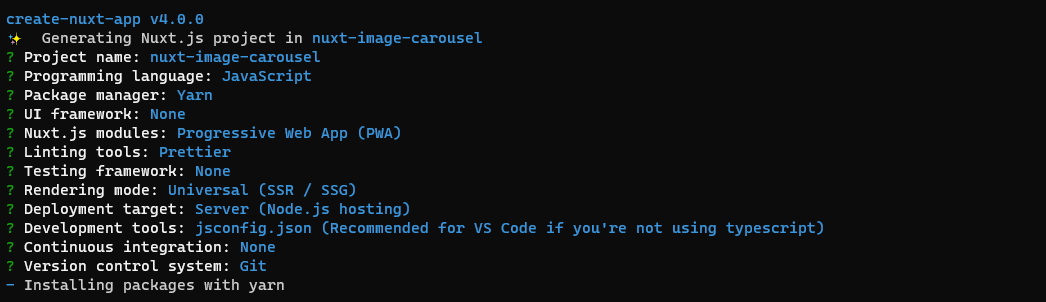
To create a new project, navigate to your preferred folder and run the code below in your terminal:
npx create-nuxt-app nuxt-image-carousel
The terminal will present you with a series of prompts. Follow the recommended options below:
On successful setup, open the project in your preferred code editor, and run the terminal command below:
yarn dev
This will serve the project with a hot reload development server on localhost:3000 accessible on your browser.
Bootstrap Vue is a component library based on the popular Bootstrap framework, optimized for Vue.js websites and apps.
Installation and setup
In your project’s terminal, install bootstrap-vue by running the command below:
yarn add bootstrap-vue
In your nuxt.config.js file, add bootstrap-vue to the modules section:
// nuxt.config.js
export default {
  // Modules: https://go.nuxtjs.dev/config-modules
  modules: [
    'bootstrap-vue/nuxt'
  ]
}
This will give you access to bootstrap.css and bootstrap-vue.css
Implementation
Navigate to your components/ folder, create a FirstDemo/ folder with an index.vue file having the following content.
<template>
  <div style="width: 100%; max-width: 800px; margin: 20px auto">
    <h1>First Demo - Bootstrap Vue</h1>
    <b-carousel
      :interval="0" controls indicators img-width="1024"
      img-height="480" background="#ababab"
    >
      <b-carousel-slide
        img-src="https://res.cloudinary.com/dpkreativ/image/upload/b_auto,c_mpad,h_480,w_1024/v1646483551/wallpapers/car.jpg"
      ></b-carousel-slide>
      <b-carousel-slide
        img-src="https://res.cloudinary.com/dpkreativ/image/upload/b_auto,c_mpad,h_480,w_1024/v1646695756/wallpapers/laptop.jpg"
      ></b-carousel-slide>
      <b-carousel-slide
        img-src="https://res.cloudinary.com/dpkreativ/image/upload/b_auto,c_mpad,h_480,w_1024/v1646696065/wallpapers/conversation.jpg"
      ></b-carousel-slide>
    </b-carousel>
  </div>
</template>

<script>
export default {
  name: 'FirstDemo',
}
</script>
In the code above:
- You created a
<div>with a max width of800pxandmargin: 20px autoto space it out. -
<b-carousel>is the carousel component provided bybootstrap-vue. It wraps the carousel slides and provides custom attributes for setting up the carousel. - You set
:intervalto0, addedcontrols, and specified an image width and height. These settings will be applied to each slide in the carousel automatically. -
<b-carousel-slide>represents each individual slide. It contains animg-srcwith a Cloudinary image URL. In each image URL, you addedb_auto,c_mpad,h_480,w_1024Cloudinary transformations to programmatically set the size of the image to match the carousel.
To view your carousel, navigate to pages/index.vue and update <template> with the code below:
<template>
  <div>
    <FirstDemo />
  </div>
</template>
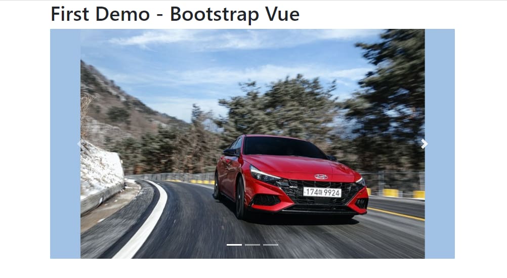
Here’s the result:
Go through their official documentation for more information on how you can implement carousels with Bootstrap Vue.
Vue Awesome Swiper is a carousel component based on Swiper.js written specifically for Vue.js. It has inbuilt support for desktop and mobile Single Page Applications (SPAs) and Server-side rendering (SSR).
Installation and setup In your project’s terminal, run the command below to install Vue Awesome Swiper:
yarn add swiper@5.x vue-awesome-swiper
This also installs swiper5, the version of Swiper.js compatible with vue-awesome-swiper.
In your nuxt.config.js file, update css: [] with the code below:
// nuxt.config.js
export default {
  css: [
    'swiper/css/swiper.css'
  ]
}
This will make Swiper’s CSS file available globally.
Implementation
Navigate to your components/ folder and create a SecondDemo/ folder with an index.vue file containing the code below:
<template>
  <div style="width: 100%; max-width: 800px; margin: 20px auto">
    <h1>Second Demo - Vue Awesome Swiper</h1>
  </div>
</template>

<script>
import { Swiper, SwiperSlide } from 'vue-awesome-swiper'

export default {
  name: 'SecondDemo',
  components: {
    Swiper,
    SwiperSlide,
  },

  data() {
    return {
      swiperOption: {
        slidesPerView: 1,
        spaceBetween: 20,
        loop: true,
        pagination: {
          el: '.swiper-pagination',
          clickable: true,
        },
        navigation: {
          nextEl: '.swiper-button-next',
          prevEl: '.swiper-button-prev',
        },
      },
    }
  },
}
</script>
In the code above:
- Your
<template>has some boilerplate code to identify the demo you’re currently working on. - You imported Vue Awesome Swiper’s default components;
Swiper(the carousel wrapper) andSwiperSlide(the carousel items). -
data()contains some component APIs you can apply to your carousel. You specified that the carousel should show only one slide per view, have pagination, and be on an infinite loop.
Now, update <template> portion above with the code below to display the slider on the browser:
<template>
  <div style="width: 100%; max-width: 800px; margin: 20px auto">
    <h1>Second Demo - Vue Awesome Swiper</h1>
    <swiper class="swiper" :options="swiperOption">
      <swiper-slide>
        <img
          src="https://res.cloudinary.com/dpkreativ/image/upload/v1646483551/wallpapers/car.jpg"
          alt="car"
        />
      </swiper-slide>
      <swiper-slide>
        <img
          src="https://res.cloudinary.com/dpkreativ/image/upload/v1646695756/wallpapers/laptop.jpg"
          alt="laptop"
        />
      </swiper-slide>
      <swiper-slide>
        <img
          src="https://res.cloudinary.com/dpkreativ/image/upload/v1646749176/wallpapers/photo-1646727002357-073c182015e0_qv2xlg.jpg"
          alt="mist"
        />
      </swiper-slide>
      <div class="swiper-pagination" slot="pagination"></div>
      <div class="swiper-button-prev" slot="button-prev"></div>
      <div class="swiper-button-next" slot="button-next"></div>
    </swiper>
  </div>
</template>
In this code:
- You wrapped your carousel with a
<swiper>component.:optionstakes in your specified component APIs fromsliderOptionsand applies it to the carousel - Your
<swiper>component contains a few<swiper-slide>elements, each of which contains an image for your carousel.
To view your carousel, navigate to pages/index.vue and update <template> with the code below:
<template>
  <div>
    <SecondDemo />
  </div>
</template>
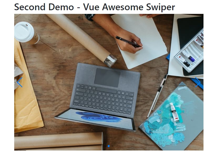
Here’s the result:
To explore Vue Awesome Swiper in-depth, check out its official documentation.
Vue Slick Carousel is a Vuejs implementation of the original Slick Carousel. It comes with built-in support for SSR and offers a variety of functions like lazy loading, variable width, and vertical sliders. However, it’s worth noting that the slick carousel is based on jQuery. While this doesn’t present an immediate issue, considering that VueJS is declarative, you might encounter challenges or prefer another solution that better aligns with Vue’s declarative nature.
Installation and setup To install Vue Slick Carousel, run the command below in your terminal:
yarn add vue-slick-carousel
In your nuxt.config.js file, update css: [] with the code below:
// nuxt.config.js
export default {
  css: [
    'vue-slick-carousel/dist/vue-slick-carousel.css',
    'vue-slick-carousel/dist/vue-slick-carousel-theme.css',
  ]
}
This will add the CSS files for Vue Slick Carousel globally.
Implementation
Navigate to your components/ folder and create a ThirdDemo/ folder with an index.vue file containing the code below:
<template>
  <div style="width: 100%; max-width: 800px; margin: 20px auto">
    <h1>Third Demo - Vue Slick Carousel</h1>
  </div>
</template>

<script>
import VueSlickCarousel from 'vue-slick-carousel'
export default {
  name: 'ThirdDemo',
  components: {
    VueSlickCarousel,
  },
  data() {
    return {
      slickOptions: {
        slidesToShow: 1,
      },
    }
  },
}
</script>

<style>
.slick-next:before,
.slick-prev:before {
  color: black;
}
</style>
In the code above:
- You imported
VueSlickCarouseland made it available as a component. - You set
slickOptionsto contain some component APIs for your carousel. - You set the styling for the
nextandprevbuttons on your carousel.
To see how this implementation works on your browser, update <template> portion above with the code below:
<template>
  <div style="width: 100%; max-width: 800px; margin: 20px auto">
    <h1>Third Demo - Vue Slick Carousel</h1>
    <!-- Implementation -->
    <div>
      <VueSlickCarousel v-bind="slickOptions">
        <div>
          <img
            src="https://res.cloudinary.com/dpkreativ/image/upload/v1646483551/wallpapers/car.jpg"
            alt="car"
          />
        </div>
        <div>
          <img
            src="https://res.cloudinary.com/dpkreativ/image/upload/v1646695756/wallpapers/laptop.jpg"
            alt="laptop"
          />
        </div>
        <div>
          <img
            src="https://res.cloudinary.com/dpkreativ/image/upload/v1646749176/wallpapers/photo-1646727002357-073c182015e0_qv2xlg.jpg"
            alt="mist"
          />
        </div>
      </VueSlickCarousel>
    </div>
  </div>
</template>
In this code, <VueSlickCarousel> contains v-bind=``"``slickOptions``" as its parameter, which makes use of the component APIs in your <script>.
To view your carousel, navigate to pages/index.vue and update <template> with the code below:
<template>
  <div>
    <SecondDemo />
  </div>
</template>
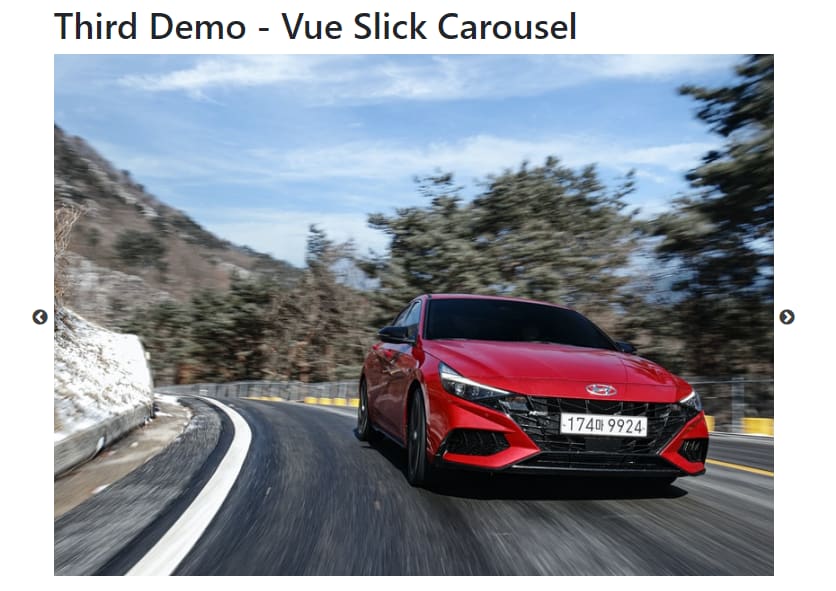
Here’s the result:
You can explore all the component APIs available in Vue Slick Carousel from its documentation.
For developers seeking a quick solution, there are pre-built sandboxes available. One option is the nuxt-vue-carousel-example sandbox on CodeSandbox. This pre-built solution can be used as a template to jumpstart your development.
In this article, you discovered three ways to implement a carousel in your Nuxt project. You can further explore various customizations available to each carousel.