Working with images and texts in a web application is a complex task. In many scenarios, you want to blur a picture to make it less distracting or to make the text on top of it more readable. For example, blurring the background image of a modal window or page section when it isn’t in focus. We’ll explore how to blur a background image in html using native CSS and Cloudinary.
In this blog post, you’ll learn how to:
- Add a blur effect with the CSS
filterattribute. - Add a partial blur effect to a background with the CSS
backdrop-filter. - Use Cloudinary’s blur transformation.
The most straightforward way to blur an image is to combine the CSS filter property and function blur() with filter: blur(degree-of-blur);
This CSS function takes a single parameter degree-of-blur, the amount of Gaussian blur to apply to the target image or the selected element. The higher we set the value of degree-of-blur, the more blurry the picture will be. In the example below, we’ll apply a blur of 5px to the image:
<head>

<style>

.blur {

     filter: blur(5px);

}

</style>

</head>

<body>

<img src="https://res.cloudinary.com/mayashavin/image/upload/w_500,f_auto,q_auto/v1597000013/examples/cat_relaxing" alt="sample image" class="blur">

</body>Code language: HTML, XML (xml)
The result:

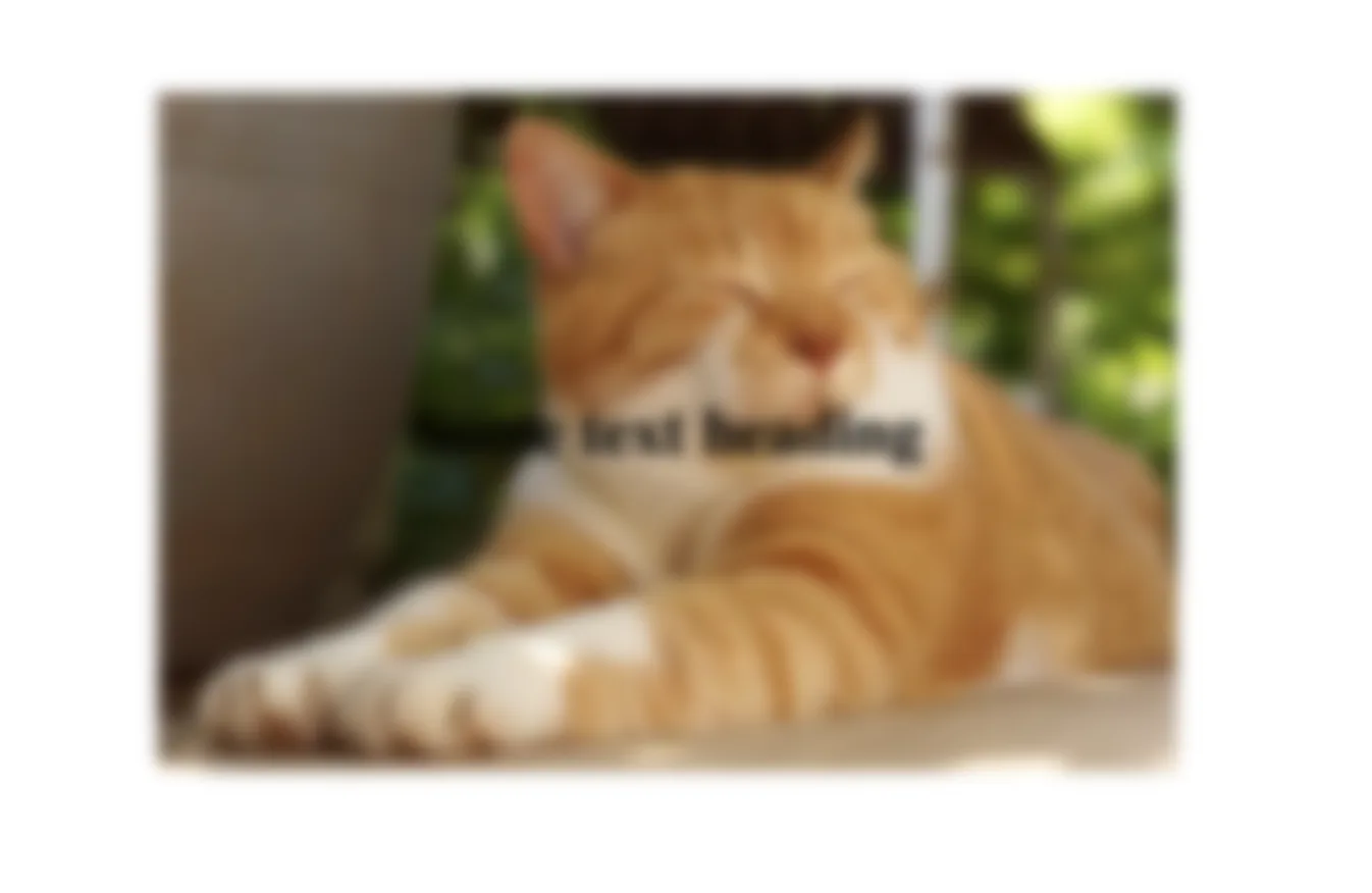
This solution works well if the target element is an img or picture, but it also blurs the entire image, including any text element nested within the target element. For instance, if you have a text element on top of the background image using background-image property, as follows:
<head>

<style>

.background {

   background: url(https://res.cloudinary.com/mayashavin/image/upload/w_500,f_auto,q_auto/v1597000013/examples/cat_relaxing) no-repeat center;

   height: 400px;

   width: 400px;

}

.blur {

     filter: blur(5px);

}

.heading {

text-align: center;

}

</style>

</head>

<body>

<div class="background blur">

   <h1 class="heading">Some text heading</h1>

</div>

</body>Code language: HTML, XML (xml)
The text will be blurred as well:
So, filter with blurr() isn’t ideal if you want to blur only the background image but not the content on top of it. Using the CSS backdrop-filter property would be a better solution.
The syntax of the CSS backdrop-filter property is similar to filter, which we can apply a blurry effect using blur() function: backdrop-filter: blur(degree-of-blur);
Unlike filter, the CSS backdrop-filter property applies a graphical filter effect to the area behind the target element. That means our background blur effect will apply to everything behind the target element, not the target element itself. In the example below, we’ll define a .with-blur-backdrop class selector with the following properties:
- A
backdrop-filter(also-webkit-background-filterfor Webkit-based browsers support) property with5pxblurry effect. - A semi-transparent background color to have the blurry effect visible.
- Some paddings to make the text more readable.
.with-blur-backdrop {

  background-color: rgba(255, 255, 255, 0.4);

  -webkit-backdrop-filter: blur(5px);

  backdrop-filter: blur(5px);

  padding: 20px 30px;

}Code language: CSS (css)
We’ll also define another class selector, `.background` with a background image as cover using background-size, as below:
.background {

  background: url(https://res.cloudinary.com/mayashavin/image/upload/w_500,f_auto,q_auto/v1597000013/examples/cat_relaxing) no-repeat center;

  background-size: cover;

  width: 400px;

}Code language: CSS (css)
In our HTML, we’ll apply these two class selectors to the target element and its parent element, as below:
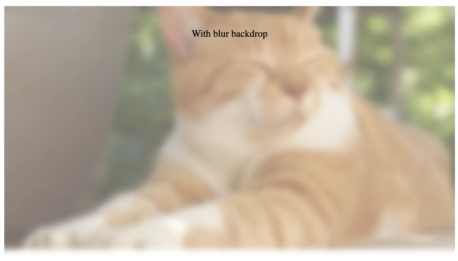
<div class="background">

  <div class="with-blur-backdrop">

    <p>With blur backdrop</p>

  </div>

</div>Code language: HTML, XML (xml)
In the browser, the text “With blur backdrop” isn’t blurred, but there is a blurry area behind the text.
If you want to apply the blurry effect to the entire background image, you can set the height of any element with the with-blur-backdrop class selector to inherit (or 100% depending on your app’s layout), as below:
.with-blur-backdrop {

  //...

  height: inherit;

}Code language: JavaScript (javascript)
The output of the browser will now become:
And that’s it. You’ve successfully applied a blur effect to the background image of an element without blurring the content displayed on top of it.
A great use case for backdrop-filter is to apply a graphical effect on a modal’s backdrop or create a blurry effect of images in a gallery when they are behind the top navigation header of a page during user scrolling.
In the next section, we’ll explore how we can easily apply a blur effect to a background image using Cloudinary’s blur transformation.
Cloudinary is a cloud-based image and video management solution that provides comprehensive tools to manage, optimize, and deliver media files. It also offers a robust set of transformation features that allow you to manipulate images on the fly via images’ URLs. One of these features is the ability to apply a blur effect to an image using the e_blur transformation parameter.
To apply a blur effect to an image, we can add the e_blur parameter to the image’s Cloudinary URL after /upload/, with e_blur:blur_amount.
With this, blur_amount is the blur level to apply to the image, from 1 to 2000. The higher the blur level, the more blurry the image. For example, if we want to use a blur effect level of 500 to a picture, we can add the transformation parameter like this:
<img src="https://res.cloudinary.com/mayashavin/image/upload/e_blur:500/examples/cat_relaxing" alt="blurry relaxing cat">Code language: HTML, XML (xml)The above code will generate the following image:

The e_blur transformation parameter is an excellent solution for applying a blur effect to an image. However, this solution won’t work when we need to blur only a part of the image. In that case, you can use the e_blur_region with the target region’s coordinates (x, y, width, and height) instead. Take the previous example, for instance. We’ll replace e_blur:500 with e_blur_region:500 and add the target region’s coordinates as below:
<img src="https://res.cloudinary.com/mayashavin/image/upload/e_blur_region:500,x_0,y_0.5,w_1.0/examples/cat_relaxing" alt="blurry relaxing cat">Code language: HTML, XML (xml)In which, x_0 and y_0.5 specify the offsets of the target region where x_0 is the starting point (bottom), and y_0.5 is the bottom half location (0.5) on the y-axis of the image. w_1.0 is the width of the target region, which is 100% of the image (1.0).
The URL’s result will be a half-blurry image, as below:

Cloudinary’s blur transformation allows you to apply multiple transformations to an image without changing the original. Then, you can deliver that image in an optimized format and size, depending on the user’s device and browser, using f_auto and q_auto parameters. With that, we can easily apply a blur effect to a background image using Cloudinary’s blur transformation and reduce the amount of CSS code required to achieve a similar effect.
We’ve explored different ways to apply a blur effect to a background image using CSS filter, backdrop-filter properties, and Cloudinary’s blur transformation. Each solution has pros and cons, and you should choose the one that best suits your use case. You can also experiment further with each solution to achieve the desired effect.
Transform your website’s visual appeal with Cloudinary’s image transformation capabilities. Sign up for a free account today.