Lossy image compression is a great way to reduce the file size of an image, which helps to improve the performance of your website or app and cut bandwidth costs. And, if it goes well, nobody can tell the difference. If it goes well…
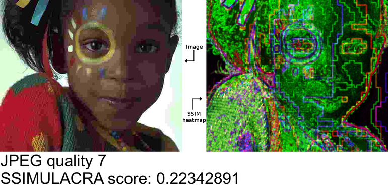
When lossy compression does not go well, compression artifacts become noticeable or even completely ruin an image. For example, the following JPEG images have been encoded with a compression setting that is too aggressive:

The 8×8 block structure of the JPEG format becomes obvious (“blockiness”) and too much quantization of the DCT coefficients causes “halos” (also called “ghosts” or “echoes”) to appear around sharp edges (“ringing”) and speckles to form around text (“mosquito noise”). Chroma subsampling causes colors to blur into neighboring pixels (“color bleeding”) and quantization of the chroma channels degrades the smooth color gradients (“color banding”).
In other words: lossy is fine, as long as we don’t lose too much.
If you are a person (which should be a safe assumption), you can answer this question yourself when manually saving an image: just use the lowest quality setting that still looks “good” to you. But if you’re a computer – or someone who has to save a whole lot of images – that approach is problematic. Just using a fixed compression setting for all images is not a good strategy either: some images seem to get away with very aggressive compression, while others require a much higher quality to avoid visible artifacts.
For this reason, Cloudinary has implemented a feature called q_auto. It automatically selects a quality setting that strikes the right balance between compression density and visual quality. But how does it work, behind the scenes?
What we need for q_auto to work is an automatic method – an algorithm – that can judge the visual quality of a compressed image when compared to the original. This kind of algorithm is called a perceptual metric. Given two input images, an original and a lossy version of it, a perceptual metric computes a numeric score that indicates the visual difference between the two. If the metric outputs a low number, the images are probably visually indistinguishable, so the compression is acceptable (or maybe a lower-quality setting can be tried). If it outputs a high number, there is a lot of difference between the images – probably enough to be visually noticeable – so a better compression quality should be used. This kind of scoring is a core ingredient of the q_auto magic. So let us dig a bit deeper.
There are many perceptual metrics out there. Probably the simplest metric is called PSNR: Peak Signal-to-Noise Ratio. Essentially it compares the numeric pixel values of both images and gives a worse score as the differences get larger – more precisely, as the Mean Square Error (MSE) gets larger.
A simple metric like PSNR does not really take human perception into account. It can easily be ‘fooled’: for example an image that is just slightly brighter or darker than the original will get a bad score (since all pixels have some error), while it can give a good score to an image that is identical to the original except for a small region where it is completely different – something people will most certainly notice.
But PSNR is easy to compute, and to some extent it does give an indication of image fidelity, so it has been, and still is, widely used in image and video compression research.
At the other end of the spectrum, there are metrics like Google’s Butteraugli, which are computationally much harder to calculate (so it takes a long time to get a score), but which do take human psychovisual perception into account. Butteraugli is used behind the scenes in Google’s Guetzli JPEG encoder.
Unfortunately, Butteraugli (and Guetzli) currently only works well for high quality images – it has been optimized specifically for images that are just on the threshold of having very subtle, just-barely visible artifacts when meticulously comparing a compressed image to an original. Guetzli will not let you save a JPEG in any quality lower than 84 for this reason. But on the web, you typically want to be quite a bit more aggressive than that in your image optimization. After all, your visitors are not going to do a meticulous comparison – they don’t even have access to the original, uncompressed image. They just want an image that looks good and loads fast.
Somewhere in between these two extremes – PSNR and Butteraugli – there is a well-known perceptual metric called SSIM (Structural Similarity). It takes an important aspect of human perception into account: the spatial relationship between pixels, i.e. the structure of an image. Instead of focusing on absolute errors like PSNR, which ignores where the pixels are located in the image, SSIM looks at relative errors between pixels that are close to one another.
One variant of SSIM is called MSSIM (Multi-Scale SSIM). It does the SSIM analysis not just on the full-resolution image, but also on scaled-down versions of it, which results in a more accurate overall metric. A good and popular implementation of MSSIM is Kornel Lesinski’s DSSIM (the ‘D’ indicates that it computes dissimilarity scores, i.e. lower is better, unlike the original SSIM where higher is better).
Kornel’s DSSIM improves upon the original (M)SSIM algorithm in a few ways: instead of looking at grayscale or RGB pixel values, it does the comparison in a different color space called CIE Lab*, which corresponds more closely with the way people perceive colors.
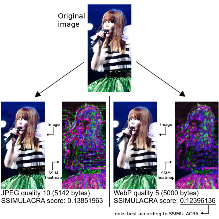
Still, SSIM can be fooled by some images. The final score it gives is still based on averaging the score over the entire image. For photographs that is a reasonable thing to do, but not all images are purely photographic. In eCommerce for example, it is a common practice to remove the background of an image and replace it with a solid color (usually white). Solid backgrounds are easy to compress, so even with aggressive compression the background will be very close to the original. As a result, simply taking an average of the metric over the entire image will give a score that is better than it should be, since it is artificially inflated by the ‘easy’ background, while the important part of the image – the foreground object – might not be OK at all.
Illustration:
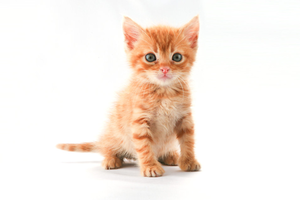 Original image
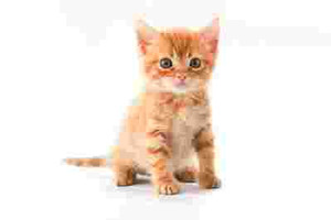 Compressed image at very poor quality
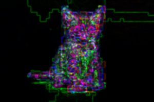 SSIM heatmap. Much of the image area (the background) is almost perfect, so the overall score will get inflated.
Since the perceptual metric is such a crucial component of q_auto, we decided to implement our own metric based on SSIM. We tuned it to be better at detecting the psychovisual impact of compression artifacts (as opposed to other kinds of distortions an image might have, like incorrect camera calibration). It is also better at dealing with images that are not purely photographic. Our metric is called SSIMULACRA: Structural SIMilarity Unveiling Local And Compression Related Artifacts.
Our metric is based on a standard multi-scale SSIM implementation in CIE Lab* color space. This produces several “heat maps”, one for every combination of scale (full image, 1:2 downscaled, 1:4 downscaled, and so on) and color channel. These maps indicate how problematic each part of the image is, according to the metric. In a standard SSIM implementation, the final score is then computed as a weighted sum of the average values of the metric for each scale and color channel – the luma channel (L*) gets more weight than the chroma channels (a* and b*) since it is perceptually more important, and more zoomed-out scales also get more weight since their errors have more impact.
Illustration: SSIM heatmap for a JPEG-compressed image at various qualities. Only the full-scale heatmap is shown here; green corresponds to luma errors, red and blue correspond to chroma errors.
However, simply taking the average is not quite the right thing to do. If the error is concentrated in one region of the image, while the other regions are close to perfect, the average might be overly optimistic. This can be problematic for images with a solid or blurry background, as we discussed above.
To avoid such problems, we added local artifact detection, which looks for local “lumps” of errors, and adjusts the metric result accordingly. So instead of considering just the overall error (a global average), we also consider the worst-case errors (local minima).
 We’ve also added blockiness detection as most lossy image formats encode images in blocks, for example, JPEG uses blocks of 8×8 pixels. At low quality settings, this block structure becomes noticeable. In fact, “blockiness” seems to be one of the most visually annoying compression artifacts – for that reason, modern formats like WebP and JPEG 2000 explicitly try to avoid it, e.g., by using a so-called deblocking filter.
Blockiness shows up in the SSIM heat maps as a grid of errors along the edges of the blocks. SSIMULACRA is able to detect the presence of such a grid, and again adjusts its score accordingly.
Finally, there is one more thing we added to our metric: redundant edge detection. It is a bit harder to explain.
Most lossy image formats use some kind of quantization in the frequency domain, which is the main source of compression artifacts. One possible outcome of this quantization is blur (because the high-frequency detail gets removed). Another possible outcome is the introduction of spurious edges and speckles (ringing and mosquito artifacts). The latter typically happens near strong edges in the original image, for example around text.
These two kinds of artifacts – blurriness and ringing – do not have the same psychovisual impact. In general, people seem to be more tolerant to blur than they are to ringing, especially when they don’t have access to the original image. Blur can even have the desirable side-effect of eliminating some sensor noise that was present in the original. Also, it is not uncommon for parts of a photograph to be (slightly) out of focus for artistic reasons, so it can be hard to tell whether the blur was part of the original image, or introduced by compression. In ‘sharp’ contrast to blurriness, ringing artifacts always look like undesirable compression artifacts.
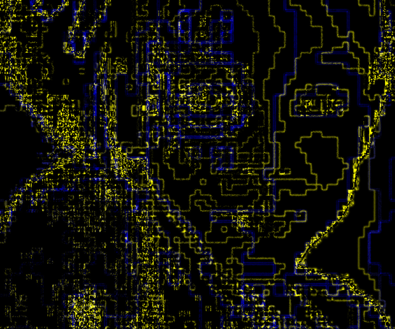 Illustration: detecting the redundant edges
For that reason, we treat blur (removing edges that should be there) in a different way to how we treat ringing (introducing edges that shouldn’t be there). Edges that are in the distorted image, but not in the original, contribute an extra penalty to the score, while edges that get blurred out, don’t. We call this penalty redundant edge detection. It helps to “punish” ringing artifacts, mosquito noise, blockiness and color banding, which all introduce edges that shouldn’t actually be there.
This is, by the way, the only non-symmetric part of the metric: it matters which of the two input images is the original. The other computations (including the original SSIM algorithm) are completely symmetric: the “difference” between image A and image B is the same as the difference between image B and image A. In SSIMULACRA this is no longer the case because of the redundant edge detection.
The goal of any perceptual metric is to accurately predict how people would score the quality of images. So to measure the performance of a metric, one has to look at how well it correlates with human opinions.
The TID is one of the largest publicly available datasets which can be used to evaluate perceptual metrics. In its 2013 edition (the most recent one), it consists of 25 original images, which are distorted in 24 different ways, at 5 different levels of distortion, for a total of 3000 distorted images. Almost a thousand people were asked to score a number of distorted images given the original. Over half-a-million such comparisons were done in total. The result: Mean Opinion Scores (MOS) for 3000 distorted images. Then, in order to measure the accuracy of a perceptual metric like SSIMULACRA, you can examine the correlation between the metric and the MOS. This allows us to evaluate and compare metrics, and come to conclusions like: multi-scale SSIM performs better than PSNR.
At first, we thought we could use the TID2013 dataset to validate SSIMULACRA. But the initial results were rather disappointing. The reason? While TID casts a wide net, capturing many different kinds of distortion, SSIMULACRA is only concerned with the distortion introduced by lossy image compression. Most of the distortions in TID are not related to image compression: of the 24 distortions, only 2 correspond to image compression (JPEG and JPEG 2000); the others are related to problems that may occur while capturing, transmitting or displaying an image. In addition, in the experimental setup of TID, the observers are always comparing an original image to a distorted image, and they know which is which. On the web, all you get is the compressed image, which is a somewhat different setting.
So we decided to conduct our own experiment. Compared to TID2013, our experiment was more modest in size, but more focused. We encoded 8 original images in 8 different lossy image formats and at 4 different compression densities (file sizes) – so that we could compare the different formats fairly, but more about that in a later blogpost. The following image formats were used: Lepton (MozJPEG, recompressed with Lepton), WebP, JPEG 2000, JPEG XR, (lossy) FLIF, BPG, Daala, and PNG8 (pngquant+optipng).
We then let people compare pairs of images, asking them which of the two images they think looks best. Given two images A and B, there were 5 possible responses they could pick: “A looks much better than B”, “A looks a bit better than B”, “I cannot really say which one is best”, “B looks a bit better than A”, and “B looks much better than A”.
The pairs we presented them with were as follows: the original versus each of the compressed images (without saying which is the original), and each pair of two compressed images (in different image formats) at the same compression density. Each comparison was done multiple times and in both orders – A vs B and B vs A.
We used ScaleAPI to implement the experiment. That way, we did not have to worry about finding people to do all of these comparisons. We just had to create a Comparison Task, provide instructions, a list of responses, and the URLs of all the image pairs, and a week later we had the results. ScaleAPI transparently assigns all of these small comparison tasks to a pool of people – they call them “Scalers”. These human observers are screened by ScaleAPI and receive micropayments for each completed comparison. For each comparison we submitted to ScaleAPI, they actually internally assign it to at least two different Scalers, and aggregate the responses based on their internal reputation metrics. So the final results that we got back from ScaleAPI are high-quality, valid responses. In total we submitted just over 4000 comparisons to ScaleAPI; making sure we did at least 4 independent ScaleAPI requests per pair of images, which means that at least 8 actual human comparisons were done per pair of images.
To see how various perceptual metrics manage to capture human opinions, we first averaged the human opinions about each A,B pair. We represent this average opinion on a scale from -10 to 10, where 10 means that everyone said A looks much better than B, and -10 means that everyone said B looks much better than A. If the score is closer to zero, it can be because respondents had weaker opinions, or because they had conflicting opinions: for example the score can be 0 because everyone said “I cannot really say which one is best”, but it could also be the case that half of the observers said A looks better than B and the other half said the opposite. In any case, the absolute value of the score says something about the level of “confidence” we can have in human judgment.
Then for each A,B pair we can use a perceptual metric to compute two scores: one for A compared to the original and the other for B compared to the original. We’ll say that the metric says A looks better than B if the metric’s score for A is better than that for B.
A good perceptual metric should agree with human judgment, especially concerning the high-confidence judgments. However we cannot expect it to completely agree with human judgment. People are weird creatures and some of the results were surprising. In some cases, people considered a (slightly) compressed image to look a bit better than the original. In other cases, (averaged) human preferences seemed to be non-transitive: for example, people said that one particular 30KB WebP image looked a bit better than a 30KB Daala image, and that the same Daala image looked a bit better than a 30KB Lepton-compressed JPEG. So we would expect preferences to be transitive, which would imply that the WebP would look at least a bit better (or maybe even much better) than the JPEG. But in this case, when comparing the WebP directly to the JPEG, everyone said that the JPEG looked a bit better.
When we compare two images to an original with a perceptual metric, the results will always be transitive, and original images will always be better than a distorted image. So for this reason, we cannot expect perceptual metrics to agree with people in 100% of the cases. But we can get close, since fortunately such weird human judgments are relatively rare.
There were 682 pairs of images for which the averaged human judgment was non-zero, i.e. there was a preference (strong or weak) about which of the two images looked best. For these pairs, we looked at whether or not various perceptual metrics agree with this human preference. Random guessing should already give about 50% agreement, and luckily all of the metrics that we considered performed better than that. All of them also get better as the confidence in human judgment increases. Here is a plot of our results:
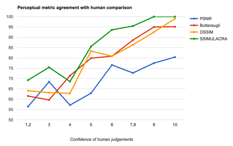
Overall, PSNR is “correct” in only 67% of the cases. Butteraugli gets it right in 80% of the cases, DSSIM in 82% of the cases (we used Kornel’s implementation of DSSIM, which is the best one we know of). Our new metric, SSIMULACRA, agrees with human judgments in 87% of the cases. Looking just at the high-confidence human judgments – say, those with an average (absolute) value of 6 or higher, i.e. one image looks more than “a bit” better than the other – we get about 78% agreement for PSNR, about 91% agreement for both Butteraugli and DSSIM, and almost 98% agreement for SSIMULACRA.
We have released SSIMULACRA as Free Software under the Apache 2.0 license. This means you can use it in your own projects and experiments, or maybe even build upon it and further improve it. The code is relatively simple and short (thanks to OpenCV). It is available on GitHub: https://github.com/cloudinary/ssimulacra. Feel free to try it out!
We will also share the dataset and the results of the ScaleAPI human comparisons we have conducted – the more datasets available publicly the better, in our opinion. Besides being useful to validate perceptual metrics, this dataset also allows us to make a direct comparison between different image formats at various compression densities. For example, which looks best at a given file size, (Microsoft’s) JPEG-XR or (Google’s) WebP? The answer to that question (and many others) will be revealed in an upcoming blogpost in which we will benchmark different lossy image compression formats, on a small scale using people (the ScaleAPI experiment) and on a large scale using SSIMULACRA. Stay tuned!