
Showing users data in easy to understand formats is an important part of front-end development these days. You can add images, make updates with CSS, or use a number of different libraries. While these approaches are fine, there is another way to generate custom data-based graphics quickly with D3js.
In this tutorial, we’ll create a Redwood app that takes data from the back-end and display it in different charts on the front-end. We’ll also be able to auto-upload images of the charts to Cloudinary so we can show them to people outside of the app.
There are a few things that we need to have in place before we get started.
One of the things you’ll need to follow along is a free Cloudinary account. You can sign up for one of those here.
To start, open a terminal and run the following command.
yarn create redwood-app d3-visuals
This will bootstrap a new Redwood app with multiple files and folders that hold the front-end and the back-end code. You’ll find all of the back-end code in the api directory and all of the front-end code is in the web directory.
We’ll also be working with a Postgres database, so if you don’t have a local instance installed you can download it here.
We’ll start work on the back-end so that we get the business logic in place.
Go to the api > db directory and open the schema.prisma file. This is where we’ll make our connection to the database and define the models for our tables. We’ll start by updating the provider to use our Postgres instance.
datasource db {
  provider = "postgresql"
  url      = env("DATABASE_URL")
}
Code language: JavaScript (javascript)
You’ll notice we get the DATABASE_URL from the environment variables. So we actually need to make a file that holds this variable. In the root directory of the project, make a new file called .env. In this file, we’ll define the connection string for our database. It’ll look similar to this.
DATABASE_URL=postgres://admin:postgres@localhost:5432/d3_charts
Code language: JavaScript (javascript)
Now we can delete the example model in the file and replace it with the tables we need for our data. You can delete the UserExample model and replace it with this.
model Fruit {
  id    String @id @default(uuid())
  label String
  value Int
}
Code language: JavaScript (javascript)
This model defines the table for the data we’ll be displaying. You see there’s a mix of text and number values all defined using Prisma. We default the id to a uuid so that we get a unique identifier automatically each time a row is added.
Since we have the model in place, we do need some data to start working with.
We’ll need something to show when we start making the graphics on the front-end, so we’re going to seed our database with some initial values. Go to the seed.js file in api > db and feel free to delete the commented out code inside the main function.
Now we’re going to add the code that will seed each table in the database. All of the following code goes inside the main function.
const fruitData = [
  { label: 'Tangerine', value: 10 },
  { label: 'Kumquat', value: 20 },
  { label: 'Dragonfruit', value: 14 },
  { label: 'Starfruit', value: 42 },
  { label: 'Raspberry', value: 31 },
  { label: 'Plantain', value: 18 }
]

return Promise.all(
  fruitData.map(async (fruit) => {
    const record = await db.fruit.create({
      data: fruit,
    })
    console.log(record)
  })
)
Code language: JavaScript (javascript)
One thing to note is that the seed data should follow the schema for the tables they will be added to. The data has the same values in the object that are expected in the models we wrote eariler.
Now we can go ahead and run the migration on our database and add the tables and the initial data. To do this, we’ll run 2 Redwood commands.
yarn rw prisma migrate dev
yarn rw prisma db seed
The first command connects to the Postgres instance and adds the table schema for the database. The second command adds all of the seed data to the tables in the database.
With the database work out of the way, we’ll be able to move on to the GraphQL server.
Now we have to create the types and resolvers that our front-end will use to communicate with the back-end. For this project, we won’t need to add data through the front-end. We’ll just need to view the data.
There’s a Redwood command that will generate all of the types and resolvers we need to retrieve the data to show in our charts. We’ll need to run this command for each of our tables. Open a terminal and run these 3 commands.
yarn rw g sdl fruit
These commands generate quite a few new files for us. If you take a look in api > src > graphql, you’ll see a new file. The file defines the GraphQL types for the table we created the model for. It has a couple of types for create and update mutations, but we won’t be implementing those.
Now go to api > src > services. You’ll see a new folder that has a resolver file and two files related to testing. If you take a look at any of the resolver files, you’ll see that right now we have the queries to read all of the rows in the table.
That’s all we need on the back-end! The database is set up and our GraphQL server is ready to go because Redwood did a lot of heavy lifting here. Now we can shift the focus to the front-end.
There are a few things we need to do on the front-end to wrap this up. We need to add a chart we build with D3 and we need to save the images to Cloudinary.
We’ll start by adding a few packages to the front-end. In a terminal, go to the web directory and run this.
yarn add d3
This gives us the package we need to build the charts. Now we’ll make a new page to show them.
We’ll use another Redwood command to create this page for us.
yarn rw g page charts /
Take a look in web > src > pages and you’ll see a new folder called ChartsPage. This folder has the component for the page, a Storybook entry, and a test. Plus the Routes.js file has automatically been updated to include this new component as the root page.
If you run the project with yarn rw dev, you should see something similar to this.

Go to the ChartsPage.js file in web > src > pages > ChartsPage and delete all of the elements below the <h1> and add this.
<PieChart data={pieData} />
Code language: HTML, XML (xml)
This is the component we’re going to make with D3.
Next we can make the PieChart component. In the terminal, run this command.
yarn rw g component PieChart
Go to web > src > components > PieChart and open the PieChart.js file. First let’s add the following imports at the top of the file.
import * as d3 from 'd3';
import { useEffect } from 'react';
Code language: JavaScript (javascript)
Then delete the current component because we’ll replace it with this.
function PieChart({ data, drawChart }) {
  // These are some values that define how the pie chart will be drawn.
  const innerRadius = 50
  const outerRadius = 150
  const margin = {
    top: 50, right: 50, bottom: 50, left: 50,
  };

  const width = 2 * outerRadius + margin.left + margin.right;
  const height = 2 * outerRadius + margin.top + margin.bottom;

  // scaleSequential maps values to an output range based on the
  // interpolator which gives us a color within a certain gradient over the
  // domain which determines how many colors we need.
  const colorScale = d3
    .scaleSequential()
    .interpolator(d3.interpolateMagma)
    .domain([0, data.length]);

  // This is the function we will call to create the chart whenever the data is updated.
  useEffect(() => {
    drawChart();
  }, [data]);

  // This is the function that will actually draw the chart.
  function drawChart() {
    // select the pie-container element and remove the existing svg to draw a fresh one
    d3.select('#pie-container')
      .select('svg')
      .remove();

    // append the new svg inside the pie-container element using the
    // attr values for the width and height we defined earlier then
    // append a new element and use the
    // attr to move it in the view
    const svg = d3
      .select('#pie-container')
      .append('svg')
      .attr('width', width)
      .attr('height', height)
      .append('g')
      .attr('transform', `translate(${width / 2}, ${height / 2})`);

    // arc is used to make circular sections and we give it an
    // innerRadius that we define how big the inner circle is and an
    // outerRadius to define how big the outer circle is.
    const arcGenerator = d3
      .arc()
      .innerRadius(innerRadius)
      .outerRadius(outerRadius);

    // pie calculates the angles we need to represent the
    // value correctly in the chart
    const pieGenerator = d3
      .pie()
      .padAngle(0)
      .value((d) => d.value);

    // selectAll gets multiple elements from the document and generates the chart based on the
    // data.
    const arc = svg
      .selectAll()
      .data(pieGenerator(data))
      .enter();

    // append arcs for each data segment
    arc
      .append('path')
      .attr('d', arcGenerator)
      .style('fill', (_, i) => colorScale(i))
      .style('stroke', '#ffffff')
      .style('stroke-width', 0);

    // append text labels for each data segment
    arc
      .append('text')
      .attr('text-anchor', 'middle')
      .attr('alignment-baseline', 'middle')
      .text((d) => d.data.label)
      .style('fill', (_, i) => colorScale(data.length - i))
      .attr('transform', (d) => {
        const [x, y] = arcGenerator.centroid(d);
        return `translate(${x}, ${y})`;
      });
  }

  // Return the chart element
  return <div id="pie-container" />;
}
Code language: JavaScript (javascript)
We’re using a lot of D3 methods chained together and it’ll be easier to understand if you read through the comments in the code snippet.
D3 can be a difficult to get started with and it’s common to need to try things out and refer to the documentation often. So if this is still confusing after reading through the comments, take some time to try going through the docs as well.
With the chart component ready, we can pull the data from our GraphQL server.
Since we have the back-end ready, all we have to do is write a little query in the ChartsPage.js file. So open that file and add the following imports.
import { useQuery } from '@redwoodjs/web'
import PieChart from '../../components/PieChart/PieChart'
Code language: JavaScript (javascript)
The first import is how we’re going to connect to the GraphQL back-end and the second lets us use the PieChart component. Next we need to add the query for our fruits below these imports.
const GET_FRUITS = gql`
  query {
    fruits {
      label
      value
    }
  }
`
Code language: JavaScript (javascript)
This query will call the resolver to get all of the rows in the fruits table and give us the label and value for each so we can display them in our chart.
Now we’ll add the call we need to execute this query using the useQuery hook we imported. This code will go inside of the ChartsPage component.
const { data, loading } = useQuery(GET_FRUITS)

if (loading) {
  return <div>Loading...</div>
}
Code language: JavaScript (javascript)
We’re getting the data from our query and also a loading state. When you’re working with databases, sometimes you’ll run into latency issues with your requests that could cause a page to crash because it doesn’t have the data it expects. Returning a loading indicator while we wait for the data gives a better user experience.
All that’s left for our component is updating the data value for the PieChart that gets rendered. This replaces the previous pieData we had in this element a bit earlier, but we still have just one instance of the PieChart on the page.
<PieChart data={data.fruits} />
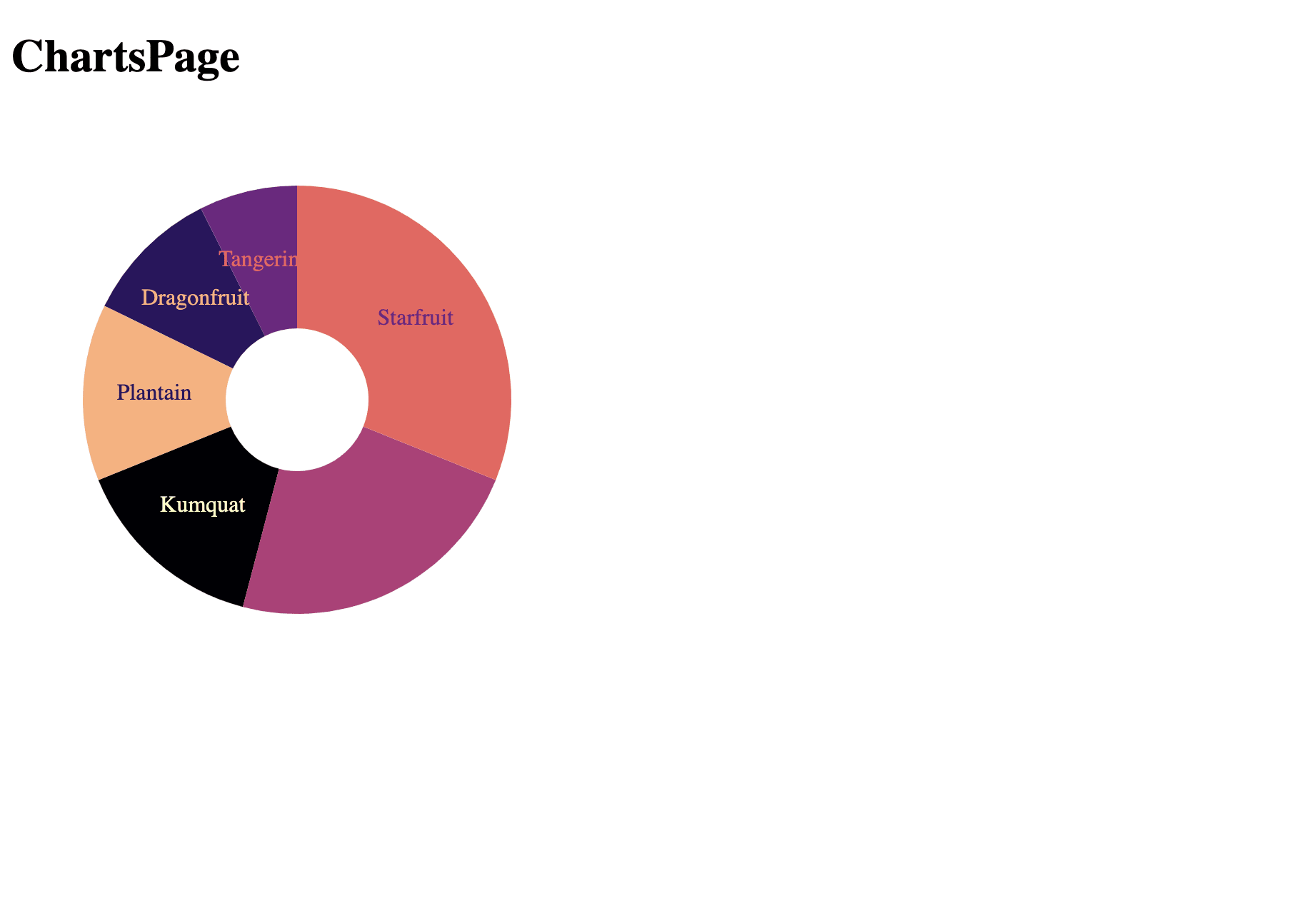
Code language: HTML, XML (xml)Now if you save everything and run the project with yarn rw dev, you’ll see something like this in your browser.
All that’s left is uploading a snapshot to Cloudinary!
We’ll add a little function inside the PieChart.js file right above our component declaration.
const uploadChart = () => {
  const svgEl = document.getElementsByTagName('svg')[0]

  const svgString = new XMLSerializer().serializeToString(svgEl)

  const base64 = window.btoa(svgString);

  const imgSrc = `data:image/svg+xml;base64,${base64}`;

  const uploadApi = 'https://api.cloudinary.com/v1_1/your_cloud_name/upload'

  const body = {
    'file': imgSrc,
    'upload_preset': 'your_preset_name'
  }

  fetch(uploadApi, {
    method: "POST",
    body: JSON.stringify(body)
  })
  .then((response) => {
    console.log(response.text)
  })
}
Code language: JavaScript (javascript)
First we grab the svg element that has the chart image. Then we convert that to a string using the XMLSerializer. That’s so we can get a base64 string for the image using the btoa function in the browser. The next step appends the image type on the base64 string so that when we upload the image, it’s able to be processed as an SVG image.
Then we get the Cloudinary API to handle uploads and set the values for the post request. You’ll need to go in your Cloudinary settings and make an upload preset if you don’t have one already.
This function will be added to the useEffect hook after we create the chart. That way each time the data updates, we’ll have an updated image being uploaded to Cloudinary.
useEffect(() => {
  drawChart();
  uploadChart();
}, [data]);
Code language: JavaScript (javascript)
Now you have an app that can generate report graphics and upload them to another source!
You can take a look at some of the front-end code in this Code Sandbox or you can check out the full project in the d3-visuals folder of this repo.
You can make charts with D3 now! Getting used to all of the options you have in D3 can take a while, but once you play with it you’ll be able to make graphics that can’t be generated with CSS. You can even make these graphics interactive with some JavaScript work.