
I’m sure you’ve experienced one of those moments where you visit a page on a website, maybe by clicking on a blog post. While you were still on the page, some additional page content (images, ads e.t.c) got loaded, and suddenly, you couldn’t find your position again. Layout shifts occur when an existing content on a page moves from its initial position because something new was introduced to the page. See here for more on cumulative layout shift.
There are several reasons why these unexpected movements happen, but this article will focus on preventing image-based layout shifts with the Next.js Image component.
Here is a link to the demo on CodeSandbox.
Images are one of the major causes of layout shift, and one way to avoid this is to specify the width and height attributes on the <img> tag. This way, the browser knows how much space to reserve for the image if it takes a while to download.
<img src="/sunset1.jpg" alt="Sunset" width={600} height={450} />
Code language: HTML, XML (xml)
Specifying the width and height on images also has issues when attempting to use CSS to ensure the image dimensions don’t overflow their allotted space. However, we are not going to cover that in this article. You can find more information on that in this post.
The Next.js Image component serves the HTML img tag under the hood, but it is packed with a lot of performance optimizations that help improve the Core Web Vitals for applications built with Next.js.
The width and height properties are required when using the Image component, and there are three ways to add them to the Image component.
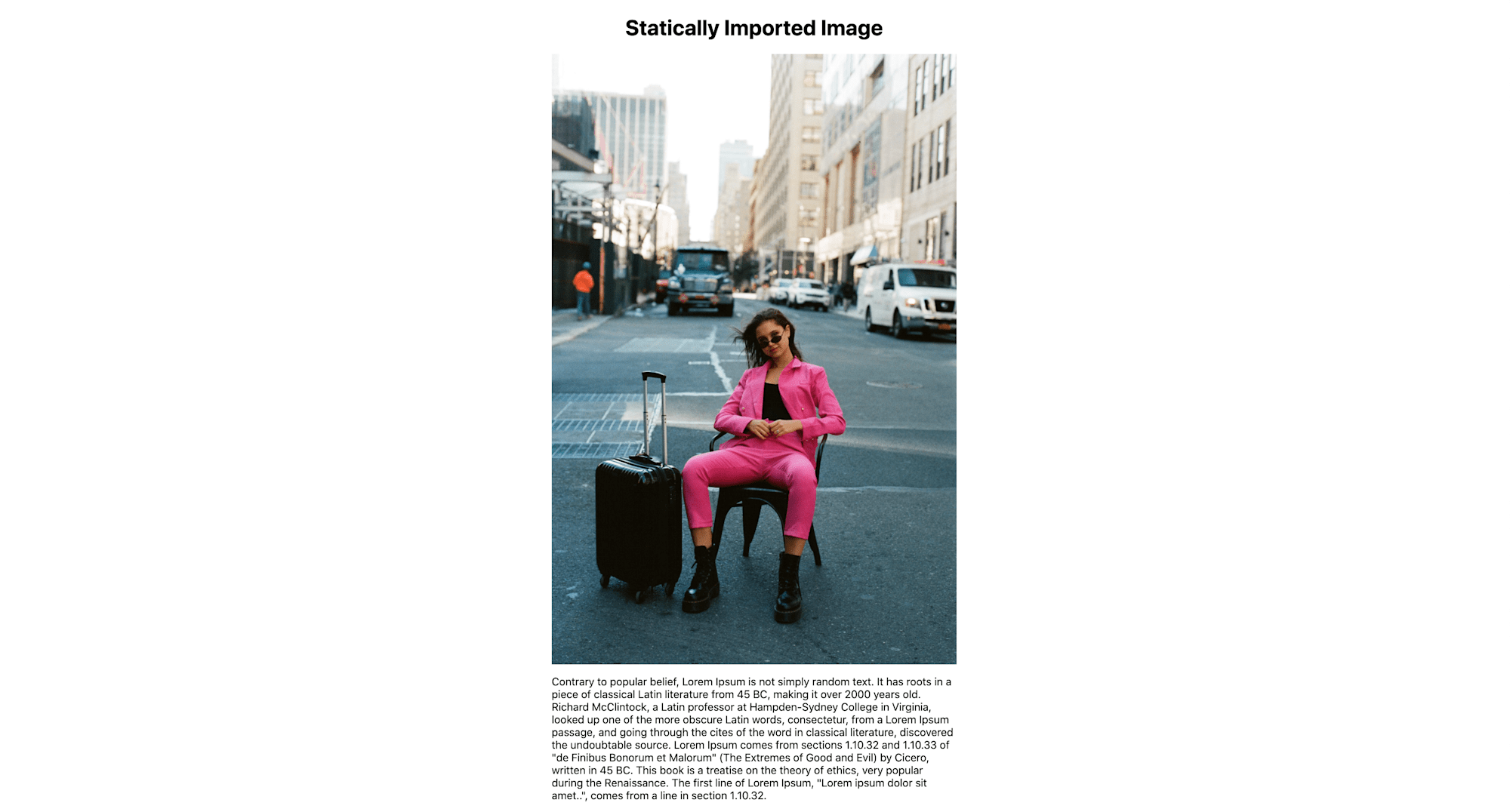
When you import your local image statically, you don’t need to set the width and height properties on them.
import Image from "next/image";

// import your local image from the public folder
import picture from "../public/picture.jpeg";

export default function Home() {
  return (
    <div style={{ display: "flex" }}>
      <div style={{ width: "400px", margin: "auto" }}>
        <h1>My Homepage</h1>
        <Image
          src={picture}
          alt="My Picture"
          // width={500} automatically provided
          // height={500} automatically provided
        />
        <p>
          Contrary to popular belief, Lorem Ipsum is not simply random text. It
          has roots in a piece of classical Latin literature from 45 BC, making
          it over 2000 years old. Richard McClintock, a Latin professor at
          Hampden-Sydney College in Virginia, looked up one of the more obscure
          Latin words, consectetur, from a Lorem Ipsum passage, and going
          through the cites of the word in classical literature, discovered the
        </p>
      </div>
    </div>
  );
}
Code language: JavaScript (javascript)
First, we imported the Image component at the top of the file, and then we imported a static image file. Setting the width and height properties on an image is important in preventing layout shifts and ensuring that the image tag creates a holding space for the referenced image, but Next.js takes care of that if the image was imported statically.
Based on the imported image file, Next.js automatically determines the width and height to set on the Image component.
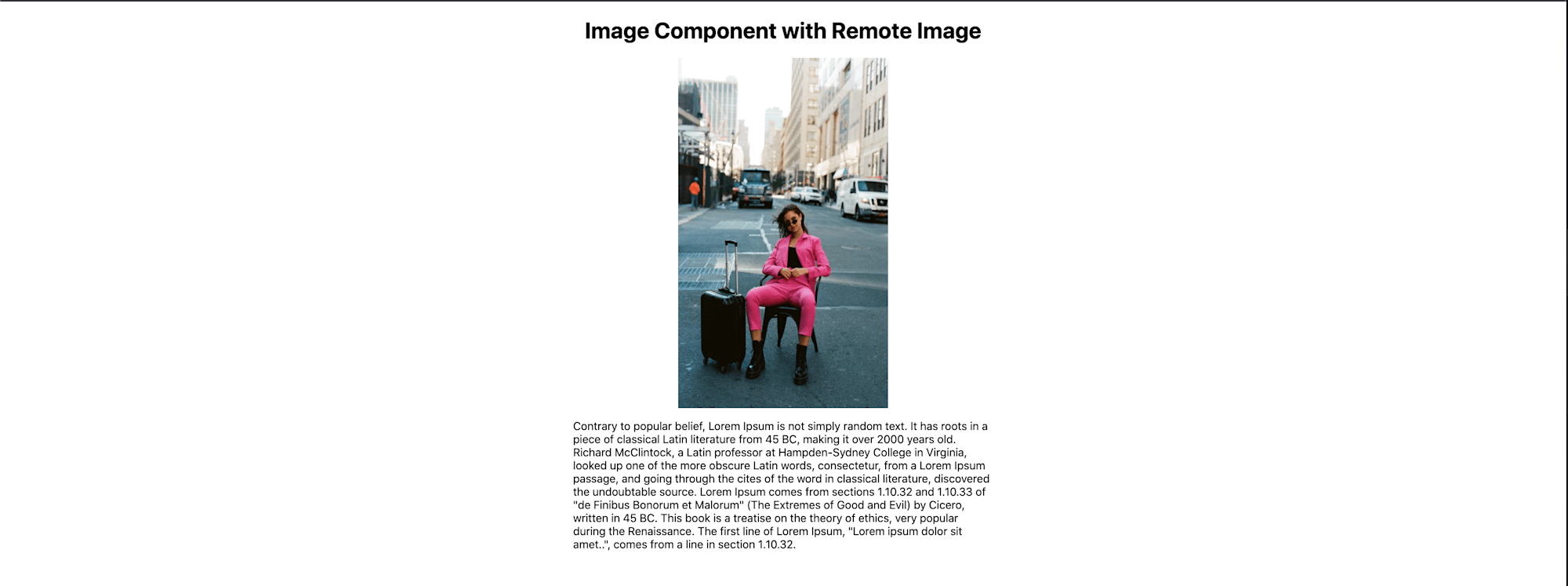
For remote images, you need to provide the width and height properties manually as you would when using the native HTML tag.
<Image src="/picture.jpg" alt="My Picture" width={300} height={500} />
Code language: HTML, XML (xml)
In the snippet above, we provided a partial URL for a remote image optimized and served from Cloudinary. We explicitly defined the width and height properties because, at build time, Next.js won’t have access to the remote image. See here for more information on working with remote images.
The Next.js Image component also accepts an optional layout property with different modes for determining its size on a page. The default layout behavior for the Image component is intrinsic. This scales images down for smaller viewports and maintains their original size for larger viewports.
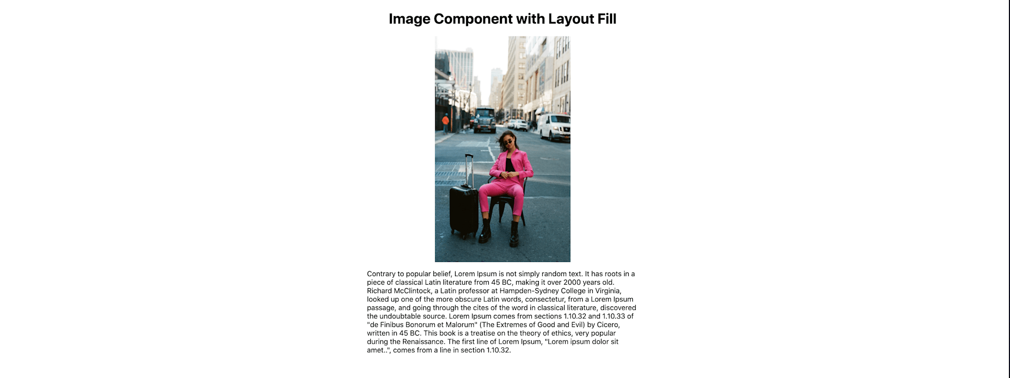
If you don’t know the sizes of the images you are working with, one option is to use the fill layout mode.
<div
  style={{
    width: "300px",
    height: "500px",
    position: "relative",
    alignSelf: "center",
  }}
>
  <Image
    src="https://res.cloudinary.com/ifeomaimoh/image/upload/v1637573164/picture.jpg"
    alt="My Picture"
    layout="fill"
  />
</div>
Code language: HTML, XML (xml)
In the snippet above, we have an Image component whose src property contains a URL string of a remote image on Cloudinary. With the fill layout mode, the image will stretch to its parent element’s size, so we don’t need to specify the width and height properties. The parent element must have a declared position whose value is relative in its stylesheet. See here for more on image layout modes.
See here for guidelines on styling the Next.js Image component.
We’ve seen the three ways we can achieve visual stability and prevent layout shifts by using the Image component when building Next.js applications. The Next.js Image component offers a lot of optimization benefits. See this page for more advanced use cases.
Useful Links