Web Components have been around for a couple of years now. According to the most recent MDN documentation:
Web Components is a suite of technologies that allow you to create custom elements, whose functionality is encapsulated and separated from the rest of the source code, for use in web applications.
On other hand, SVG content is the preferred way to add logos, icons, and other graphic resources on the web. Mainly because of their speed, accessibility, and resolution among other benefits.
In this Media Jam, we’l use LitElement features and TypeScript to process interactions that allow changing the SVG colors in a practical way.
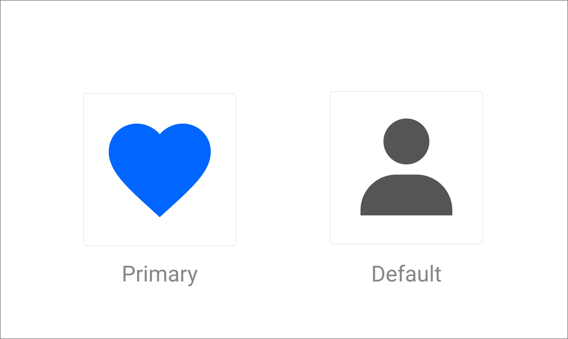
Let’s suppose you’re working in a web application that needs to render some web components that are built using SVG content. However, it’s needed to capture the user interaction to provide a change of the state of your widget using a different color. See the next image for a better understanding.
As you may think, we can implement these widgets using the Web Components approach and provide an external component to trigger the state change. Let’s get started.
Let’s get started using a couple of SVG icons. Instead of creating .svg files, we can define this content as lit-html templates.
lit-html is an efficient, expressive, extensible HTML templating library for JavaScript.
This is the template library to be used to render the custom components later.
- Start creating the
svg/svg-heart.tsfile
// svg-heart.ts

import { html } from 'lit-html';

export const corpIconHeart = html`
  <svg
    width="24"
    height="24"
    viewBox="0 0 24 24"
    fill="none"
    xmlns="http://www.w3.org/2000/svg"
  >
    <path
      d="M12 21.35L10.55 20.03C5.4 15.36 2 12.27 2 8.5C2 5.41 4.42 3 7.5 3C9.24 3 10.91 3.81 12 5.08C13.09 3.81 14.76 3 16.5 3C19.58 3 22 5.41 22 8.5C22 12.27 18.6 15.36 13.45 20.03L12 21.35Z"
    />
  </svg>
`;
Code language: JavaScript (javascript)- Now create an alternative icon in the
svg/svg-user.tsfile.
// svg-user.ts

import { html } from 'lit-html';

export const corpIconUser = html`
  <svg
    width="24"
    height="24"
    viewBox="0 0 24 24"
    fill="none"
    xmlns="http://www.w3.org/2000/svg"
  >
    <path
      d="M7.5 6.5C7.5 8.981 9.519 11 12 11C14.481 11 16.5 8.981 16.5 6.5C16.5 4.019 14.481 2 12 2C9.519 2 7.5 4.019 7.5 6.5ZM20 21H21V20C21 16.141 17.859 13 14 13H10C6.14 13 3 16.141 3 20V21H20Z"
    />
  </svg>
`;

Code language: JavaScript (javascript)We can create a small component as an abstraction to load any icon defined in the application. Let’s create it under the corp-icon.ts file with the following content.
import {
  LitElement,
  html,
  property,
  customElement,
  css,
  TemplateResult,
} from 'lit-element';

@customElement('corp-icon')
export class CorpIcon extends LitElement {
  static styles = css`
    :host {
      display: inline-block;
    }
    .corp-button {
      padding: 10px;
      border-radius: 5px;
      cursor: pointer;
    }
  `;

  @property({ type: String }) icon?: TemplateResult;
  @property({ type: String }) color?: string;

  constructor() {
    super();
  }

  render() {
    return html`
      <div class="corp-button">
        ${this.icon}
      </div>
    `;
  }
}
Code language: JavaScript (javascript)
Using the @property declaration from LitElement, we’ll be rendering the template every time the given property changes.
To have more control over the possible changes over any of these attributes, we can override the updated function as follows.
// corp-icon.ts
  updated(changedProperties: Map<string, unknown>) {
    if (changedProperties.has('color')) {
      const svg = this.shadowRoot.querySelector('svg');
      let color: string;
      switch (this.color) {
        case 'primary':
          color = '#0066FF';
          break;
        default:
          color = '#555555';
          break;
      }
      svg.style.fill = color;
    }
  }
Code language: JavaScript (javascript)
You can use the updated function(which is part of the component’s lifecycle) to:
- Identify a property change
- Perform any post-updating task
Also, let’s understand what’s happening in the above code snippet:
-
changedProperties.has('color')verifies if the propertycolorhas been changed. - Once the above property changes, we’ll get access to the
<svg>element in the DOM through thethis.shadowRoot.querySelector('svg')call. - According to the new state of the
colorattribute(this.color) we’ll perform an update assigning the primary or a default value. - Finally, the
svg.style.fill = color;line will override any color value with the new one. It should be equivalent to have something like this in your CSS:
svg {
  fill: color
}
Code language: CSS (css)The container component, again, will be an abstraction to wrap all the UI elements in the application. Let’s create the corp-container.ts file.
// corp-container.ts
import {
  LitElement,
  html,
  customElement,
  css,
} from 'lit-element';
import { corpIconUser } from './svg/svg-user';
import { corpIconHeart } from './svg/svg-heart';
import './corp-icon';

@customElement('corp-container')
export class CorpContainer extends LitElement {
  static styles = css`
    :host {
      display: block;
    }
    .container {
      display: flex;
      flex-direction: column;
    }
    .controls {
      display: flex;
      flex-direction: row;
    }
  `;

  color: string = 'basic';

  constructor() {
    super();
  }

  render() {
    return html`
      <div class="container">
        <div>
          <corp-icon .icon=${corpIconUser} .color=${this.color}> </corp-icon>
          <corp-icon .icon=${corpIconHeart} .color=${this.color}> </corp-icon>
        </div>
      </div>
    `;
  }
}
Code language: JavaScript (javascript)
There are a couple of important notes to explain here:
- The
import './corp-icon';line will import the definition of the CorpIcon component. - The
CorpContainerclass extends fromLitElement, which is the base class provided by the library. - The
static stylesline provides a context to define the styles needed by the local component. - The
render()function will return a template through lit-html- Inside this function, you can define your template using the existing HTML elements and your custom ones.
- The
<corp-icon>element is used here, and also pay attention to the JavaScript expressions to be evaluated for theiconand thecolorattributes. - In LitElement, it’s used the dot notation to bind an expression with a component property(ie.
.icon=${corpIconUser})
At this point, the app is able to render a couple of icons with a predefined style. However, it would be good to add a couple of controls to change their state.
Let’s update the render function in the corp-container.ts file to add two buttons:
  render() {
    return html`
      <div class="container">
        <div class="controls">
          <button @click=${() => this.changeColor('primary')}>Primary</button>
          <button @click=${() => this.changeColor('Basic')}>Basic</button>
        </div>
        <div>
          <corp-icon .icon=${corpIconUser} .color=${this.color}> </corp-icon>
          <corp-icon .icon=${corpIconHeart} .color=${this.color}> </corp-icon>
        </div>
      </div>
    `;
  }

  private changeColor(color: string) {
    this.color = color;
  }
Code language: JavaScript (javascript)
These new buttons are meant to provide the user a way to interact with the icons and change the style from Primary to Basic and vice versa.
The LitElement-way to provide this behavior is with a custom function and the event handler binding using the @ notation: @click=${function()}. This means the function will be called every time the user interacts with a click over both buttons.
This code may not work at this time if you are interacting with the buttons already, since we have to find a way to say: “We changed a property’s value. It’s needed to perform and update”.
This can be done automatically with LitElement using the @property and @internalProperty decorators. And since this container doesn’t need to define public properties, we can use the second one, and apply it to the color attribute as follows:
// corp-container.ts

@customElement('corp-container')
export class CorpContainer extends LitElement {
  // styles

  @internalProperty() color: string = 'basic';

  render() {
    // returns the template
  }
}
Code language: JavaScript (javascript)
The rendering issue will be fixed now since LitElement will make sure to trigger an “update” for the CorpIcon component.
If you feel curious about the differences between @property and @internalProperty decorators, take a look into the LitElement properties: @proeprty vs @internalProperty article.
This project is available on CodeSandbox.
If you prefer, you can play around with the project here too: