
Card components are a way to group and display related information into a container. Sometimes users can interact with them by clicking or tapping to see more details.
In this article, we will learn how to build reusable, customizable, and responsive card component using Chakra UI.
The completed project is on CodeSandbox. Fork it and run the code.
The source code is also available on GitHub.
The knowledge of Chakra UI is needed to get the most out of this article.
While we created the demo with Next.js, it is not a requirement, and we can transfer the knowledge to work with any frontend framework compatible with Chakra UI.
We create a Next.js project by running the command below in our terminal.
npx create-next-app airbnb-cards-demo
Next, we navigate into the project directory.
cd airbnb-cards-demo
We run the command below to install Chakra UI.
npm i @chakra-ui/react @emotion/react@^11 @emotion/styled@^11 framer-motion@^6
Code language: CSS (css)
Finally, we need to integrate Chakra UI into our application by adding ChakraProvider to the root of our application in the _app.js file.
pages/_app.js
import { ChakraProvider } from '@chakra-ui/react'
function MyApp({ Component, pageProps }) {
  return (
    <ChakraProvider>
      <Component {...pageProps} />
    </ChakraProvider>
  )
}
export default MyApp
Code language: JavaScript (javascript)Since we are modeling the cards after Airbnb, it is only proper we use the colors they used for their card component.
To do this, we create a theme/index.js file in the root directory and add the snippet below.
import { extendTheme } from "@chakra-ui/react";

const theme = extendTheme({
  colors: {
    black: "#000",
    white: "#fff",
    gray: {
      50: "#717171",
      100: "#222222",
    },
  },
});

export default theme;
Code language: JavaScript (javascript)
We can extend Chakra UI’s default theme using the extendTheme function. We add white, black, and the shades of gray we need.
An Airbnb card consists of the following:
- an image of the property
- the name of the property
- the property’s distance
- the property’s price
- the date
We will need to create a card component that contains all of this information.
We begin by creating a components/Card.js file in the root and adding the code below:
import { Box, Image, Heading, Text, Flex, Stack } from "@chakra-ui/react";

export default function Card({ img, name, distance, date, price }) {
  return (
    <Box w="full">
      <Image
        h="337px"
        w="full"
        borderRadius="12px"
        mb="10px"
        src={`/images/${img}`}
        alt="A house"
        fontSize="16px"
        objectFit="cover"
      />
      <Stack spacing="0">
        <Flex justifyContent="space-between">
          <Heading
            as="h2"
            fontWeight="bold"
            color="gray.100"
            fontSize="16px"
            isTruncated
          >
            {name}
          </Heading>
          <Text as="span" color="gray.100" ml="4">
            ${price}/night
          </Text>
        </Flex>
        <Flex justifyContent="space-between">
          <Text as="span" color="gray.50">
            {distance} kilometers away
          </Text>
          <Text as="span" color="gray.50">
            {date}
          </Text>
        </Flex>
      </Stack>
    </Box>
  );
}
Code language: JavaScript (javascript)
In the code above:
- We create the
Cardcomponent. It acceptsname,img,distance,date, andpricethrough props. - The
Imagecomponent takes in theimgprop for thesrc. We set*objectFit*tocoverto prevent the images from shrinking and getting distorted in reaction to the dimension of its parent. - We pass in the
name,distance,date,priceto their respective Chakra UI components.
The code snippet below is a sample of the data we will pass to the card component through props.
const data = [
  {
    name: "Lagos, Nigeria",
    distance: "3,619",
    date: "Mar 13 – 20",
    price: "213",
    img: "1.jpg",
  },
  {
    name: "Delta, Nigeria",
    distance: "3,619",
    date: "Mar 13 – 20",
    price: "213",
    img: "2.jpg",
  },
  //more data objects below
]
Code language: JavaScript (javascript)Next, let’s set up the grid to lay out the cards.
To do that, we update the pages/index.js file with the code below:
import Head from "next/head";
import { Heading, SimpleGrid } from "@chakra-ui/react";
import Card from "@components/Card";
import data from "data/index";

export default function Home() {
  return (
    <div>
      <Head>
        <title>Chakra UI Airbnb Card</title>
      </Head>

      <Heading as="h1" mb="10">
        Chakra UI Airbnb
      </Heading>

      <SimpleGrid minChildWidth="300px" spacing="10" minH="full">
        {data.map((house, i) => (
          <Card
            key={i}
            name={house.name}
            img={house.img}
            distance={house.distance}
            date={house.date}
            price={house.price}
          />
        ))}
      </SimpleGrid>
    </div>
  );
}
Code language: JavaScript (javascript)
In the code above, we use:
-
Headto add the metadata for the demo. -
Headingto set the heading of the demo. -
SimpleGridto easily add a responsive grid layout for the cards. We iterate through the properties’dataand render the card for each property.
Finally, we need to give the demo a layout to bring it all together.
import { Box } from "@chakra-ui/react";

export default function Layout({ children }) {
  return (
    <Box maxW="1500px" p={["6"]} mx="auto" my="10">
      {children}
    </Box>
  );
}
Code language: JavaScript (javascript)
We set the max-width of the app to 1500px and the horizontal margin to auto. By doing so, we vertically center the app.
Next, we use the layout in our pages/_app.js file by updating it with the code below:
import { ChakraProvider, ScaleFade } from "@chakra-ui/react";
import Layout from "@layout/index";
import theme from "theme/index";

function MyApp({ Component, pageProps, router  }) {
  return (
    <ChakraProvider theme={theme}>
      <Layout>
        <ScaleFade key={router.route} initialScale={0.9} in="true">
          <Component {...pageProps} />
        </ScaleFade>
      </Layout>
    </ChakraProvider>
  );
}
export default MyApp;
Code language: JavaScript (javascript)
Besides adding the layout, we also use the ScaleFade component to add a nice transition to the demo.
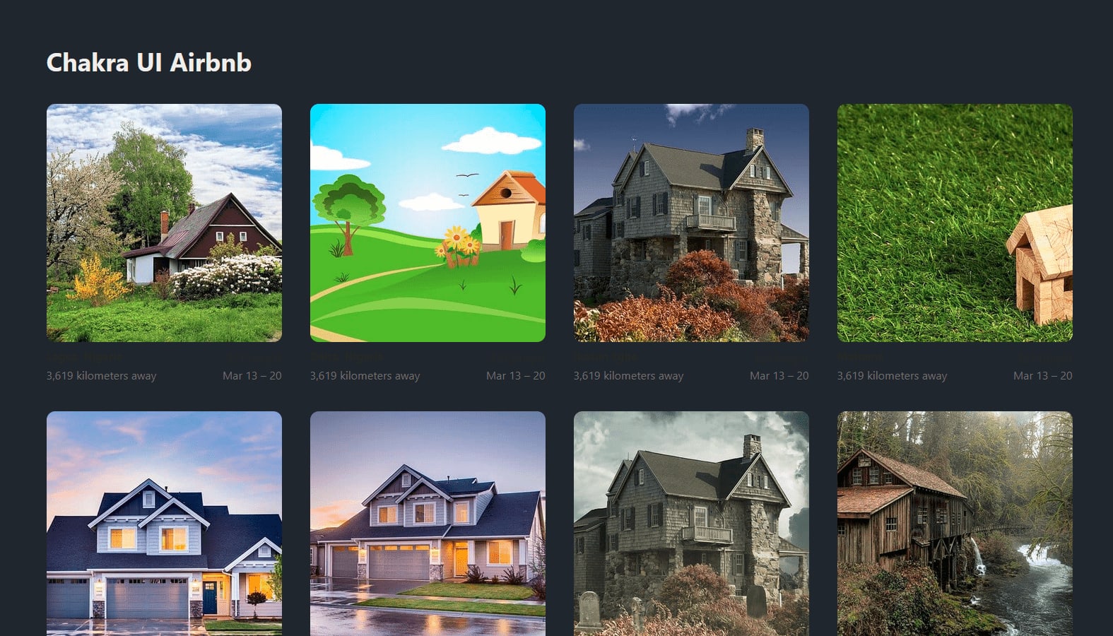
The image below shows the completed demo.
Our components must not just be functional. They must also be responsive and pleasing to the eye. Chakra UI empowers us to create accessible, responsive, and appealing user interfaces.
This article taught us how to build a Grid of Airbnb-inspired cards using Chakra UI.
You may find these resources helpful: