
Customers of modern E-commerce systems, expect custom-made products and the option to see how their products will look before purchasing them.
In this tutorial, we will use Next.js to create a product image zoom lens that allows us to zoom in on a product image while maintaining the anticipated image look and feel of the image after purchase.
This project was completed in a Codesandbox. To get started quickly, “fork” the Codesandbox or run the project.
GitHub Repository: https://github.com/Olanetsoft/E-commerce-Product-Image-Zoom-Lens-in-Next.js
<!— Can you please swap the link text, it is different than the actual git link —>
Next.js is an open-source React-based front-end development web framework, that allows server-side rendering and the generation of static websites and applications.
To create a new project, we use the npx create-next-app command to scaffold a new project in a directory of our choice.
Once the app is created and the dependencies automatically installed, we will see a message with instructions for navigating to our site and running it locally. We do this with the command
    cd <project name> && npm start
Code language: HTML, XML (xml)
Next.js will start a hot-reloading development environment accessible by default at http://localhost:3000
We will use react-image-magnify to handle the product image zoom.
React-Image-Magnify is a responsive React image zoom component for touch and mouse. It provides features like in-place and side-by-side image enlargement, positive or negative space guide lens options, interaction hint, configurable enlarged image dimensions, optional enlarged image external render, hover intent, etc.
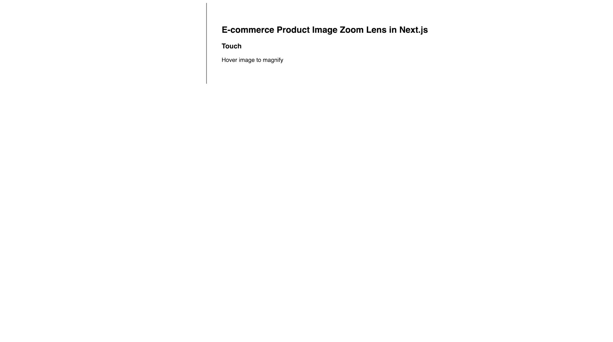
On the main page, we need the user interface to handle the product image zoom. We create this by updating the pages/index.js file to a component:
    export default function IndexPage() {

      return (
        <div className="body">
          <div className="image">
            // Image here
          </div>
          <div className="text">
            <h2>E-commerce Product Image Zoom Lens in Next.js</h2>
            <h3>Touch</h3>
            <p>Hover image to magnify</p>
          </div>
        </div>
      );
    }
Code language: JavaScript (javascript)
As shown in the code snippet above, we created a simple layout to fit our image and a text description.
In the project’s root directory, we create a folder titled css, and in it, a stylesheet called styles.css with the following content.
<!— Based on your procedure, I would be unsure where to place this piece of code —>
<!— I think you might have skipped creating a css folder in root and a style.css file —>
    .body {
      /* max-width: 1024px; */
      margin: 0 auto;
      display: flex;
      flex-direction: column;
    }
    .image {
      flex: 0 0 100%;
    }
    .text {
      border-left: 2px solid grey;
      padding: 40px;
      font-family: sans-serif;
    }
    @media (min-width: 415px) {
      .body {
        flex-direction: row;
      }
      .image {
        flex: 0 0 50%;
      }
    }
    @media (min-width: 800px) {
      .image {
        flex: 0 0 33.5%;
      }
    }
Code language: CSS (css)
https://gist.github.com/Olanetsoft/ff5a07491d6a62ed372c2e333edc72b8.js
We also need to create an _app.js file inside the pages directory. This file is native to Next.js and wraps the whole application. We’ll import the CSS file we created into this _app.js file.
    import "../css/style.css";
    export default function MyApp({ Component, pageProps }) {
      return <Component {...pageProps} />;
    }
Code language: JavaScript (javascript)
Our application should now look like this on http://localhost:3000/:
In the project, we install the react-image-magnify package using the command below:
npm i react-image-magnify
Next, in pages/index.js we import react-image-magnify.
    import ReactImageMagnify from "react-image-magnify";

    export default function IndexPage() {
      return (
        <div className="body">
          <div className="image">
            <ReactImageMagnify
              {...{
                smallImage: {
                  alt: "",
                  isFluidWidth: true,
                  src: "",
                  srcSet: "",
                  sizes:
                    "(min-width: 1000px) 33.5vw, (min-width: 415px) 50vw, 100vw"
                },
                largeImage: {
                  alt: "",
                  src: "",
                  width: 1200,
                  height: 1800
                },
                isHintEnabled: true
              }}
            />
          </div>
          <div className="text">
            // ...
          </div>
        </div>
      );
    }
Code language: JavaScript (javascript)
We have successfully imported react-image-magnify with the default configuration from the docs.
Notice that we are yet to specify src, srcSet, and alt in the above snippet, to do that we will be using an image URL for src and we will also create an array to specify sizes that will be used for srcSet.
src : The src stands for image source, which is used to specify the source of an image in a tag.
srcSet : This is a new attribute that allows you to specify different images for different screen sizes/orientations/display-types.
alt : Adds a text description to an image on a Web page.
Let’s create our base URL and sizes with the snippet below:
    import ReactImageMagnify from "react-image-magnify";

    export default function IndexPage() {

      const imageBaseUrl =
        "https://res.cloudinary.com/olanetsoft/image/upload/cat.jpg";

     const sizes = [ "355","481","584","687","770","861","955","1033","1112","1192","1200"];
      return (
        // ...
      );
    }
Code language: JavaScript (javascript)
We defined our preferred picture sizes and created our primary image URL, which will be used for srcSet in the code snippet above.
We will loop through all of the sizes in the array because srcSet is used to define various types of pictures for various screen sizes.
Using the code snippet below, create the srcSet:
    import ReactImageMagnify from "react-image-magnify";

    export default function IndexPage() {
      //...

    const srcSet = () => {
      sizes.forEach((i) => {
        return `https://res.cloudinary.com/olanetsoft/image/upload/w_${i},c_scale/cat.jpg`;
        });
    };

      return (
        // ...
      );
    }
Code language: JavaScript (javascript)
We successfully iterated over the sizes array, passing it in our base URL to set the image size based on the sizes in the array. With this, we’ll use the srcSet attributes to define different types of images.
We will update the src, srcSet, and alt attribute as shown in the code snippet below:
    import ReactImageMagnify from "react-image-magnify";

    export default function IndexPage() {
      [...]
      return (
        <div className="body">
          <div className="image">
            <ReactImageMagnify
              {...{
                smallImage: {
                  alt: "Cat", // updated
                  isFluidWidth: true,
                  src: `${imageBaseUrl}`, // updated
                  srcSet, // updated
                  sizes:
                    "(min-width: 1000px) 33.5vw, (min-width: 415px) 50vw, 100vw"
                },
                largeImage: {
                  alt: "Cat", // updated
                  src: `${imageBaseUrl}`, // updated
                  width: 1200,
                  height: 1800
                },
                isHintEnabled: true
              }}
            />
          </div>
          <div className="text">
            // ..
          </div>
        </div>
      );
    }
Code language: PHP (php)
The final interface should appear something like this, with the product image on the left and the text description on the right. See demo below:
https://drive.google.com/file/d/1cMHpmk5ii9pI4qdsASef4lP4KfyvkQFZ/view?usp=drivesdk
This article explains how to create an E-commerce product image zoom lens in Next.js, using React-image-magnify.
You may find this resource useful.