Responsive images are essential in the modern-day as this improves the appearance of websites on devices with both large and small displays. They are vital because they enable us to serve the right image for the correct screen size, improve user experience, and reduce loading time.
This article utilizes the Next.js Image component to serve responsive images. It comes with multiple built-in performance features to deliver optimal web vitals.
The completed project is on CodeSandbox, and you can fork it to get started quickly.
You can also find the source code on Github.
To follow the steps in this article, you should have:
- Basic knowledge of CSS, JavaScript, and React.js.
- Installed the most recent version of Node.js.
- Terminal such as Git bash(Windows) or ITerm2(MacOS).
We create a Next.js app in a new folder called responsive-image-app by running the following command in our terminal:
npx create-next-app responsive-image-app
Next, we’ll navigate into the project directory.
cd responsive-image-app
Running npm run dev starts the project on the local development server at localhost:3000 in our browser.

The Next.js Image component, next/image, extends the HTML img element. It comes with several built-in performance enhancements to assist us in achieving good Core Web Vitals. These scores are a crucial indicator of our website’s user experience, and they are taken into account by Google when determining search rankings.
Some of the optimizations built into the Image component include:
- Improved Performance: Always deliver images of the correct size for each device, using updated image formats.
- Visual Stability: Prevent an unexpected shift layout as the page loads automatically
- Faster Page Loads: The images load when they enter the viewport, with blur-up placeholders as an option.
- Asset Flexibility: Resize photos stored on remote servers on the fly
To use the Next.js Image Component, import it at the top of the home page on pages/index.js:
import Image from 'next/image'
Then, we’ll render any two random local images from our computer. The local image files titled sunset.jpg and snow.jpg are in the project’s public directory.
Several attributes are similar between using the Next.js Image Component and using the img tag in HTML. There are a few required attributes:
-
src: This is the path to the image. -
alt: This specifies the alternate text for an image. -
width: This specifies the width of the image in pixels. -
height: This specifies the height of the image in pixels.
Let’s replace the existing content of the home page with:
    <div className={styles.container}>
        <h1 className={styles.title}>
          Responsive images using Next JS Image Component
        </h1>

        <div className={styles.imagecontainer}>
            <Image src="/sunset.jpg" alt="Sunset" width={650} height={380} />
            <Image src="/snow.jpg" alt="Sunset" width={650} height={380} />
        </div>
    </div>
One of the Image Component’s vital props is the layout prop. A viewport is the user’s visible area of a web page. We can tell Next.js how to display the images as the viewport changes in size. The layout prop has four options which are:
-
fixed: The image is not scalable. The image’s width and height are specified regardless of the device’s size displayed. -
intrinsic: The image scales down to fit the container’s width on smaller viewports. The image does not scale up beyond its actual size on a larger viewport. The container width is set to 100%. -
responsive: On different viewports, the image is scaled down or up depending on the container’s width while retaining the aspect ratio. -
fill: Stretches the image’s width and height to fill the parent container.
We’ll set the layout prop to responsive and add it to the Image Component:
    <div className={styles.imagecontainer}>
      <Image src="/sunset.jpg" alt="Sunset" width={650} height={380} layout="responsive"/>
      <Image src="/snow.jpg" alt="Sunset" width={650} height={380} layout="responsive"/>
    </div>
For a better experience, let’s display the images in a grid layout by styling the images container.
The CSS Grid Layout offers a grid-based system with rows and columns, making it easier to design web pages without having to use floats and positioning.
In the CSS file — style/Home.module.css, we’ll add the code snippet below.
    .imagecontainer {
      display: grid;
      grid-template-columns: 2fr 2fr;
      column-gap: 2rem;
    }
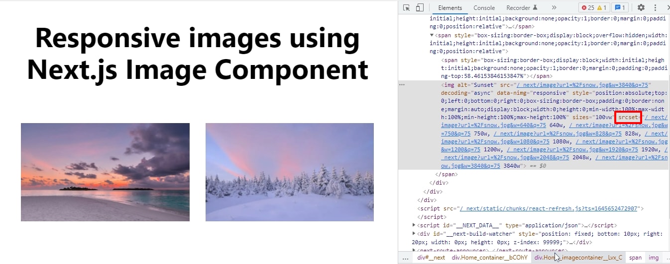
Using grid-template-columns, the images are aligned side by side as columns with a spacing of 2rem. The Next.js app will look like this after making it responsive:

Looking at the source page for our project, Next.js dynamically sets the srcset attribute to load different images at different sizes depending on the viewport size. Ideally, we would like to serve images adjusted to fit the user’s viewport dimensions.
Without a way to achieve this, we’ll have to supply a larger image than is required. That means the browser will be able to load different image sizes depending on the size of the browser or screen size. So, if a visitor is using a small device, they won’t have to load the same large images as a desktop.

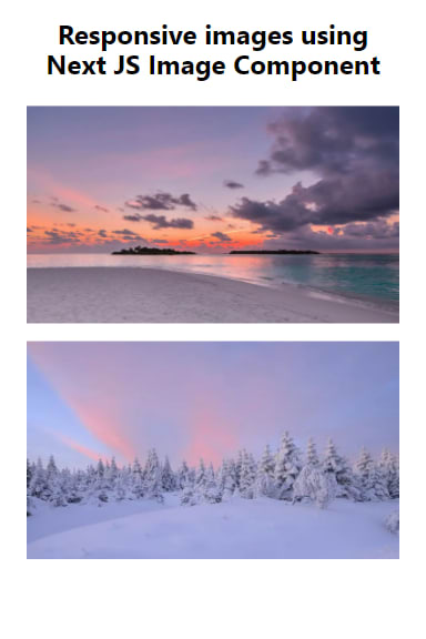
We’ll also style the image container to stack our images on one another when it is displayed on a smaller screen.
    @media (max-width: 425px) {
      .imagecontainer {
        display: grid;
        grid-template-columns: 2fr;
        row-gap: 2rem;
      }
    }
For example, the screen size for mobile devices (320px — 480px) will look like this:

The goal is to eliminate the need for excessive resizing, scrolling, zooming, or panning of images that arise on sites that are not mobile-friendly. With the Next.js Image component, images are responsive across as many devices.
You may find these resources helpful:
