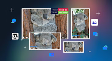
Today, users access content on multiple platforms and devices — each with different screen sizes and resolutions. This diversity presents a challenge: How can developers ensure that images look great on every device without compromising performance? Check out the responsive breakpoints mechanism in the Cloudinary iOS SDK, a powerful tool that automatically optimizes images for different screens, ensuring the best possible user experience.
When building mobile applications or websites, developers often struggle with delivering the right image size to the right device. Traditionally, this meant either serving a single large image (which wastes bandwidth on smaller screens, might hurt performance, and drains battery) or manually creating multiple image sizes for different devices. Both options have their drawbacks, e.g., longer load times, higher data usage, and a more labor-intensive workflow.
Cloudinary, a leading cloud-based image and video management service, introduced the responsive breakpoints mechanism. This feature streamlines the process of delivering perfectly sized images to various devices while reducing the effort developers require.
The responsive breakpoints mechanism solves developers’ challenges to deliver the right image size to the right device with:
Problem:
- Serving a single image size to all devices results in either wasted bandwidth or poor image quality.
Solution:
- The responsive breakpoints mechanism automatically generates and delivers the optimal image size based on the user’s device, ensuring efficient use of resources.
Problem:
- Large images can slow page load times, especially on mobile devices with limited bandwidth.
Solution:
- By delivering images that are appropriately sized for each device, load times are reduced, leading to a faster, more responsive application.
Problem:
- Managing multiple image versions for different devices is time-consuming and error-prone.
Solution:
- Cloudinary automates this process, dynamically generating the necessary image sizes and delivering them as needed.
The responsive breakpoints mechanism works by analyzing each image you upload and determining a set of optimal breakpoints — specific image widths that are ideal for various screen sizes. When a device requests an image, the SDK automatically selects the most appropriate version based on the screen’s dimensions and resolution.
Let’s dive into a practical example to see how it all comes together.
import Cloudinary

let cloudinary = CLDCloudinary(configuration: config)
let transformation = CLDTransformation().setFetchFormat("avif")
let params = CLDResponsiveParams.autoFill()

photoImageView.cldSetImage(publicId: "sample",
    cloudinary: cld, resourceType: .image,
responsiveParams: params, transformation: transformation)Code language: JavaScript (javascript)CLDTransformation().setFetchFormat("avif"). Converts the image to AVIF format for consistent delivery.CLDResponsiveParams.autoFill(). Automatically adjust the image dimensions based on the device’s screen size, ensuring a perfect fit.photoImageView.cldSetImage(...). Sets the optimized image in a UIImageView on your app’s UI, delivering the best version for the user’s device.
import Cloudinary

let cloudinary = CLDCloudinary(configuration: config)
let transformation = CLDTransformation().setFetchFormat("avif")
let params = CLDResponsiveParams.autoFill()

photoImageView.cldSetImage(publicId: "sample",
    cloudinary: cld, resourceType: .image,
responsiveParams: params, transformation: transformation)Code language: JavaScript (javascript)setFetchFormat("avif"). Converts the image to AVIF format.CLDResponsiveParams.fit(). This method ensures the image fits within the given dimensions, preserving its aspect ratio. UnlikeautoFill, which might crop the image to fill the space, scale the image to fit within the container, potentially leaving some empty space.photoImageView.cldSetImage(...). Displays the optimized image in the UIImageView, ensuring it fits perfectly within the space available on the user’s device.
This approach is useful when you want to maintain the image’s full view without cropping while still optimizing it for different screen sizes.
let transformation = CLDTransformation().responsiveWidth(true).maxWidth(2000).maxImages(3)
photoImageView.cldSetImage(publicId: "sample",
    cloudinary: cld, resourceType: .image,
    responsiveParams: CLDResponsiveParams.autoFill(),
transformation: transformation)Code language: JavaScript (javascript)responsiveWidth(true). Enables responsive width adjustments based on device needs.maxWidth(2000). Limits the maximum width of the image, ensuring it’s not larger than necessary.maxImages(3). Limits the number of generated image sizes, balancing performance and quality.
These examples show how the Cloudinary iOS SDK simplifies the process of delivering the right image to the right device, without requiring extensive manual effort from developers.
Delivering the right content to the right device is crucial to enhancing the user experience. The responsive breakpoints mechanism in the Cloudinary iOS SDK offers a smart, automated solution to the challenges of responsive image delivery. Optimizing images for different screen sizes and resolutions ensures faster load times, better performance, and a more seamless user experience — all while reducing developers’ workload.
Whether you’re building a complex mobile application or a simple website, leveraging this feature can make a significant difference in how users interact with your content. With Cloudinary, delivering high-quality, responsive images has never been easier. Contact us today.
You can find the Cloudinary iOS SDK here.


