
Figma is a cloud-based design tool that enables users to create, collaborate on, and share interface and graphic designs. It provides features for UI/UX design, such as vector graphics creation, prototyping, and code generation, and is known for its real-time collaboration capabilities, allowing multiple users to work on the same project simultaneously. Its browser-based nature means that it’s accessible from various devices and platforms, facilitating a seamless design workflow for individuals and teams.
In this blog post, we’ll walk through setting up Figma, creating a custom button image on it, uploading those into Cloudinary, and using the WordPress block editor to help edit and render that image on the frontend.
Creating a Figma account is straightforward.
Figma’s website:
- Go to https://www.figma.com.
- Click on the Get started for free button, located in the top right corner of the homepage.
- Choose your sign-up method via Google or email and password creation.
Set up your profile:
- Once your email is verified and your method of account creation is finished, log in to your Figma account.
- Navigate to your profile settings to add more details like your name, profile picture, and job title.
Choose your plan:
- Figma offers different plans, including a free tier and various paid options.
For this blog post, choose the free plan if you don’t already have one.
Now that you have a Figma account, let’s create a button image to export into Cloudinary.
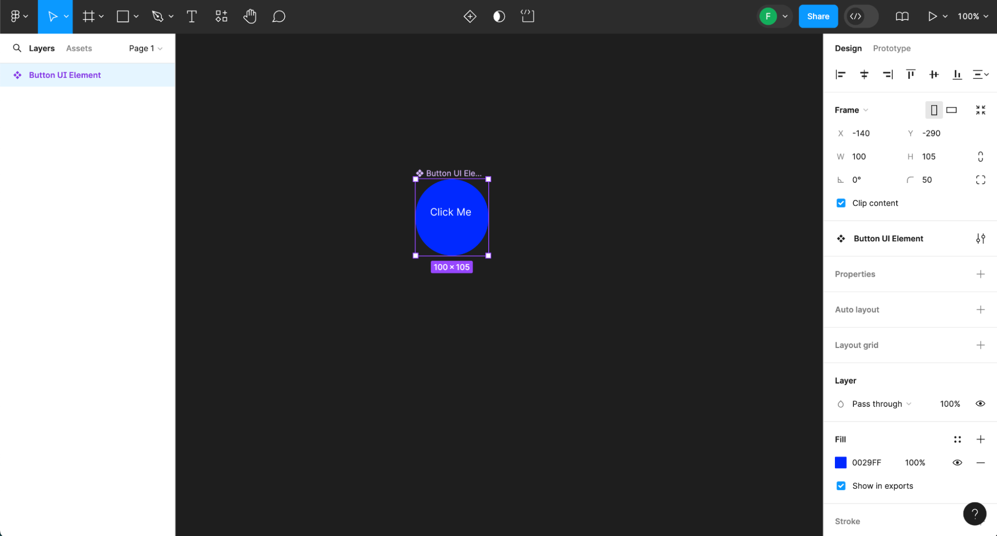
Creating UI elements and custom illustrations in Figma is a fundamental skill for designers. This step-by-step guide will walk you through the process of designing a button UI element.
- Open Figma. Start by launching Figma. You can use the web version or the desktop app.
- Create a new file. Click the + icon or select New File to start a new design project.
- Draw the button shape. Select the Rectangle tool from the toolbar or press R on your keyboard. Click and drag on the canvas to draw a rectangle. This will be your button’s base.
- Style the button:
- Fill. With the rectangle selected, choose a fill color from the right-hand panel.
- Rounded corners: Adjust the corner radius to make the corners rounded, giving it a more button-like appearance.
- Add text. Select the Text tool or press T, click the canvas, and type your button label (e.g., Submit). Position the text over your button shape.
- Adjust text properties. Customize your text’s font, size, and color from the right-hand panel to match your design.
- Group the elements. Select both the text and the rectangle by holding Shift and clicking both. Right-click and select Group or press Ctrl + G (Windows) or Cmd + G (Mac). This makes the button one cohesive element.
- Create a component: With the group selected, click the Create Component button in the toolbar or press Ctrl + Alt + K (Windows) or Cmd + Opt + K (Mac). This allows you to reuse the button across your designs.
You should have a Figma page that looks like this:
Exporting a graphic in Figma is a straightforward process, designed to give you control over the format and quality of the output file. Here’s how to do it:
- First, navigate to your Figma canvas and click on the graphic, component, or design element you want to export. You can select multiple layers or objects by holding the Shift key and clicking on them.
- With your graphic selected, look for the Export panel in the right-side properties panel. If it’s not immediately visible, scroll down in the properties panel until you find it.
- Click the + button to add a new export setting if none exists. Figma allows you to export your selection in several formats, including PNG, JPG, SVG, and PDF.
- Choose the format that best suits your needs. For web graphics, PNG and SVG are commonly used; PNG for raster images and SVG for vectors.
- You can also adjust additional settings such as the scale (e.g., 1x, 2x, or 3x for higher resolution) and suffix (to automatically name files based on their scale or format).
For optimal web images, we’ll choose the SVG option in this article.
- Once you’ve configured your export settings, click the Export button at the bottom of the Export panel. If you selected multiple objects, it would say Export [number] layers.
- Choose where you want to save the file on your computer in the dialog that appears and click Save. In this blog post, choose downloads.
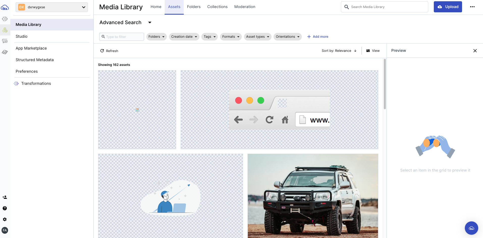
Setting up a Cloudinary account is easy. Go to their website and at the top of the main landing page, click the Sign up for free button. Once you click that, you have an option to create an account via email and password or OAuth via social login with GitHub or Google.
Once you sign up, navigate to your Media Library page, which will show what media you have in Cloudinary:
You can use any WordPress server and host. Because setting up a local environment to develop a website can be a needlessly extensive process, I chose Local by WP Engine, a free program that allows you to easily set up a WordPress environment on your local computer, regardless of your skill level or experience. Local is supported on Windows, Mac, and Linux systems.
Please refer to your WordPress host docs for any special installation instructions.
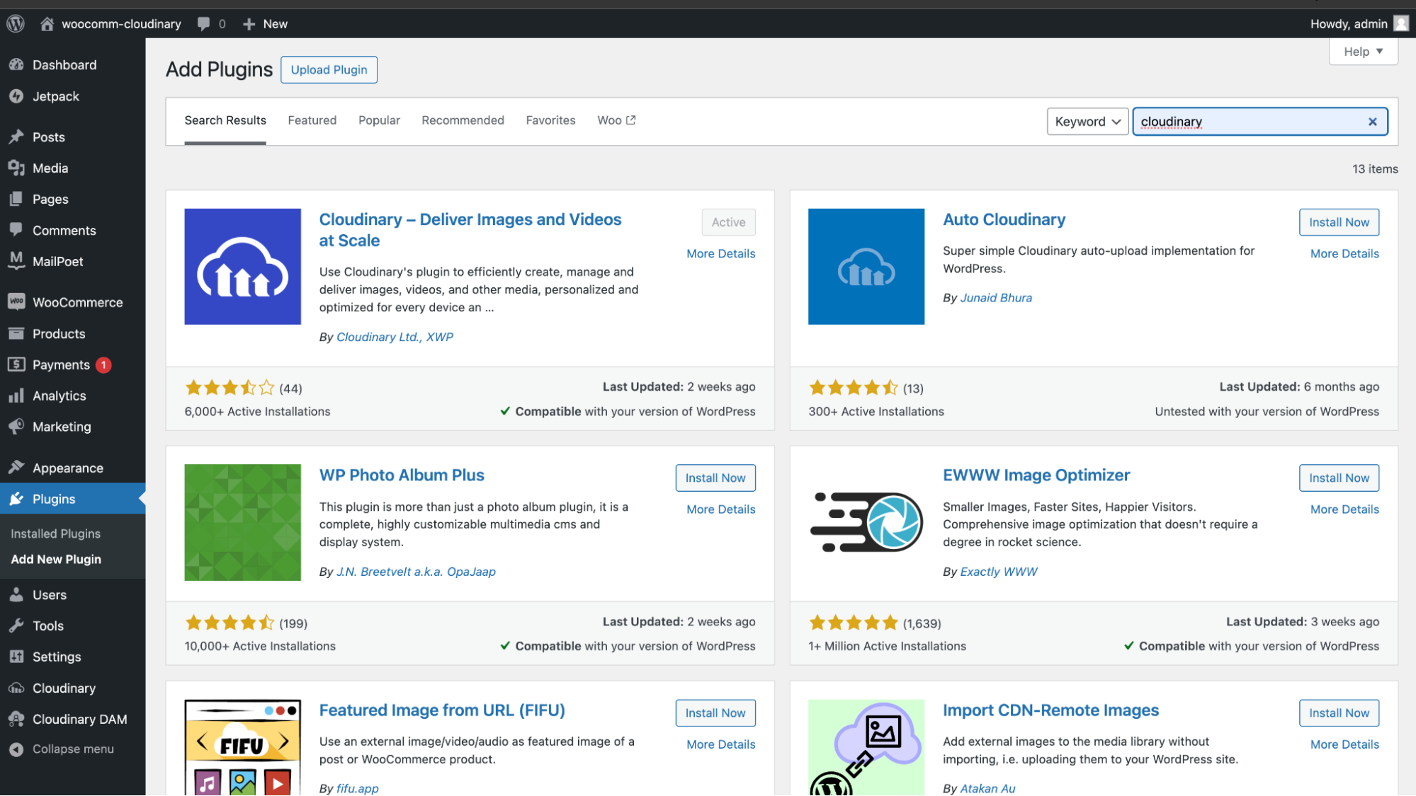
Now that we have a WordPress server installed, let’s set up the connection between WordPress and Cloudinary. Search for Cloudinary in the Plugins directory page. Install and activate it:
Now that we have it installed in our WP Admin, after you follow the setup wizard, you should have a main dashboard that looks like this:
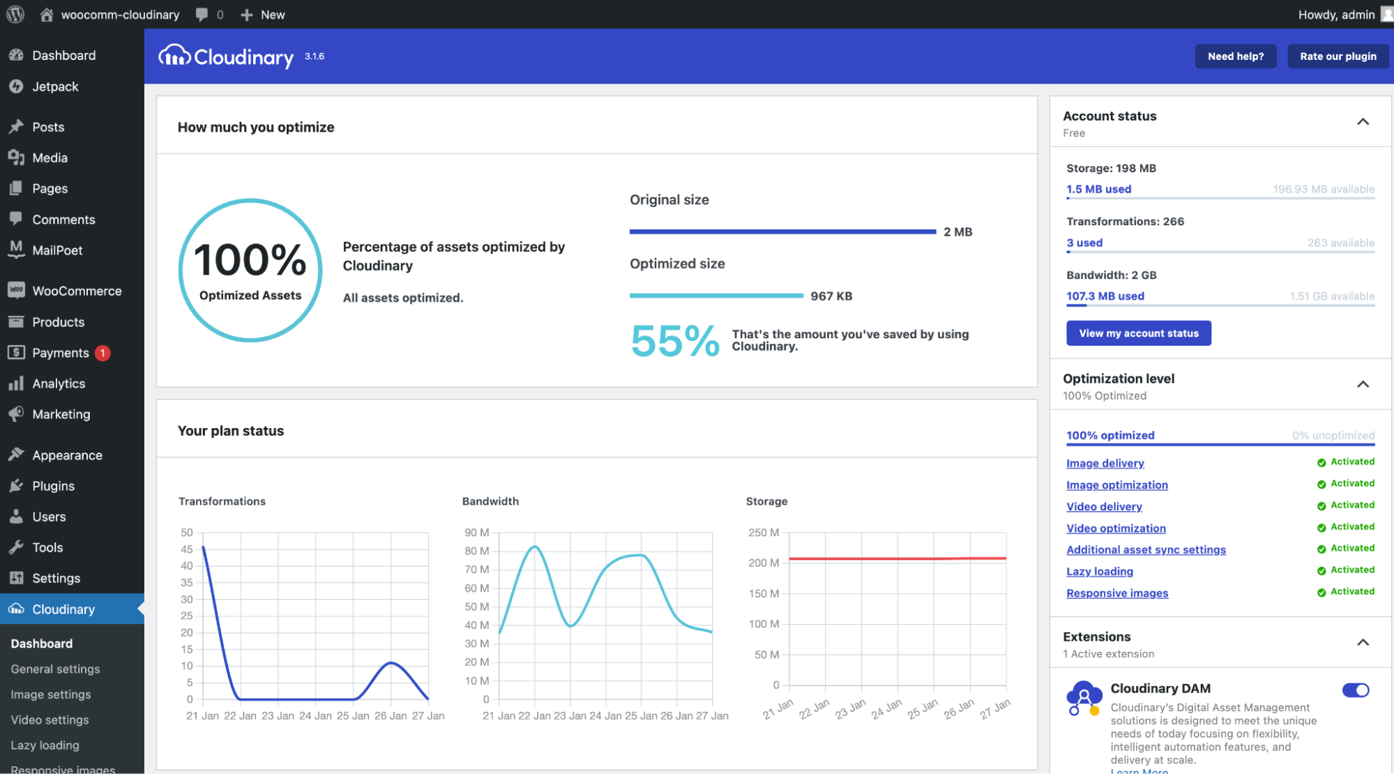
The major value add of using the Cloudinary plugin is how easy it is. Once downloaded, the default settings and media sync is automatic. Your media items are now offloaded to an optimized media CDN!
If you go to your Media option on the side menu of your WP Admin and start loading in images, the Cloudinary plugin will automatically sync your images to the Cloudinary CDN as well as your dashboard:
The green cloud icon indicates that the sync is successful between your WordPress backend and your Cloudinary account.
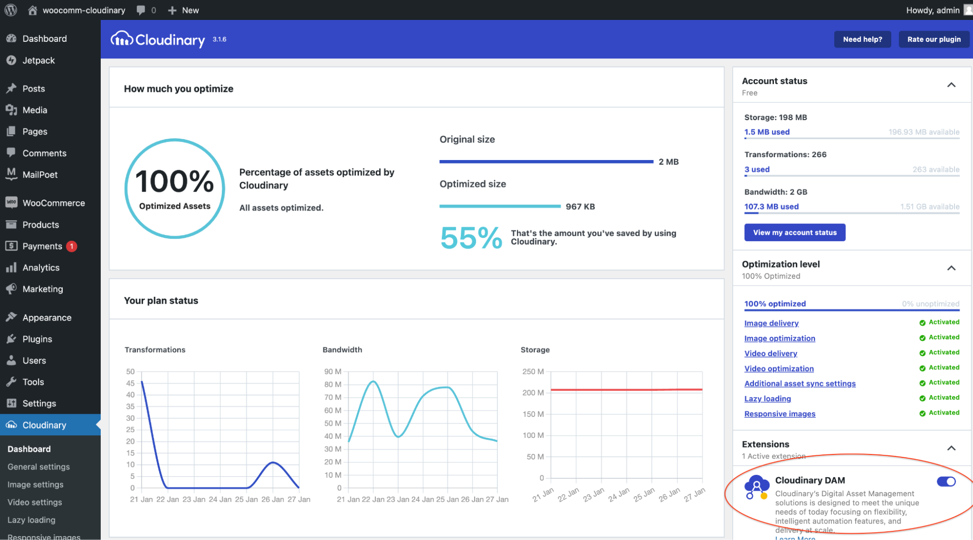
The next setting is setting up the Cloudinary DAM option. Navigate back to your Cloudinary option on the left-hand menu and on the bottom-right part of the screen. Toggle the button to On. It will give you access to your media library and the features that you similarly have in your Cloudinary console. This is awesome as it eliminates having to switch back and forth from WP admin to your Cloudinary console.
We now have our Cloudinary and WordPress installation all setup and synced together. Let’s use the Block Editor in WordPress.
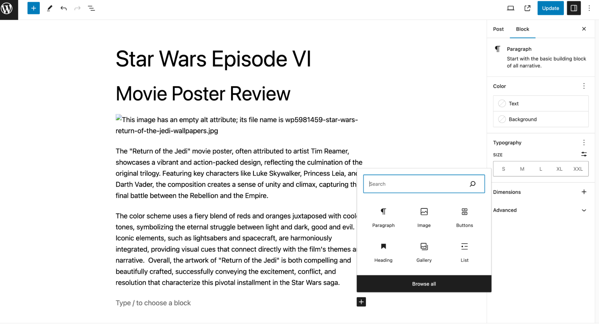
Navigate to the Posts option and click on any posts you have in there or make a new one and populate it with data. By default, the block editor in WordPress will show a placeholder text, which says Type / to choose a block, and marks the start of a new block as well as the plus sign next to it. Click on that plus sign and select button:
Once selected, click the downward pointing arrow at the end of the selection bar. When clicked, this will give you a menu and option of putting an inline image into the button block. Go ahead and choose that. When you choose that, it will show you the images available to you in WordPress and it will also have a tab available to you for your Cloudinary account due to the plugin that are all being optimized by Cloudinary.
Go to the Cloudinary tab, click the Upload button and select the button image you created in Figma. This will upload your button image while you are still in the WordPress admin via Cloudinary. This will upload the button image into Cloudinary. Go ahead and choose it by selecting the blank box to check it off.
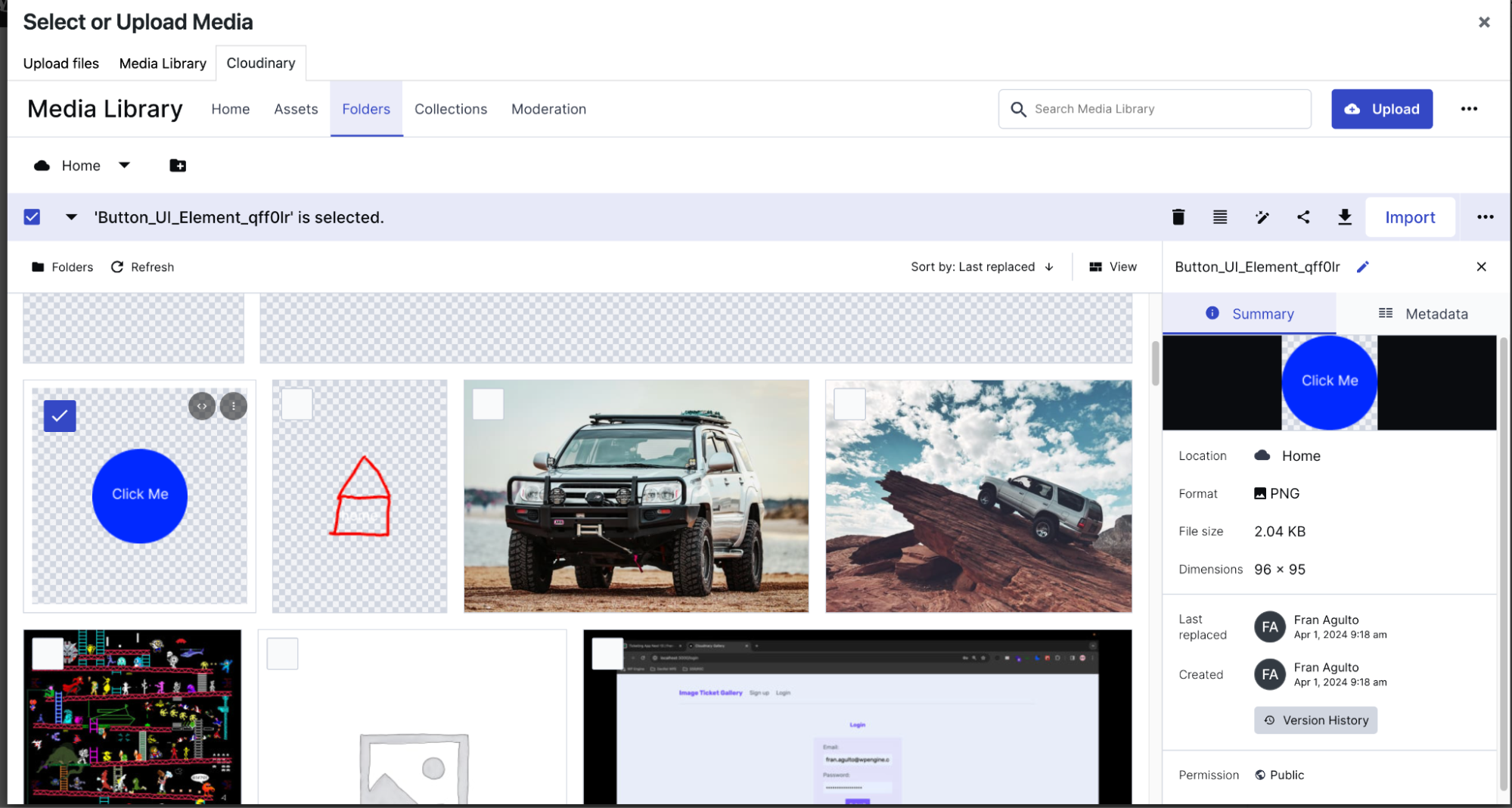
Once you check and select the button image, click import. This tells Cloudinary to import this image into your WordPress media library. Now select that image and hit the Select button:
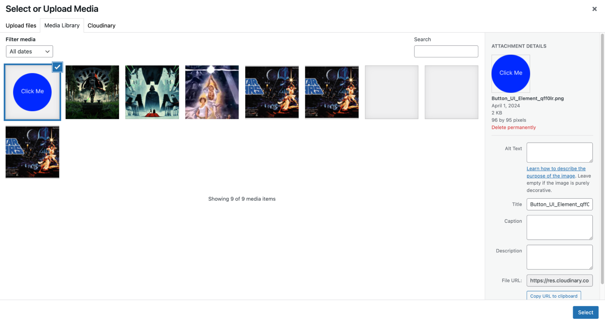
With a few clicks, we were able to upload an image from our local machine, into Cloudinary then import it into WordPress without having to leave the WP Admin.
This is what you should see once the image is chosen in the button block:
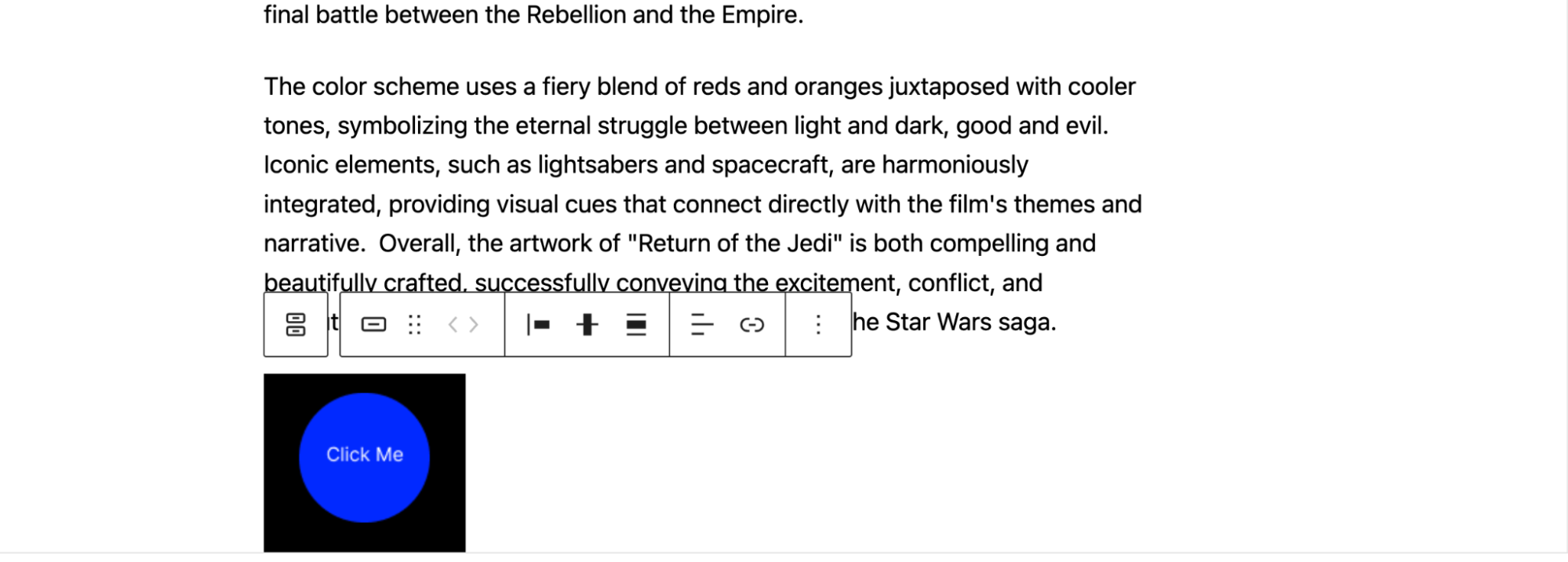
Notice that the button comes with a default background color. This doesn’t look great. In order to change the styling around the button block, navigate to Block > Styles > Background in the left-hand Block settings menu.
This is what your screen should look like:
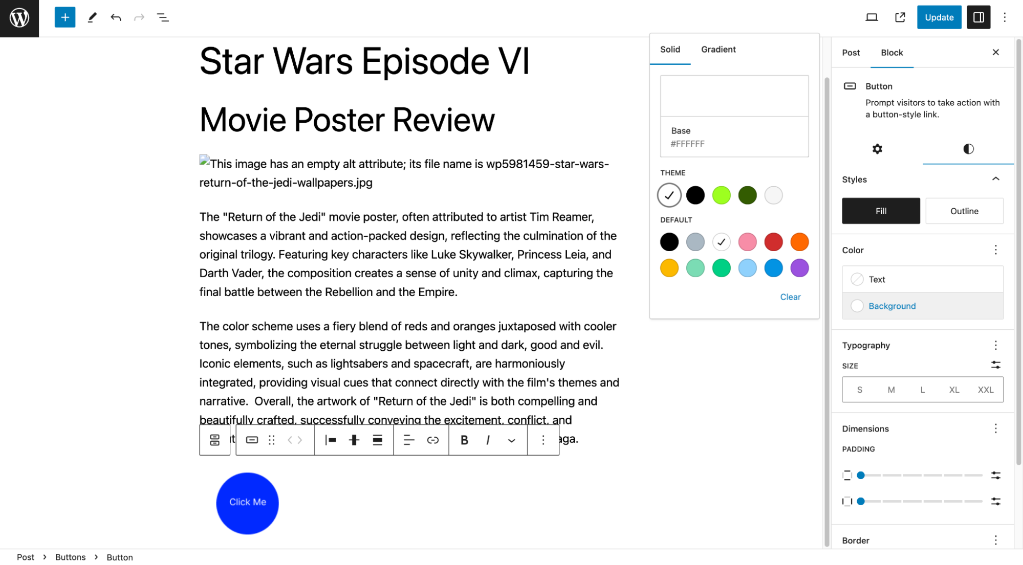
You can modify the color background here. Let’s check no background color so that it takes the color of the post page’s background. Once you choose that, click outside of the box to hide the color choice widget. Then hit the update button at the top.
You should see the button image on your frontend when you visit your WordPress site’s URL like this:
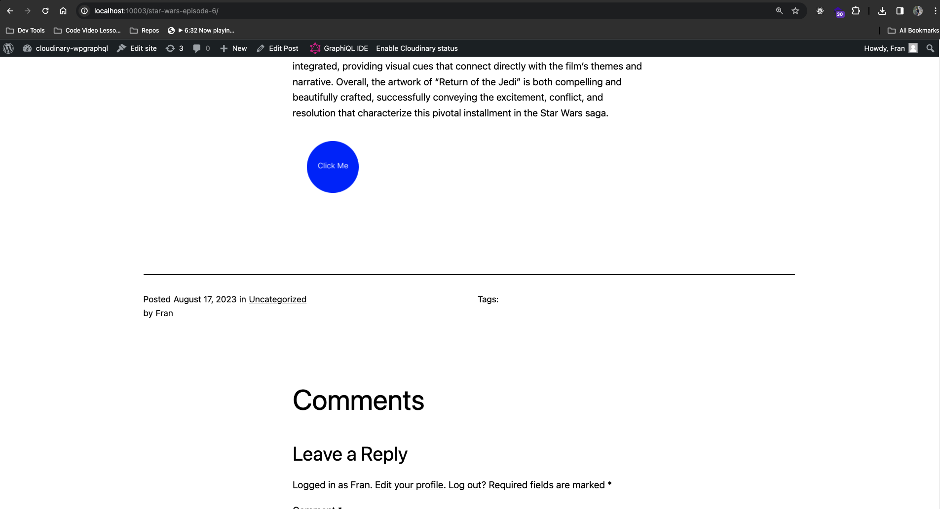
We now have a clickable functional custom button block element in WordPress, with the image being optimized by Cloudinary that we made in Figma.
This was a simple example to get you started but you can go even further by customizing its appearance, and linking it to any URL. You can customize the text, background color, text color, and add more border radius to make the button more rounded if desired. Additionally, you can align the button, adjust its width, and apply various styles provided by your theme or create custom styles. Please refer to the docs here if you want further information.
I hope this blog post provided a better understanding for you in using the Cloudinary WordPress plugin with the WordPress Gutenberg Block editor and creating custom images in Figma. Sign up for a free account today to try Cloudinary for yourself.


