StencilJS is a new compiler for composing user interfaces using pure custom components. Stencil enables you to build components using new, cutting-edge technologies, such as TypeScript and JSX, then generates a pure custom component that can be used anywhere supported. This means you can import a Stencil generated component into React, Angular, Vue, etc.
Stencil is basically a compiler, not necessarily a UI library. A compiler that transforms TSX (TypeScript + JSX) into self-contained custom components.
Before you start learning about the tool, it’s important to note that Stencil is not another heavy JavaScript framework you need to learn. If you have worked with Angular or React, or understand web components, then Stencil is worth a look.
Stencil enables you to write some TSX and SCSS, which it compiles down into shippable components. It was built by the Ionic team to help them write smaller, reusable components without having to carry along the weight of Angular. However, this led to solving a more general problem. We can write platform-independent component with our favorite tools (TS, JSX, etc) and compile to standard custom components which can then be used with any framework and supporting browsers. All features of Stencil boil down to optimization and performance, which is the motivation behind Stencil.
Stencil also provides a lot of progressive features out of the box, including easy server-side rendering and service worker installation. Now let’s take a look at a practical approach to using Stencil and some of its interesting features.
Even Stencil’s installation is simple. You can clone a starter template from GitHub and install the npm dependencies. No major configuration, just clone, install and run.
Clone the repository from GitHub to your machine:
# Clone starter
git clone https://github.com/ionic-team/stencil-starter.git todo
Code language: PHP (php)
Install the dependencies:
# Enter the cloned project
cd todo

# Install dependencies
npm install
Code language: PHP (php)
You can start the app at port 3333 using the following command:
npm start
All our component code will be written in src/components. You can ignore the my-name starter component, since we will remove it from the face of the project.
Each component is saved in a containing folder, such as a TSX file. The containing folder also can contain an SCSS file for the component’s styles.
Let’s start with a container component that will serve as the app’s shell. Create a folder named site in the components folder, then add site.tsx and site.scss files in the folder. You just created an empty Stencil component.
Throughout the article, we will skip the SCSS contents for brevity. You can grab them from the GitHub repo provided. With that in mind, let’s add some component content:
// components/site/site.tsx
import { Component } from '@stencil/core';

@Component({
  tag: 'todo-site',
  styleUrl: 'site.scss'
})
export class Site {

  render() {
    return (
      <div class="wrapper">
        <nav>
          <div class="container">
            <h2>To - Do</h2>
          </div>
        </nav>
        <div class="container">
          <div class="row">
            <div class="col-md-offset-4 col-md-4 col-sm 12">
				{/* Todo App goes here */}

            </div>
          </div>
        </div>
      </div>
    );
  }
}
Code language: JavaScript (javascript)- The
Componentdecorator – which is imported from@stencil/core– defines a class as a component. - The
Siteclass, which is decorated with theComponentdecorator, gets extended by the decorator to posses component features. - One of these features is having a tag, a style and a template. The tag and style is defined using an object and passing the object as argument to the decorator. The
rendermethod returns JSX, which serves as the template for the component. This template is what gets rendered to the browser when the component is mounted.
The tag is used to mount the component. In this case, replace my-name tag in index.html with the following:
<todo-site></todo-site>
Code language: HTML, XML (xml)
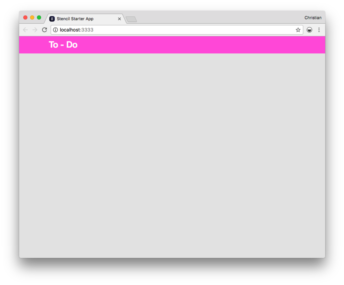
Then run the app using npm start. You should get the following:

Just like every other scenario in which you used components, Stencil components can be composed with each other. This is the beauty of web components. A component can have multiple children and grandchildren, as well as siblings. This enables you to write small, self-contained components that can work with other smaller components and carry out a single task.
As an example, let’s create another component called TodoList and compose with the Site component. The former will be a child component to the latter.
// components/todo-list/todo-list.tsx
import { Component } from '@stencil/core';

@Component({
  tag: 'todo-list',
  styleUrl: 'todo-list.scss'
})
export class TodoList {

  render() {
    return (
      <div class="todo-list">
        <ul>
          <li>Write some code</li>
        </ul>
      </div>
    );
  }
}
Code language: JavaScript (javascript)
Same syntax with the Site component, with different names and visuals. Let’s now add the component to the parent Site component:
export class Site {
  render() {
    return (
      <div class="wrapper">
        <nav>
          ...
        </nav>
        <div class="container">
          <div class="row">
            <div class="col-md-offset-4 col-md-4 col-sm 12">
              {/* Child component, TodoList */}
              <todo-list></todo-list>

            </div>
          </div>
        </div>
      </div>
    );
  }
}
Code language: JavaScript (javascript)
We don’t have to import the component child class to the parent class. We only need to include the todo-list tag and then Stencil looks up the component in the components folder and loads it accordingly.
So far, we have just been dealing with static contents and markup. Most components you will write in Stencil will be useless if they do not handle dynamic contents and markup. States and Props decorators are used to bring life to Stencil components.
A state is a mutable chunk of data defined in a component. After initialization, it can be overwritten, deleted and updated to fit the needs of a component. A state is basically a class property decorated with the State decorator:
import { Component, State } from '@stencil/core';

@Component({
  tag: 'todo-site',
  styleUrl: 'site.scss'
})
export class Site {

  // todos as a state
  @State() todos: Todo[] = [
    {task: 'Cook', completed: false},
    {task: 'Dance', completed: true},
    {task: 'Eat', completed: false}
  ];

  render() {
    return (
      <div class="wrapper">
        ...
        <div class="container">
          <div class="row">
            <div class="col-md-offset-4 col-md-4 col-sm 12">
              <todo-list todos={this.todos}></todo-list>
            </div>
          </div>
        </div>
      </div>
    );
  }
}

interface Todo {
  task: string;
  completed: boolean;
}

Code language: JavaScript (javascript)
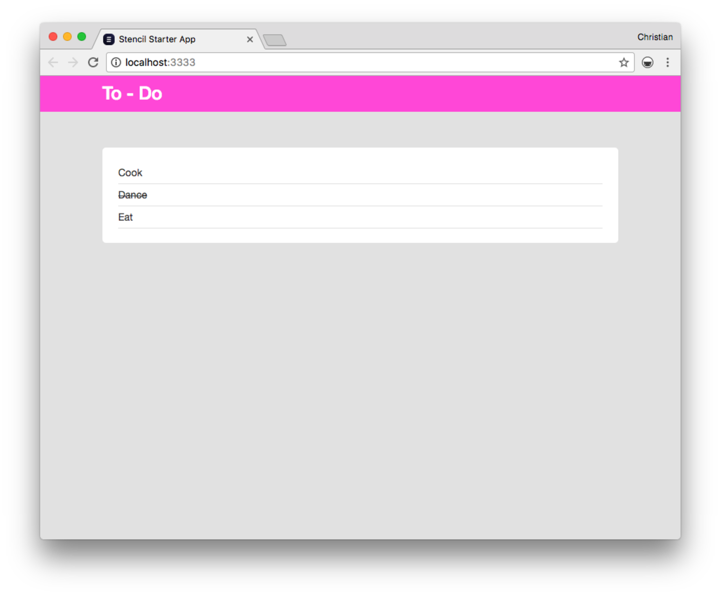
The todos property is defined as a state and initialized with an array with three Todo objects. The object is typed as a Todo interface and has task (string) and completed (boolean) properties.
A state, unlike props, can be updated at runtime, which makes them mutable. In our case, for example, we can add or remove tasks.
The todos state is used in the component by passing it down to the todo-list component using props.
Take another look on how we passed the array of todos to the todo-list component:
<todo-list todos={this.todos}></todo-list>
Code language: HTML, XML (xml)
The todos property, which is passed the array of todo items is what is referred to as props.
Before the todo-list component can receive values via todos props, it needs to be aware of the incoming values. In that case, we need to create a todos property on the component class and decorate the class using Props:
import { Component, Prop } from '@stencil/core';

@Component({
  tag: 'todo-list',
  styleUrl: 'todo-list.scss'
})
export class TodoList {

  @Prop() todos: Todo[];

  completedClass(todo: Todo) : string {
    return todo.completed ? 'completed' : '';
  }

  render() {
    return (
      <div class="todo-list">
        <ul>
          {this.todos.map(todo => <li class={this.completedClass(todo)} >{todo.task}</li>)}
        </ul>
      </div>
    );
  }
}

interface Todo {
  task: string;
  completed: boolean;
}
Code language: JavaScript (javascript)
The property is defined as an array and typed with the Todo interface, as well. When the component receives this value, we iterate over each of the items in the array using map and display them in a li tag. There is a also a completedClass method, which returns completed or empty string if the completed property of the each todo is true or false respectively.
There is a major difference between states and props. States are mutable and can be changed at runtime, while props will always retain the value it received throughout runtime. Props also are received as attributes via the component’s tag.
Now we got the problem of dynamic content of the table, we need to worry about interaction. How do we create new tasks? What happens when each todo item is clicked? Let’s answer those questions now.
An event is raised when a user interacts with your component. We can create and emit custom events for such interactions. Events are raised with Event Emitters and are decorated with the Event decorator.
Let’s see some event logic by clicking on each item in the todo list:
import { Component, Event, EventEmitter, Prop } from '@stencil/core';
export class TodoList {

  @Prop() todos: Todo[];
  @Event() toggleTodo: EventEmitter;

  ...

  // Event handler. Triggered by onClick
  // DOM event on the template in render()
  handleToggleTodo(todo) {
    this.toggleTodo.emit(todo)
  }

  render() {
    return (
      <div class="todo-list">
        <ul>
          {this.todos.map(todo => <li class={this.completedClass(todo)} onClick={this.handleToggleTodo.bind(this, todo)}>{todo.task}</li>)}
        </ul>
      </div>
    );
  }
}
Code language: JavaScript (javascript)
In the render method, you can see we have an onClick attribute attached to each li method in the map iteration. This attribute attaches a DOM event; a click event to be precise.
When this button is clicked, the handleToggleTodo method is called with the right context while passing the actual todo item that was clicked.
The handleToggleTodo method then emits a custom event. This custom event (toggleTodo) is decorated as Event and defined as EventEmitter type. Calling emit on the custom event triggers a global event that we can listen to from anywhere in the app.
We can head to the parent component (Site) and create a listener for the event:
import { Component, State, Listen } from '@stencil/core';
...
export class Site {
  ...
  @Listen('toggleTodo')
  toggleTodo(e): void {
    // Retrieve event payload
    // from e.detail
    const todo = e.detail;
    this.todos = this.todos.map(x => {
      if (x.task === todo.task) {
        const updated = {
          task: x.task,
          completed: !x.completed
        };
        return updated;
      }
      return x;
    })
  }
  ...
}
Code language: JavaScript (javascript)
The event listener is of course a decorated method. The method must be decorated with Listener and the decorator is passed the actual name of the emitter; in our case toggleTodo.
The name of the method handling the event doesn’t have to be the same as the event emitted. What is important is that the method is decorated and that the decorator is passed the name of the emitted event.

You have learned so much about Stencil and Stencil components. Before we conclude, let’s add another component that we can use to add more todo items to the todo list:
// components/todo-form/todo-form.tsx
import { Component, Event, EventEmitter, State } from '@stencil/core';

@Component({
  tag: 'todo-form',
  styleUrl: 'todo-form.scss'
})
export class TodoForm {

  @Event() newTodo: EventEmitter;
  @State() todo: string;


  handleChange(e) {
    this.todo = (e.target as HTMLTextAreaElement).value;
  }

  handleNewTodo() {
    this.newTodo.emit(this.todo);
    this.todo = '';
  }

  render() {
    return (
      <div class="todo-form">
        <input type="text" class="form-control" placeholder="New Task" value={this.todo} onChange={this.handleChange.bind(this)} />
        <button onClick={this.handleNewTodo.bind(this)}>Add</button>
      </div>
    );
  }
}
Code language: JavaScript (javascript)
Not so much a big difference from what we have dealt with in previous sections. Here are the obvious additions:
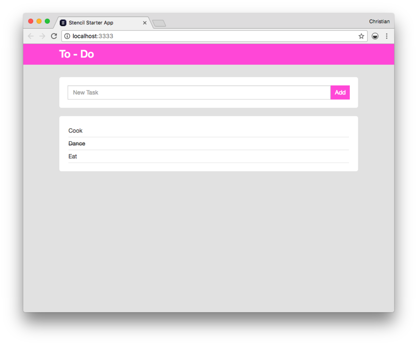
- We have an internal state property (
todo) that tracks the text being entered in the input field. When the value changes, we set the value of the state property to the new value of the input field. - There is a button that submits the current value of
todoanytime the button is clicked. It does so by triggering ahandleNewTodomethod which in turn emits anewTodocustom event
Back to the parent component, we can add a listener to update the list of todo items:
import { Component, State, Listen } from '@stencil/core';

export class Site {
  @State() todos: Todo[] = [
    {task: 'Cook', completed: false},
    {task: 'Dance', completed: true},
    {task: 'Eat', completed: false}
  ];

  @Listen('newTodo')
  newTodo(e) {
    const newTodo = {
      task: e.detail,
      completed: false
    };
    this.todos = [...this.todos, newTodo];
  }
 ...
 render() {
    return (
      <div class="wrapper">
        ...
        <div class="container">
          <div class="row">
            <div class="col-md-offset-4 col-md-4 col-sm 12">
              <todo-form></todo-form>
              <todo-list todos={this.todos}></todo-list>
            </div>
          </div>
        </div>
      </div>
    );
  }
}
...
Code language: JavaScript (javascript)- The
newTodomethod, which handles the custom event, updates the list of todos with the new task we added. - We also added the form component in the render method:
<todo-form></todo-form>.

While we covered a lot of interesting Stencil concepts, there are many other features, such as routing, offline-first, SSR and more, to explore. As a matter of fact, to start building an offline experience, just run npm build to generate app builds with a service worker.
You can head right to the Stencil website to learn more about these advanced features. Stencil has an engaging Slack community which you can be apart of to get help faster. You can also follow the Stencil team on Twitter to get updates on the tool. You also can get the demo from the Github repo and play with the examples you saw in this article.
Cloudinary enables you to manage (store, transform and deliver) media contents from the cloud. You can get started with the free plan that supports 300,000 images and videos and offload media assets management in your app to Cloudinary.
In the next post we will discuss how to Make a Video Web Component, the Stencil Way with Cloudinary!
