
When you’re working on large projects, it can help to have reusable components to handle the same functionality across different views. This saves time on writing code, makes it easier to maintain apps with many views, and can even lead to components that are usable in different projects.
There are a few different ways to do this and we’ll be taking a look at component-driven development and one of the tools you can use to help with that.
Component-driven development is when you create independent components. So your components aren’t tied to any particular data, APIs, or other functionality. They can stand alone on their own and you work with them however you need at the time.
Some common components you’ll see created like this include dropdowns, buttons, and containers. Building your components independently of each other can help you model your system better because you can drop in the pieces you need.
You’ll even be able to write better tests for your apps because you can test components with more simple mock data. It also makes it clearer to find issues since you can test everything in isolation.
This is where a tool like Storybook comes in. It lets you develop your components in isolation from the rest of the app. That means you can test components without connecting to a server or running all of the functionality in the app.
Storybook starts up its own process to let you interact with components and demonstrate how components should work. Something else it helps with is the documentation for your apps.
You’ll be able to add descriptions for props that are passed to components, explain how the component changes under different conditions, and check for accessibility issues.
Now that you know a bit about component-driven development and Storybook, let’s see how it actually works. We’ll do this with a new Redwood app since it comes with Storybook integration by default.
You can make a new app by running the following command:
yarn create redwood-app storybook-component
This will make a new Redwood project with several files and directories generated for us. While our focus will be in the web directory, it’s good to note that the api directory is where your database connection and GraphQL server will live.
The front-end is where we’ll be focused, so let’s start by adding a new page to the app. Run the following command:
yarn rw g page display /
This creates a new page called DisplayPage in the web > src > pages directory. We’ll use this page to display a video to the user, kind of like if they went to a page on YouTube.
Before we add the video component, let’s take a look at what we have in Storybook just from our Redwood commands. So we’ll start up Storybook with:
yarn rw storybook
This should start up Storybook and you should see something like this in the browser.
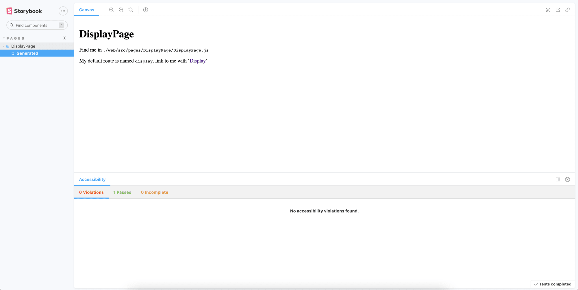
If you look in web > src > pages > DisplayPage, you’ll see the DisplayPage.stories.js file. This is the type of file Storybook will be looking for to render individual components. The Storybook page will render the DisplayPage component exactly like it’s written. Here’s what the story page should look like.
import DisplayPage from './DisplayPage'

export const generated = () => {
  return <DisplayPage />
}

export default { title: 'Pages/DisplayPage' }
Code language: JavaScript (javascript)
A couple of things to note for the stories.js file.
- The name of the exported component is
generatedand that’s the title of this particular view in the story. This name could be anything else you see fit. We’ll go into more detail on story views in just a bit. - The
titlethat’s part of the export is how components and different views are grouped in Storybook. The directory format defines the group name and the component name for the tab in that group.
Redwood generates this basic file by default so all we have to do is update it.
To get a better feel for writing stories, let’s make a component for the video that gets shown to the user.
We’ll run the following command to create the video component:
yarn rw g component video
This command will create three new files in the web > src > component directory. We have the Video.js file that holds the actual video component. Then there’s the Video.stories.js file that holds the Storybook story. Lastly, there’s the Video.test.js file that holds the tests for this component.
Let’s modify the existing code to render a video element with several props that are passed in. So in web > src > component > Video.js, you can delete the existing code and paste the following:
const Video = ({ videoSrc, width, height, controls }) => {
  return (
    <video width={width} height={height} controls={controls}>
      <source src={videoSrc} type="video/mp4" />
      Your browser does not support the video tag.
    </video>
  )
}

export default Video
Code language: JavaScript (javascript)
This is where the beauty of Storybook comes in. We’re not going to worry about adding this component to the DisplayPage while we’re developing it. We’re going to use the story page to test and document how the Video component works.
Since we have the Video component ready to play with, we can switch over to the Video.stories.js file and start writing new pieces to the story.
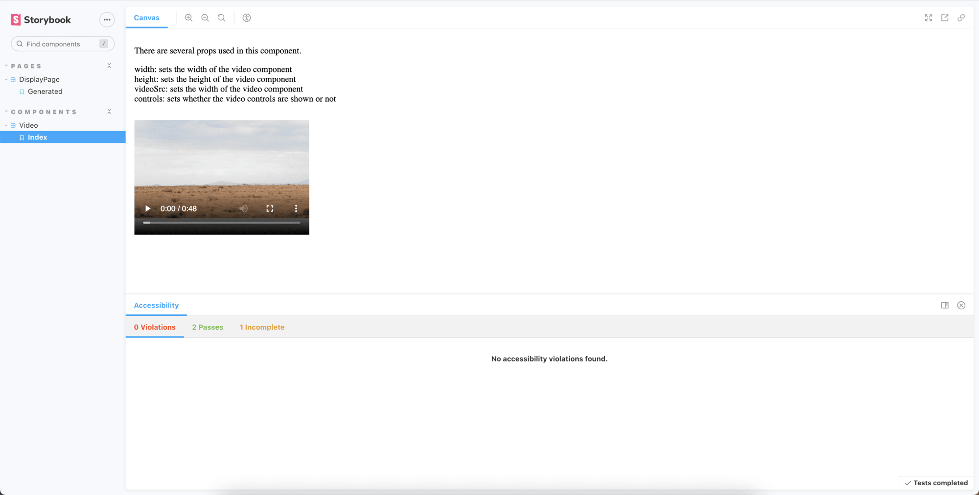
The first thing we’ll do is update the generated view. We’ll rename it to index because it will act as the starting point for working with the Video component and it’ll have more documentation than the other views we’ll add.
export const index = () => {
  return (
    <>
      <p>There are several props used in this component.</p>
      <div>
        width: sets the width of the video component
      </div>
      <div>
        height: sets the height of the video component
      </div>
      <div>
        videoSrc: sets the width of the video component
      </div>
      <div>
        controls: sets whether the video controls are shown or not
      </div>
      <Video width="320" height="240" videoSrc="https://res.cloudinary.com/milecia/video/upload/v1606580790/elephant_herd.mp4" controls={true} />
    </>
  )
}
Code language: JavaScript (javascript)
Here, we’ve defined the props that are passed into the Video component and we have an example of the component in use. If you check back in the browser, you should see something like this.
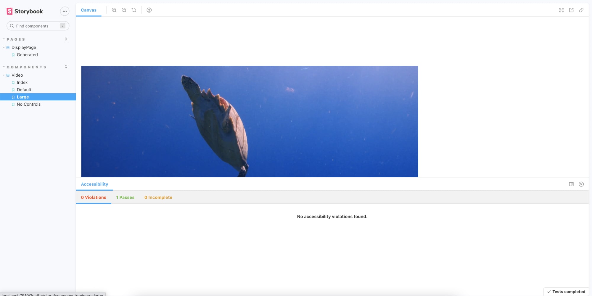
Many times you’ll have different use cases for the same component and Storybook can help you look at those individually as well. To handle passing props to different use case views, we have to introduce args into our story. We’ll do that by adding the following template in Video.stories.js.
const Template = args => <Video {...args} />
Code language: JavaScript (javascript)
This will let us pass different props to the Video component for each view we make. We’ll make a default view, a large view, and a view with no controls. Add the following code below the index view we made earlier.
export const Default = Template.bind({})
Default.args = {
  controls: true,
  height: "240",
  width: "320",
  videoSrc: "https://res.cloudinary.com/milecia/video/upload/v1606580790/elephant_herd.mp4"
}

export const Large = Template.bind({})
Large.args = {
  controls: true,
  height: "840",
  width: "1020",
  videoSrc: "https://res.cloudinary.com/milecia/video/upload/v1606580788/sea-turtle.mp4"
}

export const NoControls = Template.bind({})
NoControls.args = {
  controls: false,
  height: "560",
  width: "840",
  videoSrc: "https://res.cloudinary.com/milecia/video/upload/v1606580790/elephant_herd.mp4"
}
Code language: JavaScript (javascript)
We’re using Cloudinary to store the videos and getting a URL to use as the source for the Video component to keep things simple. You can set up a free account and upload your own videos if you want to see something more interesting.
We’re binding the view to the Template we created and that’s how we’re able to see them in the browser. You should see something like this now.
You can take a look at the stories for the Video and DisplayPage components in this Code Sandbox or you can clone the whole project from the storybook-component directory in this repo.
Developing components in isolation from the complete app can make it easier to catch bugs before they become issues and it can help give developers a better understanding of how the whole system works.
Configuring Storybook in an existing project doesn’t require much time, but it’s a nice integration that already comes with Redwood. Whether you’re working with multiple projects that depend on the same set of components or you’re working with one large app that has a lot of components, using Storybook can help you with long-term maintenance and onboarding new engineers.