
Users interact with the web through different devices, from phones and laptops to smartwatches. As developers, we must ensure that the websites and web applications we create are performant, functional, and responsive on all screen sizes.
Chakra-UI is a simple, modular, and easily extensible component library that provides building blocks for our front-end application structure.
This article will discuss using Chakra-ui Grid and SimpleGrid components respectively to build a responsive image grid in a Next.js application.
We completed the application in CodeSandbox. Fork it and run the code.
The source code for this application is available on GitHub.
The knowledge of the following is required:
- A basic understanding of CSS, JavaScript, and React.js.
- Node and its package manager, npm. We run the command
node -v && npm -vto verify we have them installed, or install them from here. - Alternatively, we can use another package manager, Yarn.
- Understanding Next.js would help us follow this tutorial quicker.
Next.js is an open-source React framework that enables us to build server-side rendering static web applications.
To create our Next.js app, we go to our terminal or command line. Using the git cd command, we navigate to the directory in which we want our app to be created.
cd <directory-name>
Once inside the directory, we create our project by running the command below:
npx create-next-app

# or

yarn create next-app
Once that’s finished, we can navigate into that directory and start a hot-reloading development server for the project with:
npm run dev
#or
yarn dev
We open http://localhost:3000 from the browser to see the application.
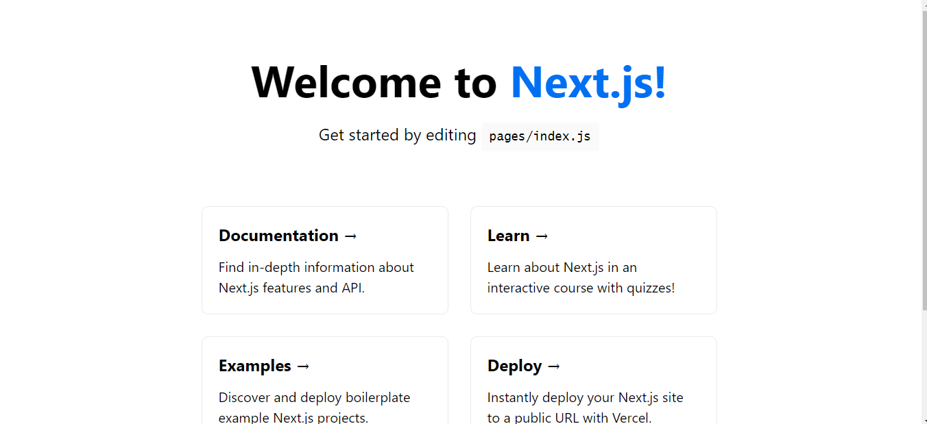
Next.js on port 3000
Next, we install the required dependencies in our project directory, by running:
npm i @chakra-ui/react @emotion/react@^11 @emotion/styled@^11 framer-motion@^6
#or
yarn add @chakra-ui/react @emotion/react@^11 @emotion/styled@^11 framer-motion@^6
Using this command, Chakra UI and its dependencies, including emotion and framer-motion, will be installed, as it relies on them for the styling.
To get Chakra working inside our app, we need to configure a Provider at the root of our application. This configuration will allow Chakra’s components to share data and maintain consistent styles.
Go to pages/_app.js (create if it doesn’t exist) and add the snippet below:
import { ChakraProvider } from '@chakra-ui/react'

function MyApp({ Component, pageProps }) {
  return (
    <ChakraProvider>
      <Component {...pageProps} />
    </ChakraProvider>
  )
}

export default MyApp
Chakra allows us to set responsive styles with its baked-in sizing, allowing us to recreate our responsive grid cards easily.
Grid renders a div element. Grid is a chakra-ui Box component with display: grid``, and it comes with helpful style shorthand.
The first thing to do is import the Grid, Box and Image components to our file. We create the posts directory under pages.
Then, we will create a file called Grid.js inside the posts directory with the following content:
import { Grid, Box, Image } from '@chakra-ui/react'
We will use the Grid component to make our responsive image that will span through the different screens.
Enter the code block below into the rendered JSX portion of the Grid.js file:
<Grid
      templateColumns="repeat(3, 1fr)"
      gap={6}
      height="auto"
      maxW="xl"
      alignItems="center"
      justifyContent="center"
      margin="100px auto"
    >
      <Box>
        <Image src="https://bit.ly/dan-abramov" alt="Dan Abramov" />
      </Box>
      <Box>
        <Image src="https://bit.ly/dan-abramov" alt="Dan Abramov" />
      </Box>
      <Box>
        <Image src="https://bit.ly/dan-abramov" alt="Dan Abramov" />
      </Box>
      <Box>
        <Image src="https://bit.ly/dan-abramov" alt="Dan Abramov" />
      </Box>
      <Box>
        <Image src="https://bit.ly/dan-abramov" alt="Dan Abramov" />
      </Box>
      <Box>
        <Image src="https://bit.ly/dan-abramov" alt="Dan Abramov" />
      </Box>
    </Grid>
In the above code block, we did the following process:
-
Grid: The main wrapper withdisplay: grid. -
Box:Boxis the most abstract component on top of which all other Chakra UI components are built. By default, it renders adivelement. -
Image: TheImagecomponent is used to display images.ImagecomposesBoxto use all the style props and add responsive styles as well.
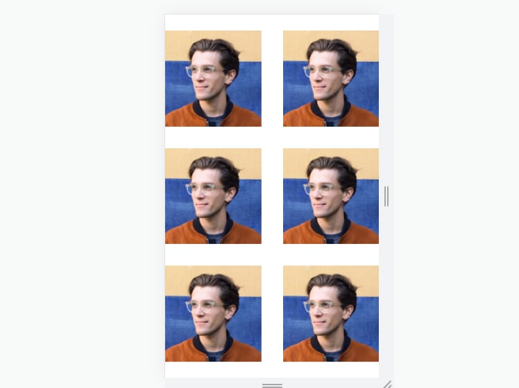
By now, we should have something like this in our Next.js application.
Note: Navigate to http://localhost:3000/posts/Grid (or anything our directory is named).
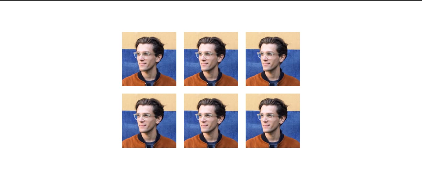
On a PC screen
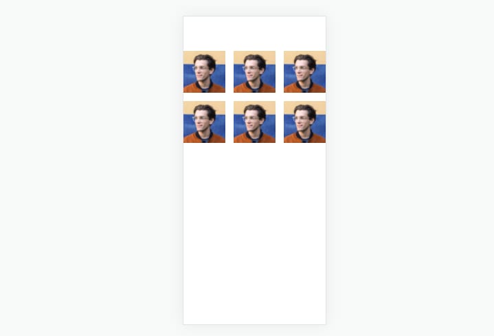
On a Mobile phone
And that is how to use the Charka-ui Grid component to build a responsive image grid.
SimpleGrid provides a friendly interface to create responsive grid layouts. It renders a div element with display: grid.
The first thing to do is to import the SimpleGrid, Box and Image components to your file, inside the pages/index.js.
import { SimpleGrid, Box, Image } from "@chakra-ui/react";
To make our image grid responsive through different screens using the SimpleGrid component, we copy the code below into the rendered JSX portion of pages/index.js directory:
<SimpleGrid
        minChildWidth="150px"
        spacing="40px"zes
        maxW="xl"
        alignItems="center"
        justifyContent="center"
        margin="100px auto"
      >
        <Box>
          <Image src="https://bit.ly/dan-abramov" alt="Dan Abramov" />
        </Box>
        <Box>
          <Image src="https://bit.ly/dan-abramov" alt="Dan Abramov" />
        </Box>
        <Box>
          <Image src="https://bit.ly/dan-abramov" alt="Dan Abramov" />
        </Box>
        <Box>
          <Image src="https://bit.ly/dan-abramov" alt="Dan Abramov" />
        </Box>
        <Box>
          <Image src="https://bit.ly/dan-abramov" alt="Dan Abramov" />
        </Box>
        <Box>
          <Image src="https://bit.ly/dan-abramov" alt="Dan Abramov" />
        </Box>
      </SimpleGrid>
To make the grid responsive and adjust automatically without passing columns, pass the minChildWidth prop to specify the min-width a child should have before changing the layout.
This uses CSS grid auto-fit and minmax() internally.
Box and Image components are similar to those imported when we used Grid above.
By now, we should have something like this in our Next.js application. Navigate to http://localhost:3000
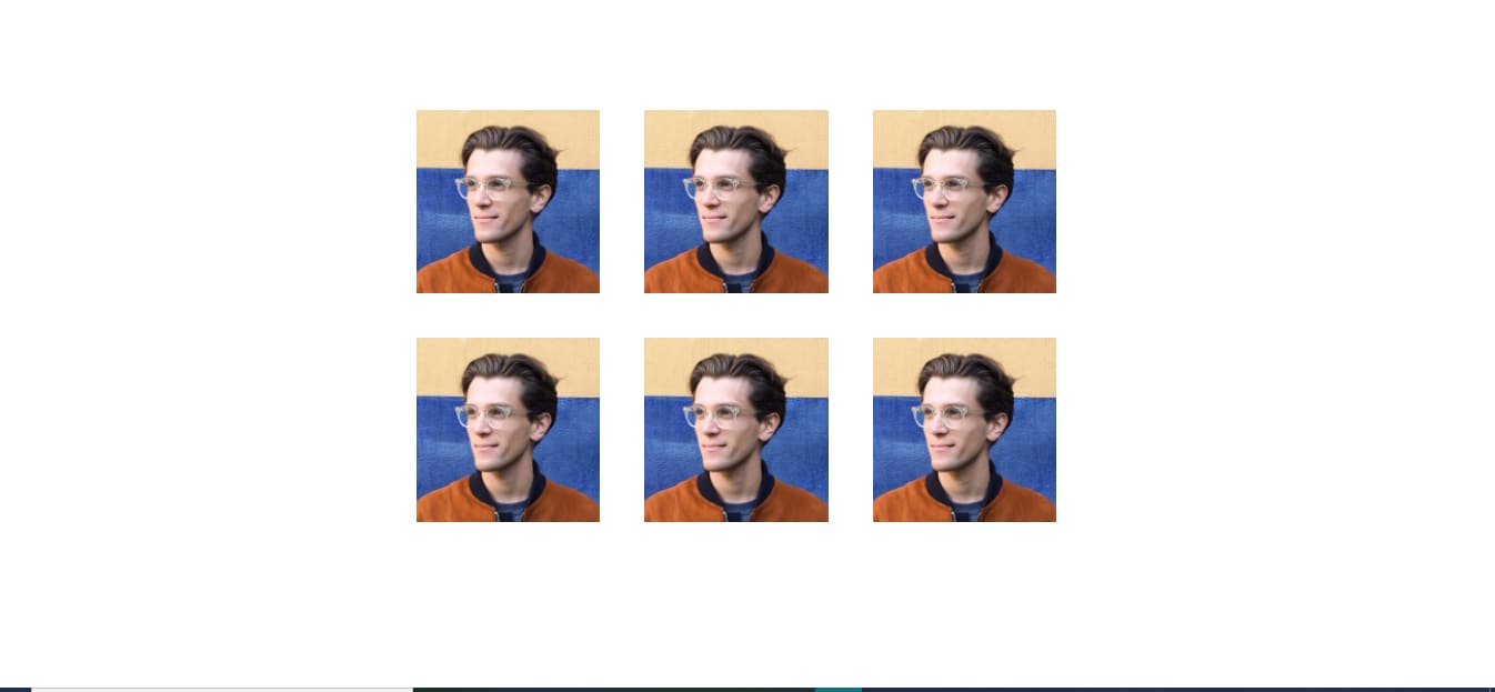
On a PC screen
On a Mobile phone
In this article, we used the Chakra-UI SimpleGrid and Grid components, respectively, to build a responsive image grid.
To learn more about using Chakra-UI, check out the following resources: