Placing layers on images
Last updated: Mar-31-2026
Cloudinary allows you to dynamically add layers to specific locations within your images, where the new layers are added over the base image as overlays, and can also be easily transformed to suit your needs. There are multiple options for adding a new layer to a base image, either an image uploaded to Cloudinary, a remote image, or a text string.
Image layers can also be added as underlays instead, and there are special layer applications for using layers in combination with other Cloudinary transformations.
Here are examples of some popular use cases that you can accomplish using layers (combined with other transformations). Click each image to see the URL parameters applied in each case:
your images
 Hide all
 detected faces
 Add personalized
 text
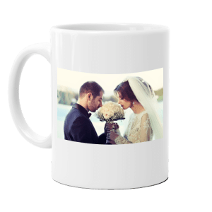 Displace images
on products
Layer transformation syntax
In its most simple form, adding a layer over the base image takes following URL syntax:
The layer parameter is in its own URL component and starts the overlay definition (similar to an open bracket). The layer_apply flag is in a separate component that closes the definition (similar to a closing bracket) and instructs Cloudinary to place it.
You can enhance your layer both by controlling where and how it is placed on the base image using gravity, offset and other placement qualifiers, and by applying transformations to the layered asset, using the following general URL syntax.
Authenticated or private layers
You can add image overlays that are set to authenticated or private by modifying the syntax:
- For private layers:
l_private:<public_id of layer> - For authenticated layers:
l_authenticated:<public_id of layer>
You can only add image overlays that are set to authenticated or private if you also sign the whole URL (no separate signature is required for the overlay part). See the Media access control documentation for more details on delivering private and authenticated assets.
Image overlays
The default overlay type is an image. For example, adding an overlay of a logo to a base image (l_docs:logo-semi-opaque/fl_layer_apply):

If the public ID of an image includes slashes (e.g., the public ID of an image is animals/dog), replace the slashes with colons when using the image as an overlay (e.g., the public ID of the overlay image becomes animals:dog when used as an overlay).
See full syntax: l_<image id> in the Transformation Reference.
Try it out: Layers.
Remote image overlays
Use a remote image (an image not stored in your Cloudinary product environment) as an overlay by adding the fetch (or url for some SDKs) property of the layer parameter ( l_fetch: in URLs) and the base64 encoded URL of the remote image.
The general URL syntax for adding a remote image as an overlay takes the following form:
For example, adding an overlay of the remote image https://res.cloudinary.com/demo/image/upload/logos/cloudinary_icon_white.png to the base image.

See full syntax: l_fetch in the Transformation Reference.
Text overlays
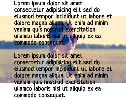
Add a text overlay over the base image with the text property of the layer parameter ( l_text: in URLs). The parameter also requires specifying font family and size (separated with an underscore and followed by a colon), and the text string to display. The general URL syntax for adding a text layer takes the following form:
In addition to the required font and size styling values, you can optionally specify a variety of other CSS-like styling parameters and to further customize your text layers by specifying text color, adding line breaks, emojis and other special characters, and other text layer options.
Cloudinary first generates an image from the text definition and then overlays it like any other image overlay, and thus supports all the same transformations that any image overlay supports.
For example, to overlay the text string "Coffee" in the Arial font with a size of 80 pixels (l_text:Arial_80:Coffee/fl_layer_apply):

See full syntax: l_text in the Transformation Reference.
Try it out: Layers.
Layer placement
The fl_layer_apply component not only acts as the closing bracket for the layer, but is also used to include any options that will control how the layer is placed on the base image, and any details regarding the relationship between the overlay element and the base image.
Positioning layers with gravity
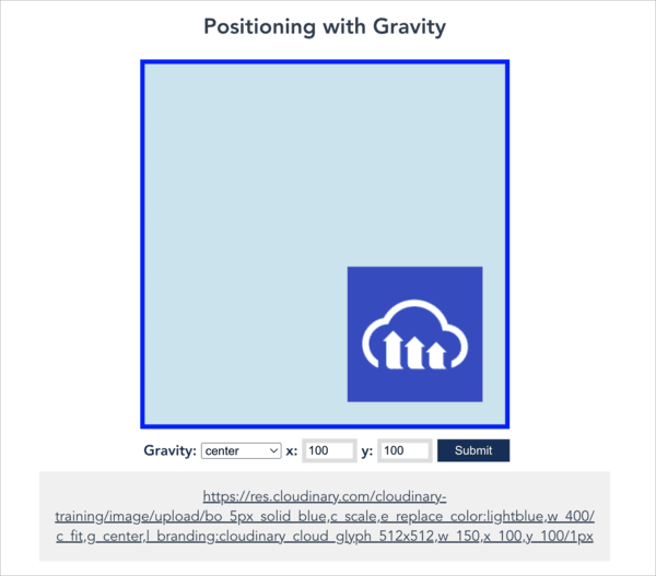
To determine the position of the new layer, you can add the gravity parameter to define the location to place the layer within the base image ('center' by default). The gravity parameter is added in the same component as the layer_apply flag.
For example, to add an image overlay to the base image with gravity set to west (l_lotus_layer/fl_layer_apply,g_west):

To fine-tune the exact location of the layer, you can offset the overlay from the focus of gravity by also adding the x and y coordinate offset parameters. These parameters accept either integer values representing the number of pixels to adjust the overlay position in the horizontal or vertical directions, or decimal values representing a percentage-based offset relative to the containing image (e.g., 0.2 for an offset of 20%).
For example, to place a text overlay at a vertical distance of 5% from the top of the image (l_text:Roboto_400:Paradise/fl_layer_apply,g_north,y_0.05):

The direction of x and y depends on the compass position:
| Compass position | Positive x | Positive y | Negative x | Negative y |
|---|---|---|---|---|
center, north_west, north, west
|
right | down | left | up |
north_east, east
|
left | down | right | up |
south_east |
left | up | right | down |
south, south_west
|
right | up | left | down |
Overlays on special positions
The gravity parameter can also be set to a custom region within an image, which becomes the focus when placing the overlay. These 'special positions' are locations within the image that are either automatically detected by Cloudinary (e.g., a face), custom coordinates that were previously specified (e.g., as part of the upload method), or detected by one of the Cloudinary add-ons (e.g., eyes or text within the image).
For a full list of all the special positions available to use for placing overlays with the gravity parameter, see the <special position> section in the Transformation Reference.
For example:
-
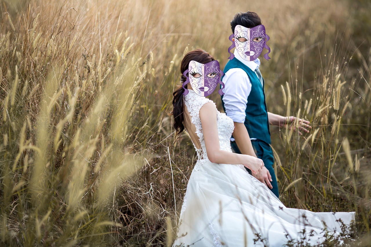
Add an overlay of the
purple-maskimage over all faces detected in thecouple-cornfieldimage:
-
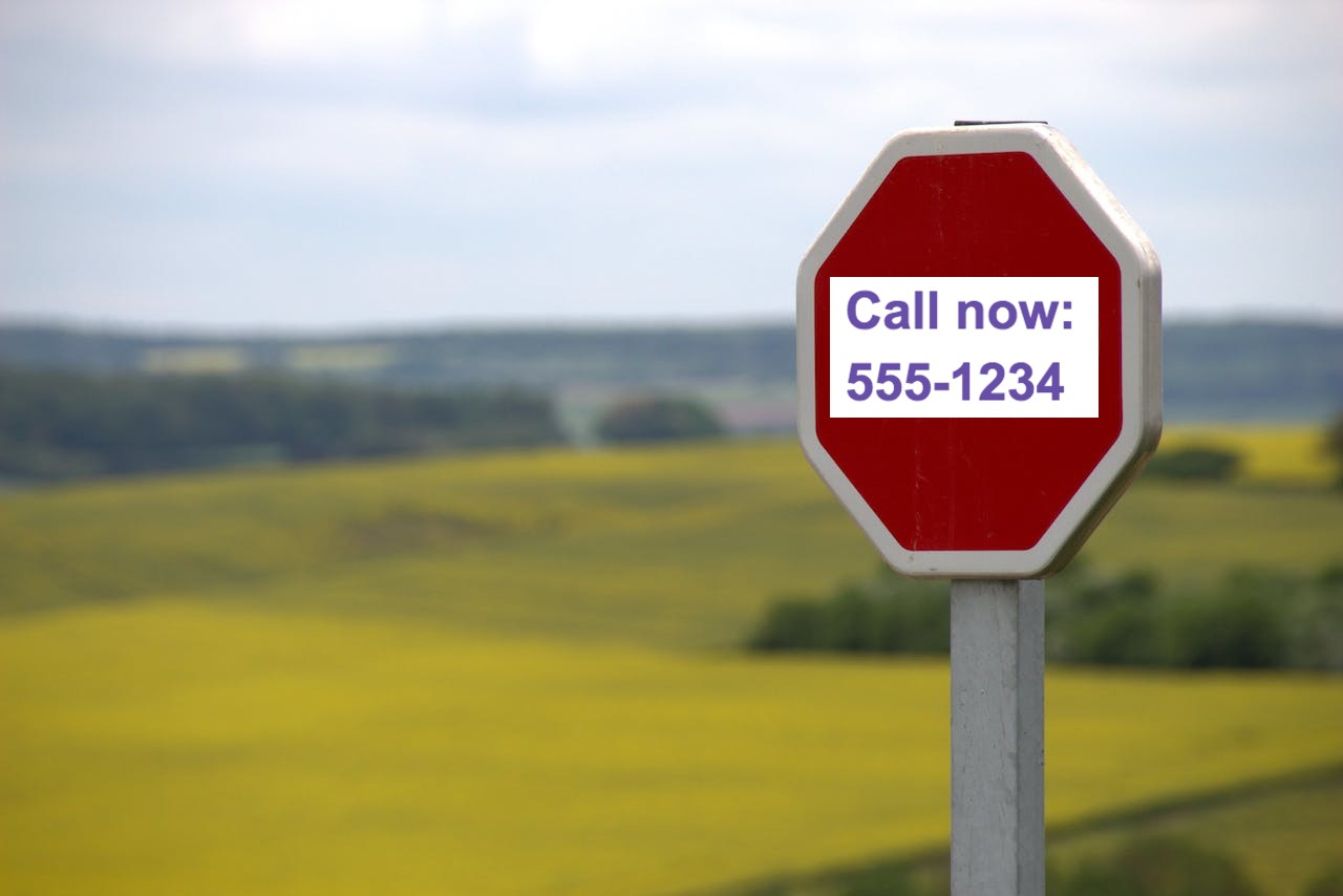
Use the OCR Text Detection and Extraction add-on to add an overlay with your site's contact information that covers any detected text in an uploaded image:

You may also want to position an overlay ensuring that it avoids a special position. See Position overlays avoiding detected faces for an example of how to achieve this.
- When gravity is set to one of the special position values, and no special position is detected in the image, then no overlay is placed at all.
- Instead of specifying an absolute width for overlays, you can use the fl_region_relative flag to place each overlay relative to the size of each detected region.
Layer overflow behavior
By default, if a layer (image or text) has a larger width or height than the base image, the delivered image canvas is resized to display the entire layer. If you want to ensure that the delivered size will never be larger than the base image, you can use the fl_no_overflow flag in the same component as the layer_apply flag.
For example, the no_overflow flag prevents the logo overlay from extending the canvas of the base image (c_scale,w_400/l_cloudinary_icon_blue/fl_layer_apply,fl_no_overflow):
Placing images side by side, vertically, or in a collage
You can concatenate, append, or arrange images adjacent to each other — side by side, stacked vertically, or in a 2×2 grid or larger mosaic — by using overlays with gravity and x,y placement offsets. Instead of overlaying one image on top of another, you position each additional image outside the canvas of the base image, which automatically expands the canvas to include it.
Simple side-by-side or vertical arrangement
To place two images next to each other (concatenate them), crop both to a fixed size, then set the x offset of the second image to equal the width of the first for a side-by-side arrangement, or the y offset to equal the height for vertical stacking.
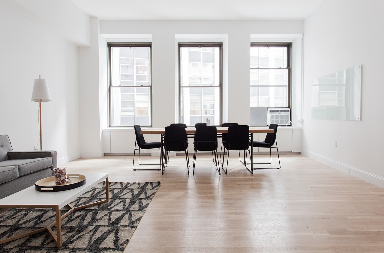
Side by side — dining room image on the left, kitchen image appended to the right:

Looking at the URL:
-
c_fill,h_300,w_400crops the base image (dining room) to 400 × 300 pixels. -
l_docs:kitchen-apartmentadds the kitchen image as an overlay. -
c_fill,h_300,w_400crops the overlay to the same 400 × 300 pixel size. -
fl_layer_apply,x_400positions the overlay 400 pixels to the right of the base image center, placing it immediately adjacent to the right edge.
Stacked vertically — dining room image on top, kitchen image appended below:
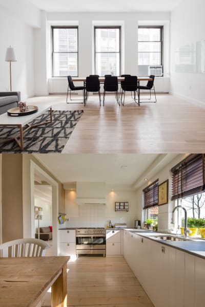
This time, the vertical (y) offset of 300 pixels places it immediately below the bottom edge.
Multi-image collages and mosaics using variables
For more complex arrangements — such as a 2×2 grid, a mosaic, or a larger collage — you can use user-defined variables such as $w_iw and $h_ih to dynamically capture each image's width and height. This approach lets you append images of any size side by side or vertically without knowing their exact dimensions in advance.
Here's an example of four apartment images combined into a 2×2 collage:
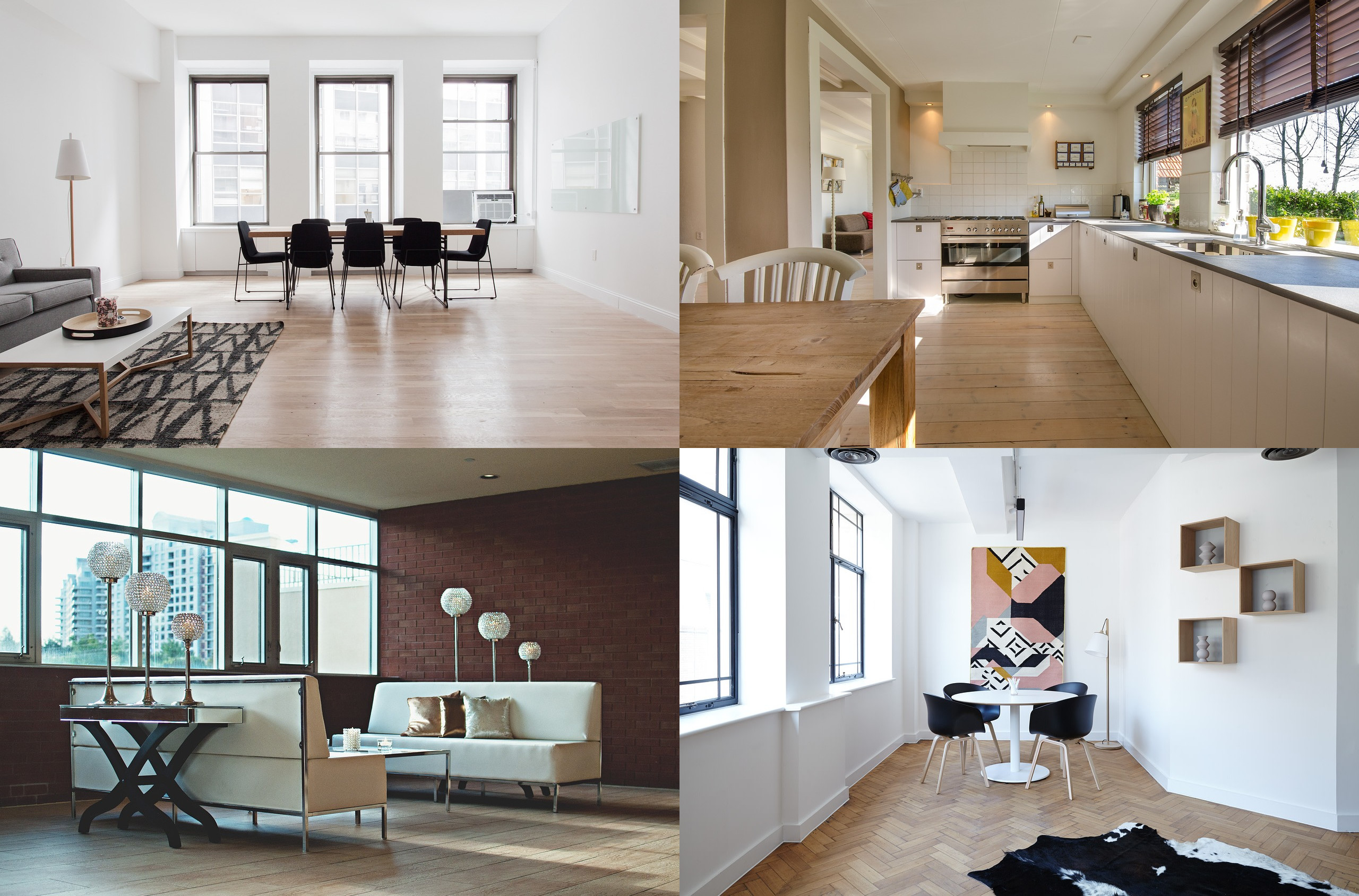
- The base image (
docs/dining-apartment) goes in the top left.
- The kitchen image appends to the right using the base image width as the
xoffset ($w_iw/l_docs:kitchen-apartment/fl_layer_apply,x_$w): - The study image stacks below the kitchen image using
eastgravity and the base image height as theyoffset ($h_ih/l_docs:study-apartment/fl_layer_apply,g_east,y_$h): - The lounge image fills the bottom left corner using
south_westgravity.
You can also set fixed dimensions for each image and add spacing and background colors. For example, the following collage crops each image to 250 × 250 pixels, adds 30 pixels of spacing between them, and applies a burlywood background:

In this example:
- Each image uses
c_auto,g_autoto crop to a 250 × 250 pixel square, focusing on the most interesting area. - The
xandyoffsets include 30 extra pixels to space out the images (for example,fl_layer_apply,x_$w_add_30). - The background color uses
burlywood. - The
lpadcrop mode pads the whole collage to form a uniform border.
Layer transformations
You can apply resizing and other transformation options on your overlays just like any other asset delivered from Cloudinary. You can apply multiple (chained) transformations to overlays by adding them in separate components before the layer_apply component. All chained transformations, until a transformation component that includes the layer_apply flag, are applied on the last added overlay or underlay instead of applying them on the base asset (the layer_apply flag closes the layer, similar to a closing bracket).
For example:
-
Adding a logo overlay scaled down to 50% of its original width and made into a watermark by reducing the opacity to 70% and increasing the brightness to 50% using the
brightnesseffect. The transformed image is then placed as a layer in the top-right corner of the base image (l_cloudinary_icon_blue/c_scale,w_0.5/o_70/e_brightness:50/fl_layer_apply,g_north_east):
-
The base image is scaled to a width of 500 pixels before adding an image overlay, where the overlay is automatically cropped to a 150px thumbnail including only the detected face and placed in the top left corner (
c_scale,w_500/l_docs:model/c_thumb,g_face,w_150/fl_layer_apply,g_north_west):
Multiple overlays
Multiple overlays can easily be added as chained transformations to an asset. The following example adds both image and text overlays to the base image as follows:
- An overlay of an image called
umbrella, scaled to a 300px and place in the top left corner (l_umbrella/c_scale,w_300/fl_layer_apply,g_north_west). - An overlay of an image called
cloudinary_icon_whitewith a relative width of 50% of the base image and an opacity of 50% and a brightness of 100 (l_cloudinary_icon_white/c_scale,fl_relative,w_0.5/o_50/e_brightness:100/fl_layer_apply). - The white text string "London" in bold 'Roboto' font with a size of 80 pixels, placed at a distance of 20 pixels from the bottom of the base image (
co_white,l_text:roboto_80_bold:London/fl_layer_apply,g_south,y_20).
Nesting layers
Layers can be nested within layers. Each layer must have its own layer and layer_apply components, and the inner layer must be closed before the outer one, like with any nested programming statement.
For example, adding text to the moon overlay:
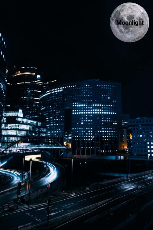
The first image layer has a transformation that changes its size and the second layer is a text layer configured with a font and size. The second layer is closed and placed by the first (inner) fl_layer_apply. Since no gravity was specified for that later, it's placed in the center of the first overlay. Then the outer layer apply closes and places the entire layer (including its nested layer) and positions it in the northeast corner.
Relative layer sizing
By default, whenever you apply relative resize transformations to your overlay, the overlay image is resized relative to its own original size. However, you can use one of the following flags to resize relative to other elements.
Sizing relative to the base image
You can add the relative flag (fl_relative in URLs) to specify that percentage-based width & height parameters of overlays (e.g., w_0.5) are relative to the size of the base image instead of to the original size of the overlaying image itself.
For example, to add an overlay of the image called stamp-exclusive-premium, where the overlay is resized to 70% of the width of the base image (l_stamp-exclusive-premium/c_scale,fl_relative,w_0.7/fl_layer_apply):

Sizing relative to the detected region
You can add the region_relative flag (fl_region_relative in URLs) to instruct Cloudinary to size your layers relative to the regions detected by the specified gravity type.
- The region can be detected faces (
g_face,g_faces), detected OCR text regions (g_ocr_text) or pre-defined custom regions (g_custom). - This flag must be used in conjunction with a relative (decimal value) width or height qualifier.
For example, to hide all the faces in an image by covering them with an emoji overlay, where each overlay is sized at 1.3x (130%) of each detected face (l_happy_smiley/c_scale,fl_region_relative,w_1.3/fl_layer_apply,g_faces):

Text layer options
Text layers can be customized in a variety of ways, such as applying CSS-like styles, adding line breaks, applying special characters, custom fonts, and more.
Styling parameters
In addition to the required font family and font size values of the text layer, a variety of optional CSS-like styles are supported, such as decoration, alignment, letter spacing, line spacing and more. For a full list, see the Styling parameters table in the Transformation Reference.
The Cloudinary SDK helper methods support supplying the values as an array of mapped values or as a serialized string of values. For example, in Ruby (other frameworks use similar syntax):
overlay: { text: 'Hello World', font_family: 'Arial', font_size: 18, font_weight: 'bold', font_style: 'italic', letter_spacing: 4 }
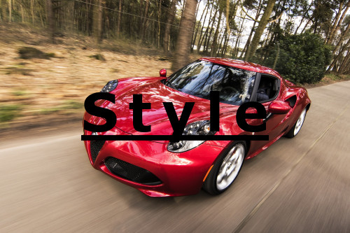
For example, to overlay the text string "Style" in Verdana bold with a size of 75 pixels, underlined, and with 14 pixels spacing between the letters: l_text:Verdana_50_bold_underline_letter_spacing_14:Style:
Text color
You can control the color of the text overlay by adding the color property (co in URLs).
Opaque colors can be set as an RGB hex triplet (e.g., co_rgb:3e2222), a 3-digit RGB hex (e.g., co_rgb:777) or a named color (e.g., co_green). By default, if the color property is omitted, the text has a black color.
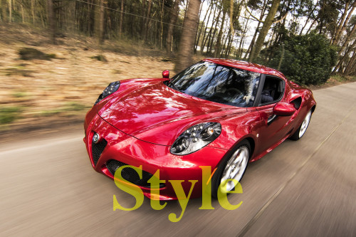
For example, adding the text string "Style" in Times bold with a size of 90 pixels at a distance of 20 pixels from the bottom of the base image, in yellow text (FFFF00):
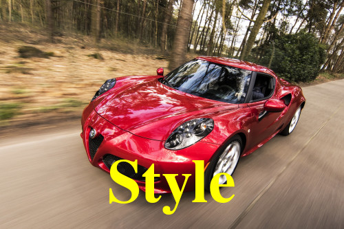
You can also use a 4-digit or 8-digit RGBA hex quadruplet for the color, where the 4th hex value represents the alpha (opacity) value (e.g., co_rgb:3e222240 results in 25% opacity).
The example below uses the same text string "Style" in Times bold with a size of 90 pixels at a distance of 20 pixels from the bottom of the base image, in yellow text, but this time with an opacity of 50% (FFFF0080):
Multi-line text
You can manually break lines of text by separating each line of text with the newline character (%0A). For example, adding the text string "Pretty Flowers" in Verdana bold with a size of 50 pixels at a distance of 10 pixels from the left border of the base image, where each word appears on a new line with line spacing of -15 pixels:
Auto-line breaks
Cloudinary can also automatically wrap your text into multiple lines based on a specified maximum width for the text string. To do this, apply the fit crop mode to the text layer and specify the width to use for word wrapping. This setting tells Cloudinary to automatically wrap the actual text content onto a new line once the width is reached.
c_fit (called textFit in the latest major version of some SDKs) is the only 'resize' option that can be used as a qualifier of text overlays.For example, to add a long text string in bold Neucha font with a size of 26 pixels to the base image that wraps at a width of 400 pixels:

When using the fit (textFit in some SDKs) crop mode, you must specify a width for your text overlay, but height is optional. Line breaks are applied as needed to achieve the requested width and/or height rectangle.
The specified font size of your overlay stays as is, even if the resulting text overlay height exceeds the height of its hosting image. So, if you don't limit the overlay height, the height of the image expands to accommodate large texts:
If you do limit the height of your overlay, any text that does not fit within the space defined is cut and an ellipsis (...) is added to the end of the text string to indicate that the text was truncated.
To define a maximum height for the multi-line text add the height parameter in addition to width in the 'resize' transformation of your text layer:
You can also set text alignment and line spacing values to further control the text's appearance. Other resize parameters can be applied as an action over the entire overlay (before the fl_layer_apply) to resize the resulting the text-image overlay as a whole after it's created.
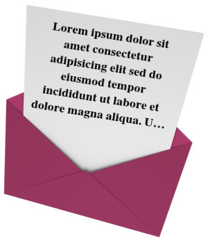
For example, to add a long text string in center aligned bold Times font with a size of 14 pixels to the base image, that wraps at a width of 200 pixels and is limited to a height of 150 pixels; and then rotate the text by 9 degrees and set 30 pixels from the north border to better align with the underlying image:
Special characters
Text strings containing special characters need to be modified (escaped) for use with the text overlay feature. This is relevant for any special characters that would not be allowed "as is" in a valid URL path, as well as other special Unicode characters. These text strings should be escaped using %-based UTF-8 encoding to ensure the text string is valid (for example, replace ? with %3F and use %20 for spaces between words). This encoding is done automatically when embedding images using the Cloudinary SDK helper methods and only needs to be done when manually building the asset delivery URL.
Additionally, to include a comma (,) forward slash (/), percent sign (%) or an emoji character in a text overlay, you must double-escape the % sign within those codes. For example:
Add a comma to a text overlay as
%252C(and not just%2C).The escaped URL code for the flower emoji is
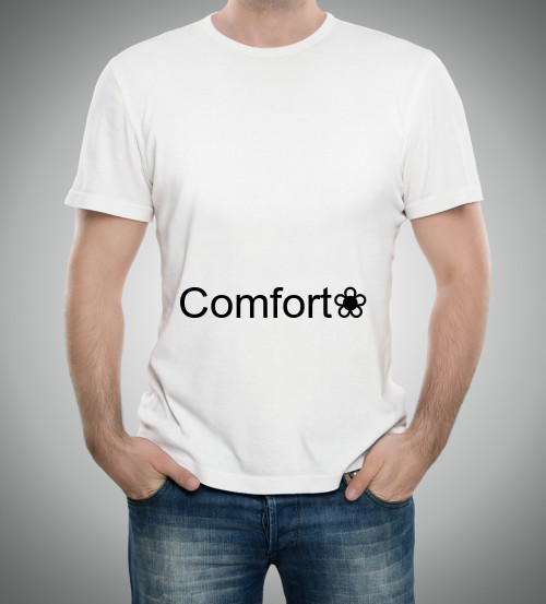
%E2%9D%80. To include this emoji in a text overlay, you must also escape each of the%signs in the escaped code:l_text:Arial_80:Comfort%25E2%259D%2580:
Custom fonts
By default, only universally available fonts are supported for text overlays. However, if you want to use a non-standard font, you can upload it to Cloudinary as a raw, authenticated file and then specify the font's full public_id (including extension) as the font for your overlay:

Custom font guidelines
-
.ttf,.otfand.woff2font types are supported. -
Custom fonts must be uploaded as raw, authenticated files.
TipYou can upload custom fonts via the Media Library by creating (or using an existing) signed upload preset where the Delivery type option in the preset is set as Authenticated. You can use this upload preset when uploading files to the Media Library by configuring it as the default Media library upload preset for Raw files.Alternatively, you can select the signed upload preset you create for custom fonts in the Media Library upload widget's Advanced settings while uploading assets, if that option is enabled for your account.
If your custom font's public ID includes slashes, specify the public ID path using colons as separators. For example:
path1:path2:myfont.ttf.Make sure to include the file extension when referencing the
public_idof the raw file. The extension must be specified in lower-case letters.To make use of bold or italic font styles, upload separate font files for each emphasis style and specify the relevant file in the overlay transformation.
A custom font is available only to the specific product environment where it was uploaded.
Underscores are not supported in custom font names. When uploading the font as a raw file, make sure the
public_iddoes not include an underscore.As with any asset you upload to Cloudinary, it is your responsibility to make sure you have the necessary license and redistribution rights for any custom fonts you use.
Predefined text templates
Instead of specifying the styling parameters every time you need to dynamically add a text overlay to an asset, you can use the public ID of a text image created with the text method of the upload API. The same styles that were used to create the text image will also be dynamically applied to the text overlay. The default text string of the text image is also used unless you provide a new text string, which can be useful if you don't want the text string to appear in the URL, or if the text string is very long.
For example, you can create a text image of "Sample text string" in 82 point, red, Roboto bold font, and the public ID of sample_text_style as follows:
This is the resulting text image:
You can then use the sample_text_style style in your text overlay, as follows:

Text layer flags
The text content for text layers is often supplied in real time by your application users or another external source. You may want to use the following flags to help handle these scenarios:
-
fl_disallow_overflow: As mentioned in layer overflow behavior above, you can control whether large image or text layers will result in expanding the size of the delivered asset using the
fl_no_overflowflag.However, for text overlays, if you don't want long text to impact the expected delivery asset size, but an unexpected trim might risk cutting off essential text, you can apply the
fl_disallow_overflowflag, which will cause URLs with overflowing text layers to fail and return a 400 (bad request) error that you can check for and handle in your application.For more details and examples, see fl_no_overflow and fl_disallow_overflow in the Transformation Reference.
-
fl_text_no_trim: By default, text layers are tightly trimmed on all sides. In some cases, especially if you add a border around the text, or you are using a gravity for your text layer that might place the text too close to the edge of the layer behind it, you can use the
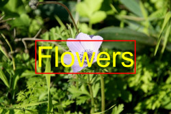
fl_text_no_trimflag to add a small amount of padding around the text overlay string. For example:
l_text:Arial_100:Flowers,b_green), Cloudinary automatically adds this padding, so this padding flag isn't necessary. Image underlays
Add an underlay image under a partially transparent base image with the underlay parameter (u in URLs) and the public ID of a previously uploaded image (e.g., u_background for an image with the public ID of background), with the following general syntax.
You can determine the dimension of the underlay using width and height, and adjust the location of the base image over the underlay using the gravity parameter and the x and y parameters. The underlay can also be further transformed like any other image uploaded to Cloudinary, and the underlay parameter supports the same features as for overlays as described above.
For example, add an underlay of an image called site_bg to the base image. The underlay and base image are both resized to the same width and height, and the brightness is increased to 100 using the brightness effect (c_fill,h_200,w_200/u_site_bg/c_scale,h_200,w_200/e_brightness:100/fl_layer_apply):

layers/blue), replace the slashes with colons when using the image as an underlay (e.g., the public ID of the image becomes layers:blue when used as an underlay).See full syntax: u_<image id> in the Transformation Reference.
Remote image underlays
Similar to overlaying a remote image, you can underlay a remote image using u_fetch:<base64 encoded URL>.
For example, add the background image, https://res.cloudinary.com/demo/image/upload/site_bg (base64 encoded: aHR0cHM6Ly9yZXMuY2xvdWRpbmFyeS5jb20vZGVtby9pbWFnZS91cGxvYWQvc2l0ZV9iZw==), as an underlay, resized to match the size of the base image (u_fetch:aHR0cHM6Ly9yZXMuY2xvdWRpbmFyeS5jb20vZGVtby9pbWFnZS91cGxvYWQvc2l0ZV9iZw==/c_fill,fl_layer_apply,fl_relative,h_1.0,w_1.0):

See full syntax: u_fetch in the Transformation Reference.
Watermarking
You can use a standard image layer for the purpose of applying a watermark to any delivered image. Opacity and/or brightness transformations are often applied to image layers when they are used as a watermark.
You can also use automatic tiling and/or the smart anti-removal effect with your layer transformation in order to achieve your watermark requirements.
Add watermarks with JavaScript video tutorial
Watch this video tutorial to learn how to protect your visual content by adding image and text watermarks using Cloudinary's JavaScript SDK.
This video is brought to you by Cloudinary's video player - embed your own!
Use the controls to set the playback speed, navigate to chapters of interest and select subtitles in your preferred language.
Tutorial contents
Automatic tiling
Instead of adding your watermark layer to a single, specific location, you can tile layer image over the entire base image by adding the tiled qualifier (fl_tiled in URLs). The tiled flag is added in the same component as the layer_apply flag. For example, tiling an overlay of the image called cloudinary_icon_white on to the base image (l_cloudinary_icon_white/fl_layer_apply,fl_tiled):
Smart anti-removal
You can use the anti-removal effect (e_anti_removal in URLs) to slightly modify image overlays in a random manner, thus making them much harder to remove (e.g., adding your logo as a watermark to assets). In most cases, the default level of modification is designed to be visually hard to notice, but still difficult to remove cleanly. If needed, you can optionally control the level of distortion that this transformation applies by adding a colon followed by an integer (the higher the number, the more the image is distorted). The anti_removal effect is added in the same component as the layer_apply flag.
For example, adding the anti-removal effect (with a high level of 90 for demonstration purposes) to an overlay of the image called cloudinary_icon_blue added to the north-east corner of the base asset, with the overlay's opacity set to 50% and scaled to a width of 150 pixels (c_scale,w_500/l_cloudinary_icon_blue/c_scale,w_150/o_50/e_anti_removal:90,fl_layer_apply,g_north_east):
See full syntax: e_anti_removal in the Transformation Reference.
Special layer applications
In addition to the primary use of layers for placing other assets or text on the base image, some transformation features make use of the layer option to specify a public ID that will be applied to the base image in order to achieve a desired effect. The following features make use of the layer transformation parameter in a special way:
| Feature | Description |
|---|---|
| 3D LUTs | 3-color-dimension lookup tables (3D LUTs) map the color space in a LUT layer to the color space in a base image. |
| Displacement maps | Displace pixels in a base image based on the intensity of pixels in a displacement map layer image. |
| Blending and masking layers | Effects that blend or mask a base image based on the pixels in a layer image. |
| Shape cutouts | Remove or keep areas of a base image based on the opaque shape in a layer image. |
 Ask AI
